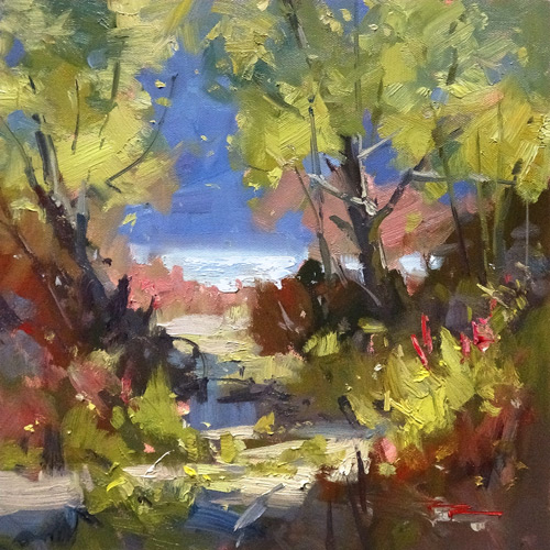
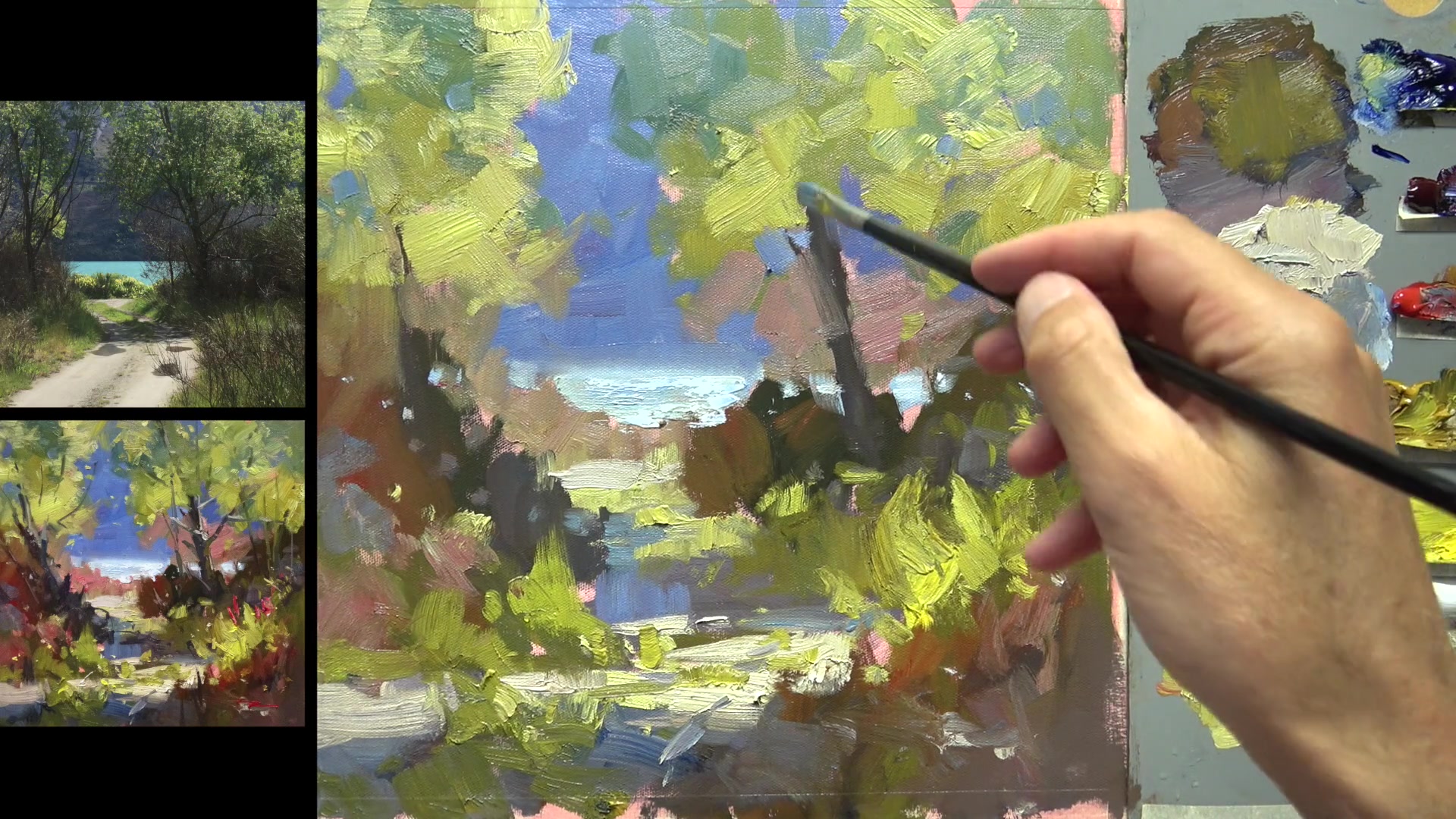
In this chapter, I invite you to join me on a virtual walk to Glenorchy, a charming village nestled at the edge of Lake Wakatipu in the South Island of New Zealand. This picturesque spot, located near the popular tourist destination of Queenstown, offers a stunning landscape that is perfect for painting. As we explore this beautiful area, you'll learn to capture the essence of its light-filled scenery in an impressionistic style. We'll focus on the theme of looking through trees to the landscape beyond, a common motif in Glenorchy paintings that adds depth and interest to your work. Using large brushes and generous amounts of paint, I'll guide you step by step through the process of designing an inviting scene and painting with freedom. This lesson is all about embracing the joy of painting outdoors and discovering techniques that bring your canvas to life. Whether you're stuck indoors or simply yearning for a creative escape, this chapter offers a rewarding subject that will enrich your painting journey.
This guide accompanies the full video lesson. The lesson includes the complete narrated video, the printable PDF chapter, and personalised critique support.
Create a cool grey by mixing blue, red, white, and a touch of yellow ochre. This will serve as the base color for your tree branches and trunk.
Load Your Brush
Squish the paint to the end of your brush and pick it up in a thin ridge. This technique allows you to create fine lines for the branches.
Suggest the Tree
Use one or two strokes to paint the branches, refilling the brush as needed. Focus on suggesting the tree rather than drawing every branch exactly as it appears in the photo.
Create Gestural Branches
Paint the branches with a sense of movement, as if they are dancing on the canvas. Allow the strokes to vary in direction, not just following the line of the branch.
Consider Branch Anatomy
Ensure branches are thicker at the base and get thinner as they extend. Observe the curvature and spread of the branches to capture the essence of the tree.
Pro tipDon't aim to paint every branch; focus on capturing the feeling and essence of the tree.
Embark on your painting journey by thoughtfully composing your scene, drawing inspiration from natural elements like trees and streams to create depth and interest. As you paint, pay attention to the interplay of edges and contrasts, using soft edges to blend elements seamlessly into the background and sharp edges to highlight focal points. Balance warm and cool tones to enhance the vibrancy and depth of your landscape.
Embrace the challenge of painting with time constraints to capture the essence of your scene with dynamic brushwork. Use large brushes to cover your canvas quickly, and don't shy away from vigorous paint application to infuse energy into your work. As you progress, consider the role of trees as natural frames and exaggerate contrasts to create a visually engaging composition.
Refine your painting by adjusting color saturation and intensity to compensate for camera limitations, ensuring your colors remain vibrant yet true to the scene. Pay close attention to the design and placement of elements, using shadows and varied shapes to guide the viewer's eye and maintain interest. Finally, soften any distracting edges and ensure your painting's composition remains dynamic and inviting.
Points to remember
Incorporate trees and natural elements to create depth and interest.
Use soft edges to blend elements into the background.
Set a time limit to encourage quick, expressive brushwork.
Exaggerate warm and cool contrasts to enhance visual dynamics.
Enhance color saturation to compensate for camera limitations.
Find your personal threshold for color intensity to avoid an overwhelming effect.
Vary the heights and widths of shapes to add interest to your painting.
Use a zigzag swish technique to maintain soft, clean edges.