In this chapter, we'll begin in the studio, where I can guide you through the colors I use and how I achieve the vibrant mixes that bring life to outdoor scenes. I've prepared my palette with a limited selection of five colors plus white, which I'll explain in detail. Before diving into mixing, let's clarify some essential terms: 'value' refers to a color's lightness or darkness, akin to where it falls on a grayscale; 'hue' is the name of the color on the color wheel, such as yellow or yellow-green; 'saturation' describes a color's intensity or purity; and 'temperature' indicates a color's warmth or coolness, with warm tones leaning towards yellow and orange, and cool tones towards blue. In the studio, I use a glass palette with a neutral gray surface for optimal mixing, but outdoors, I prefer the practicality of a wooden palette. Using a limited palette is advantageous, especially for plein air painting, as it minimizes the weight of your gear while still allowing for a vast range of color mixes. I'll share the specific colors I carry and how to mix them effectively, starting with titanium white for its opacity and affordability, and moving through a selection of Rembrandt colors that offer flexibility and depth. Let's explore how mastering these elements can enhance your painting experience and help you capture the light beautifully in any scene.
This guide accompanies the full video lesson. The lesson includes the complete narrated video, the printable PDF chapter, and personalised critique support.
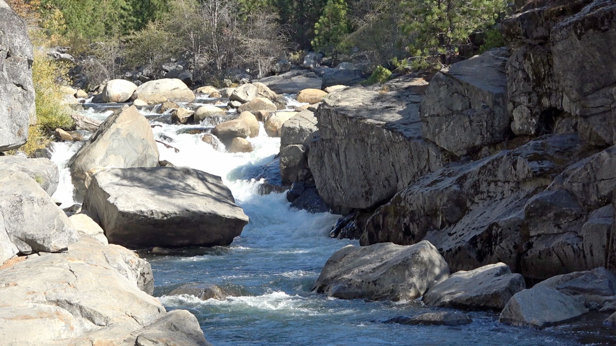
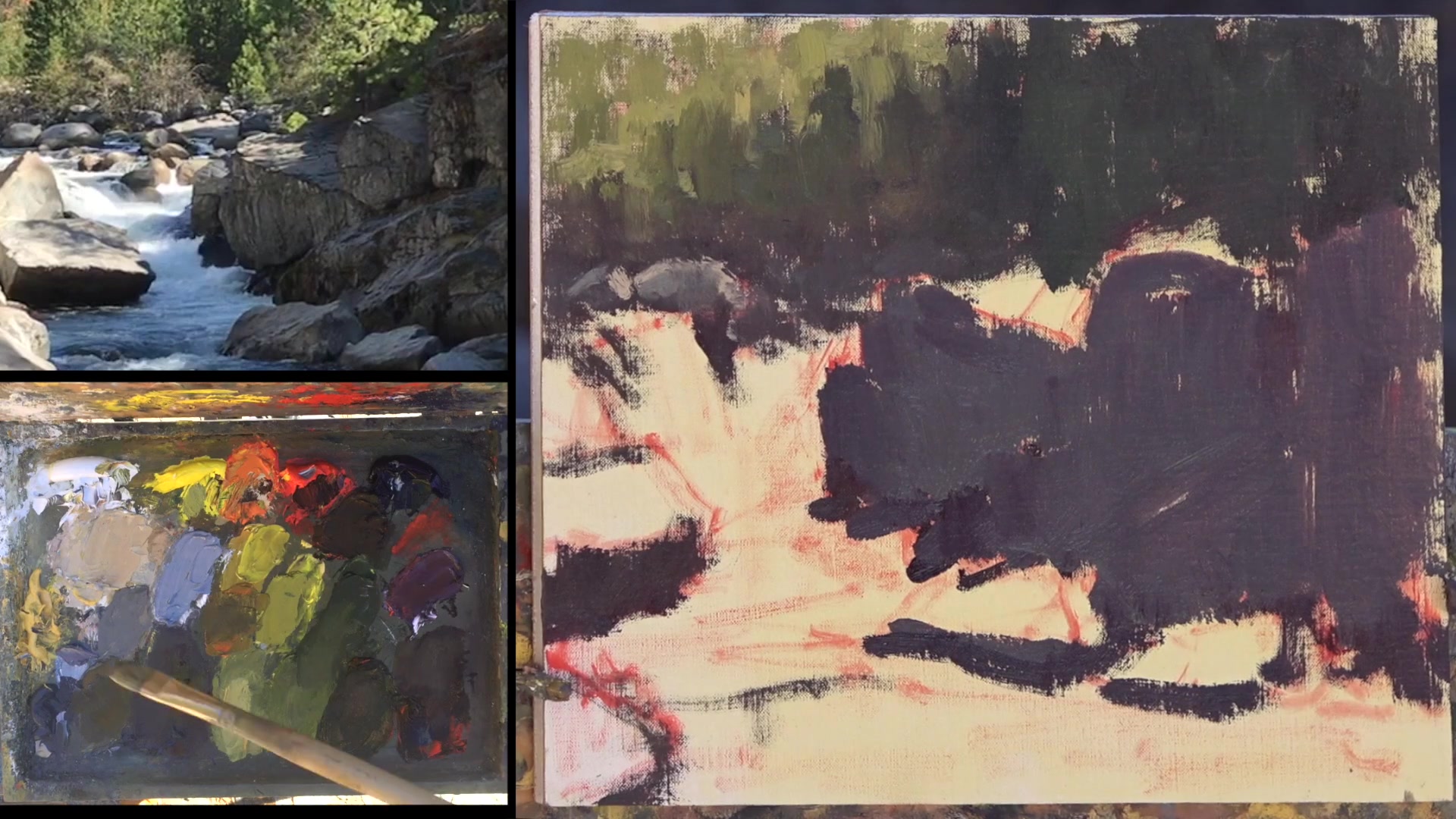
Scumble in a little bit of dark paint to define the area with small disparate shapes, like rocks at the top of the waterfall. Use the darker, cooler color to establish the base layer, which will show the motion of the water over the rocks.
Layer Light Over Dark
Apply lighter values of paint over the dark areas to create a pattern and define the negative shapes. This layering will help convey the movement and flow of the water.
Define Lightest Light
Identify the lightest light in the scene, such as a bright spot on the waterfall, and paint it in. This will establish the value range for your painting, from the darkest shadows to the brightest highlights.
Adjust Shadow Areas
Add more dark paint behind the light areas to enhance the value shift. This will create depth and contrast, helping the light areas stand out more effectively.
Refine Rock Patterns
Use the shadow color of the water to define the rocks further. Focus on creating a pattern of rocks without being constrained by the exact number or placement in the scene, aiming to convey the overall feeling of the landscape.
Pro tipScumble dark paint thinly to allow for layering and adjustment as the painting progresses.
Embark on your painting journey by carefully selecting your palette colors. Start with the primary colors—yellow, red, and blue—along with titanium white for versatility. Enhance your palette with cheater colors like Naples Yellow Deep and Cold Gray to subtly adjust warmth and saturation. As you mix your darkest darks and secondary colors, remember to keep your palette organized and clean for vibrant results.
As you progress, explore the nuances of color mixing by adjusting temperature and value. Use complementary colors to tone down overly vibrant hues and experiment with a limited palette to discover new color combinations. This practice not only simplifies your process but also enhances your understanding of color harmony. When painting outdoors, ensure you have the right tools and setup, including a toned canvas and a stable umbrella, to create a conducive painting environment.
Finally, capture the essence of your chosen scene by sketching thumbnails and making detailed observations. Use these sketches to refine your composition and focus on the elements that captivate you most. By transferring your design thoughtfully onto the canvas, you ensure that your painting reflects the unique beauty of the scene. Remember, each step in this journey is an opportunity to deepen your skills and express your artistic vision.
Points to remember
Always carry your primary colors and titanium white for a versatile palette.
Use Naples Yellow Deep to add warmth and lightness without altering saturation.
Clean your palette knife between mixes to keep colors vibrant.
Use the complement color to tone down overly vibrant greens.
Experiment with a limited palette to discover new color combinations.
Tone your canvas with acrylic paint to prevent wiping down to white.
Secure your umbrella to prevent your easel from tipping over.
Use thumbnails to explore different compositions before painting.