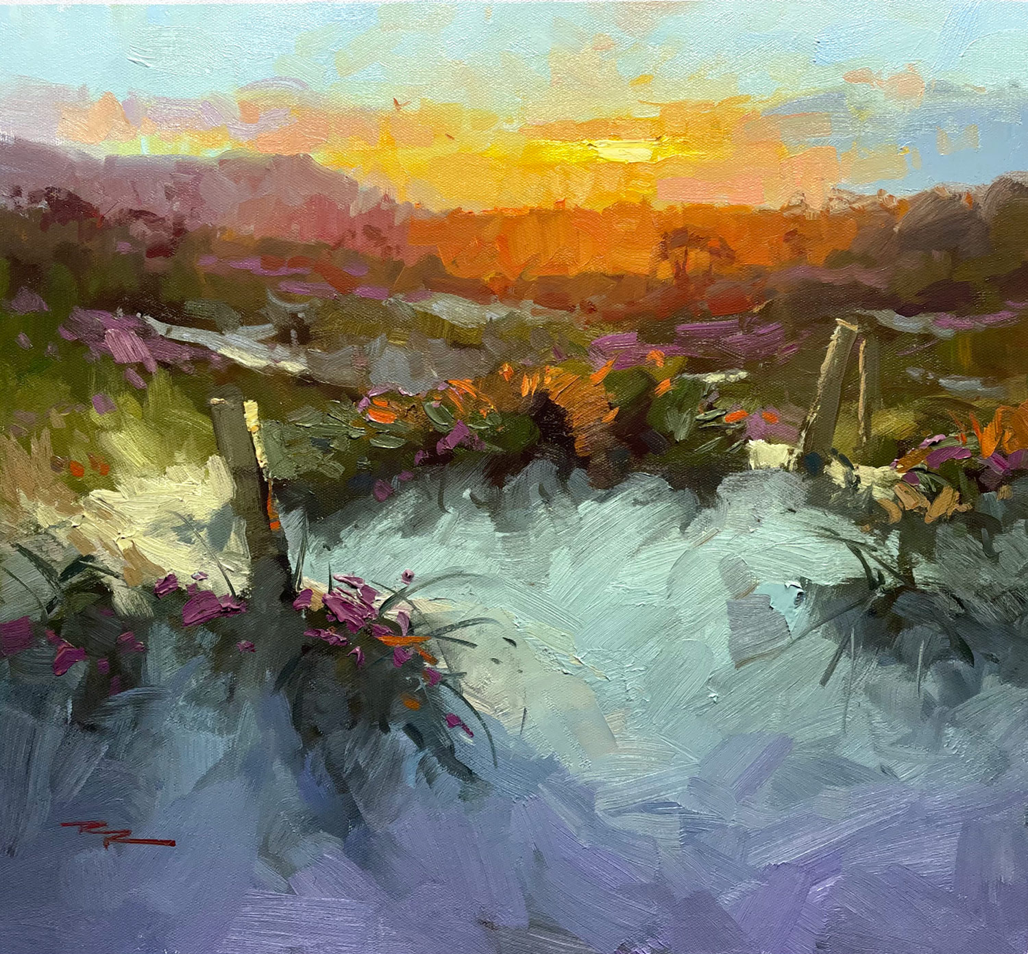
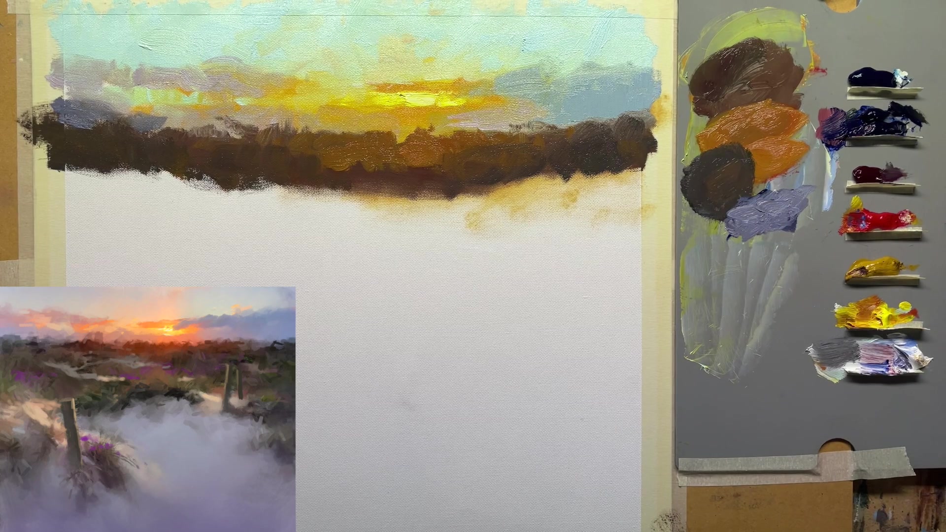
In this chapter, we embark on an exciting journey into the world of impressionistic painting, capturing the mesmerizing beauty of sunset dunes. Using a 16 by 18 inch Frederick's Ultra Smooth canvas, I guide you through the process with M. Graham oils, including a vibrant palette of phthalo blue, ultramarine blue, quinacridone magenta, cadmium red, yellow ochre, cadmium yellow light, and titanium white. With walnut oil as our medium, we'll explore how it enhances the flow of paint on the canvas. I favor a range of flat brushes, mostly natural bristles, with a few synthetic ones for finer details. These tools are essential for achieving the expressive brushwork that defines this style. Together, we'll delve into creating large movements of light, convincing depth, and the sparkling impasto highlights that bring the scene to life. By learning to alter the composition, such as removing dark elements and introducing light to harmonize the foreground with the sunset's warmth, you'll discover the joy of painting with passion and precision. This scene offers a rewarding subject, allowing you to expressively capture the serene yet dynamic interplay of light and shadow on the dunes. Whether you choose oils or acrylics, this lesson promises to enhance your skills and ignite your creative spirit.
This guide accompanies the full video lesson. The lesson includes the complete narrated video, the printable PDF chapter, and personalised critique support.
Add a punchier red to the transition area to create a vibrant contrast. This will help define the hill and add depth to the scene.
Soften Edges with Transition Color
Mix a bright orange to use as a transition color between the two areas. Apply this to soften the edge and create a smooth gradient.
Define the Second Section
Use a dark brush to outline the second section, focusing on the shape of the dune grasses and poles. Ensure the design flows nicely without placing elements too centrally.
Create a Base Color for the Second Section
Mix a slightly cooler base color by adding yellow ochre and a touch of white to adjust the darkness. This cooler tone will help distinguish the section from the foreground.
Pro tipUse a bright orange transition color to soften edges and create smooth gradients.
Embark on your painting journey by transforming your digital sketch into a vibrant canvas. Begin by modifying your initial sketch to harmonize cool and warm areas, creating a balanced composition. As you transition from digital to traditional painting, focus on broad strokes to establish depth and detail, enhancing the warmth of your scene with sun glow effects and local color elements like magenta ice plant flowers.
As you develop your painting, pay attention to the interplay of light and shadow. Use thin layers to build a glowing sunset effect, and adjust the horizon line to add interest and variation. Introduce vibrant colors like cadmium orange in the center to create a focal point, and carefully mix colors to maintain vibrancy and avoid muddiness. Embrace your unique brushstrokes as you work on the sky and color transitions, ensuring the central area remains pure and vibrant.
In the final stages, focus on creating depth and contrast within your landscape. Divide your painting into sections, using warm colors to highlight areas closest to the light source and cooler tones as you move away. Use impasto strokes to highlight grasses and posts, and build up shadow and light transitions slowly for an impressionistic effect. Finish by adding details and ensuring smooth transitions to convey energy and maintain a dynamic composition.
Points to remember
Introduce light into cool areas to harmonize them with warmer elements.
Use broad brushstrokes for outer edges and zoom in for detail in focal areas.
Keep the initial layer thin to make it easier to paint additional layers on top.
Introduce subtle variations in the horizon line for a dynamic landscape.
Start with a vibrant color in the center to create a focal point.
Keep your brush clean and avoid excessive dabbing to maintain vibrant colors.
Use phthalo blue sparingly, as it can quickly dominate your color mixtures.
Use impasto strokes to make highlights catch the light and add a 3D effect.