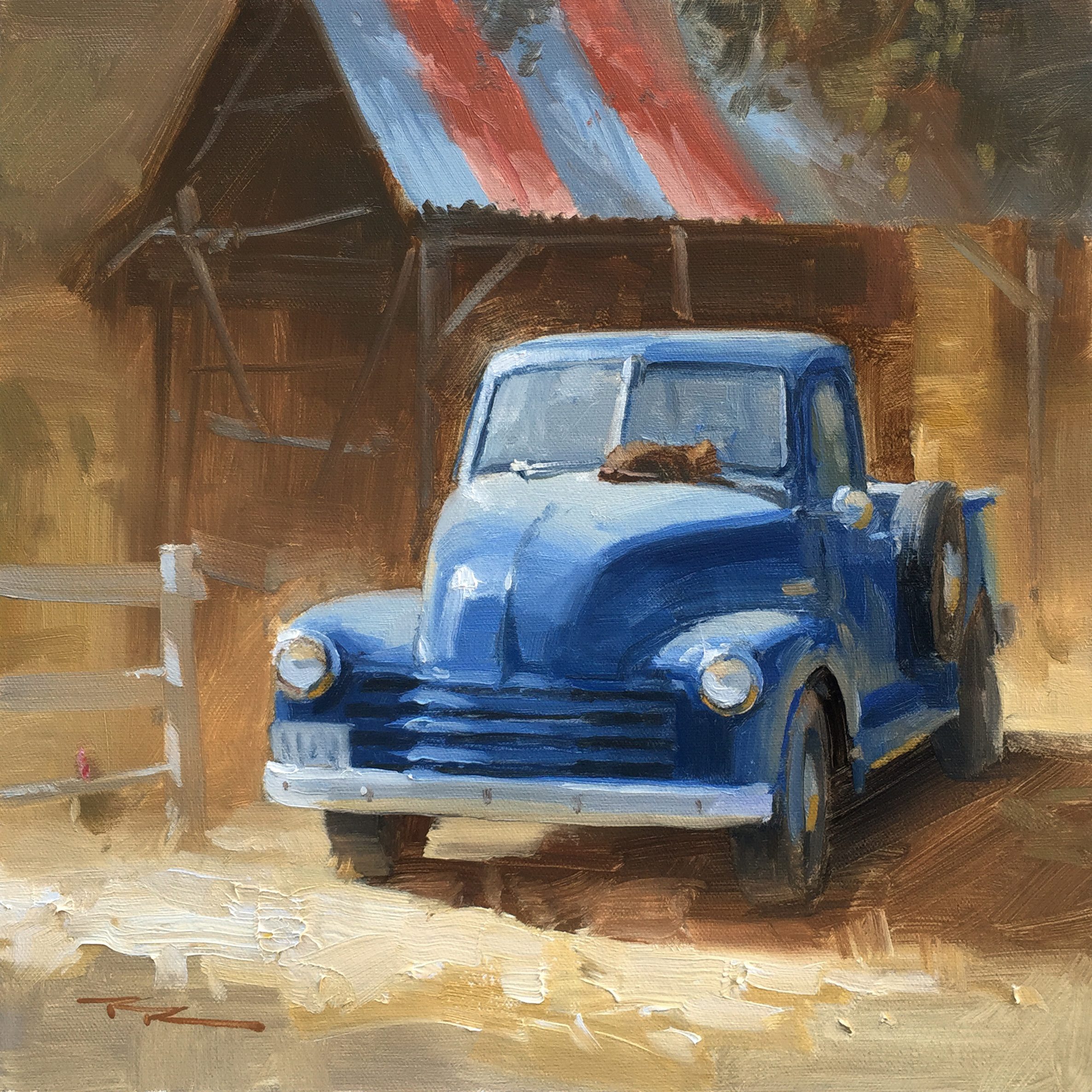
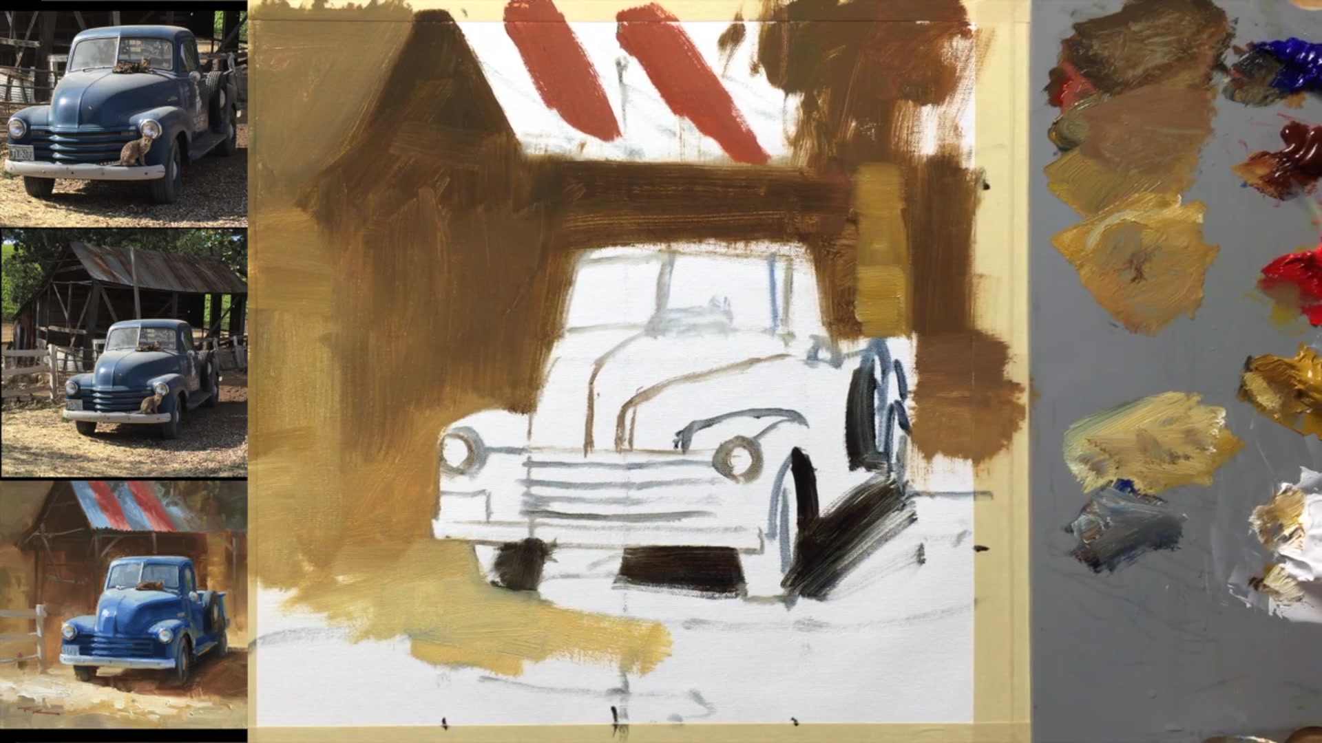
In this chapter, we'll dive into the nostalgic charm of painting a classic '53 Chevy truck, nestled against the backdrop of a beautifully weathered barn, with a cat lazily perched on the bonnet. This scene is a treasure trove of character and warmth, making it an irresistible subject for any painter with a sentimental streak. Together, we'll explore the process of bringing this scene to life, starting with the grid transfer method to sketch out our composition. We'll then block in the major dark and light shapes, gradually building up to the crisp details that make this painting pop. Throughout the lesson, I'll share techniques for achieving a consistent light effect, simplifying backgrounds, and mastering lost and found edges. Whether you follow along step by step or use the provided resource photos to craft your own unique design, you'll gain valuable insights into capturing the essence of this classic scene. Let's embark on this creative journey and see how this evocative painting comes together.
This guide accompanies the full video lesson. The lesson includes the complete narrated video, the printable PDF chapter, and personalised critique support.
"Old Timers" 13 x 13" Oil on Canvas by Richard Robinson.
Step 11Painting the Roof and Light Spots
Mix a Blue-Gray for the Roof
Create a blue-gray mixture for the tin roof. Saturate the colors slightly more than what you observe to make the roof appear brighter. This choice enhances the roof's color, but you can opt for a subtler, more gray tone if desired.
Consider Color Balance
Decide if you want the roof to stand out or blend in. A brighter roof draws attention, while a subtler gray shifts focus to the truck, adding interest there. Choose based on the overall balance you want in your painting.
Paint Around Light Spots
Carefully paint around the dappled light spots on the roof. This technique preserves the light spots and adds texture and depth to the roof area.
Pro tipEnhance the roof's color by saturating the blue-gray mixture slightly more than observed, unless you prefer a subtler look.
Embark on your painting journey by preparing your canvas and selecting a streamlined palette that emphasizes essential colors. Secure your materials and use the grid transfer method to accurately lay down the foundation of your composition. This meticulous beginning will set the stage for a balanced and proportionate painting.
As you progress, focus on establishing the darkest darks and lightest lights to define the range of your painting. Use a mix of burnt sienna and ultramarine blue for the darks, and yellow ochre with white for the lights. These contrasts will guide your color choices and add depth to your work. Pay attention to the background, using softened edges and harmonious colors to keep the focus on your main subjects.
In the final stages, refine your painting with careful attention to details and highlights. Use precise brushstrokes to enhance features like the truck's roof and the dappled light on surfaces. Consider the interplay of colors and reflections to add realism and vibrancy. With each layer and detail, your painting will come to life, capturing the essence of the scene with depth and harmony.
Points to remember
Tape your canvas securely to prevent movement while painting.
Ensure your grid on the canvas matches the reference photo for accurate proportions.
Add burnt sienna for warmth or ultramarine for coolness in your darks.
Use walnut oil to thin your paint for smooth coverage.
Establish the boundaries of your color range with the lightest lights and darkest darks.
Enhance the vibrancy of focal points like the roof rust for dynamic interest.
Plan your brushstrokes to minimize unnecessary marks and achieve desired effects.
Use subtle darker accents to suggest interior details visible through the windscreen.