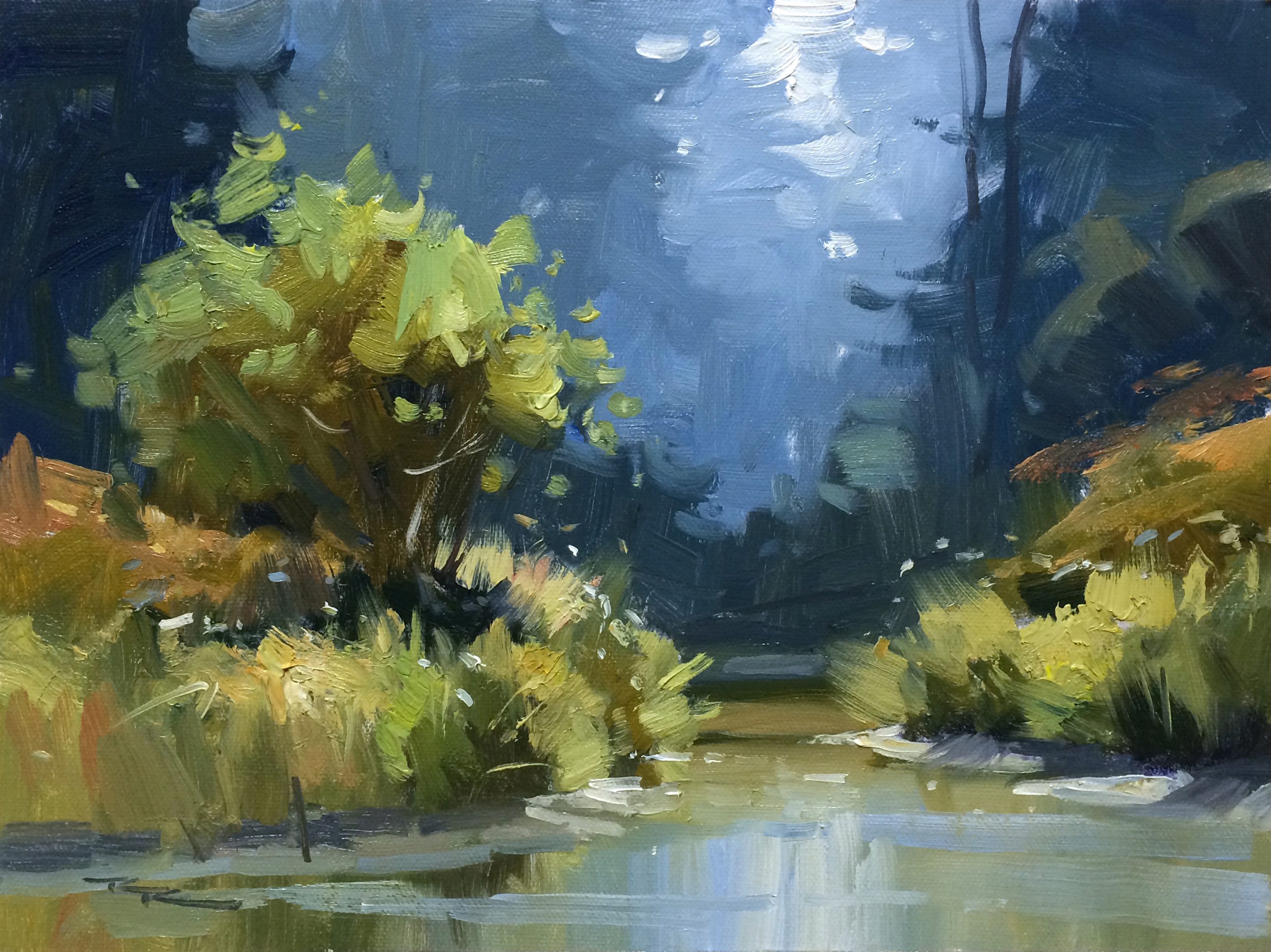
During a memorable trip to Gibsons, Canada, I had the pleasure of immersing myself in its stunning wilderness, which provided the perfect backdrop for a workshop. In this chapter, I invite you to join me as we explore a charming scene that I discovered there, rich with captivating elements. We'll delve into simplifying a complex landscape, focusing on the interplay of light and shadow, particularly the brightly lit foreground contrasted against a darker background. By honing in on the essential components, such as the striking silhouette of a tree, we'll capture the scene's true essence without the distraction of extraneous details like the tops of trees or the river's curve. Through bold brushwork and strategic composition, you'll learn to distill a scene to its most impactful elements, creating a painting that resonates with clarity and emotion. This approach not only enhances your technical skills but also enriches your artistic expression, making this scene a rewarding subject to master.
This guide accompanies the full video lesson. The lesson includes the complete narrated video, the printable PDF chapter, and personalised critique support.
"Up the Creek" 11x14" Oil on Canvas by Richard Robinson.
Step 5Initial sketch and planning
Create the Initial Sketch
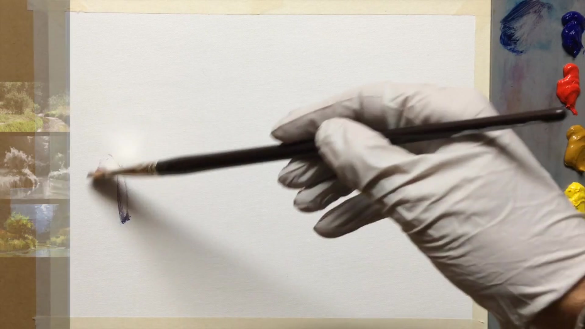
Use a very thin mixture of blue, red, and walnut oil to sketch the major shapes. Focus on capturing the overall composition without adding any detail.
Adjust Composition
Ensure the main elements are positioned centrally and are large enough to be the focal point. Adjust the placement if necessary to achieve better balance.
Plan the Clumps of Grass
Observe how the clumps of grass along the bank indicate the bank's curvature. As they turn away, they should appear smaller and closer together, similar to a tractor tire on its side.
Reflect Grass in Water
Include reflections of the grass clumps in the water to enhance the sense of depth and realism.
Outline Light and Shadow Areas
Decide where the shadow and light areas will be in your sketch. This will guide your painting process and ensure a balanced composition.
Pro tipUse reflections to enhance depth and realism in your composition.
Embark on your painting journey by focusing on the key elements that drew you to the scene. Start with a bright foreground against a dark background, capturing the essence of the tree and its surroundings. Simplify the background to let the foreground shine, and adjust the viewing angle to maintain focus on the tree as the central element.
As you progress, pay attention to the stream's edges and the overall composition. Use a thin sketch to plan major shapes and ensure the main elements are well-positioned. Mix and apply your darkest darks to establish depth, and use walnut oil to thin your paint for smooth coverage. Work on the background with varying shades to create a sense of distance.
In the final stages, focus on adding highlights and details. Use thick paint for foreground highlights and vary your brush technique for dynamic results. Pay attention to reflections and ensure your brushwork captures the energy and texture of the scene. Finish with fine details in the shadows and highlights, ensuring each element contributes to a harmonious composition.
Points to remember
Focus on essential elements to maintain a clear message.
Simplify the background to highlight the foreground.
Lower the viewing angle to adjust composition without losing key details.
Use segmented edges for realistic stream shapes.
Thin darkest darks with walnut oil for smooth coverage.
Use vertical strokes for water reflections.
Vary color in dark areas to avoid uniformity.
Use separate brushes for dark and light areas to keep tones distinct.