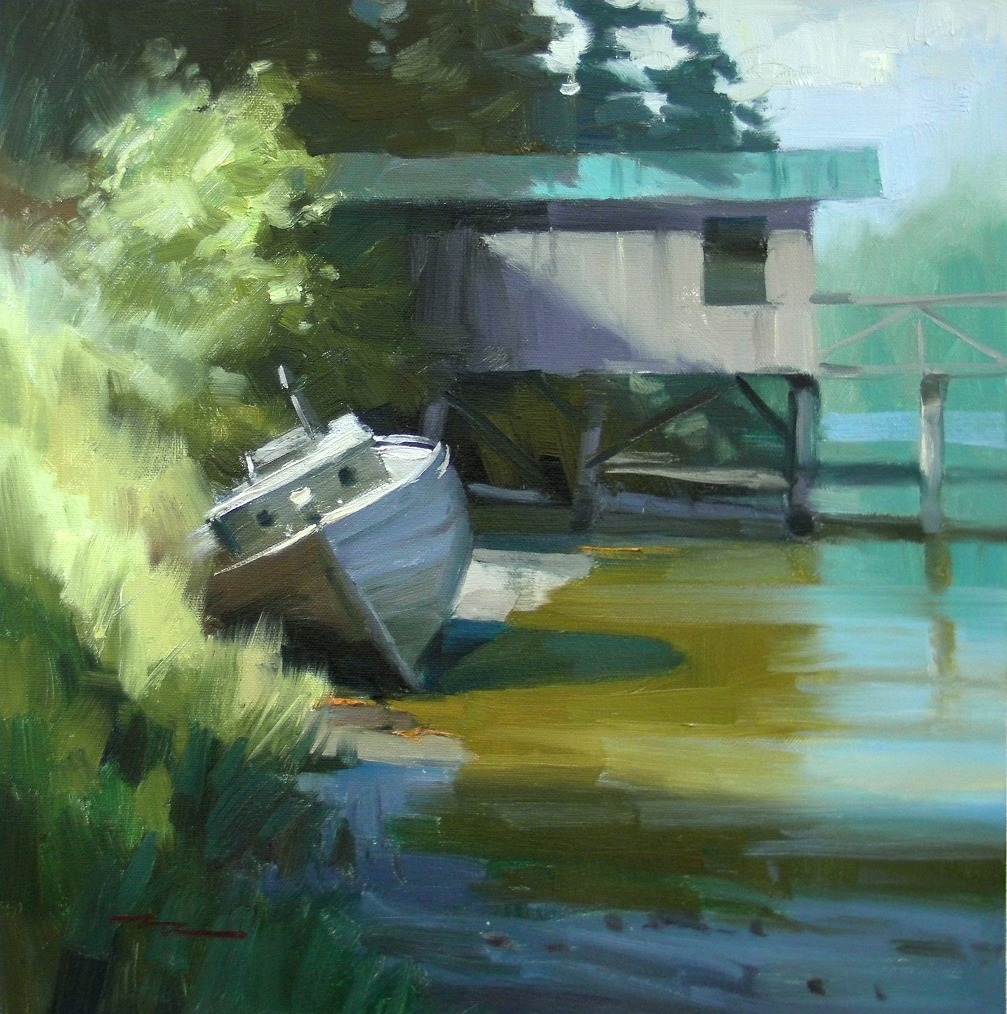
Welcome to Whiskey Slough in Pender Harbour, nestled on the stunning west coast of Canada. This charming spot, with its weathered old boat and rustic shed, offers a perfect backdrop for exploring the art of painting glowing light and vibrant color. In this chapter, I will guide you through the techniques I use to infuse a scene with warmth, rich hues, and captivating textures. You'll learn how to capture the essence of this idyllic location, transforming it into a canvas that radiates life and beauty. We'll start by adjusting the temperature of your reference image to achieve a pleasing warmth, setting the stage for a painting that truly glows. This scene is a rewarding subject, allowing us to delve into the interplay of light and color, and I'm excited to share my step-by-step process with you. Together, we'll bring this picturesque setting to life, creating a piece that captures the serene beauty of Whiskey Slough.
This guide accompanies the full video lesson. The lesson includes the complete narrated video, the printable PDF chapter, and personalised critique support.
"Whiskey Slough - Plein Air" 14x14" Oil on Canvas by Richard Robinson.
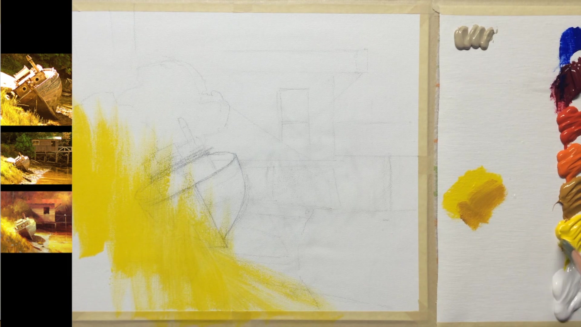
Step 4Creating shadow shapes in the grass
Mix Yellow Ochre with Yellow
Add a little yellow ochre to your yellow paint. This will push the yellow towards red and slightly gray it down, creating a more natural shadow color for the grass.
Create Large Soft Edge Shapes
Use mostly vertical strokes to paint large, soft-edged shapes. These shapes will indicate the shadow side of large clumps of grass. Ensure that both the tops and bottoms of the strokes have soft edges to suggest grasses in front.
Pro tipUse vertical strokes with soft edges to create natural-looking grass shadows.
Embark on your painting journey by first adjusting the color temperature of your reference image using an editing app. This step helps you envision the warmth or coolness you want to capture on your canvas. Prepare your acrylics on a stay wet palette to keep them workable, and ensure your canvas is moist to facilitate smooth application.
Begin with the glowing foreground, establishing a vibrant base with broad strokes of yellow. As you progress, add depth and texture to the grass using a combination of colors and techniques like lifting out areas with a paper towel. Transition into painting the boat, focusing on creating glowing effects with careful color transitions and soft edges to blend it seamlessly into the landscape.
As you refine the details, pay attention to the reflective light on the boat and the surrounding environment. Use a palette knife for crisp lines and organic textures, enhancing the weathered look of the boat. Finally, complete your scene with thoughtful details like shadows, rocks, and water reflections, ensuring all elements harmonize to create a cohesive and captivating painting.
Points to remember
Use image editing apps to adjust the color temperature of your reference.
Keep your acrylic paints moist with a stay wet palette and a misting spray.
Start with the brightest areas to establish a strong base for glowing effects.
Use vertical strokes with soft edges to create natural-looking grass shadows.
Rotate your paper towel slightly after each mark to avoid creating patterns.
Ensure all verticals are parallel and tops are perpendicular for structural accuracy.
Use a warm toning grey to create cooler shadowed areas with reflective light.
Use a fine line to add small details like a rope or a seagull to enhance the composition.