Teacher
Richard is a talented full time artist, who loves painting and teaching.

with Richard Robinson
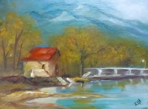
One of the best ways to learn more about using colour is to limit our palette to 3 primary colours.
Most of the colours you could want to use in a painting can be made using just Red, Blue, Yellow and White. Learn how with this charming lakeside scene. You’ll gain a much better understanding of how to mix your colours.
Whenever you’re ready! The lesson is available online any time, and your access to the lesson never expires.
As long as you need! Your access never expires, so you can come back again and again.
Sorry, no you can’t download the video. This is to avoid piracy. You’ll always be able to view the video on this site though.
Richard is a talented full time artist, who loves painting and teaching.
Hi I’m Richard. I’ve been painting my whole life and back in 2001 I traded my graphic design career for the humble life of a full time artist. I love painting, and as it turns out, I love teaching too.
Nowadays I balance my life between parenting, painting, surfing, travelling and teaching. My work is regularly featured in international art magazines, in galleries in New Zealand and America, on TV and in my Mum’s house.
I give outdoor painting workshops in interesting spots around this beautiful planet of ours and love encouraging people to paint. Two of my favourite artists are John Singer Sargent and Joaquín Sorolla.
My painting website: www.nzpainter.com
I’d love to be your new teacher.

Richard is a master artist with an exceptional skill in identifying and communicating key factors to making successful paintings. I have found his video workshops an excellent resource for improving my own work.
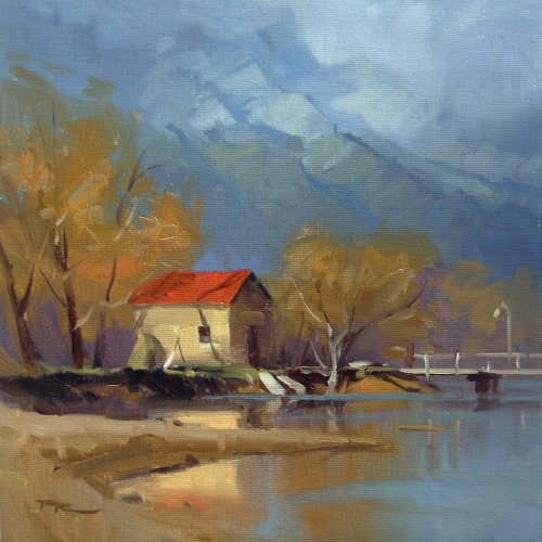
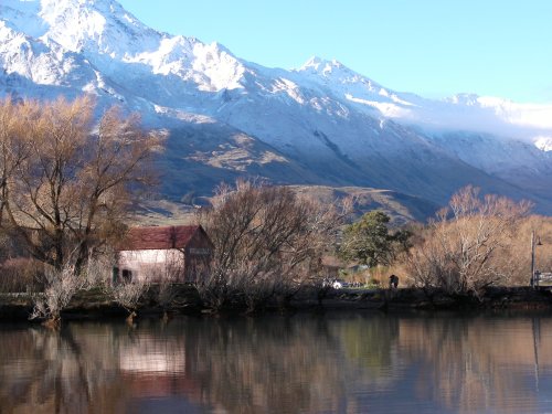
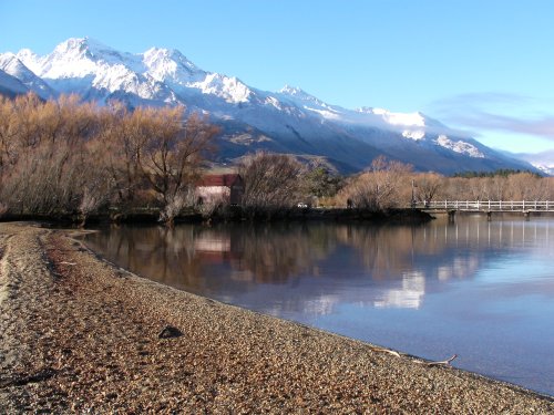
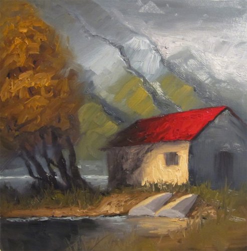
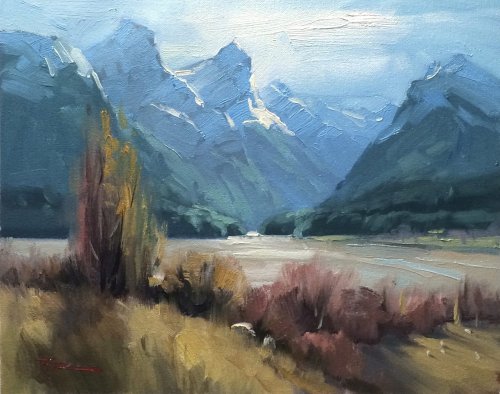
"Glenorchy" 11 x 11" Oil on Canvas by Richard Robinson
'Glenorchy Boat Shed' 12x12" Oil on Paper by Ross G.
Design Ross you've made this one your own and its bold design reminds me of the first workshop piece you did of 'First Snow' a year ago. I thought the other sketches you did were great too but I do always enjoy a painter making something from the lesson that is uniquely theirs and you've done that well. There are three elements of the design I find a bit irksome, the first being the uniformity of the lines of the mountains and the tree. Nature doesn't ever copy herself exactly - she's too original for that and you are too. You did the same with the boats. Always look for opportunities for variation. The door and window are too light and spoil the illusion of space, flattening the house as does the dark line that seems to be drawing itself around the house. Colour The colour in all your lights are great but the colourlessness of the grays in your darks is a bit concerning for me because I feel like it's missing out on the opportunity to add cool/warm variety with some blues and mauves and darker versions of local colours. It looks like you've used black for the grays which is fine, I mean, Zorn managed it beautifully but he very rarely used just pure black and white for grays. If it was me, more colour in those grays, up to you though. Brushwork Love your impasto brushwork Ross and all the textural variety you've explored with that - nice to see someone not worrying about the price of paint! Realism You seem to favour big shapes, strong lighting, a touch of mystery and heavy impasto painting. These are some of your strengths at the moment and it's great to see you sticking to your guns and applying the learning from the workshop into your own interpretation. Just a small note about the shadows on the house - you've got two different sorts of shadows. The tree is casting a hard and a soft shadow which is fine because trees can do that, but the roof is casting a soft shadow on the wall which indicates diffused lighting, in which case the tree should not be casting a hard shadow, but the easier way is to harden the shadow from the roof so that you have a consistent light source. A bold piece Ross, well done.
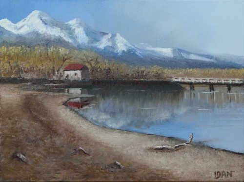
'Glenorchy Landscape' 15.7 x 11.8' Oil on Canvas by Idan Solomon
Design Interesting to see the wider view of this scene painted Idan because a lot of people went for the closer shot so good on you for tackling all that detail. I think the overall design of this is good and well balanced but the muddy looking foreground seems quite plain and mostly empty which is detracting from the whole rather than adding to it. The colour banding you did there is a step forward and If it were mine I'd be tempted to add more interest and structure with a large cast shadow across the foreground that would drive the eye deeper into the painting. Colour It's a very subtle and soft colour scheme you've put together here Idan which is commendable because it is hard to make a painting where no one colour jumps out and says 'hey look at me!'. It takes a lot of control to do this while keeping your values in check as well as you have done it. Your next challenge is to add more variety into your large colour areas and a touch more vibrant colour in your centre of interest. Brushwork It's good to see the contrast you've made between the smooth sky, water and the textured landscape but I'd like to challenge you to make more contrast is brushwork within each area, along with variety in colour as I've mentioned. Notice how all you brushwork is very similar in the landscape. Using a larger brush to begin with can help you steer away from textural monotony. Realism Because of the hard work you've put into this painting it rates quite highly in terms of realism, so, well done there. I would encourage you to challenge yourself to try for more drama in your next painting - something I was challenged with early on and continue to aspire to. Happy painting!
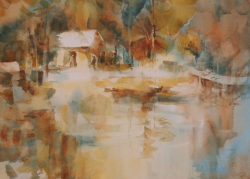
'Glenorchy 3 Color 2' 11x15" Watercolor by Jane Scott
Design Jane this is a lovely piece of work halfway between abstraction and realism. It doesn't dictate its terms to the viewer but gently suggests they enter the scene you've created - it's got spoonfuls of mystery which is something I aspire to in my own work but have never managed it as well as you have here. The design is nicely done with organic groupings and spacings rather than equally measured shapes and gaps which so often stymie a painting at the offset. Colour A fairly quiet colour scheme with nothing out of place and just enough punch to make it exciting. More colour difference between foreground and background may have helped define the space better, for instance using more blue in the foreground. Brushwork Nice to see you letting the watercolour do it's own thing with plenty of wet in wet and the occasional crisp edge. You're really onto something here Jane. Personally I would make the drawing a little more exact where it is evident and make the big washes even looser, just to push the idea further. Realism I can't stop smiling about this one! It just makes me want to look and look and look, to visit this place and see the image resolve slowly into reality. Beautifully done.
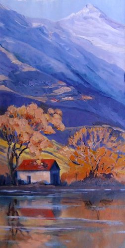
'Glenorchy' Oil on Canvas 30x60cm by Susan Skuse
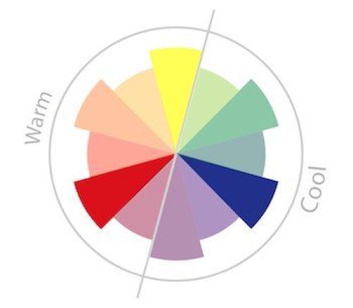
Design Great vertical design Susan - lovely to see you making a statement out of the rhythm of the mountains and how that contrasts which the more staccato tree forms. I can just about hear the song this would make if you slipped it into the orchestra's sheet music. Colour Gotta love orange and blue - my favorite complementary colour scheme. You've got some really intense colour in there which is great to see but you've tempered it with some grays so overall it's not garish, but that's a very subjective term anyway. I like your idea of introducing the orange into the mountains but parts of it are a little over-saturated for that area which makes them seem out of place. Looks like you struggled too with achieving the wispy look of the foliage - very difficult to achieve that feathering, so the tree on the left seems to be made of orange cotton balls which is a shame. Have you tried dry brush with a bigger brush? Maybe worth a go. Brushwork As usual for you it's a nice variety of brushwork but the drawing of some of the finer lines could have been better - looking a bit clumsy there in the trees and the water's wind lines and the dark reflections of the tree branches seem to be standing out to me too, probably because they're relatively too dark. Realism I 'm not sure what's happening with the river bank under the right hand tree. If it's long grasses or bushes in shadow I would add a few darker accents to add structure there or just throw a bit of light on it. The subtlety you employed at the top of the mountain is very graceful. There are a few things marring the illusion of realism like the tree and some of the drawing as mentioned but overall it's a very appealing piece to be proud of.
'Glenorchy' Oil on Canvas by Rita Long
Design Hi Rita your general design is good - very similar to mine except you've cropped the scene a bit more which makes it more intimate on the one hand but loses some sense of scale on the other. Colour You've done a good job with your colours. Looks like you've used a pthalo blue or cerulean or similar which results in much cooler colours overall than ultramarine blue, which is fine either way - it's interesting to try different blues out with a limited palette and indeed all sorts of colours, but if you change just one colour at a time you get a clearer understanding of that new colour's possibilities when mixed with your standard set. Brushwork It's good to see you're concentrating on producing a variety of soft and hard edges which keeps the eye moving around the canvas. I especially like how you've softened the right hand edge of the boat house to dissolve into the background which helps add interest and mystery to a fairly simple building. Realism Your drawing of the angles of the house is good and some parts of the trees have been deftly done but much of the rest of the drawing is too loose for it's own good, especially the dock which you've gone over and over instead of scraping off, repainting the background thinly and redoing the dock with a few simpler, well measured strokes. Easy to say though, harder to do while you're in the fray. The mountains are looking good as are the reflections except for the edge of the house reflection which is too far to the right. Overall a nice image which is unfortunately spoiled a bit by the dock - I'd redo that portion if it was mine. I hope that helps.
$15.00USD
$45.00USD
$15.00USD
$15.00USD
Not loving your painting lessons? No worries!
If it’s not the right fit, we’ll give you a full refund within 30 days of purchase - no questions asked.
When you purchase a DVD you also get online access to the same lesson, including any lesson resources like photos, downloadable notes and access to upload your painting to the student gallery.
That's why you need to make a password when you purchase a DVD, so you can access the online content as well. Enjoy!