Teacher
Richard is a talented full time artist, who loves painting and teaching.

with Richard Robinson
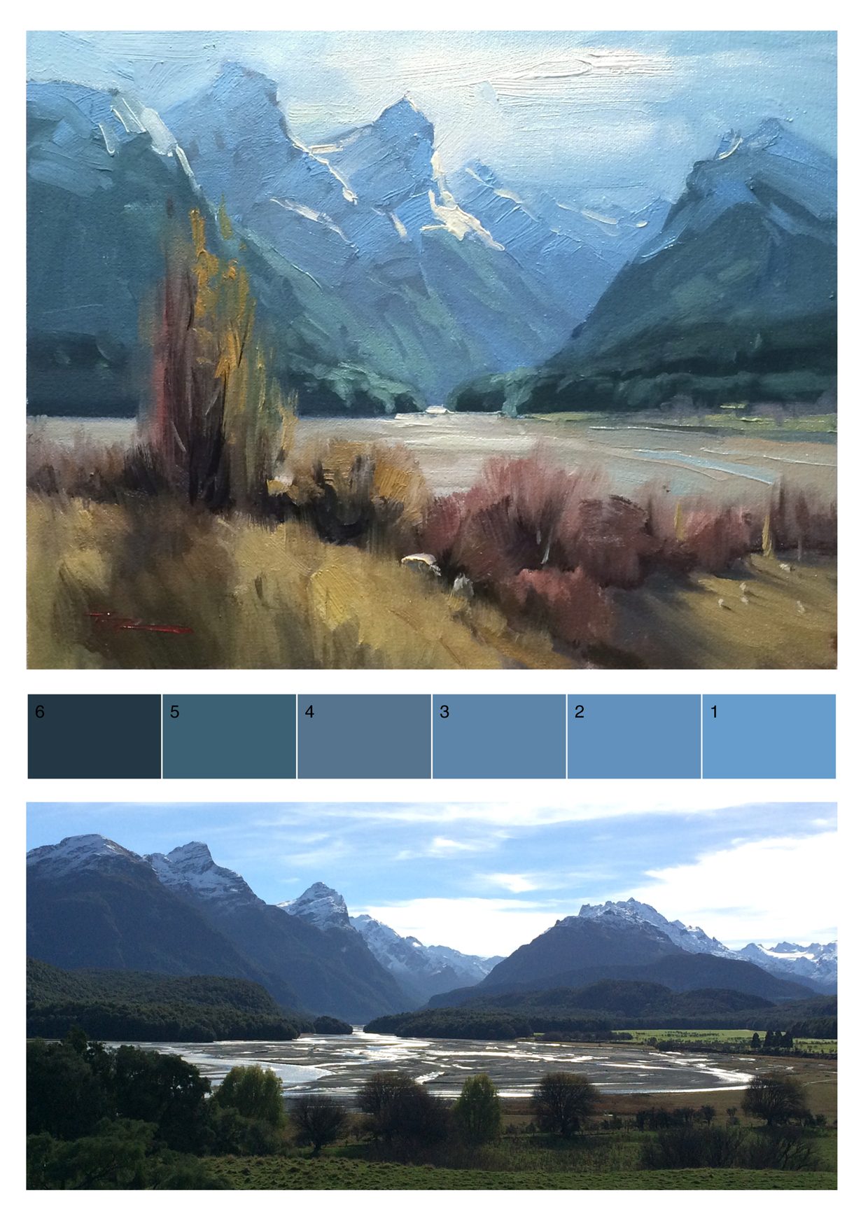
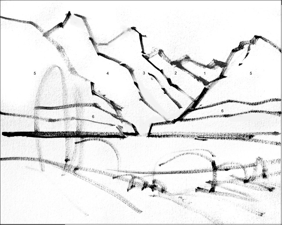
Paradise is one of my favorite painting spots anywhere on the planet. Join me as I take you through this beautiful painting step by step. You’ll learn how to paint receding mountains, snow in shade and light, wispy autumnal willow trees and how to add those finishing details. Enjoy!
Whenever you’re ready! The lesson is available online any time, and your access to the lesson never expires.
As long as you need! Your access never expires, so you can come back again and again.
Sorry, no you can’t download the video. This is to avoid piracy. You’ll always be able to view the video on this site though.
Richard is a talented full time artist, who loves painting and teaching.

Hi I’m Richard. I’ve been painting my whole life and back in 2001 I traded my graphic design career for the humble life of a full time artist. I love painting, and as it turns out, I love teaching too.
Nowadays I balance my life between parenting, painting, surfing, travelling and teaching. My work is regularly featured in international art magazines, in galleries in New Zealand and America, on TV and in my Mum’s house.
I give outdoor painting workshops in interesting spots around this beautiful planet of ours and love encouraging people to paint. Two of my favourite artists are John Singer Sargent and Joaquín Sorolla.
My painting website: www.nzpainter.com
I’d love to be your new teacher.

Richard is a master artist with an exceptional skill in identifying and communicating key factors to making successful paintings. I have found his video workshops an excellent resource for improving my own work.
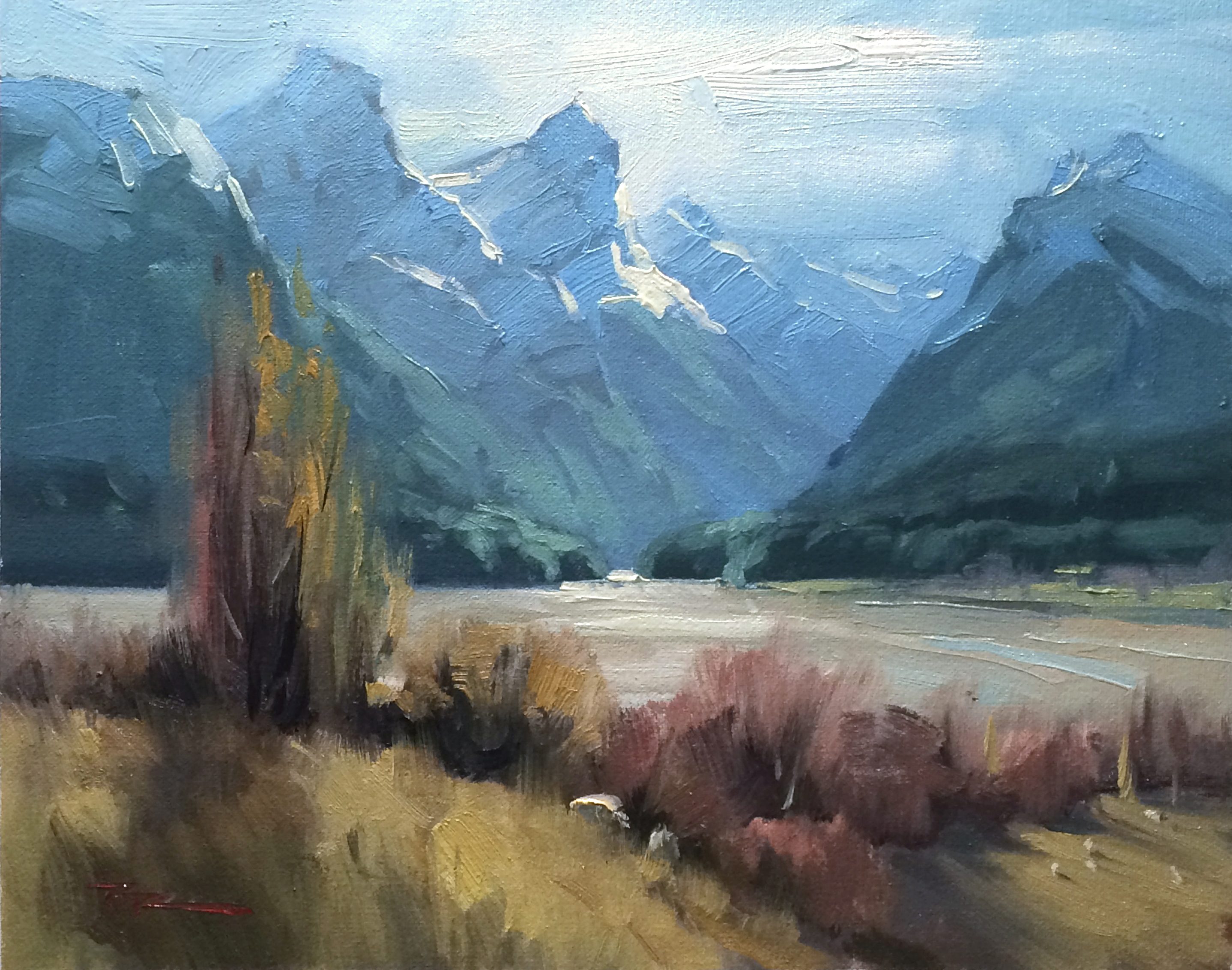
"Paradise" 13x10.5" Oil on Canvas by Richard Robinson.
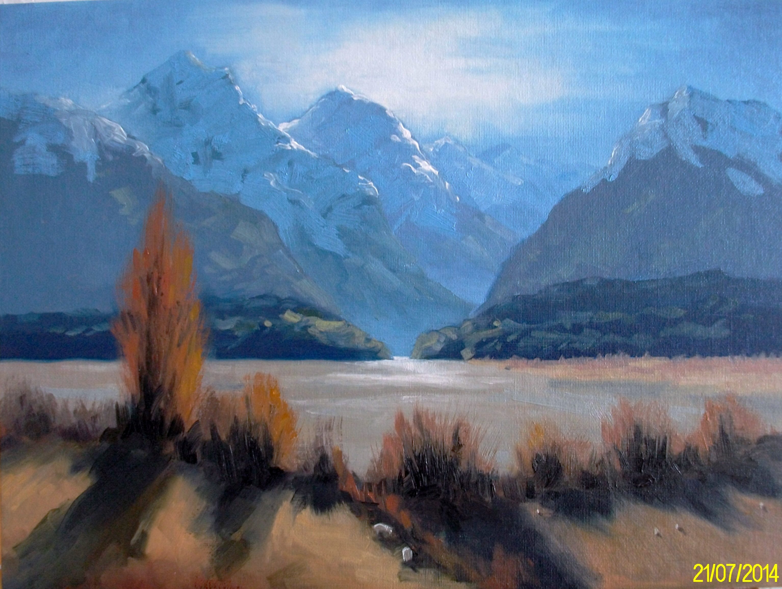
"Workshop33" Oil on Canvas, 12"x16" by Janet Buckton
Good drawing skills shown here Janet - you've been pretty acurate with your shapes while showing a fair amount of expressive brushwork - never an easy combo to get right but you've done it well. You're colours are mostly working well together, especially the atmospheric recession in the mountains. You've made a fairly tidy hedgerow of the foreground trees with simliar sizes and colours and missed an opportunity for variation. As a general 'rule' I tend to try to avoid repeating shapes and sizes anywhere in a painting - it's like a monotonous drum beat compared to a lyrical melody. There's a little confusion as to how the ground is lying the front left coming up to the big trees. I think it's the sheep doing the damage there actually because you've painted little shadows under them, as if viewed from a height whereas the shape of the hill is trying to tell us something different. Have another look at the sheep in my painting. Overall though, a very good job.
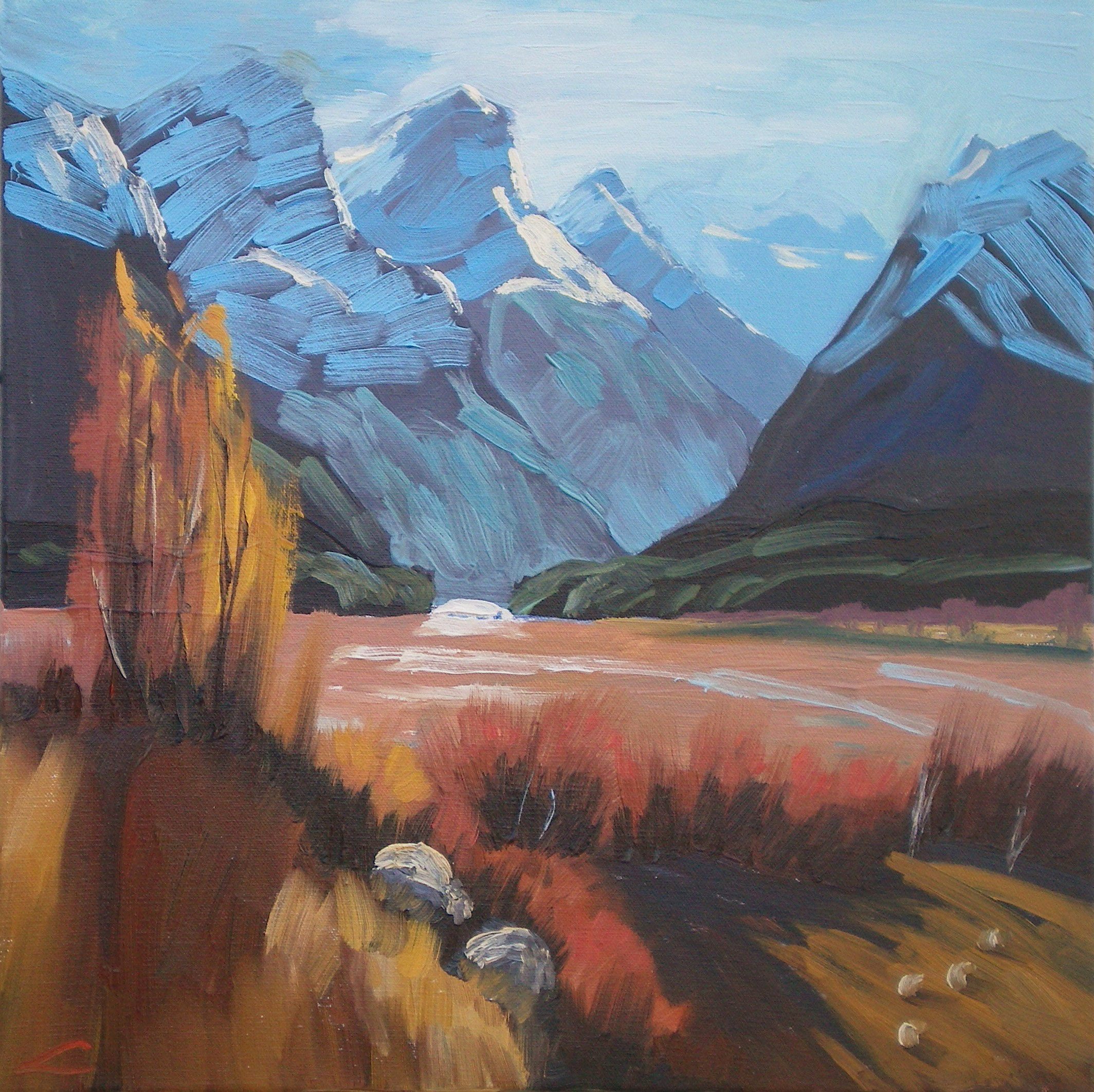
"Autumn Paradise" 40x40cm Oil on Canvas by Elena Sokolova
You've got great colour in this painting Elena. By raising the saturation of the warms in the foreground you've made a much stronger colour statement than I did in my demo painting. The cools in the mountains look all the more cool by comparison. If you had lightened the darks in the mountains by just one step you could have created a little more distance between it and the foreground, but the main thing that's causing your mountains to pop forward is the brushwork back there which you've unfortunately made a pattern of - like fence palings - without enough variation in them to simulate reality. Give it a few more goes and you'll get the hang of it - it's not easy at first.
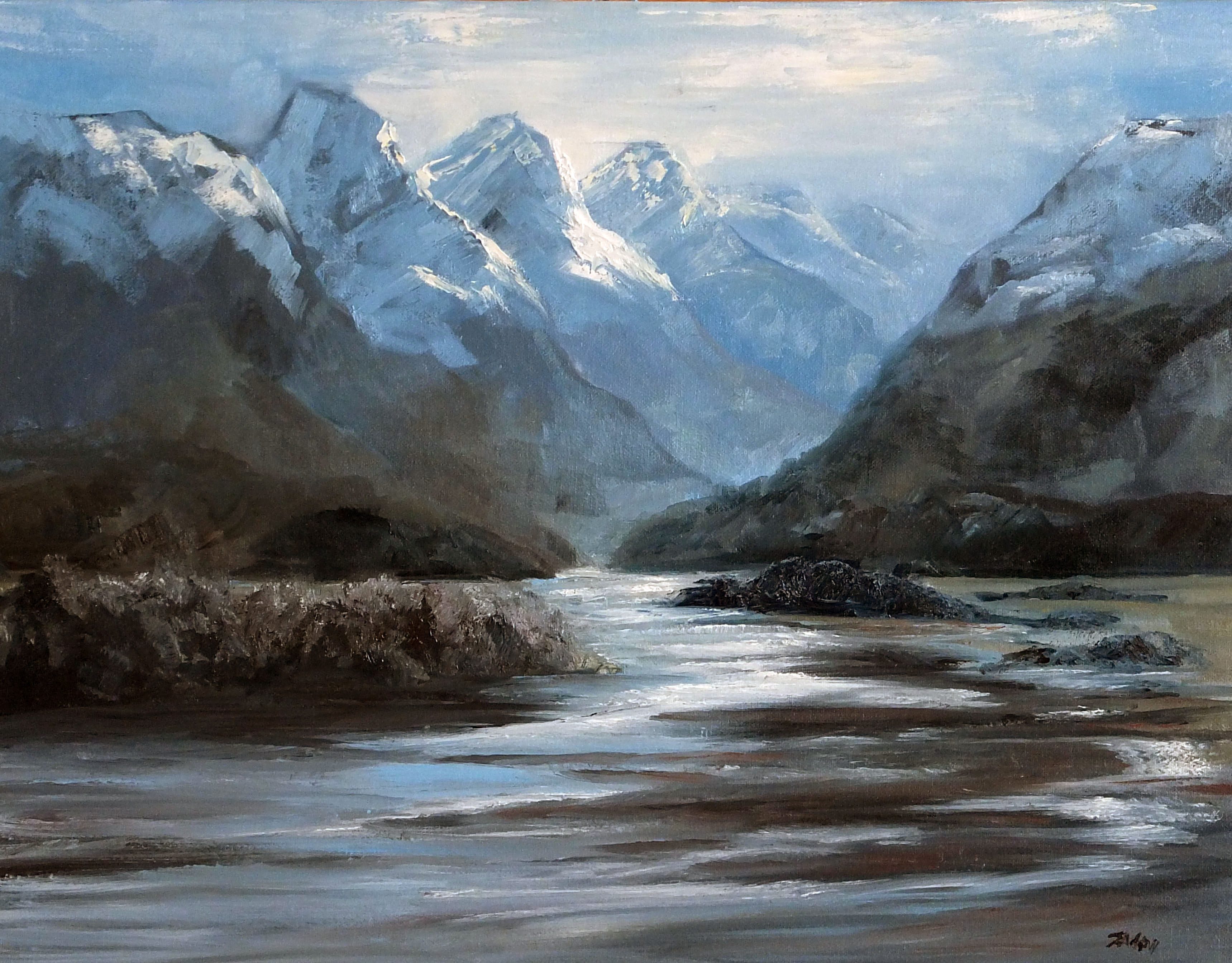
"Paradise Estuary" oil on canvas 45 x 35cm by Suzanne Louise Andrew
This is certainly a different take on the scene Suzanne - much more sombre. Great to see you playing with it like that. The mountains are receeding nicely and with subtle value steps and you've achieved that spotlit effect there too - nice job. You've made a pattern of the mountain shapes - they're starting to look mass produced rather than individual sculptures. It's all too easy to do this painting mountains and it really begins at the sketching in stage where you need to focus hard on the angles of each mountain so that they don't copy each other. Nice too see you've had fun with the palette knife in the river. I feel as though the river gets a little bitsy or fragmented there in places. I be looking to simplify some of that so it reads a little easier. Even cropping some off the bottom might do. You've made the strip of land closest to us on the left too similar in size, shape and colour to the land directly behind it for my eye and their edges are resting on each other rather than being separate or clearly overlapping. It might look better trimming the left side of it off and making an island of it. I hope those few pointers help out.
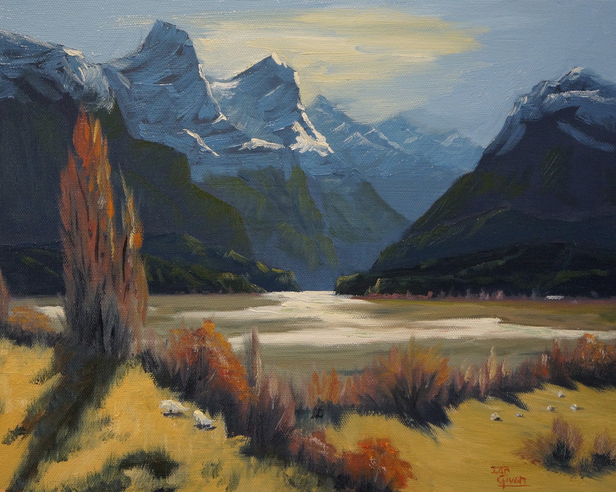
"Ian's Interpretation of Paradise" 15"x10" Water Soluble Oil on Canvas by Ian Given
Hi Ian, not too shabby brother - lots of things going right, a few things to look at again. Overall it's a very pleasing image - the values and colours are working well together and your drawing and brushwork is sound. I'd take another look at the similarity of values between the darks in the background and foreground. Making the mountains slightly lighter will give you more depth and variation. To achieve that it often pays to place your darkest dark in the foreground right at the beginning to give yourself a value baseline to measure off. You could add more variation into the yellow ochre grasses in the foreground because without that they're looking a little flat. The greens on the mountains in the mountains seem to be a little too dark and too vibrant - if they were a little lighter and grayer they would sit there better. Cameras often lighten the blues in our paintings though. (The camera does lie.)
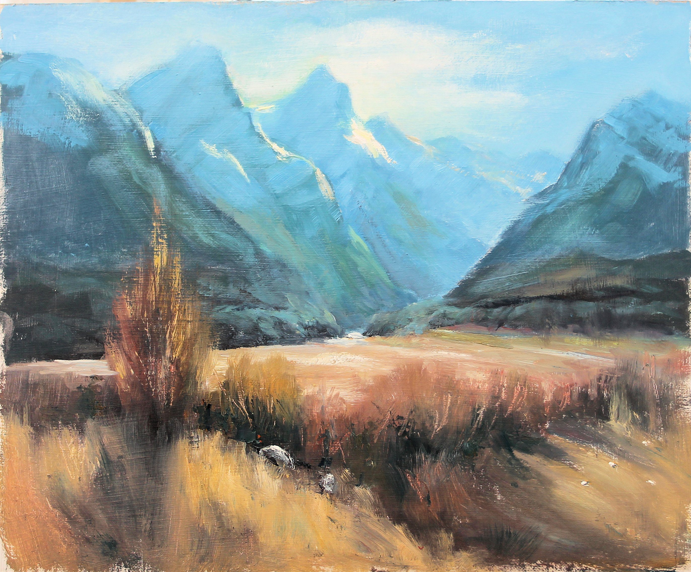
"Workshop33" Oil on gessoed cardboard 12" x 10" by Olivia O'Carra
My immediate thought here Olivia is that the gessoed cardboard you used to paint on was too absorbent because the paintwork looks very dry and scratchy. I had a similar effect recently when painting a still life of my cello on plain paper - an awful experience that made me better appreciate the slickness of a properly primed surface and just how nice it is to have the paint flow smoothly off the brush rather than being immediately absorbed into the surface. Apart from that and the detriment it's had on your brushwork I would commend you on your colour which is working pretty well but I'd caution you on your drawing of the base of the mountains which has gone awry. The bases should be pretty straight and level, but stepping back behind each other. You got the stepping back, but not so much with the straight and level. Overall it looks great from a distance - shame about that cardboard though - go spoil yourself and buy some good canvas!
$15.00USD
$15.00USD
$15.00USD
$15.00USD
Not loving your painting lessons? No worries!
If it’s not the right fit, we’ll give you a full refund within 30 days of purchase - no questions asked.
When you purchase a DVD you also get online access to the same lesson, including any lesson resources like photos, downloadable notes and access to upload your painting to the student gallery.
That's why you need to make a password when you purchase a DVD, so you can access the online content as well. Enjoy!
