Teacher
Richard is a talented full time artist, who loves painting and teaching.

with Richard Robinson
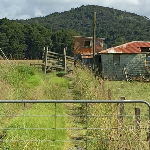
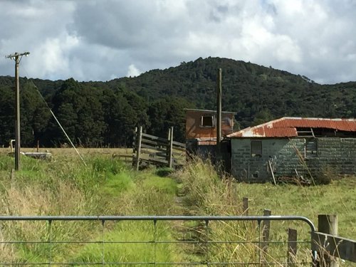
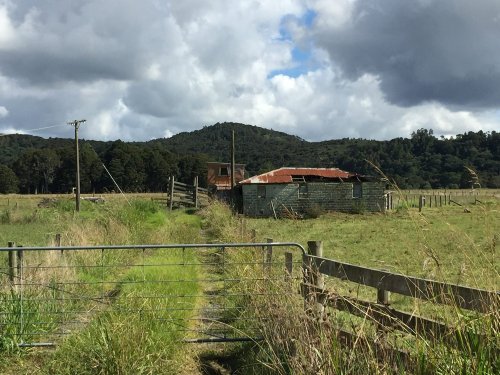
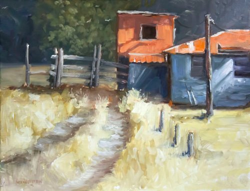
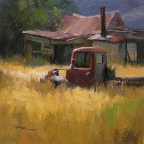
Here’s a scene just down the road from my house in New Zealand, right on the main highway. Most people will speed past it without a second glance but to me this is a beautiful little scene just waiting to be painted.
Follow me step by step as I show you the techniques I use to paint this rustic country scene. Simplifying a subject, creating glowing light, using edge variety and much more are all demonstrated in the video. Enjoy!
Whenever you’re ready! The lesson is available online any time, and your access to the lesson never expires.
As long as you need! Your access never expires, so you can come back again and again.
Sorry, no you can’t download the video. This is to avoid piracy. You’ll always be able to view the video on this site though.
Richard is a talented full time artist, who loves painting and teaching.
Hi I’m Richard. I’ve been painting my whole life and back in 2001 I traded my graphic design career for the humble life of a full time artist. I love painting, and as it turns out, I love teaching too.
Nowadays I balance my life between parenting, painting, surfing, travelling and teaching. My work is regularly featured in international art magazines, in galleries in New Zealand and America, on TV and in my Mum’s house.
I give outdoor painting workshops in interesting spots around this beautiful planet of ours and love encouraging people to paint. Two of my favourite artists are John Singer Sargent and Joaquín Sorolla.
My painting website: www.nzpainter.com
I’d love to be your new teacher.

Richard is a master artist with an exceptional skill in identifying and communicating key factors to making successful paintings. I have found his video workshops an excellent resource for improving my own work.
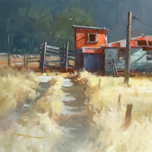
"Country Road" 15x15" Oil on Canvas by Richard Robinson.
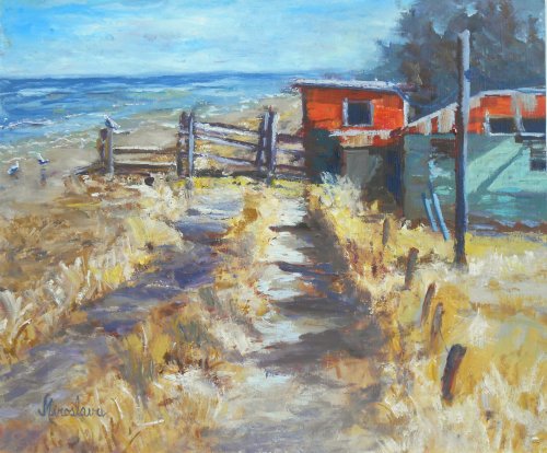
"Snack by the Sea" 20x25cm Oil on Board by Silvana M Albano
Great to see you playing with the scene Silvana. The beach and sky itself are quite believable however you've placed the horizon too high which is throwing everything out of kilter. I've altered it in Photoshop so you can see the difference. Another few things I altered were to remove the seagulls which were too large for their positions on the beach and also to change the shape of the shadows in the right-hand track because they were making a 1,2,3,4 pattern of equal size and spacing. The horizon is now flat which is always important in painting the ocean like this. While I was fiddling with your painting I also darkened the tree and extended it to the left so it wasn't in line with the edge of the building anymore. The final touch was glazing a soft shadow across the foreground to see how that looked. So there are a few ideas for you. There's plenty of good work in your painting - the colour is good, if a little muddy in places where you've let the cools mix with the warms in the halftones (between light and shadow). Your brushwork is varied and interesting, creating that rough tussocky texture nicely. Your drawing, apart from the horizon level, is very good. Keep up the good work!
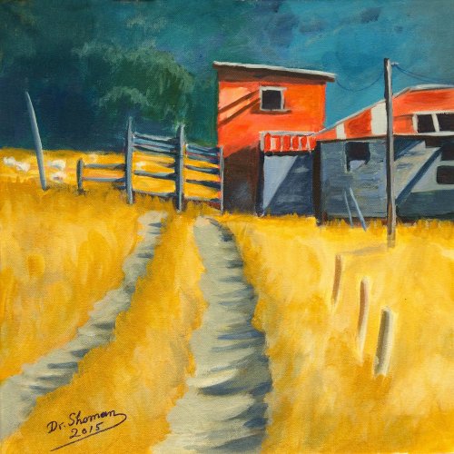
"Country Road" 16x16" Acrylic on Canvas by Shoman Mohamed
A nice colourful piece Shoman. I can see you're a very careful person from your crisp edges down to your stylish signature - much like I started out till I got all painterly, which just takes brush miles. A lot of things are working well here from your punchy colour contrasted with the grayed backdrop, the precise drawing and the attention to tonal values. Some observations... the crisp edge where the cast shadow on the drive meets the grass could be more naturally portrayed by darkening the grass there somewhat and making the edge less regular. A little more textured paint in the foreground and more attention to defining individual clumps would add more realism and depth to the whole foreground. Don't make the roof gutter line bend just behind the big pole because it makes us believe the pole is somehow influencing the shape of the building. The edges of your orange building are swelling outwards slightly which very subtly indicates health and ripeness to us. Better on a decrepit building to bow the edges slightly inwards. That should keep you busy. Well done.
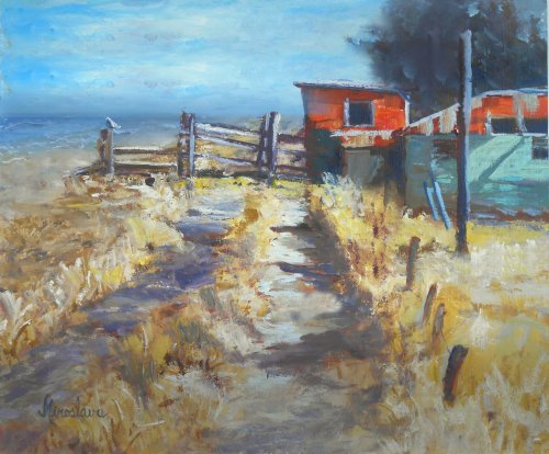
"Snack by the Sea" 20x25cm Oil on Board by Silvana M Albano - Altered
The painting altered in Photoshop.
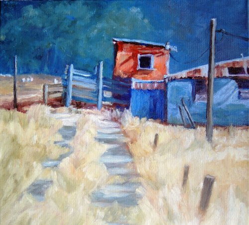
"Workshop42" 11x14" Oil on Canvas by Manneherrin
Great colour and exciting brushwork in this one, Mannerherrin. Those dark darks are really helping the colours pop off the canvas and you've kept the values really light through the foreground which is creating that beautiful glowing light effect we were trying for. It's a shame those three Stooges (posts) on the right are spoiling the illusion a bit. They're all the same and all the same dark gray which should be a warm gray brown. You see how the colour looks muddy around them too where the warm grass has mixed with the cool gray in the posts? Very easy to fix that. I'm all for cropping a painting down to its minimum but I do feel that the building is just ducking into the painting - not quite enough head room. Again, your brushwork is really strong but if you'd taken just a little more care with the drawing in a few places like making the poles straight and the top most roof line more sure it would have raised this painting up another notch. Just a few points there because overall it's really a good painting.
"Lonesome Road" 16x16" Oil on Canvas by Candi Hogan
Good work Candi. You've got that strong light effect in the foreground working well and intensified the blues so that the complementary blue/orange colour scheme is much more obvious. Your brushwork is bold and varied and your drawing is good, all except for the window being at odds with the tilt of the building. Beware your background trees kissing the top of the canvas. If you scoop the shadows across the tracks a little it gives the appearance of a dirt or gravel road rather than a flat concrete. You could afford to have a little more depth in the grass shadows and more colour as it's looking a little chalky at present and the shadow sides of the grass aren't quite connecting believably to the cast shadows on the road. I hope that helps a little. Good work.
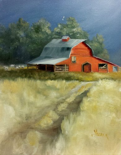
"Red Barn" Oil on Canvas by Lisa Bower
Nice one Lisa! Great green/red complementary colour combo, subtly done - glad you didn't use a Kermet the Frog green in the foreground. The drawing of the barn itself is just about spot on - nice and crisp too, except does the peak of the roof actually overlap like that? I wouldn't know. I do feel its placement is a little odd with it nearly touching the edges of the painting, aided by the road and the top of the trees all pointing to that spot. Maybe if you made a subtle swooping curve in the road swinging from left to right to left it would help there and bring our attention to that beautiful little spot of light behind the barn highlighting the sheep, which I think you could make more of and is the real hidden jewel of this painting. Because there's not a lot happening the background blue you could afford to crop an inch or two off the top without losing anything. My rule of thumb is that if it's not adding anything to the design then you might as well leave it out. Overall you've got a good painting here, but there are some things for you to think about.
$15.00USD
$45.00USD
$15.00USD
Not loving your painting lessons? No worries!
If it’s not the right fit, we’ll give you a full refund within 30 days of purchase - no questions asked.
When you purchase a DVD you also get online access to the same lesson, including any lesson resources like photos, downloadable notes and access to upload your painting to the student gallery.
That's why you need to make a password when you purchase a DVD, so you can access the online content as well. Enjoy!