Teacher
Richard is a talented full time artist, who loves painting and teaching.

with Richard Robinson
Atmospheric perspective is the effect the atmosphere and light have on a scene as it recedes into the distance, generally getting lighter and greyer, with less contrast. In the majority of landscape paintings you will see the artist has exaggerated the beautiful effect of atmospheric perspective. I certainly do in my paintings because it adds a wonderful sense of depth and an air of mystery. Discover the keys to achieving this beautiful effect in this workshop. Enjoy!
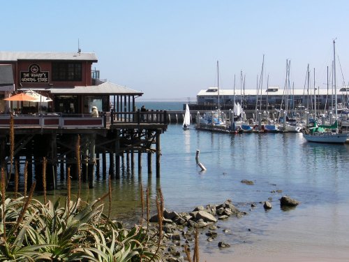
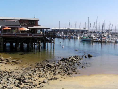
Follow along step by step or use the resource photo to create something more your own. Enjoy!
Whenever you’re ready! The lesson is available online any time, and your access to the lesson never expires.
As long as you need! Your access never expires, so you can come back again and again.
Sorry, no you can’t download the video. This is to avoid piracy. You’ll always be able to view the video on this site though.
Richard is a talented full time artist, who loves painting and teaching.
Hi I’m Richard. I’ve been painting my whole life and back in 2001 I traded my graphic design career for the humble life of a full time artist. I love painting, and as it turns out, I love teaching too.
Nowadays I balance my life between parenting, painting, surfing, travelling and teaching. My work is regularly featured in international art magazines, in galleries in New Zealand and America, on TV and in my Mum’s house.
I give outdoor painting workshops in interesting spots around this beautiful planet of ours and love encouraging people to paint. Two of my favourite artists are John Singer Sargent and Joaquín Sorolla.
My painting website: www.nzpainter.com
I’d love to be your new teacher.

Richard is a master artist with an exceptional skill in identifying and communicating key factors to making successful paintings. I have found his video workshops an excellent resource for improving my own work.
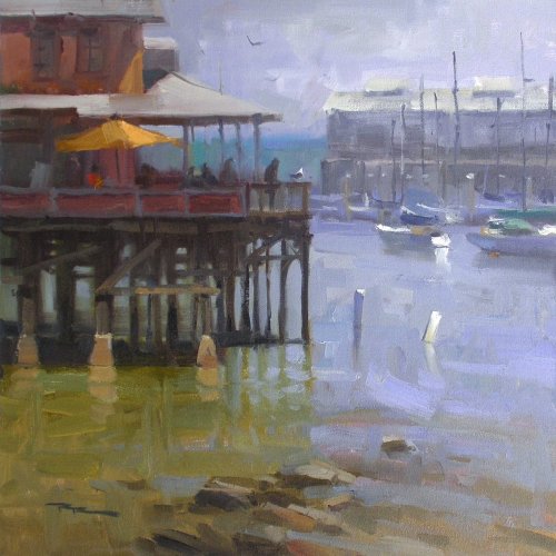
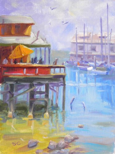
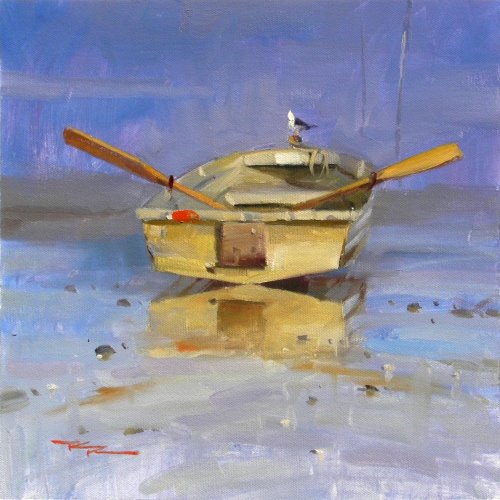
"Harbour Light" 15.5x15.5" Oil in Canvas by Richard Robinson
(Painted en plein aire)
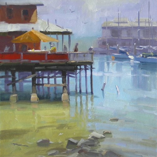
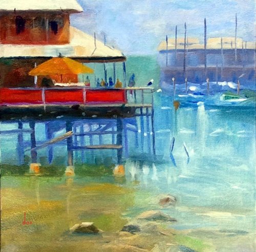
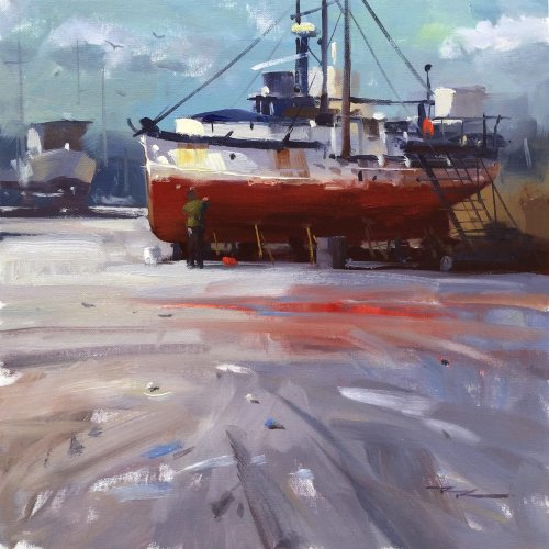
"Fisherman's Wharf" 12x12" Oil on Canvas by Richard Robinson
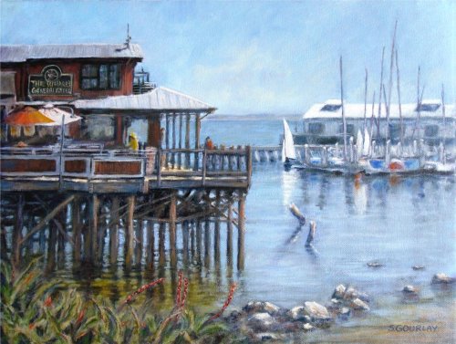
"Fisherman's Wharf" 12x16" Oil on Canvas by Stuart Gourlay
Great attention to detail as usual Stuart. Great that you included that little sailing boat too which something I wanted to do on the day but he was moving too fast! I especially like all the intricate structure you've built in the poles beneath the wharf. While you're at it how about some folks enjoying a cuppa under the umbrellas? I can't see anything in this painting that needs mending particularly, so I'm really including it in the critiques to say 'Good Job!' and 'Hey everyone, look at this!'. Good work buddy.
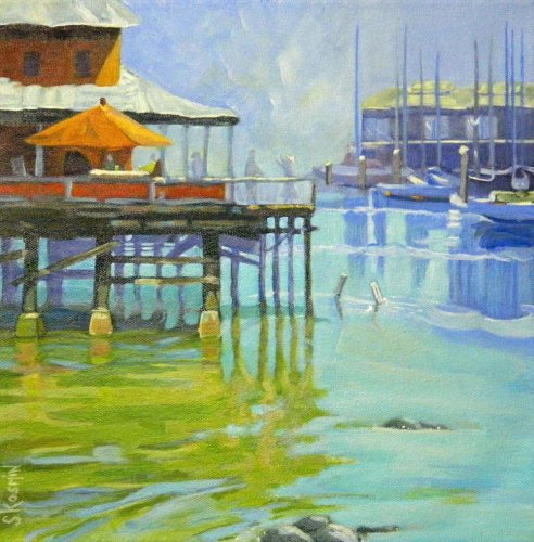
"Fisherman's Wharf" 12x12" Oil on Canvas by Sharon J Kosmin
Another strong painting in your inimitable style Sharon. Like Stuart's I've included in the critiques this time because I simply can't find anything wrong with it. Great job!
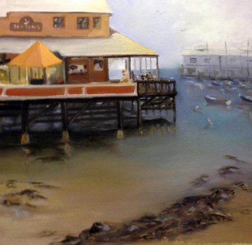
"The Sea Shack" 20x20" Oil on Canvas by Lori Ippolito
Hi Lori, looks like your water has got a little muddy but the overall colouring if this piece is really nice. I think all you need to do is stop yourself from smoothing everything out once you've put it down. The time honoured advice is 'put it on and LEAVE it!' It's so easy to go crazy with that beautiful soft blending brush that once you pick it up it's almost always fatal. What I would like to see in the water is some large horizontal and vertical strokes. If you threw those in there now they'd look awful though because everything else is smoothed out. There's always the next one. Did you use black paint? Looks like it. It has a tendancy to muddy whatever if comes into contact with, but that again could be your blending. On this scene I used Ultramarine Blue and Cad Red and a little Yellow Ochre to get my darkest dark. The recession of your far building is good and the light above it is great but there are a few little dark accents there that are popping out and spoiling the recession a bit. The shadow cast on your second story wall is too light and your umbrella wants to be a pyramid. Other than that it's all good, but do go ahead and burn that blending brush.
"Monterey Wharf, CA" 11x14" Oil on Canvas by Sharon Casavant
Great colours Sharon and a wonderful loose treatment although it's at the expense of the drawing in a few places like the umbrella and the roofline above it which seems to be angling up to get away from the umbrella. The horizon could do with some straightening too. You've got all your values looking good, especially in the distant building which sits back there nicely in space and your jumble of brushstrokes there really does give the impression of a bunch of boats nestled together which is great. All that different colour you've put in the sky looks very exciting but it is lacking a little structure, or realism. Some of the poles under the wharf are a bit too light - looks like they've picked up a bit of the light blue in that area. Over all it's great and looks like it's been a fun painting for you. Some of that loose drawing makes the painting look a bit whimsical or naive which may be what you're after. If whimsy is not what you are trying for you just need to slow down and get more serious with the drawing.
"Fisherman's Wharf" 12x12" Oil on Canvas by Dorian Aronson
Hi Dors, this is not too shabby at all! Good strong colour and good drawing (except the horizon is a bit too high). Let's see, anything need fixing? Well, the poles under the wharf are a bit too blue, like mine are too purple and light, and your back ones don't end convincingly in the water, much like mine too, so, my bad for doing it wrong the second time around and putting you wrong. Sorry about that. They need to be darker and grayer, as does the shadow cast on the water under there. Your boats are good, very nearly convincing, but the closest one or two could do with a bit clearer form. I love your seagull - he looks like he's looking down for some lunch. The light reflections under the right side of the wharf are confusing - you've fudged that area and it's worth taking another look at that and you smudged your rocks, but you know that. Great stuff!
$15.00USD
$45.00USD
$15.00USD
$15.00USD
Not loving your painting lessons? No worries!
If it’s not the right fit, we’ll give you a full refund within 30 days of purchase - no questions asked.
When you purchase a DVD you also get online access to the same lesson, including any lesson resources like photos, downloadable notes and access to upload your painting to the student gallery.
That's why you need to make a password when you purchase a DVD, so you can access the online content as well. Enjoy!