Teacher
Richard is a talented full time artist, who loves painting and teaching.

with Richard Robinson
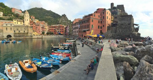
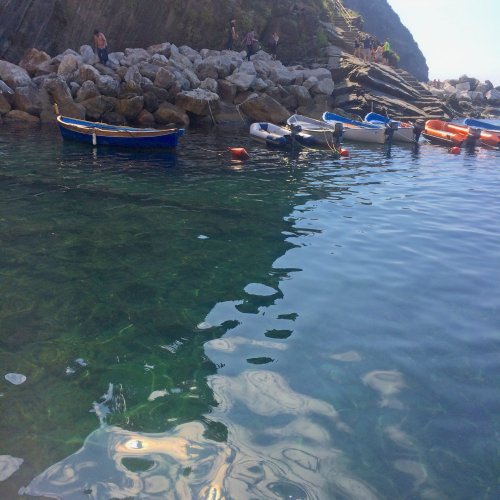
Follow me step by step as I show you the techniques I use to paint this impressionistic harbour scene. Raising the overall colour vibrancy, glowing light, transparent water and impressionistic brushwork are all demonstrated in the video. Enjoy!
Whenever you’re ready! The lesson is available online any time, and your access to the lesson never expires.
As long as you need! Your access never expires, so you can come back again and again.
Sorry, no you can’t download the video. This is to avoid piracy. You’ll always be able to view the video on this site though.
Richard is a talented full time artist, who loves painting and teaching.
Hi I’m Richard. I’ve been painting my whole life and back in 2001 I traded my graphic design career for the humble life of a full time artist. I love painting, and as it turns out, I love teaching too.
Nowadays I balance my life between parenting, painting, surfing, travelling and teaching. My work is regularly featured in international art magazines, in galleries in New Zealand and America, on TV and in my Mum’s house.
I give outdoor painting workshops in interesting spots around this beautiful planet of ours and love encouraging people to paint. Two of my favourite artists are John Singer Sargent and Joaquín Sorolla.
My painting website: www.nzpainter.com
I’d love to be your new teacher.

Richard is a master artist with an exceptional skill in identifying and communicating key factors to making successful paintings. I have found his video workshops an excellent resource for improving my own work.
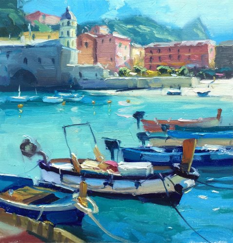
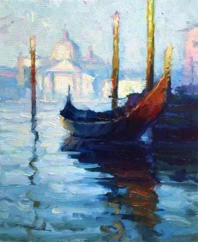
"Mediterranean Harbour" 11x13" Oil on Canvas by Richard Robinson.
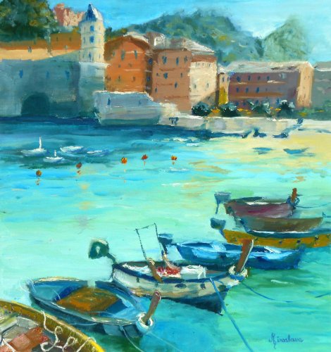
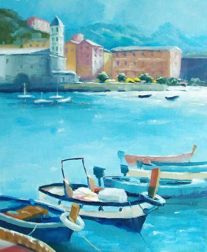
"Beautiful Vernazza" 32.5x31cm. Oil on Paper by Silvana M Albano
A good painting Silvana. The first thing I notice is the colour of the water which is really nice and vibrant. The second thing that struck me is the reason why I focused on the water - it's because you've shrunk the boats which leaves more water to see. That's fine but it has split the scene in terms of focal point where the town now holds as much weight as the boats. Previously the town was a close second to the boats. I don't know if you did that consciously or by accident, but I just wanted to make you aware of the subtle difference there. The drawing is pretty good on the whole - a few wonky boats could do with a bit of TLC though, especially the small white boats which you've dropped down from the horizon making them too small for their placement now. Your darkeset darks seem to be in the little trees above the seawall. By placing darker darks in the forground boats you'll give the painting more depth. Your brushwork is good - lots of broad painterly work contrasted by some nice crisp details. Nicely done!
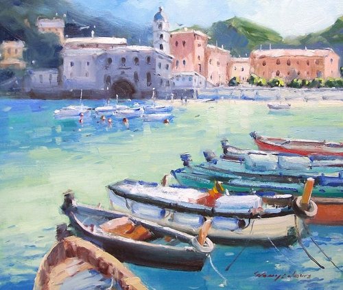
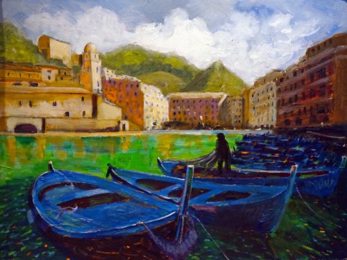
"Mediterranean Colours" 12x14" Oil on Canvasboard by Glenys Jones
Beautiful work Glenys! This has a real impressionistic feel to it. Subtle colour usage, lyrical brushwork not overworked but with enough fine detail to give it substance, solid composition. Nice! A few things I could pick out for you to look at are firstly, the drawing of the black boat which is wonky, (practice it on paper a few times), the blue in the water should be a little greener, especially in the shadows, to tie in with the greener water colour in the middle. Make sure the waterlines of your distant boats are flat and level. The green in the hill is too strong and dark compared to the blue-grey dark there and the distance it is from us. Other than that it's all good. Great work!
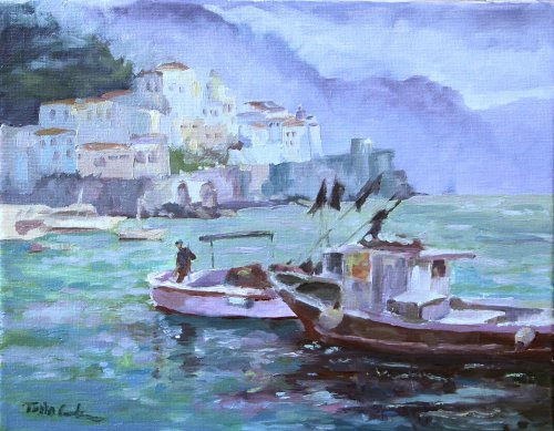
"Courbron - Amalfi Italy" 11x14" Oil on Canvas by Toska M. Courbron
Nice work Toska! It's a strong composition - large shapes with your darks joined together and a figure in an ideal 3rd/3rd spot to add narrative and scale. The painterly brushwork is the second thing I was attracted to. The drawing is strong. The overall colour scheme is quite harmonious if a little subdued. I wondered what it would look like to heighten the contrast, saturate the colour a little, warm up the lights and have a darker background behind the light village so I did that in Photoshop. See what you think. You might agree the altered image looks warmer and more inviting which suits this idyllic subject. Something to think about for the next one.
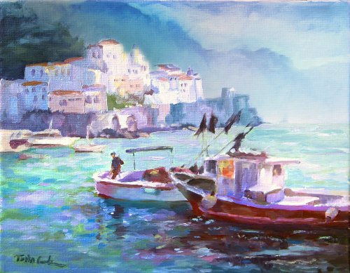
"Courbron - Amalfi Italy" 11x14" Oil on Canvas by Toska M. Courbron - Altered
"Mediterranean Harbour" Oil on Canvas by Janet Buckton
Great colour work Janet - you've really nailed it there and your drawing is pretty good too, although your central boat could be a bit bigger. Making the canvas longer has left you with a gap in the middle where there's not much going on in the water - sort of a waste of space. On the other hand you could say it makes it more restful and less busy. Depends on what you like. For me, I try to make every part of my canvas interesting in some way. Your brushwork is pretty timid in this painting. Not many people come to my workshops and say to me 'I really want to tighten up!' so I'll assume you want to get more gestural and I challenge you to paint right over this painting using LOADS MORE PAINT (and THICK!) and doing in one stroke what you previously did in five, and then LEAVE IT ALONE! Think about the stroke, what it's for, how you'll do it, how to load your brush for it, and SWOOSH! Done. You need good brushes too with long bristles because it's very hard to get beautiful brushwork out of an ugly brush. Ok so consider yourself challenged. I do that because this is a really nice painting, on the verge of becoming a really great painting. Enjoy!
"The tolling of the distant bell" 60x80cm Acrylic on Board by Jon Main
Nice composition Jon, which is giving this painting a lot of shape interest and a lot of depth due to the recession of the boats. Good drawing skills in those boats too. There's something quite Van Gogh-y about the front two. Good on you for painting such a large piece for this workshop - I bet it's much more impressive seen at full size. My first question to you would be 'why did you make all the boats the same colour?' To me the variety of colour in the boats echoed the variety in the buildings, which you've also simplified. You've removed variety from your painting in that way, which is as they say the spice of life, and also the spice in a painting. However, the broken colour you've introduced into the big shapes is working well to add variety in that more subtle manner. You commented that you'll probably tone down the green in the water which I think is a good idea, and you could also make the mountains a little more blue to help negate the weight of all the blue in the boats, while adding more depth. It's a nice touch and good thinking to add the figure pulling the net but can I suggest you get someone to pose for this and you take a photo to work from? It'll look so much more convicing if you do that. Your clouds have a nice spotlight effect on them working well, as do the buildings. A few things to think about there but some really good work too.
$15.00USD
$15.00USD
$15.00USD
$15.00USD
Not loving your painting lessons? No worries!
If it’s not the right fit, we’ll give you a full refund within 30 days of purchase - no questions asked.
When you purchase a DVD you also get online access to the same lesson, including any lesson resources like photos, downloadable notes and access to upload your painting to the student gallery.
That's why you need to make a password when you purchase a DVD, so you can access the online content as well. Enjoy!