Teacher
Richard is a talented full time artist, who loves painting and teaching.

with Richard Robinson
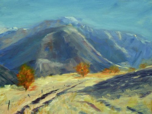
Most beginners have no problem making vibrant colour, in fact most start out painting ALL their colours vibrant, so it’s easy to have a gaudy painting, but how do we do it with a degree of tastefulness? Simply by balancing our vibrant colours with areas of more greyed colour. Find out how in this workshop.
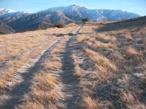
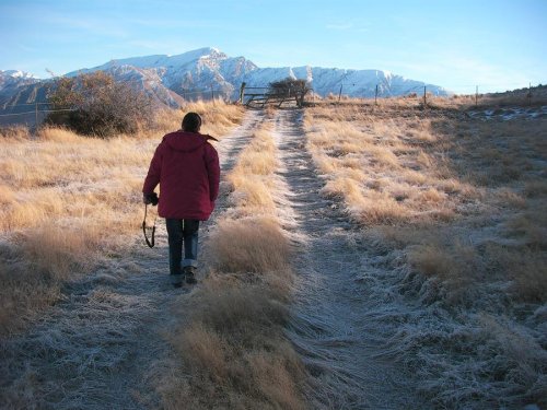
Feel free to follow me step by step in painting the same scene or use the resource photos to design a piece that is more your own. You can paint this any size or shape you like using any medium. Either way the main learning goal for this lesson is to focus on contrasting vibrant colour with more grey colour. Happy painting!
Whenever you’re ready! The lesson is available online any time, and your access to the lesson never expires.
As long as you need! Your access never expires, so you can come back again and again.
Sorry, no you can’t download the video. This is to avoid piracy. You’ll always be able to view the video on this site though.
Richard is a talented full time artist, who loves painting and teaching.
Hi I’m Richard. I’ve been painting my whole life and back in 2001 I traded my graphic design career for the humble life of a full time artist. I love painting, and as it turns out, I love teaching too.
Nowadays I balance my life between parenting, painting, surfing, travelling and teaching. My work is regularly featured in international art magazines, in galleries in New Zealand and America, on TV and in my Mum’s house.
I give outdoor painting workshops in interesting spots around this beautiful planet of ours and love encouraging people to paint. Two of my favourite artists are John Singer Sargent and Joaquín Sorolla.
My painting website: www.nzpainter.com
I’d love to be your new teacher.

Richard is a master artist with an exceptional skill in identifying and communicating key factors to making successful paintings. I have found his video workshops an excellent resource for improving my own work.
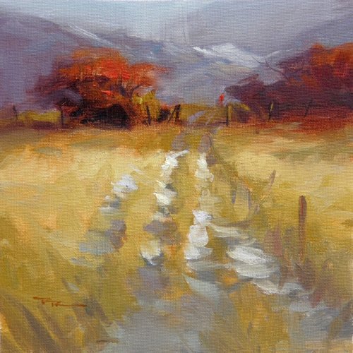
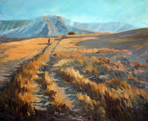
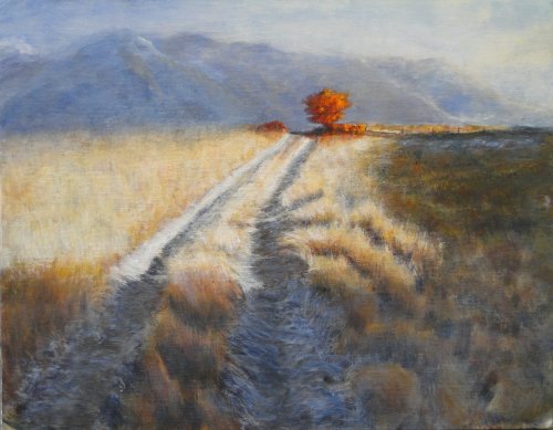
"Mountain Path" 11x11" Oil on Canvas by Richard Robinson
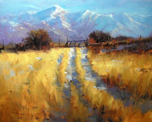
24x30" Acrylic on Canvas
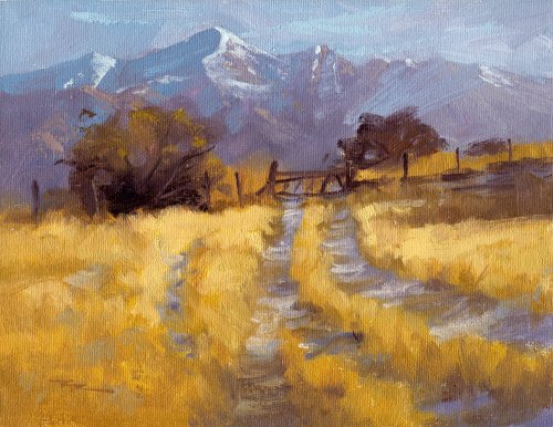
10x8" Oil on Canvas
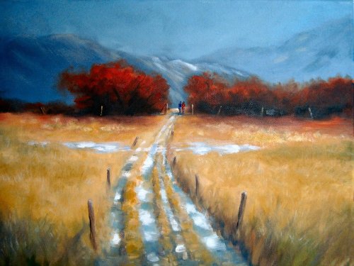
"Morning Walk" Oil on Canvas by Paula Salmons
Paula I love the design of this painting - not nearly so obvious as mine, sweeping us into the scene with your grassy track. You've approached the gray vs colour challenge rather differently by keeping the strong pthalo colour in the background and playing out the grays in the rest of the painting to offset the orange grasses and that works well but it's a shame the lighter grays on the right are slightly too light and flatly applied as they are spoiling the sense of depth there. Some of the grays in the mountain are also not quite on the mark and could do with some more practice, so I think the highlight for me is your wonderful foreground where you've clearly put a lot of work into understanding the play of light and shadow over the forms there, the consequence being that you can nearly reach out and grab a handful of snow from the shadows of the sunlit grasses there. Beautiful work!
"Winter Walk" 12x16" Oil on Canvas by Tony Quinn
Wow, what intense colour you've made in the piece Tony! You've achieved a real read glow coming off those trees. Did you use some red glazing there as well to help there? Whatever you've done it works very powerfully against the gray-blue background. You have missed a few opportunities for exciting impasto brushwork in achieving your rich colour throughout the painting, and I would love to see if you would like to work over this one a little to experiment with a looser style, or if that might happen if you painted it again. I've painted this scene several times now and each time it frees my hand to try something a bit more daring, which I highly recommend. Your drawing of the path is very careful and you've unfortunately given in to our inclination to oversimplify and 'patternise' here - all too easy to do I know! Good that you avoid symmetry with your fence posts however they should be a fair bit thinner down the track. I do like the dash of snow you ran across the path to help loosen it up - that was a nice idea and it would work even better if you added a few subtle left side shadows to some of the grasses surrounding the snow because at the moment it's floating on top a little. Good job on keeping the values very similar and subdued in the background to which lets the foreground shine. Nice work.
"Crown Range" 11x14" Oil on Board by Cheryl Lipham - Altered
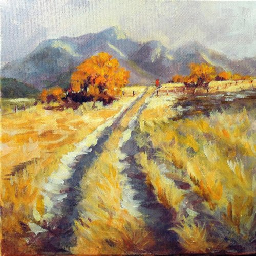
"The Golden Trail" 12x16" Oil on Board by June Stevens
Great to see such a different take on this design June and you've created with it a lot of movement and a good sense of depth. The balance of the design is good but my only reservation is the regular spacing and size of your trees which appear to have been planted along the track evenly spaced. Perhaps a little more snow would have added some drama on the mountains too and in the large foreground shadow. Your brushwork immediately stands out as being quite confident and expressive which is a pleasure to see and I'm looking forward to seeing more of your work.
"Crown Range" 11x14" Oil on Board by Cheryl Lipham
Fantastic foreground detail there Cheryl - I can almost hear the icy grasses crunching under my boots. It makes for a powerful lead in to the painting which unfortunately looks a little empty at the top of the rise after all that detail. Personally I think it would look better if you removed the tree altogether and focused on the path as in my photoshopped version of your painting. Although I totally empathise with the logic of having a single tree as the focal point, and I know you've played with various arrangements, the orange tree you have there at the moment seems to me to be too small, powerful and pruned in the design which makes it more trite than poignant. Personally I'm always fighting against my tendency to create trite and hackneyed designs - a lifelong battle I'm afraid. Saying all that, I commend you on your attention to detail and your dedication to keep pushing yourself to solve the design which was evident in your 3 posted versions of this painting - that's all it takes to make great paintings. Keep up the good work!
"Gray to Bright" Oil on Canvas by Sharron Repple
Sharron you've made a very strong painting here. The colours are very strong and that's testament to using strong colour versus grayed colour. That yellow grass is really alive with colour and light, thanks largely to the strong gray shadows you've cast on the icy track and your attention to the strength of the colour in the halftones. You've also managed to convey a slight soft shadow across the foreground which was one of the tricker parts of this scene. You could add to that with some thin glazing of alizarine crimson if you wished to enhance what you've already painted alla prima. The only two things I would personally look at changing would be the strict march of the fence line on the right and the drawing of the mountain which seems to have grown four quite similar humps, equally sized and spaced. Other than that I think it's a great painting you should be very happy with.
$15.00USD
$45.00USD
$15.00USD
$15.00USD
Not loving your painting lessons? No worries!
If it’s not the right fit, we’ll give you a full refund within 30 days of purchase - no questions asked.
When you purchase a DVD you also get online access to the same lesson, including any lesson resources like photos, downloadable notes and access to upload your painting to the student gallery.
That's why you need to make a password when you purchase a DVD, so you can access the online content as well. Enjoy!