Teacher
Richard is a talented full time artist, who loves painting and teaching.

with Richard Robinson
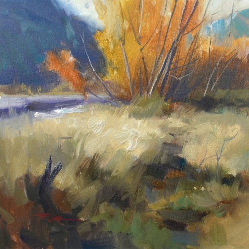
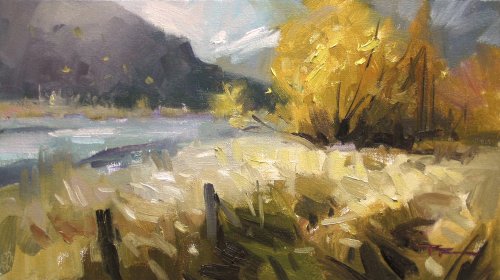
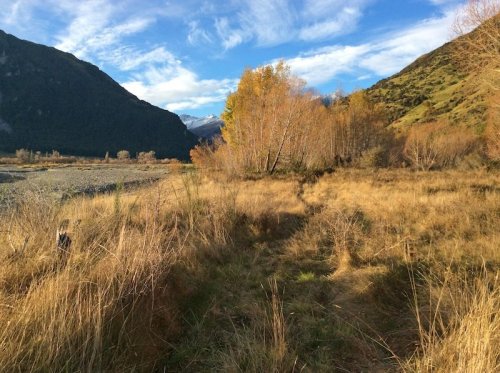
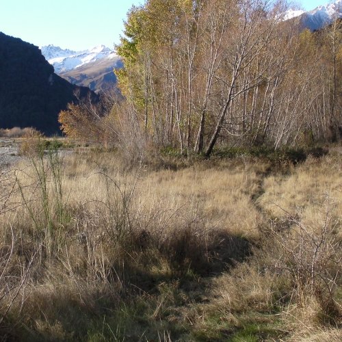
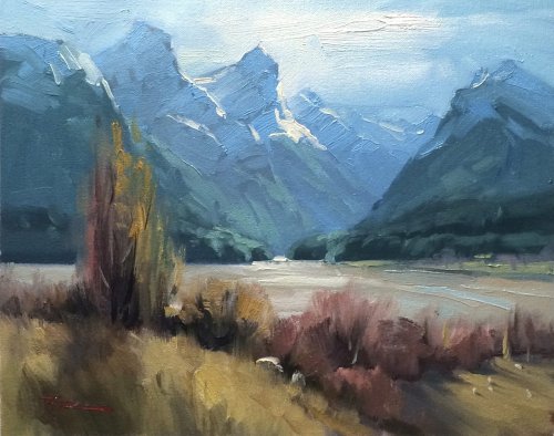
There’s nothing I find more inspiring to paint than warm autumn colours against cool mountain backdrops. This painting has been painted en plein air (outdoors) and in this video you get to see that process step by step and a self critique of the finished painting at the end.
Follow along step by step or use the resource photo to create something more your own. Enjoy!
Whenever you’re ready! The lesson is available online any time, and your access to the lesson never expires.
As long as you need! Your access never expires, so you can come back again and again.
Sorry, no you can’t download the video. This is to avoid piracy. You’ll always be able to view the video on this site though.
Richard is a talented full time artist, who loves painting and teaching.
Hi I’m Richard. I’ve been painting my whole life and back in 2001 I traded my graphic design career for the humble life of a full time artist. I love painting, and as it turns out, I love teaching too.
Nowadays I balance my life between parenting, painting, surfing, travelling and teaching. My work is regularly featured in international art magazines, in galleries in New Zealand and America, on TV and in my Mum’s house.
I give outdoor painting workshops in interesting spots around this beautiful planet of ours and love encouraging people to paint. Two of my favourite artists are John Singer Sargent and Joaquín Sorolla.
My painting website: www.nzpainter.com
I’d love to be your new teacher.

Richard is a master artist with an exceptional skill in identifying and communicating key factors to making successful paintings. I have found his video workshops an excellent resource for improving my own work.
"Last to Fall" 12x12" Oil on Canvas by Richard Robinson
"Autumn Gold" 14x8" Oil on Canvas by Richard Robinson
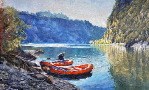
"Morning on the River" 7.5" x 11.5" WS oil on canvas textured paper by Robin Sage
You showed great courage in tackling a difficult subject Robin. The figure, the rafts, the water and the beach are beautifully done with great colour and tone. One of the things I try to make sure I do when nearing the end of a painting is to look away and then flick the eye back to the painting. Somehow, it helps me to notice things that are troublesome – out of keeping with the rest of the picture. Your cliff on the right and the reflections at the bottom of the cliff trouble me. They are too busy – especially the reflections. The other thing – less of a bother – is the line of cliffs in the background. They are far too blue for the distance. The colour is imposing itself on the rest of the painting. A quieter shade of blueish grey would have worked better. A very good effort nevertheless. - John Crump
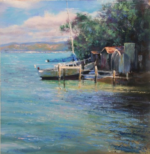
"Boat" 11"x10" Oil by Olivia O'Carra
You have done very well with a complex subject Olivia. The wharf, the dinghies, the boat sheds, (apart from a slight perspective problem with the front of the nearest shed), and the yacht obviously resting on the bottom, are all complicated shapes to manage. You have achieved the effect of glittering water in the foreground very well. The only area I have a problem with is the highlight colour on the background hills. If you look at the blue you have used for the shadows on those hills, they are obviously a long way away. However, the colour you have used for the highlights is not very far at all. This is a very common problem for many painters – the colours they use on the shadows and highlights of distant objects argue with each other, whether they are mountains, foothills, or even relatively close objects. Just remember that yellows in the landscape disappear quite quickly with distance. - John Crump
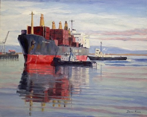
"We'll Get Her There" 20 x 16 inches Oil on Canvas by Denis King
An unusual and challenging subject Denis. I suspect you enjoy painting boats and water as you have handled them very well in this painting. Beautiful colour – especially around the bow of the boat that works so well to draw the eye to the focal point. You have handled the water well too. Perhaps my only hesitation is the land and sky behind the boats. If you had used a slightly darker blue/grey on the hills, made them a little taller, and softened the top edge slightly – almost blurred them into the sky, they would have added to the feeling of early morning haze and would have resolved a slight loss of definition around the back of the ship and the superstructure of the rear tug. Sweeping the front edge of the cirrus cloud up and out of the top right edge would have given an added dimension to the sky and would also have helped direct the viewer to the focal point. But I don't want to sound too 'picky'– it is a very nice piece of work. - John Crump
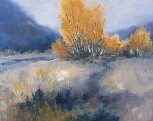
"Autumn Colours" 8" x 10" Oil on Canvas by Fay Thomson
I would agree with Michael's comments Fay but would want to add a couple of extra thoughts. The subject of your painting (obviously the trees in autumn colour) have dictated a strong autumn gold. However, the mountains to each side of the trees and the shadowy path into the painting are almost the complementary of those trees. Therefore, there is no particular colour theme to the painting – in fact the colours are almost at odds with one another. If you look at your painting dispassionately, you will see that the trees feel divorced or ostracised from the rest of the painting. Most of us would like to achieve a sparkle in our work and we can achieve that better I believe, if we let one colour be dominant and the bulk of the rest of the painting be in more neutral colours, perhaps even analogous colours with only small amounts of the complementary to bring that sparkle that we are after. In that way, the painting has a theme and 'holds together' better. The other thought is just a small one – the trunks of your trees feel as if they are drawn on top of the trees rather than a part of the group amongst the foliage. After you have drawn as loosely as possible the trunks and branches, try taking a large clean dry brush and lightly whisking across them. They will immediately become soft- edged and feel as if they are within the tree, not drawn on later. - John Crump Thanks John for all your insightful comments - hugely appreciated! - Richard Robinson
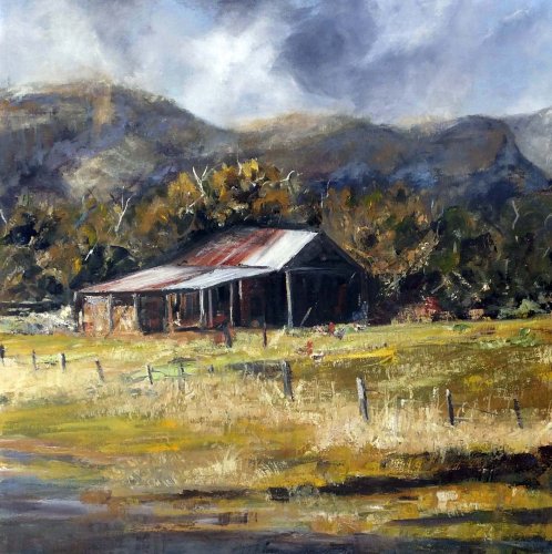
"Bush Barn" Oil on canvas 30x30" by Suzanne Louise Andrew
Overall, your painting of the barn Suzanne his some very nice colour and the feeling of distance and tone works well. I particularly like the sky which has a lovely sense of rhythm in it. However, there are a few things I would like to mention. The very dark area inside the barn is what we might call a black hole – it is too dark and has no suggestion of anything inside. Also, if you have a look at your roof structure, you will see that it is getting taller as it goes away from us – it should be getting smaller! Try taking some photos of similar buildings from an angle and you will be surprised how much the roof slopes downwards as it moves away from us. One other thing, putting a fence line or a gate in the foreground of a painting puts a mental barrier in front of the viewer. It implies that you are not allowed in. You can use a fence to lead people in to your painting but it needs to run away from the viewer and preferably be very broken down and incomplete so that we can mentally walk through it. An afterthought – if you look at the green you have used at the base of the building, you will see that it is virtually the same as the green in the immediate foreground. It needs to be much quieter – more gentle. Because green has yellow in it and yellows disappear with distance, your green should begin to move towards a greyish green. It will better convey a sense of distance. - John Crump
$15.00USD
$15.00USD
$15.00USD
$15.00USD
Not loving your painting lessons? No worries!
If it’s not the right fit, we’ll give you a full refund within 30 days of purchase - no questions asked.
When you purchase a DVD you also get online access to the same lesson, including any lesson resources like photos, downloadable notes and access to upload your painting to the student gallery.
That's why you need to make a password when you purchase a DVD, so you can access the online content as well. Enjoy!