Teacher
Richard is a talented full time artist, who loves painting and teaching.

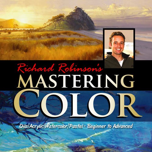
with Richard Robinson
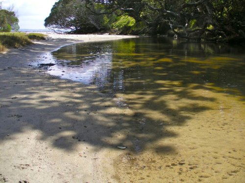
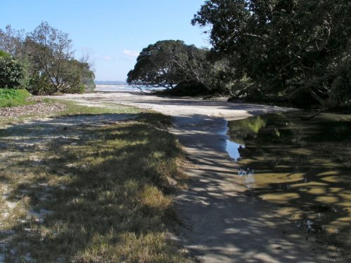
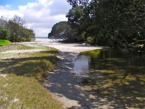
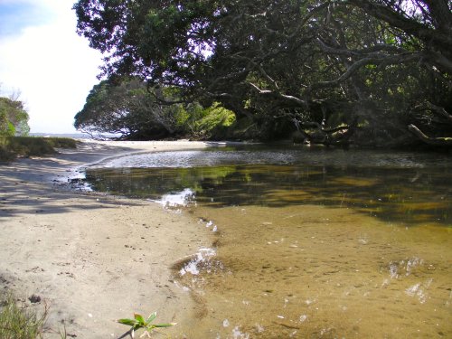
A good painting, no matter what style or subject, is an interesting collection of shapes, colours, textures and lines. That’s what it all boils down to. All painters fall on a line somewhere between pure abstraction and super realism. Most painters start from copying what’s around them, but as a realist painter it can be very rewarding to see how far we can bring our subject towards abstraction without losing its integrity. The resulting ‘loose’ painting can really widen your horizons and give you much more mastery over your materials. Let me show you how in this workshop.
Whenever you’re ready! The lesson is available online any time, and your access to the lesson never expires.
As long as you need! Your access never expires, so you can come back again and again.
Sorry, no you can’t download the video. This is to avoid piracy. You’ll always be able to view the video on this site though.
Richard is a talented full time artist, who loves painting and teaching.
Hi I’m Richard. I’ve been painting my whole life and back in 2001 I traded my graphic design career for the humble life of a full time artist. I love painting, and as it turns out, I love teaching too.
Nowadays I balance my life between parenting, painting, surfing, travelling and teaching. My work is regularly featured in international art magazines, in galleries in New Zealand and America, on TV and in my Mum’s house.
I give outdoor painting workshops in interesting spots around this beautiful planet of ours and love encouraging people to paint. Two of my favourite artists are John Singer Sargent and Joaquín Sorolla.
My painting website: www.nzpainter.com
I’d love to be your new teacher.

Richard is a master artist with an exceptional skill in identifying and communicating key factors to making successful paintings. I have found his video workshops an excellent resource for improving my own work.
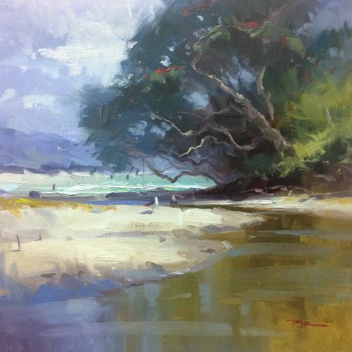
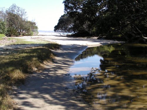
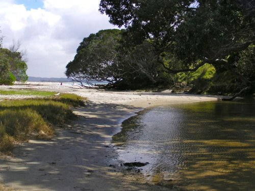
"Summer at the Cove" 15x15" Oil on Canvas by Richard Robinson
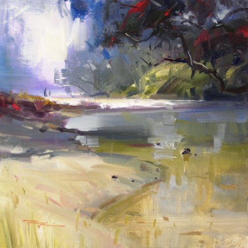
"Waipu Cove" 11x11" Oil on Canvas by Richard Robinson
"Waipu Cove" 11x11" Oil on Canvas by Richard Robinson
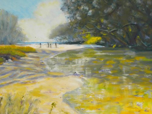
"Mystic River (with tribesmen approaching)" 40x50cm Oil on Canvas by Jon Main
Nice painting there Jon with a lot going right. Good to see you battling to loosen up and mostly winning. You've achieved something of an overall colour harmony by keeping your yellows and greens quite close and greying your darks and blues and you've certainly achieved the look of a summers day within that smaller colour gamut. Your water colours are very convincing although they're marred a bit by the sky reflection which seem a bit patchy and a little light in places. You have carried your shadows well from the water to the sand although their size and spacing begins to look too regular on the sand making me wonder at the shape of the tree that could cast those shadow shapes. The drawing of the distant scenery and figures is very good though and draws my eye into the painting which has great depth. I would however question the value jump of the furthest dark bank to the tree which grows on it. Seems like those values should be closer where they meet, which practically means that the bank there should be a little lighter. I would also challenge you to repaint the beach in the close foreground and give those grasses another bash as they have smudged into mud at present. Keep up the good work Jon!
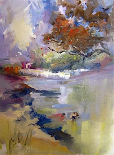
"Waipu Cove" 9x12" Oil on Linen by Donna Spears Lauzon
Wow I love this painting Donna. You've pushed it more into the realm of abstraction than I have dared to do but retained just enough realism to encourage the viewer to figure out what's going on amongst all that beautiful colour. How intriguing! You've got more variation in there in terms of colour, shape, line and texture than I could shake a stick at - a real pleasure to explore. You've inspired me to break out and do something more drastic in my next painting and I'd lke to see what you come up with next in this vein. Good stuff!
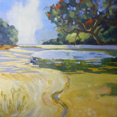
"Waipu Cove" 12x12" Acrylic on Canvas by Sharon J Kosmin
Sharon this is lovely. It's so interesting to see how we all approach the same subject differently and your stylised graphic approach is certainly a refreshing take on it as well. The balance of colour areas seems very good and your values are pretty good too. Some painters will say that if you get the colour right you don't need to worry about value, but I find it helpful to be able to think of colour in terms of its 3 components of hue, value and chroma. The two areas where your value has gone awry are the shadows on the sand on the left and the large reflection of the sky in the water. Both are too light. That's one of the trickiest part of the painting where these two intricate shapes merge into their colourful neighbours and if I were you I'd give these areas another shot because the rest of the painting is great. I love the lyrical line you've made of the water's edge and also the towering cloud on the horizon. Great work!
"Sea Scout Hall (Loose)" 12x24 Acrylic on Canvas by Nigel Necklen
Nigel it's great to see you breaking away from your more detailed style and trying to loosen things up. As you probably found it's much easier to try this with a subject you know well and have painted before as I saw your two previous paintings of this scene which were very good. I've personally painted the Waipu Cove scene about 8 times so far and find it easier each time to add lib and push things a little further and I noted that some of the painters in the workshop this time have painted the scene this month as many as 10 times! Monet new something about the power of this too I think. You chose to add more colour into the trees which is nice but you missed an opportunity for more colour variation in there with the more reddish tree directly behind the boatshed. I'm not saying it would look good with a bright autumnal tree in there, but a little variation from the green would add more interest in that area as would a little of that browner hue as the land reaches the water, especially since you made the roof greener as well. These trees presented a good opportunity to try out the 'infused light' look as they disappear around the corner too and I think some of that could have helped add more interest as well, especially seeing that saturated blue sky. Nice that you opened up the trees a litttle behind the shed to relieve the darkness there and you could have reflected a little of that in the water to help there too. Overall a pretty pleasing result and I'd like to see if this idea will impact on your future work.
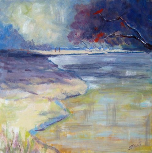
"Waipu Cove" 11x11" Oil on Paper by Jessica Futerman
Here's a whole 'nother take on it again! Interesting how your blue grays, darker sky and soft edged shadows have turned this into a much more brooding low key scene although the warm lights in the foreground ease it away from becoming opressive. Nice to see you working the colour up in thin glazes and then dry-brushing over that to create a rich texture. If you want a 'juicier' look you'd just need to use big piles of thick paint. Good to see you using only vertical and horizontal strokes in the water as suggested in the video - that really helps with the reflective qualities of it and at the same time you've achieved a good colour transition from top to bottom. The detail in your foreground tree is a little sparse - you prune a tree like my Mum does, so it stays pruned. Similarly you could have added a few of those little rocks and shells in the foreground to help with the sense of depth at the same time as adding interesting detail - little gems for the eyes to discover on the beach. Good stuff Jessica - keep it up!
60.00USD
$45.00USD
$15.00USD
$45.00USD
$55.00USD
Not loving your painting lessons? No worries!
If it’s not the right fit, we’ll give you a full refund within 30 days of purchase - no questions asked.
When you purchase a DVD you also get online access to the same lesson, including any lesson resources like photos, downloadable notes and access to upload your painting to the student gallery.
That's why you need to make a password when you purchase a DVD, so you can access the online content as well. Enjoy!