Teacher
Richard is a talented full time artist, who loves painting and teaching.
with Richard Robinson
Colour mixing takes up the majority of a painter’s time, especially mixing greys, which seems to take ages! Most of the colours we see in landscapes are greyed to some extent so this is especially pertinent for landscape painters. In this workshop we look at how we can speed that whole process up by premixing a set of greys before we start painting. Shock! It really works!
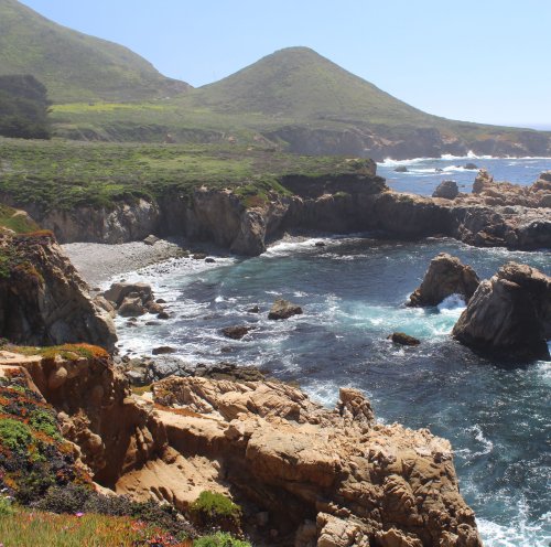
Follow along step by step or use the resource photo to create something more your own. Enjoy!
Whenever you’re ready! The lesson is available online any time, and your access to the lesson never expires.
As long as you need! Your access never expires, so you can come back again and again.
Sorry, no you can’t download the video. This is to avoid piracy. You’ll always be able to view the video on this site though.
Richard is a talented full time artist, who loves painting and teaching.
Hi I’m Richard. I’ve been painting my whole life and back in 2001 I traded my graphic design career for the humble life of a full time artist. I love painting, and as it turns out, I love teaching too.
Nowadays I balance my life between parenting, painting, surfing, travelling and teaching. My work is regularly featured in international art magazines, in galleries in New Zealand and America, on TV and in my Mum’s house.
I give outdoor painting workshops in interesting spots around this beautiful planet of ours and love encouraging people to paint. Two of my favourite artists are John Singer Sargent and Joaquín Sorolla.
My painting website: www.nzpainter.com
I’d love to be your new teacher.

Richard is a master artist with an exceptional skill in identifying and communicating key factors to making successful paintings. I have found his video workshops an excellent resource for improving my own work.
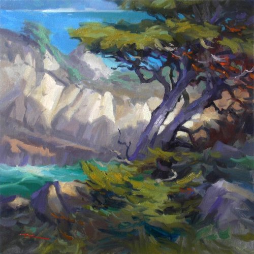
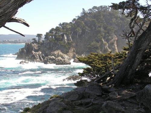
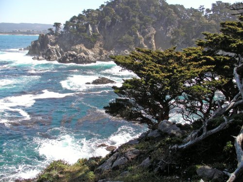
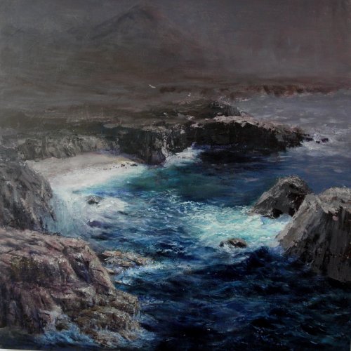
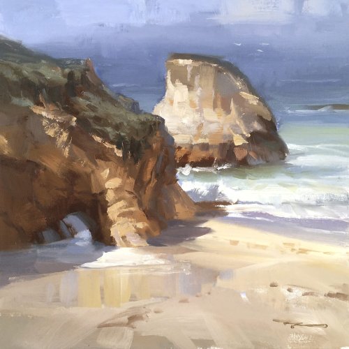
"Point Lobos" by Richard Robinson
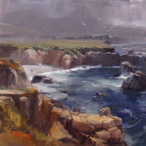
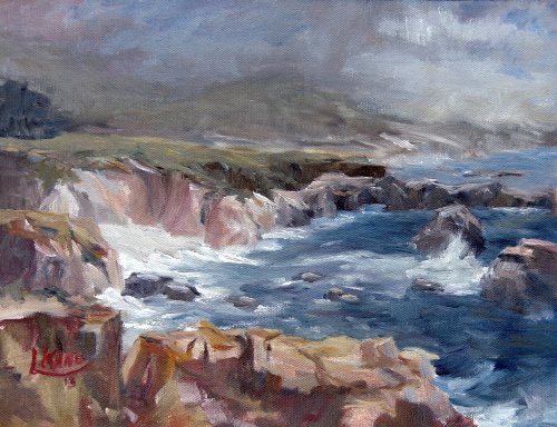
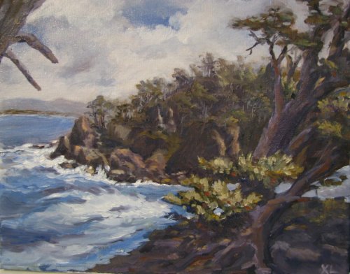
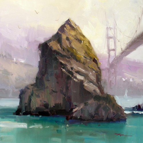
"Garrapata" 12x12" Oil on Canvas by Richard Robinson
"Workshop 24" 9x12" Oil on Canvas by Linda L. Kano
Linda it's great to see you achieving this level of painting. Looking back over your work I can see a steady improvement but as often happens with enough brush time this one has taken a leap ahead. Sometimes it all comes together for a few blissful hours and everything seems to fall into place nicely, and that seems to have happened here. I'm impressed with the motion in this painting and the fluid brushwork and the subtlety of your colour work against the greys, but most of all, after comparing your previous work I'm delighted with the simple variety of your rock forms - you've made a tricky thing look easy, especially in the foreground where you've managed to juggle all those slightly different hues and at the same time built a convincingly simplified rock structure, seemingly with little effort. If I have to pick something I'd change it would only be the 1,2,3 spacing of your small rocks strung across the water, probably by removing one, and to clear up the slight muddiness obscuring the distant coast.
"Brittany" 50x40cm Oil on Canvas by Suzanne Louise Andrew
Suzanne it's great to see the extent to which you've changed the original scene to create this painting. You've made it more exciting that the photo which is always a good goal when painting from a photo. There's something so dramatic about a spotlit landscape against a dark grey background that just gets me every time and you've certainly achieved that here. You might also have tried casting the whole foreground into a soft shadow (which could still be done with glazing) to add to the lighting effect. The cliff face itself could do with a little more obvious structure - the lighter yellowish shape on top adds a dash of colour interest but the form of it is detracting from the shape of the hill rather than adding credence to it. Specifically, the large yellow shape is mostly the same colour and value which suggests flatness rather than a rounded hillside or even a broken rocky face. You've invented it yourself which is great but I feel like you've stretched beyond your understanding and need some photo resource to plan that hill a bit better. I love the energy of your brushwork in the sea foam and the rich texture you've built up in the hillsides and the whole of the background has a beautiful mystery about it. Good work Suzanne.
"Garrapata Study 2" 11x14" Oil on Canvas by Xiao Li
Hi Xiao, this is a good painting with a few things I'd change. First of all the good points though... nice fluid brushwork, subtle light and shadow on the water, interesting composition. Here's what I'd change - I read your comments about your battle to lighten the landscape and push it back in space and you're right you haven't quite achieved it, but being aware of the problem is the first step to fixing it. Check out the painting of point lobos I did below. There's a bigger value difference between the foreground and the mid ground than in your painting and I've especially lightened the background behind the tree which is my centre of interest. In your painting, to establish the more distinct value difference I would have first of all laid down the darkest dark in the foreground and then the darkest dark in the midground. That makes it easy to make value choices from there on in. Behind your tree I would have lightened the background even more, thinking of light through seaspray. Otherwise it's all good and the only other thing I would change is the shape of the branches in the top left because they're too similar.
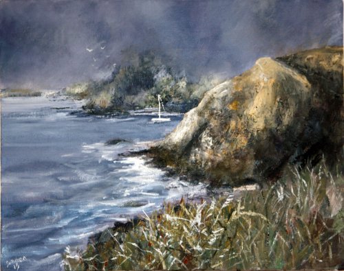
"Lighthouse Beacons" Oil on Board by Lori Ippolito
Hi Lori that's a great glowing spotlight effect you've achieved - very striking! You've taken the grey vs colour concept and used it to good advantage. You chose a very difficult photo to work from which has relatively flat lighting on a very complex collection of non descript rocks so I applaud you for taking the challenge where you've had to change and imagine so much of the scene to distill a decent painting from it. The biggest challenge here was describing the form of the landscape while playing that big spotlight over it and you've done a good job of that, although I can see it was a real labour in the foreground and all that thick muddy grey there could do with scraping and rethinking. I try to keep my darks fairly thin and loose and save the impasto for the lights because light sparkling off impasto darks spoils the illusion of shadow. Your softening and greying of the distant hills has helped hugely with adding depth to the painting. The gulls are a nice touch but I wouldn't have them cloned and flying in formation - I'd change their size and angle and placement. The one big thing I'd like to see changed in the landscape is the repeating shapes of the main spotlit rocks and the green covered rocks directly beneath it. It's less obvious because the two shapes are different colours but once you see the duplication it it's hard to ignore it.
"Californiascape" 60x60cm Acrylic on Canvas by Guðmundur Valur Magnusson
A very dramatic painting Guðmundur! You've really taken the idea of contrasting colour against grey and made a powerful statement with it. My brain is saying 'it should have slightly more colour in the top third' and that might lend it some more realism in terms of a recognisable weather/lighting effect, but then again, with that forboding ashen greyness you've given the painting such mystery that it's enticing to look at and puzzle over and it certainly leaves the blue as the star of the show. Your drawing and perspective is great and the detail you've achieved in the water which the larger canvas has allowed is captivating. It's great to see you've used a range of interesting brushwork and techniques from wet in wet to impasto knife work to scumbling and glazing to build up the paint surface. Perhaps my only reservation I have would be to break the line of the base of the rock which is just skirting the bottom left corner as it seems to me to be sqeezed into the frame with not enough room to breath. I such cases I either run the rocks out of the bottom edge or push them further up the picture plane. Despite that you've done well to shadow that area enough so that it's not a big problem. Great work Guðmundur, and I bet it looks pretty striking on the wall with a spotlight on it.
$15.00USD
$45.00USD
$15.00USD
$15.00USD
Not loving your painting lessons? No worries!
If it’s not the right fit, we’ll give you a full refund within 30 days of purchase - no questions asked.
When you purchase a DVD you also get online access to the same lesson, including any lesson resources like photos, downloadable notes and access to upload your painting to the student gallery.
That's why you need to make a password when you purchase a DVD, so you can access the online content as well. Enjoy!