Teacher
Richard is a talented full time artist, who loves painting and teaching.

with Richard Robinson
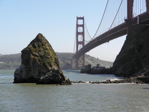
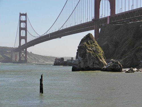
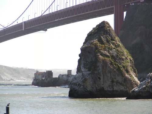
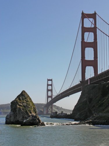
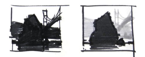
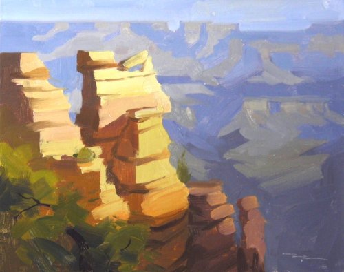
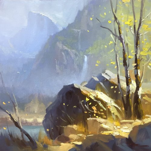
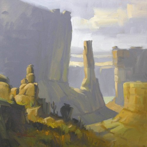
What is about about rocks that we love so much? Their timelessness in a fast paced world? Their simple surety? They rock? Whatever it is, I sure get a lot of requests to do rock demo’s, so here we go – this one’s perhaps a tad larger than what you might traditionally start out with, but the principles are the same from stones to mountains.
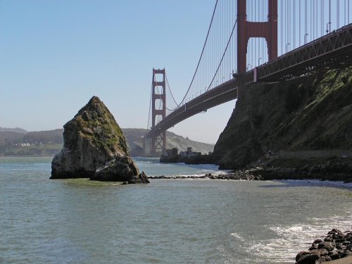
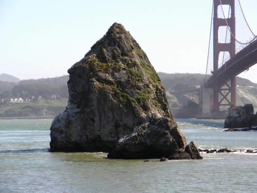
Join me to learn how to paint convincingly solid rocks. Follow along step by step or use the resource photo to create something more your own. Enjoy!
Whenever you’re ready! The lesson is available online any time, and your access to the lesson never expires.
As long as you need! Your access never expires, so you can come back again and again.
Sorry, no you can’t download the video. This is to avoid piracy. You’ll always be able to view the video on this site though.
Richard is a talented full time artist, who loves painting and teaching.
Hi I’m Richard. I’ve been painting my whole life and back in 2001 I traded my graphic design career for the humble life of a full time artist. I love painting, and as it turns out, I love teaching too.
Nowadays I balance my life between parenting, painting, surfing, travelling and teaching. My work is regularly featured in international art magazines, in galleries in New Zealand and America, on TV and in my Mum’s house.
I give outdoor painting workshops in interesting spots around this beautiful planet of ours and love encouraging people to paint. Two of my favourite artists are John Singer Sargent and Joaquín Sorolla.
My painting website: www.nzpainter.com
I’d love to be your new teacher.

Richard is a master artist with an exceptional skill in identifying and communicating key factors to making successful paintings. I have found his video workshops an excellent resource for improving my own work.
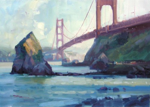
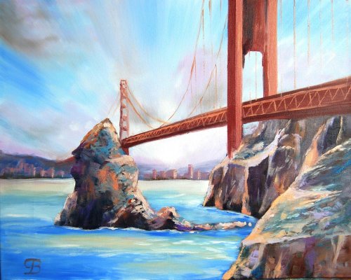
"Golden Gates" 12x16" Oil on Canvas by Richard Robinson
(Painted en plein aire)
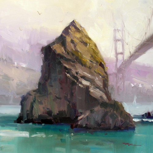
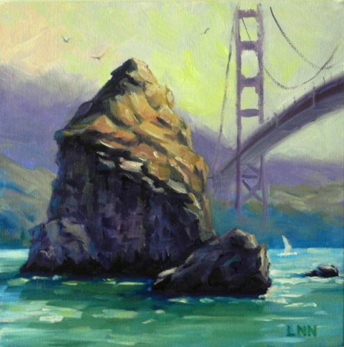
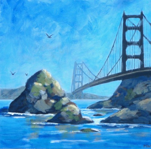
"Golden Gate" 13x13" Oil on Canvas by Richard Robinson
"Golden Gate Bridge - San Francisco - California - USA" Oil on Canvas Paper by George
George this is a pretty striking painting, helped by a well balanced design with the foreground nicely leading us in and your zoomy clouds pushing our eyes back in from the top. Couple of things I'd like to see are the blue in the water grayed down a smidge because it hits my gaudy button, the horizon to not step down behind the rock, and for there to be some evidence of atmospheric recession in the bridge. At the moment the colour and value of the distant bridge is telling me it's been built on the back of the big rock but the good drawing of the bridge is saving it somewhat. You just need to grey and lighten the colour of the bridge as it receeds. I like the interesting paintwork on the rocks which has a natural sort of randomness to it. Again there could be evidence of a reflection of the rock in the water which would add more interest and realism there. Good work George.
"A Rock" 30x30cm Oil on Canvas by Ningning Li
Great painting Li, love your bold colour and strong contrasts. I think enlarging the bridge slightly as you have done was a good idea in terms of balance but it does irk me a little that the top of the bridge finishes right at the top of the canvas. Also you could have given a little more information about how the bridge uprights connext to the land - looks a tad unfinished there to my eye. Minor things. Overall it's terrific and I love the solid brushwork. Good job!
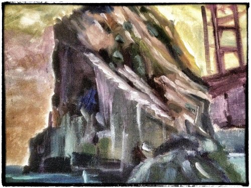
"Rock Picture" Oil on Canvas by Diane Bialecki
A really bold design Diane and bold suits the subject so it works on two levels. You've broken the space into interesting shapes. The bottom right quarter seems a little lost in terms of structure though - perhaps a larger darker value shape would be good in there? I do like how you've cropped the top of the rock off as though it's too big to take in with one glance. Strong colour usage - you've contrasted grays with small touches of more vibrant colour and you have plenty of variation within the greys to keep me interested. Although the background colour gradation up the left side of the canvas is interesting I can't help but feel it would have been even more interesting to just add a subtle hint of something else in the background like the distant shore or the bridge carrying on. Looking a the shadow side of the rock there it looks to me like a few of those lighter strokes could have been ommitted or darkened to retain the simplicity and boldness of the large shadow shapes there. It's always tempting to over-lighten the reflected lights to add more oomph but there's a price to pay in the loss of realism, the weakening of form. Overall it's very powerful though and I'd like to see some more in this style.
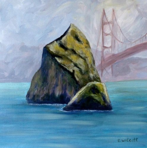
"The Rock - Golden Gate Bridge" 11x11" Acrylic on Canvas Paper by Tammy Wolcott
Hi Tammy, not your best painting - but a tricky subject for sure, especially with acrylics because much of it is dealing with softer blends of colour. The brushwork in the sky is bold and interesting although it did get a little muddy around the bridge. Working back and forth with it tends to sort that out. ie. painting the sky then the bridge then the sky then the bridge. Similarly the water could do with some more work and some vertical strokes in there to give some evidence of the reflections on the rocks, which you've avoided. Those reflections help to anchor the rocks in the water - without them they float a bit. You've kept your eye on the direction of the light which is good but your darks look a little too dark, giving the feeling of holes rather than shadowed areas. The horizon could be flatter too. One thing's for sure, not every painting is going to be a masterpiece, but every one is a stepping stone - that's what I keep telling myself anyway.
"The Rock" 30x30cm Acrylic on Canvas by Maria Woolrich
Not too shabby Maria! Good drawing skills and a good sense of the direction of the light and form of the rocks. Looks like you've used burnt sienna or raw umber as a base for the colours in your rocks (I'm guessing). I used to do that too but found that the brown muddies too much of the other colours - it's hard to get away from it so I don't have it on my palette anymore. You're bridge could be a bit light on the far side - see how it's pushing forward of the land it's supposed to be resting on? Values. You missed out on adding the slight reflection of the rocks in the water which helps the water look more realistic. Also the rocks cast shadows on the water should be more of a blue grey rather than a brown grey. If you introduce more colour variation into your sky and rocks and water they will be more interesting - yes, harder to control as a painter, but more interesting for the viewer. You'll get there. Doing great already!
$15.00USD
$15.00USD
$15.00USD
$15.00USD
Not loving your painting lessons? No worries!
If it’s not the right fit, we’ll give you a full refund within 30 days of purchase - no questions asked.
When you purchase a DVD you also get online access to the same lesson, including any lesson resources like photos, downloadable notes and access to upload your painting to the student gallery.
That's why you need to make a password when you purchase a DVD, so you can access the online content as well. Enjoy!