Teacher
Richard is a talented full time artist, who loves painting and teaching.

with Richard Robinson
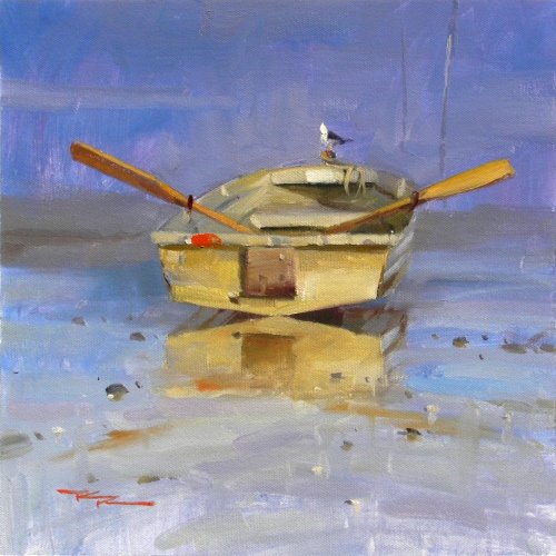
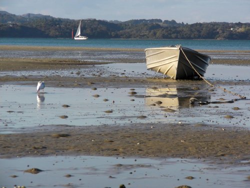
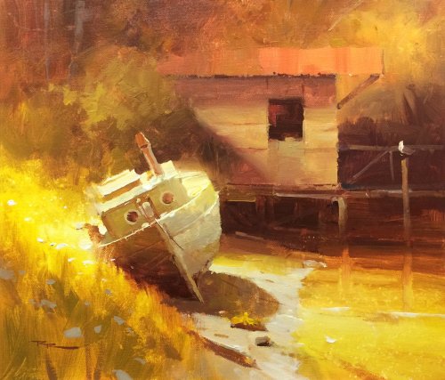
Following on from the previous workshop which explored how to paint more loosely, we’re now going to look at staying loose in the background but really tightening up in the centre of focus. It’s a style reminiscent of some classical portraiture in that there’s just one central focus area and the rest is supporting colour, but in this instance we’re really having fun splashing paint around.
You will find that adding little points of detail like the stones and shells in the foreground can make sense of all that loose paintwork. I hope you enjoy the video and have fun exploring this concept.
Whenever you’re ready! The lesson is available online any time, and your access to the lesson never expires.
As long as you need! Your access never expires, so you can come back again and again.
Sorry, no you can’t download the video. This is to avoid piracy. You’ll always be able to view the video on this site though.
Richard is a talented full time artist, who loves painting and teaching.
Hi I’m Richard. I’ve been painting my whole life and back in 2001 I traded my graphic design career for the humble life of a full time artist. I love painting, and as it turns out, I love teaching too.
Nowadays I balance my life between parenting, painting, surfing, travelling and teaching. My work is regularly featured in international art magazines, in galleries in New Zealand and America, on TV and in my Mum’s house.
I give outdoor painting workshops in interesting spots around this beautiful planet of ours and love encouraging people to paint. Two of my favourite artists are John Singer Sargent and Joaquín Sorolla.
My painting website: www.nzpainter.com
I’d love to be your new teacher.

Richard is a master artist with an exceptional skill in identifying and communicating key factors to making successful paintings. I have found his video workshops an excellent resource for improving my own work.
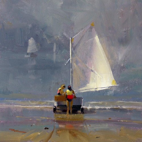
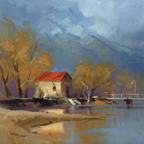
"Smooth Sailing" 10x10" Oil on Canvas by Richard Robinson
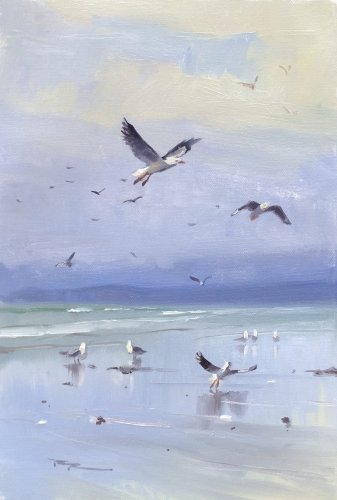
"Sea Life" 12x11" Oil in Canvas by Richard Robinson
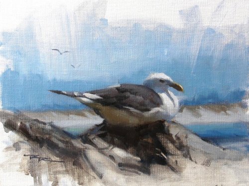
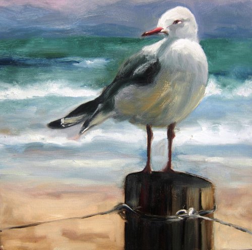
"Seagull" 8x10" Oil on Canvas by Richard Robinson
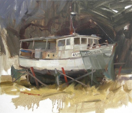
"Lady Isla" 13x12" Oil on Canvas by Richard Robinson
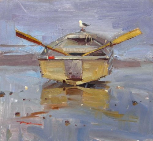
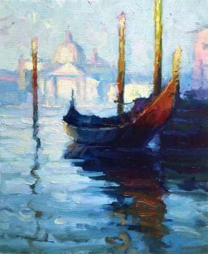
"The Dinghy" 11x11" Oil on Canvas by Richard Robinson
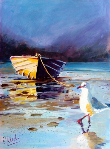
"Not Another Dinghy!" Acrylic on Canvas Board' by Pauline Le Merle
A very striking piece Pauline and very graphic with its inky darks and vibrant colours. I love the diffused background contrasting the sharp as steel details in the boat - very punchy, and you haven't let the drawing lapse at all there although the bird has been rendered a little more roughly. Similarly for those stones to sit right you'd need to pay more attention to the shape of their bases and reflections. Design wise it might have been nice to extend the darkness in the water horizontally across behind the gull's head to give him even more pop and if you had added the soft halftone between the light and shadow on his neck he would have looked more rounded, less flat. Actually you've done such a dramatic job of the rest of the painting you could probably take out the seagull altogether without much trouble. Very bold work! Thanks Pauline.
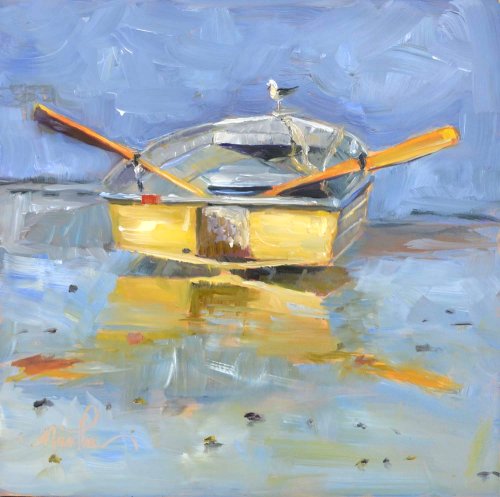
"Dinghy" by Martha Lever
Wow just look at the energy in this! Your brushwork has really caught my eye - the whole canvas is alive and vibrating with it. Great to see you've even mixed your colours on the canvas sometimes giving us some truely juicy paintwork to revel in - something that looks easy but can be a real challenge if you're used to mixing colours thoroughly on the palette before appying them. Some of the accuracy of the drawing was unfortunately sacrificed for your vivid brushwork, particularly in the oars and the shape of the back of the boat where the right side is longer the the left and their reflections have gone astray as well, but other than that the interior of the boat is sound and your seagull looks pretty healthy too. With brushwork like this you could consider foregoing accurate rendering altogether and allowing the forms to attain a playful expressive quality all their own. I look forward to seeing what you make out of the next workshop which pushes the expressive qualities of paint even further. Great work Martha.
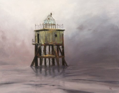
"Dundy Lighthouse" Oil on linen, 14 x 18" by ÞorgrÃmur Andri Einarsson
The mood of this painting is the first thing that strikes me ÞorgrÃmur, because you haven't just painted a scene, you've captured a feeling, or at least you've reduced the gamut of feelings this painting might elicit in a viewer, narrowed it down and pushed us in one direction. Thanks for reminding us again of the power of a limited palette, or a colour 'gamut'. I love the contrast of the crisp detail in the ladders and fixings compared with the big soft gradation in the background, and that's really what this workshop was all about so congratulations on fulfilling the brief to the letter. Great to see the subtle vertical shift in hue that you managed in the background from reds to blues to yellows as you lightened it at the same time - good control of colour there. The way you softened the edges of the foreground ripples is pretty masterful too as it pushes us back into the focal area - great! The only thing I might look at changing in this painting is to add the faintest hint of a boat in the distant mist on the right to add to the narrative. Good stuff.
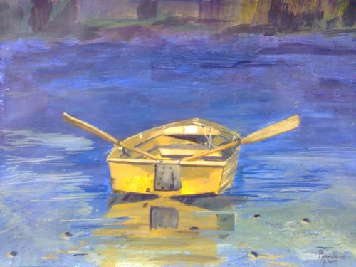
"Dinghy..." Acrylic on Paper, 13 x 9" by Silvana M Albano
Good work Silvana - great to see you've really explored the idea of tight vs loose painting with all your crisp detail in the boat constrasted with the almost abstract background. Your colours are strong but with enough grays to lend them subtlety and I have to congratulate you on slightly toning down the reflected boat colours which is something I failed to do in my demo painting as I mentioned in the video. It looks like you played with the idea of adding ripples on the water with a fine brush but wasn't too sure about it and fudged them a bit on the left which seems to flatten out the illusion of space there. Using a large brush with its bristles spread could achieve a similarly detailed effect but without the struggle. You can do that by loading the brush with paint and then pinching the bristlesnear the ferrul and splaying them a little, similar to the interesting effects you've achieved at the top of your painting. Speaking of which I think it's a nice touch to have balanced that empty space with a little darker interest as you have done along the top. Nice splatters too! Keep up the good work.
"Workshop19" WS Oils on Canvas 12x12' by Darya Vassina
Nice design Darya leaving space on the left for the gull to peer into and balancing the canvas delicately with the dark wave face on the left and the beautiful crisp detail of the wire. Making the top third of the background quite dark to accentuate the light on the gull was also a very nice idea which is helping to balance the dark post. It may just be the exposure of your photograph but that post does look unnaturally dark which agrees with my resource photo but falls short of natural lighting - one of the pitfalls of working purely from photos. The form of the bird is quite convincing in your sensitive treatment of light to dark ('modelling') but you have rounded his corners off a bit (he looks more angular to me) so tha has weakened his presence and believability a little. Be a little more careful too in the shadowed belly to keep the values close together because that's creating some confusion of form there at the moment. It's a very common error to make reflected lights too light. They belong in the shadow family. Your brushwork is really quite lyrical and appealing especially with its contrasts of soft and sharp edges - nicely done, and that sharpest of accents on the beak is the crown jewel. I noticed you bent the wave around his tail rather than letting it overlap which doesn't seem like a good idea to me since overlapping forms helps us so much in establishing depth. Overall a very pleasing painting - would love to see it finished in a nice frame. Great work!
$15.00USD
$15.00USD
$15.00USD
$15.00USD
Not loving your painting lessons? No worries!
If it’s not the right fit, we’ll give you a full refund within 30 days of purchase - no questions asked.
When you purchase a DVD you also get online access to the same lesson, including any lesson resources like photos, downloadable notes and access to upload your painting to the student gallery.
That's why you need to make a password when you purchase a DVD, so you can access the online content as well. Enjoy!