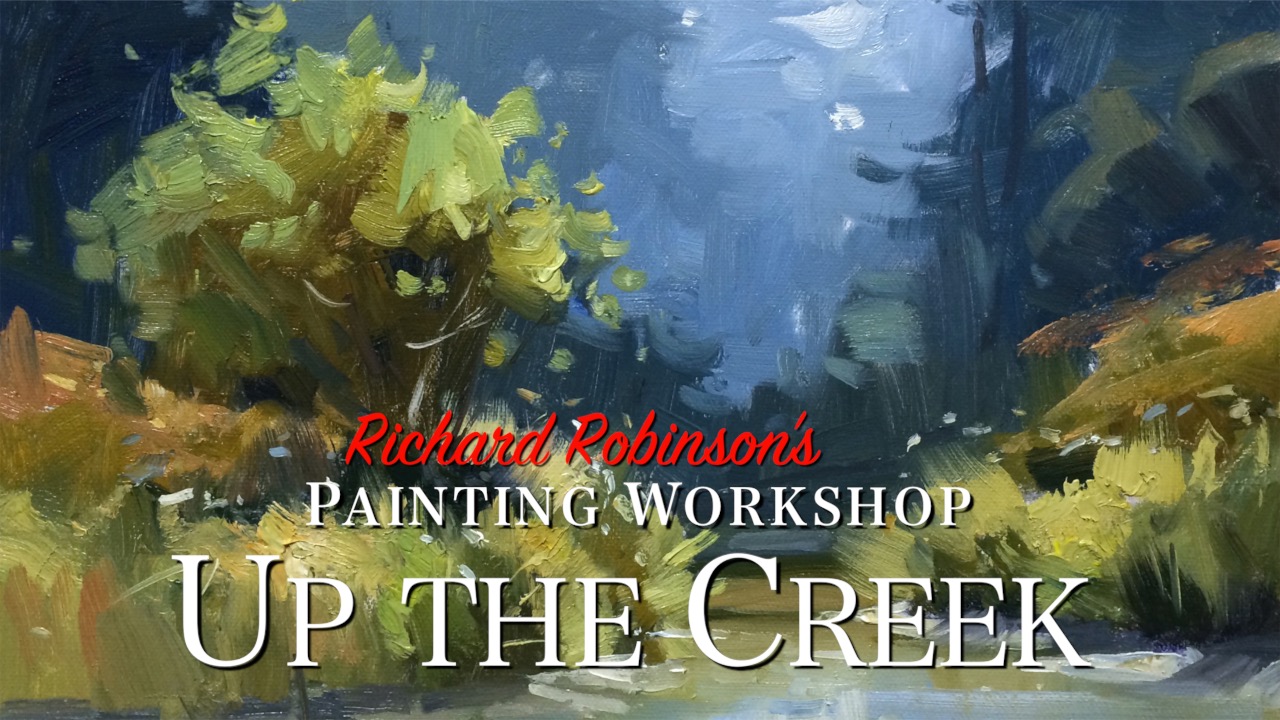
Every month on mypaintingclub.com we run an online group workshop for Premium Members. 5 of the student paintings get critiqued and included in the International Art Magazine. You can learn from their painting critiques what works well and what could work better. Enjoy!
Get the video lesson here: https://mypaintingclub.com/lessons/81-Up-the-Creek
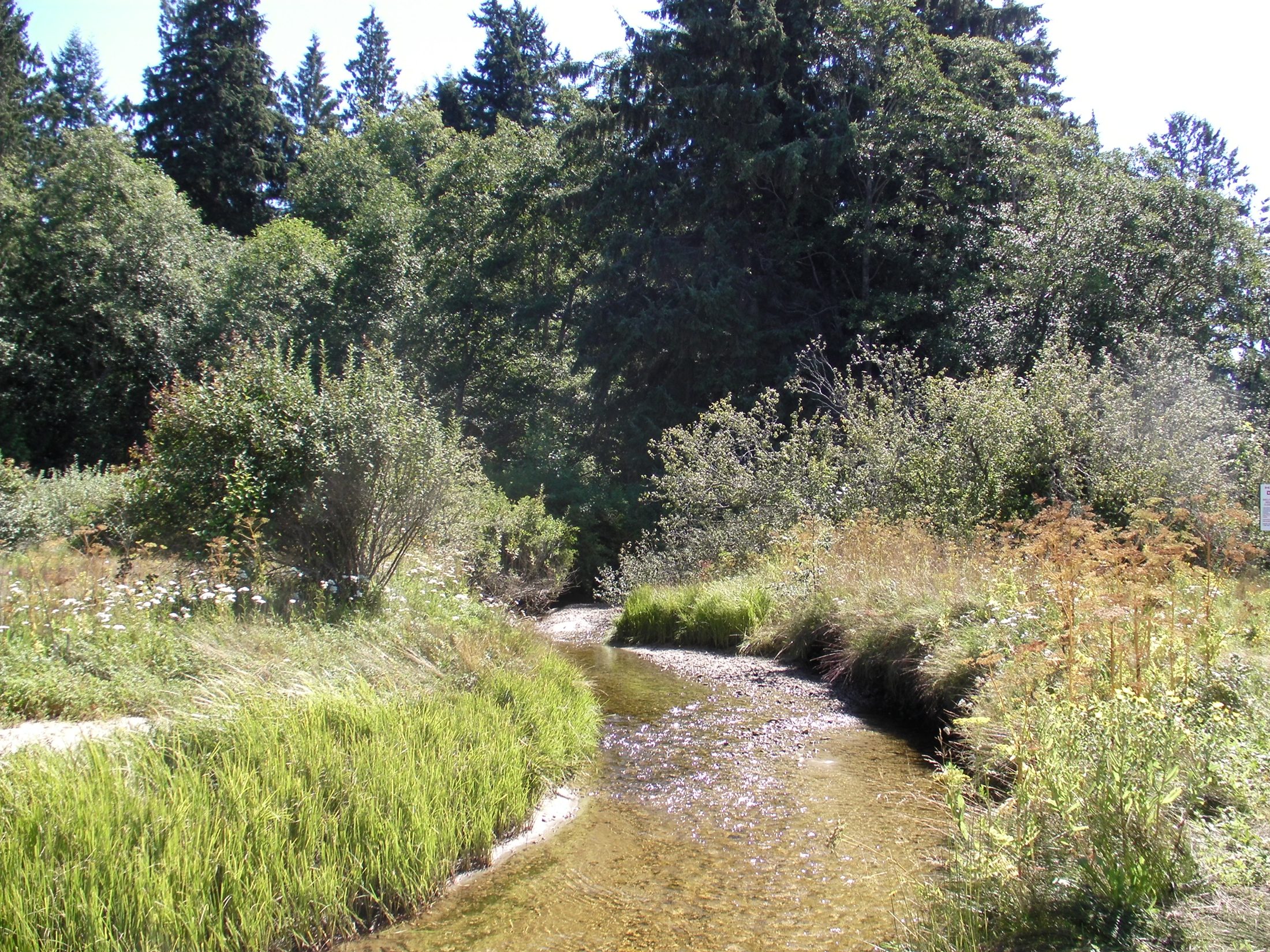
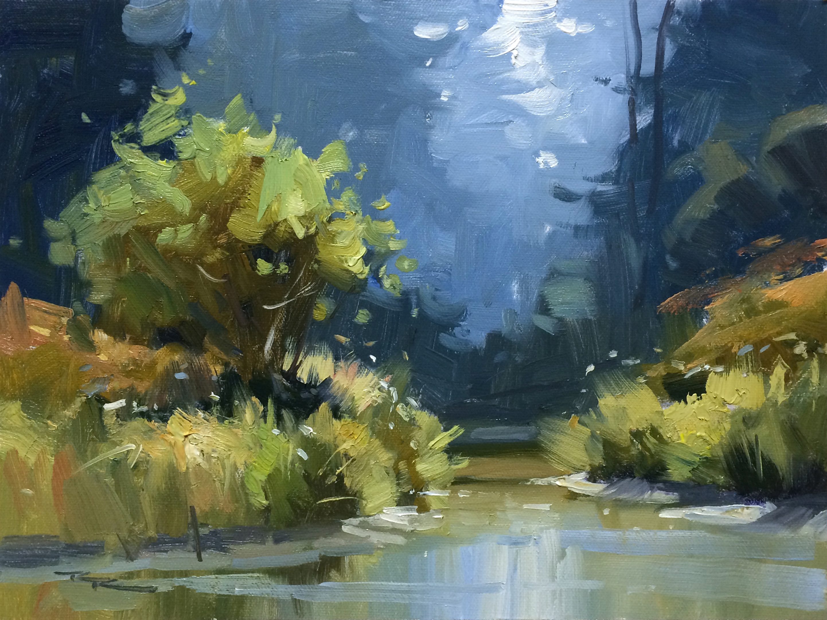
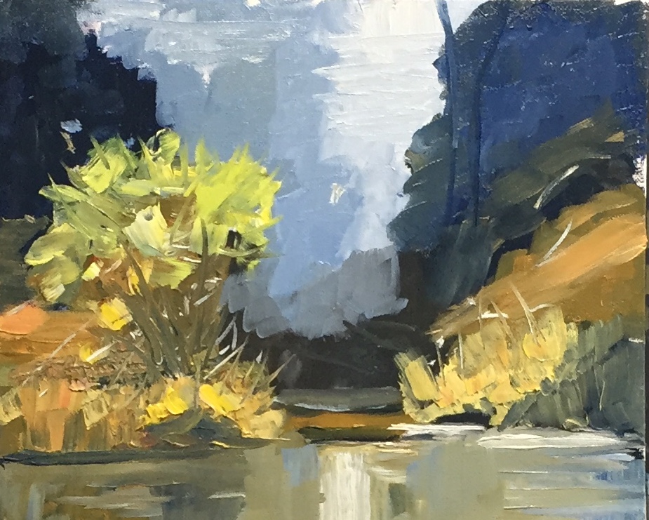
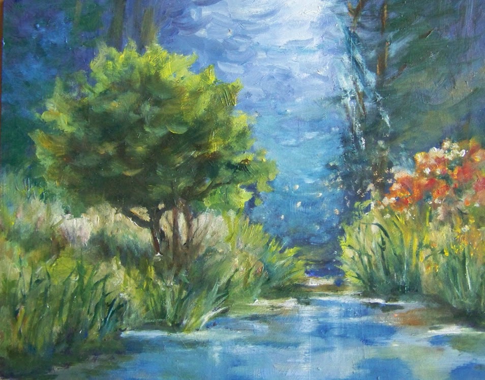
"Up the Creek" 11x14" Tutor Painting: Richard Robinson
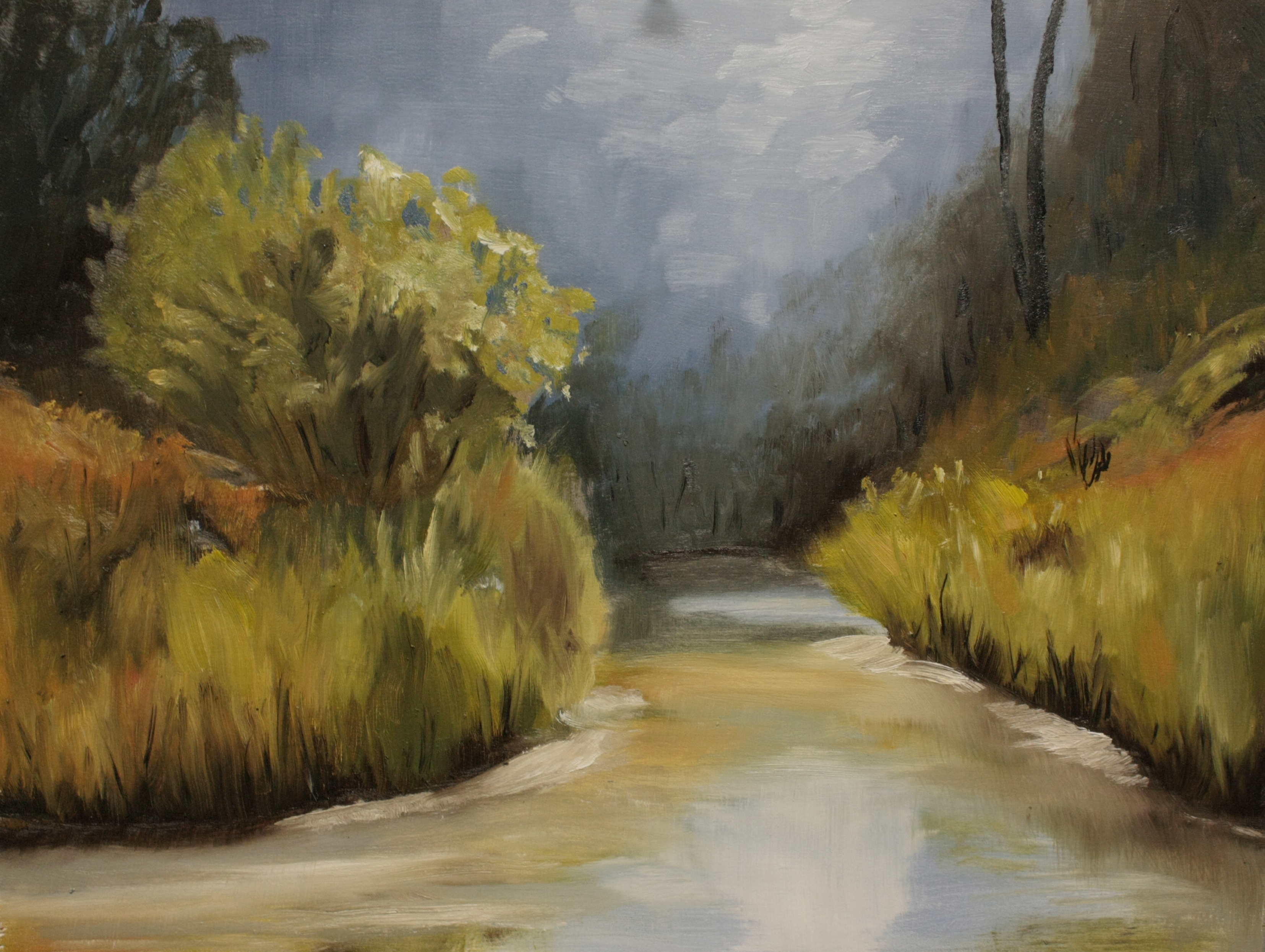
River Reflections by Lindsay Shaw
Great work Lindsay. You've thought about modelling with light and shade a lot and that's paid off. Nice to see a big contrast in soft and hard edges, although I feel you've missed that opportunity in the water, which has a lot of hard edges in those vertical strokes. If you soften those off the water will look more water-ish and the textured grasses will have a cleaner stage to dance on.
Up the Creek by Richard
Nice bold work Richard. Makes me think of Richard Claremont's work in Australia. Plenty of juicy thick paint! Your lights in the foreground foliage have been muddied a little by mixing them in with the darks. To avoid that I usually try to keep the lights separate from the darks by painting the darks first, then a midtone working out from that, and then the lights working into the midtones. It's when the lights hit the darks that things get muddy.
16X20 oil on mahogany plywood by Frank Brooks
Hey not bad at all Frank! Very Monet in fact. All those little brush strokes have a nice fluid rhythm to them. Perhaps the lights in the sky could stand with being vertical strokes though - they kind of break the flow you've got going on. A little more tree shape interest back there wouldn't hurt either. Overall very nice though. Sign that puppy!
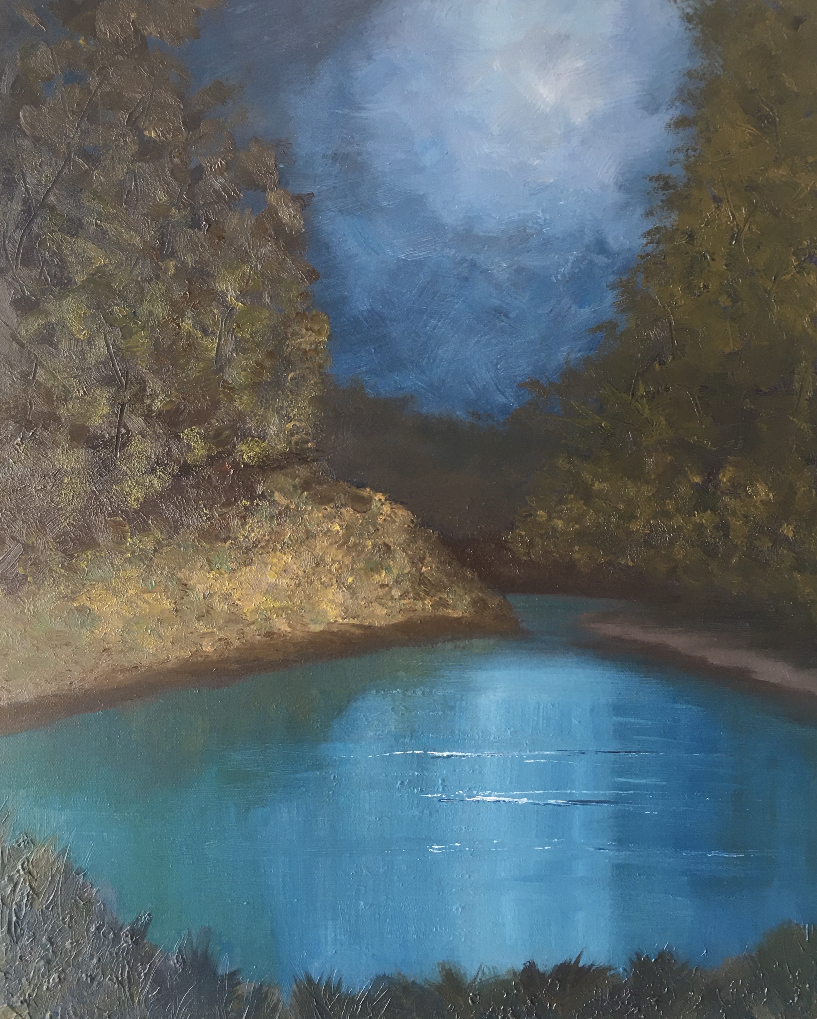
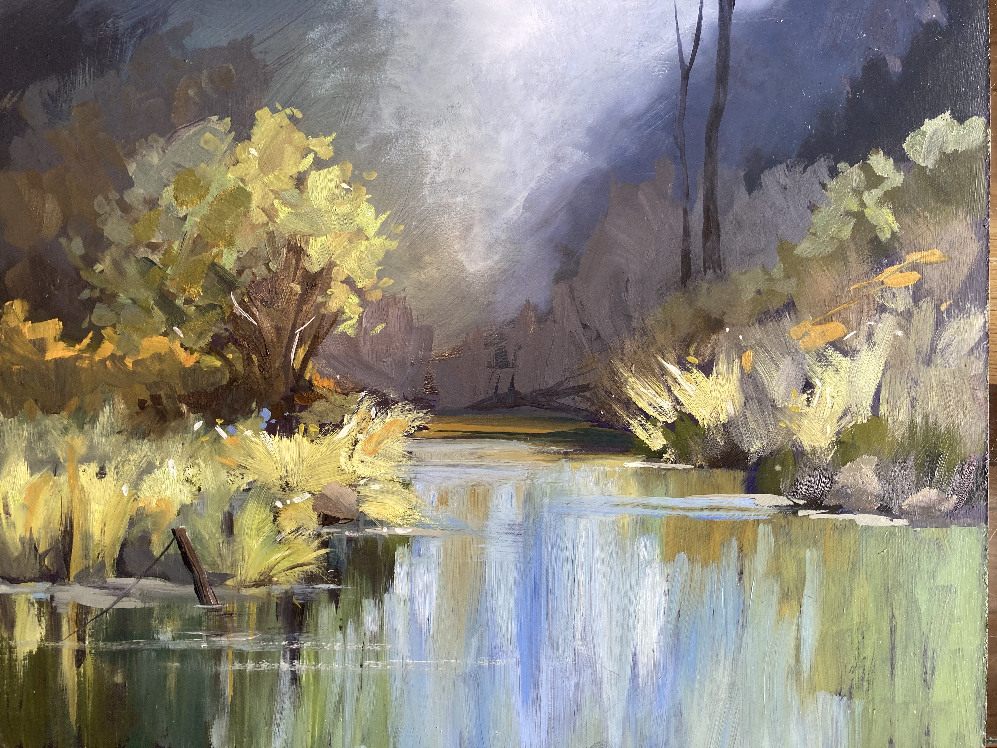
The Creek by Barbara Magor
Well you've gone all out this month Barbara with THREE paintings! GREAT! This one's got a nice kinda moonlit feel to it - very tranquil. Good work creating a spotlight effect and that water looks great too. You've really over-simplified the forms of the bank and the trees here. That happens when you paint more from your imagination than what you're actually seeing. I encourage you to keep looking hard at your subject to see what she's telling you about shape and form and light. Squint down and ask yourself, 'what are the main shapes that make that think look look that thing.' Then go ahead and paint those big shapes. Keep up the good work!
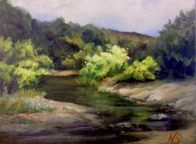
Up Another Creek by Nancy Sands
What a beauty, Nancy! Nice one!! You've got a whole lot of good stuff happening here. Love the play of light across the forms - you're really directing the attention like a master now. Subtle shadows across the foreground. Ooohhh! Nice! Love the rich colour of the reflected green too. Put that one in a big gold frame with some cherubs on it. Done!
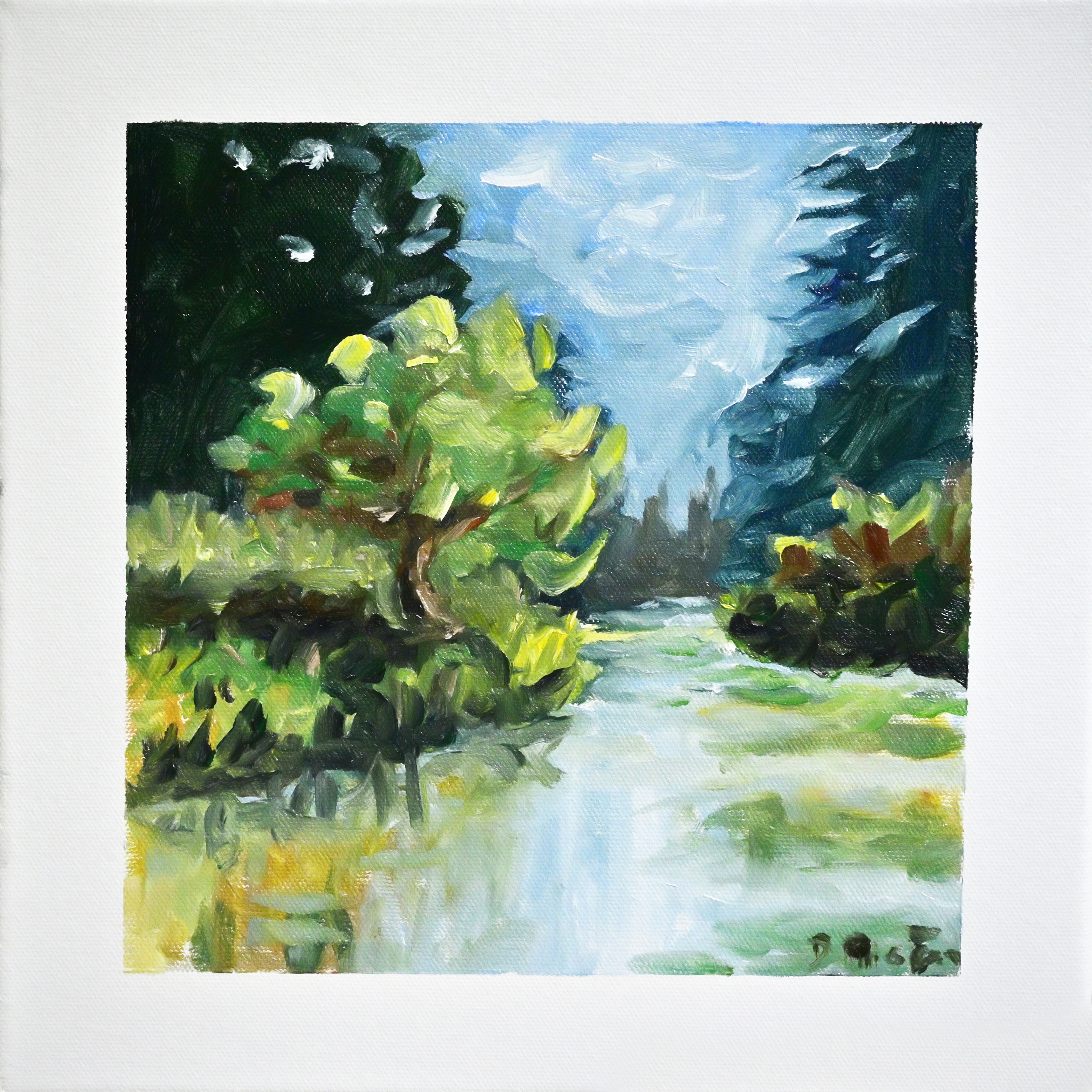
Dave Higgins
Wow that's some painterly work Dave, nice! That's kind of how I paint when I'm really happy and got some good tunes on. That freedom and joy comes out in the paint and gives everyone a touch of that same feeling. Great to see. Only thing I'd like to add to this is the little grey sandbanks with the shadows cast across them. Perhaps just because I know they were there, but it's a good opportunity for a little more colour interest and relief from the green. My two cents. Good work!
Up a Creek - Pamela Wissinger
Really nice work Pamela. Good brushwork and light and shadow treatment. Careful of making water too blue. Love the idea of the sun rays but they need a softer effect.
Great work everyone! Join us for this month's group workshop here: https://mypaintingclub.com/live-workshops
Get the video lesson here: https://mypaintingclub.com/lessons/81-Up-the-Creek
Login to your account to post a comment.