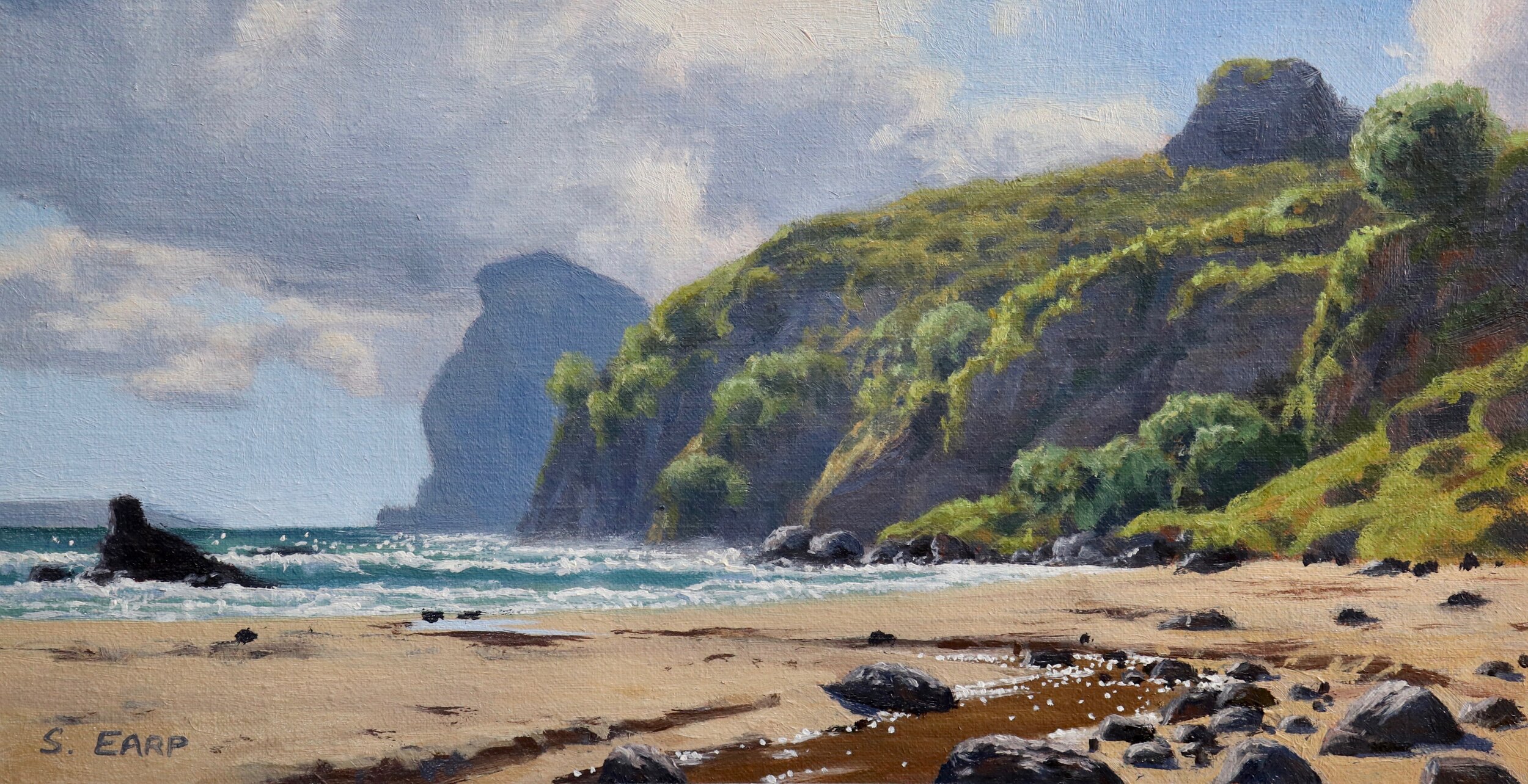
Good tonal dynamic and colour harmony. Some of the greens in the mid ground cliff are a little saturated. Keep in mind how saturated your colours are, you will find your most saturated colours in the foreground but as landforms recede into the distance many of those colours drop out especially greens. Greens can be desaturated by mixing in a colour that contains its opposite, red. Other than that this painting looks great and I love the seagulls.
Antonia Clark
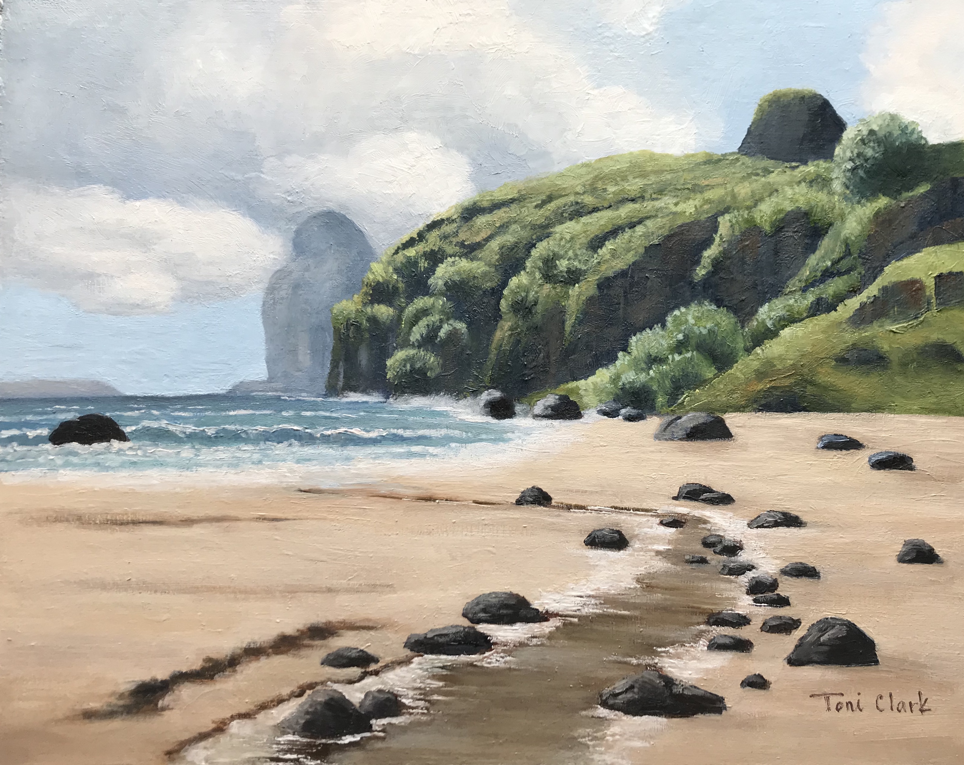
Nice work here Antonia, tonal dynamic looks pretty good. Perhaps the value of the cliffs in the mid ground could be made a little lighter so it sits back in the painting. You could also increase the saturation of the foliage in the cliffs in the right side of the painting, this is a little closer to the viewer and improve the atmospheric perspective. Overall the painting reads well, great job.
Sharon Repple
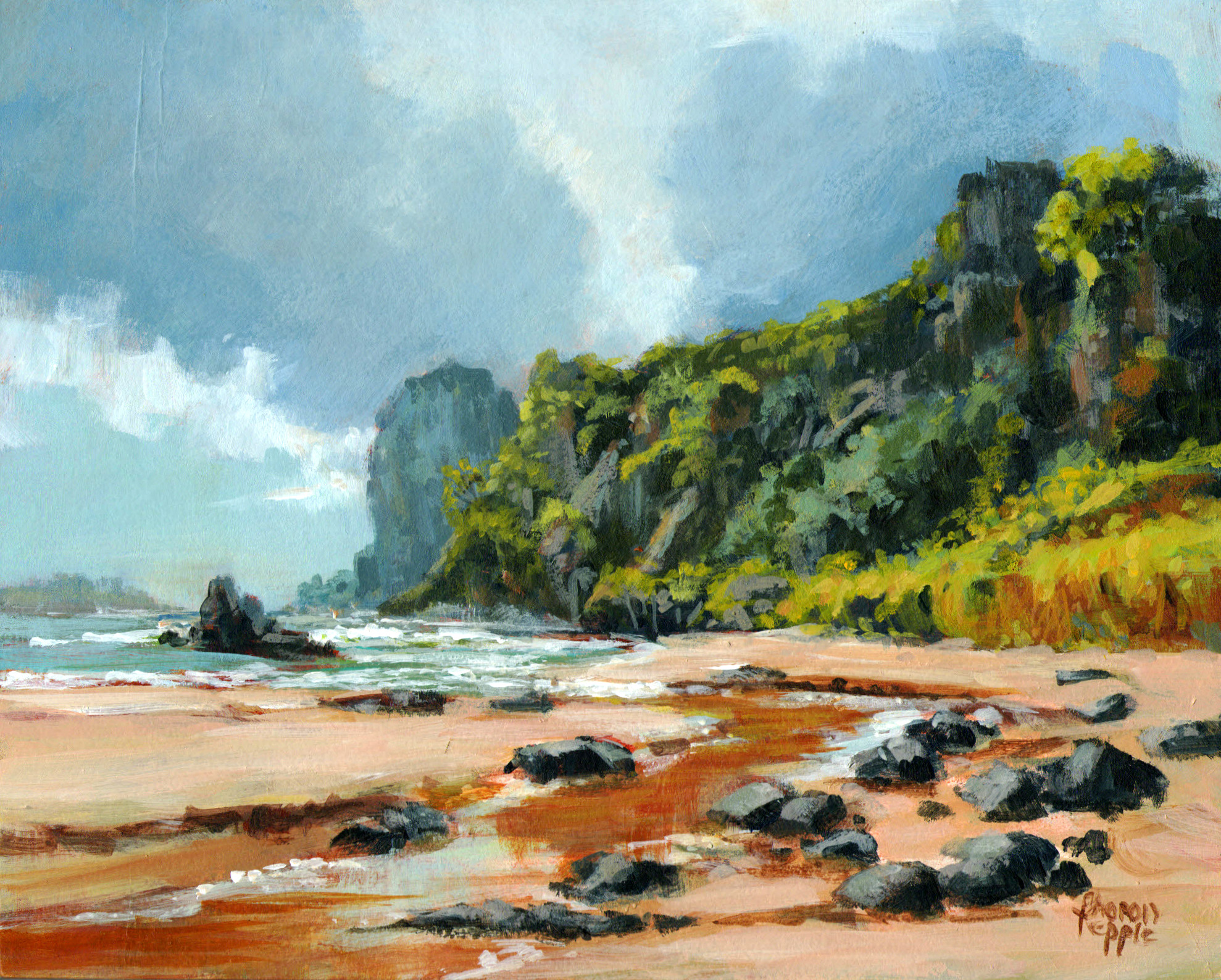
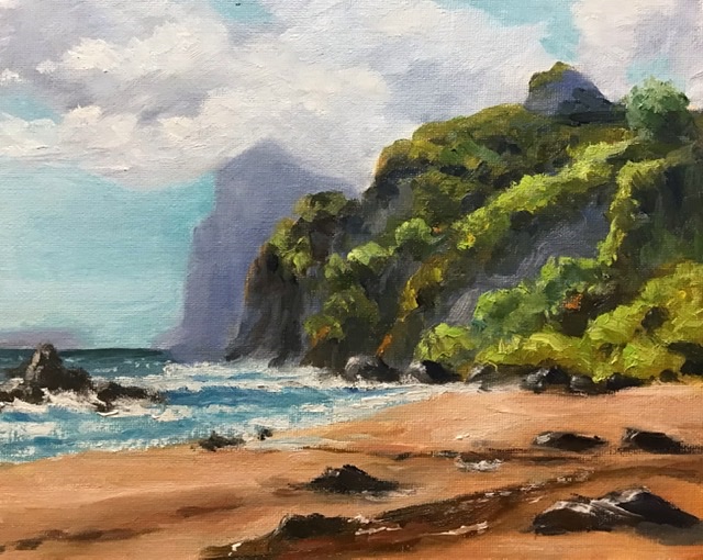
I love the painterly brush work in this painting. The values in the cliff shadows could be a little lighter and the foliage a little lower in chroma in order to make it sit back in the painting. You can desaturate a colour by mixing in a colour opposite. However this painting looks good and I love your use of colour, great stuff.
Elena Sokolova
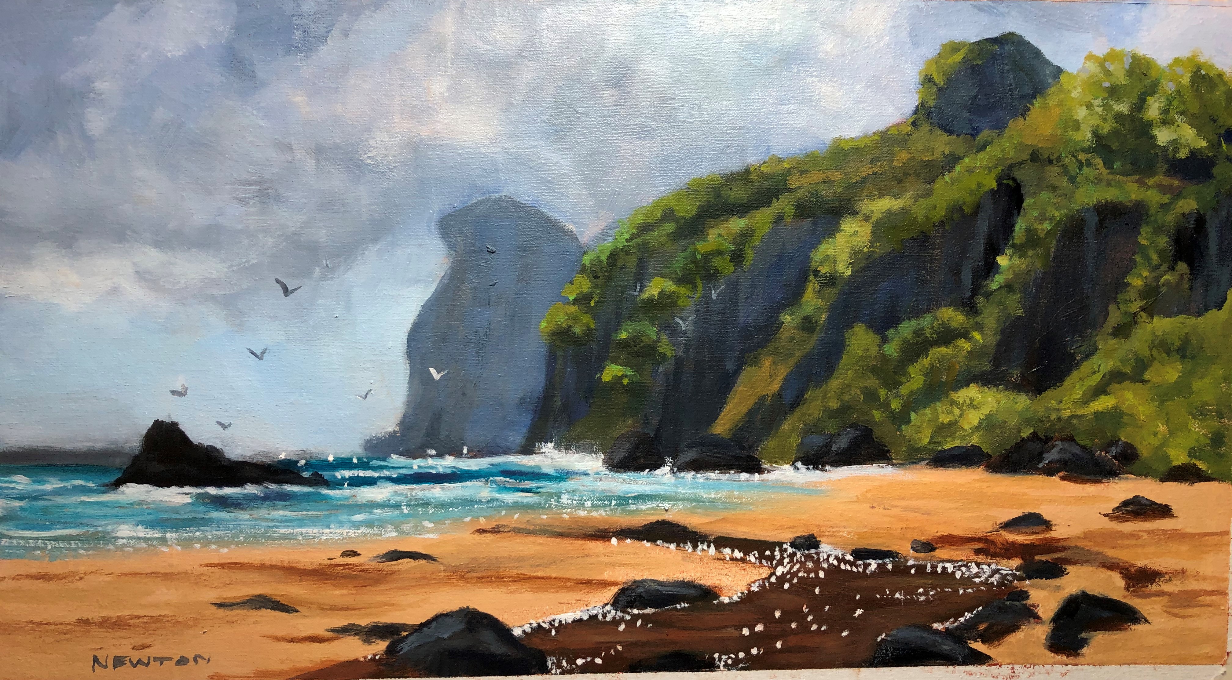
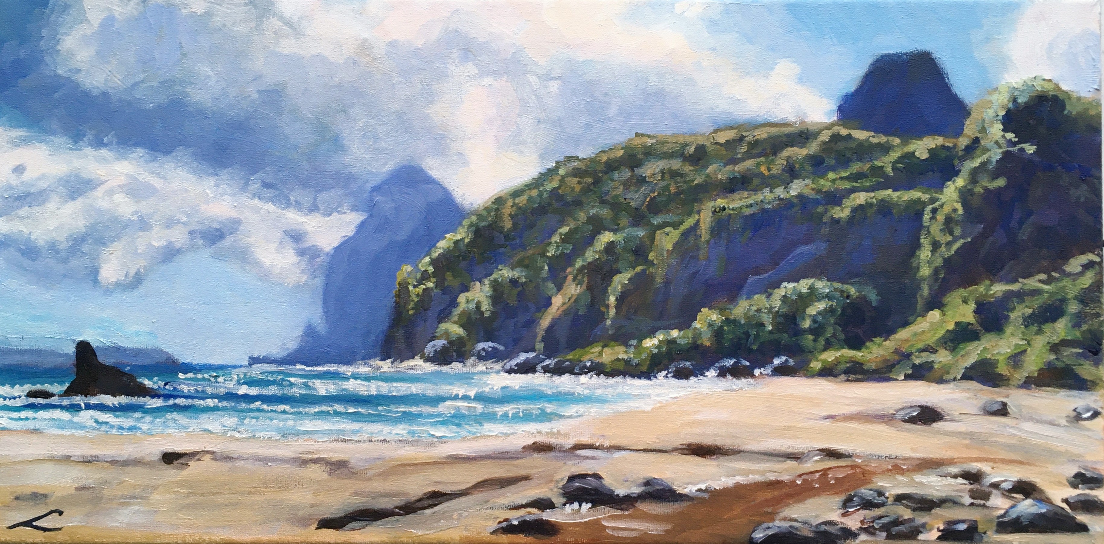
Nice work here, I love the painterly style of this painting. Keep an eye on the saturation of your colours, the blue in cliff shadows is a little too saturated and is making the cliffs come forward in the painting a little. You can desaturate the blue by mixing in more burnt sienna and as burnt sienna is a dark orange, orange is opposite to blue on the colour wheel. Apart from that your colours look clean which is great and the blue cast in your distant shadows (clouds and cliffs) looks good. Great job.
Reenie McCallum
I love the loose brushwork in this painting and the vibrancy of the vegetation on the cliffs. Pay attention to the values in your painting, the shadows in the mid ground cliff should be a little lighter so it’s not coming forward in the painting. Save your darkest values for the shadows in the foreground and then make your shadows progressively lighter as you move further back in the landscape. Other than that, I like the colour harmony and aliveness in this art work and I think it will be a great painting.
Thanks again everyone for your beautiful paintings.
Login to your account to post a comment.