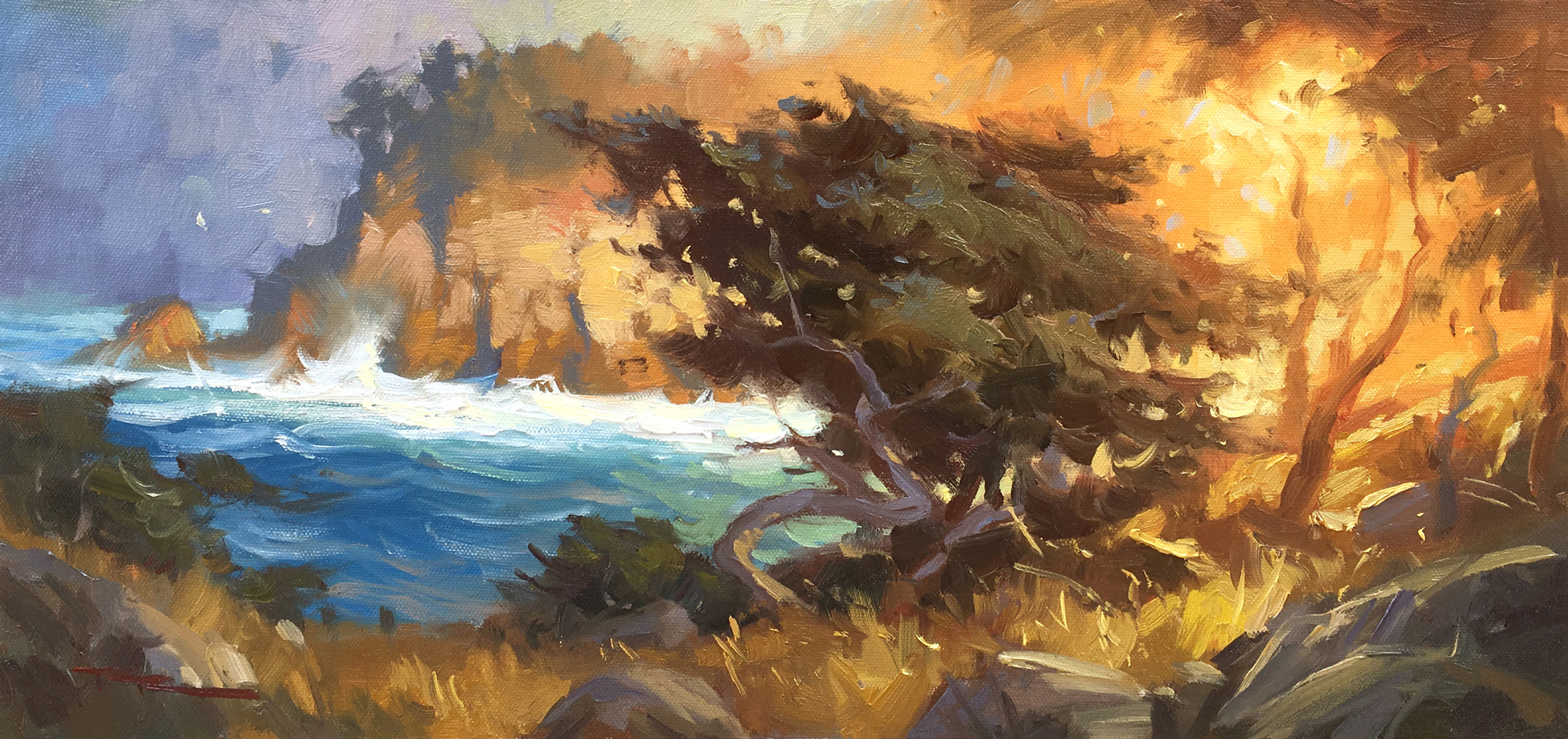
15 x 18" Oil on Canvas by Richard Robinson.
Get the video lesson here: https://mypaintingclub.com/lessons/140-Point-Lobos
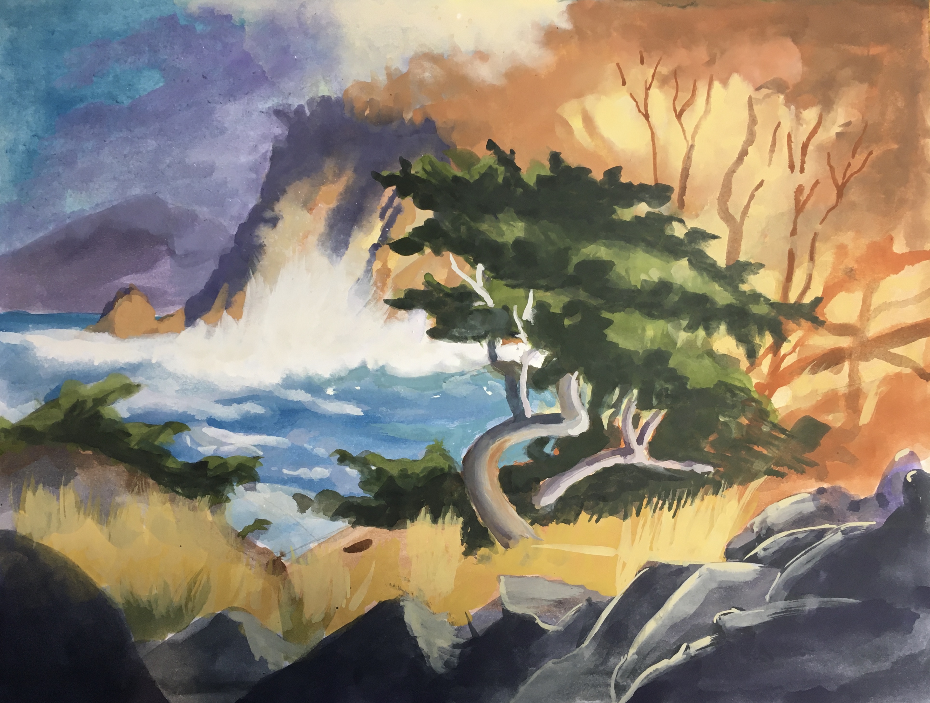
Golden Mist by Lindsay Shaw
Hi Lindsay, good work here. I especially like the painterly feel of the trees, water and cliff. You haven't achieved the same degree of loose brushwork in the grasses, which are all a bit dark and could do with another look. The orange tree is nicely painted but you've missed the idea of the light transitioning across the cliff and instead you have a hard distinction between the orange tree and the cliff, which is what is making it look more like an orange coloured tree rather than a tree obscured by strong light. Have another look at my demo painting. Particularly good work in the water and cliff. Great to see.
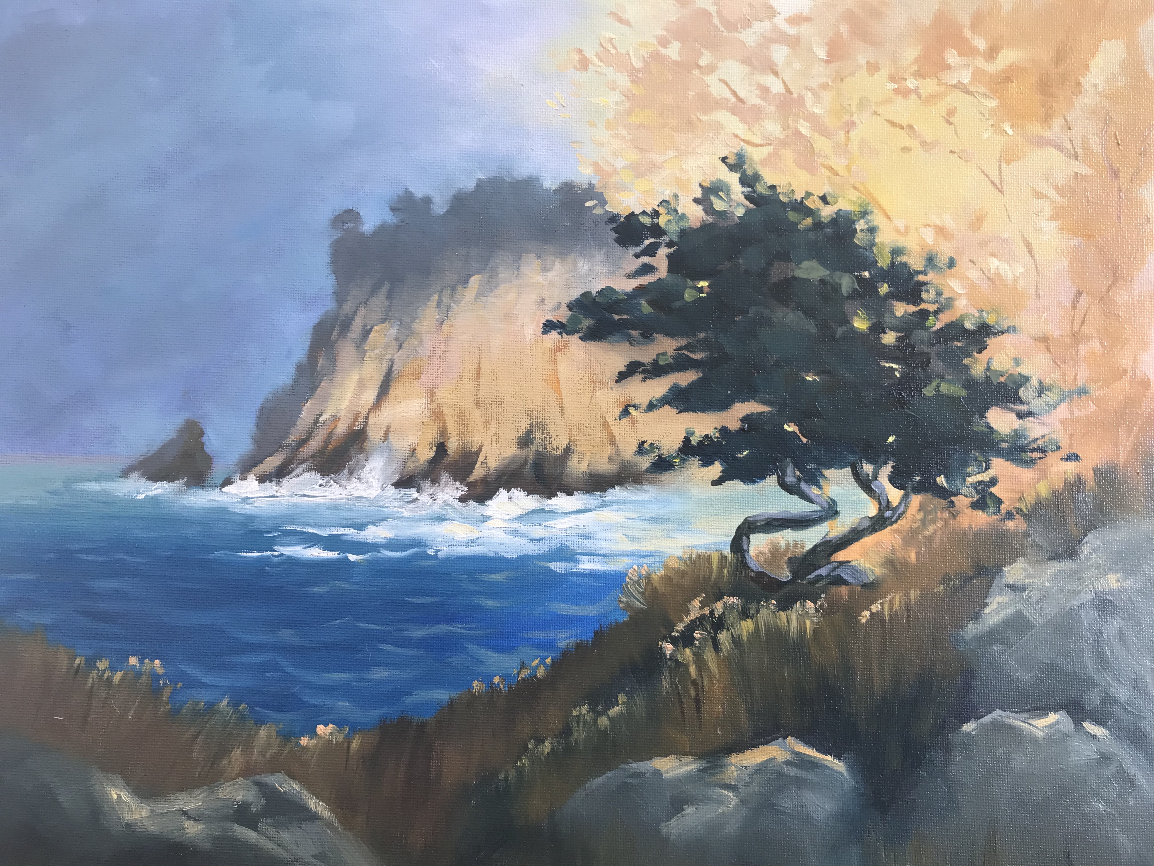
"Point Lobos" watercolour & Gouache, by Eric hillmer, Toronto, ON, Canada.
Hey Eric, nice work. I think this one is significantly more difficult in watercolour because of the detail of the tree layering over the background and the big colour transition in the background. Anyway you gave it a good shot. The drawing is good and you've cropped the design nicely into a shorter canvas. Your handling of the water and rocks is good.
Two things that could be improved is first of all the grasses in the foreground could have a softer edge in places to give the effect of soft grasses. Hard edges are great for the rocks, but not so much for grasses. They could also have some slightly darker soft shadows. Secondly, the transition from warm orange to cool purple grey in the background could be a lot more gradual. As it is now it doesn't make sense of the light through that area.
Hope that helps.
Get the video lesson here: https://mypaintingclub.com/lessons/140-Point-Lobos
Login to your account to post a comment.