Teacher
Richard is a talented full time artist, who loves painting and teaching.
with Richard Robinson
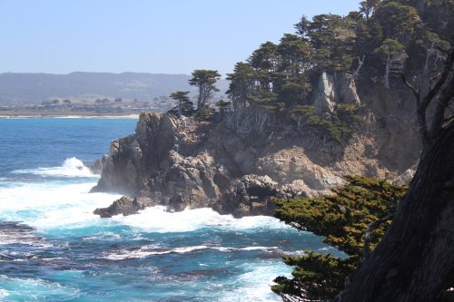
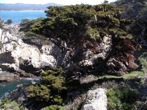
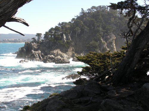
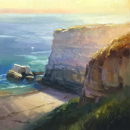
Join me in a painting adventure to one of my favorite painting spots - Point Lobos, California. Paint this stunning impressionistic coastal scene with ease using big brushes. Follow along step by step using the resource photos or use the techniques to create something more your own.
When I first set foot here I couldn’t quite believe my eyes - Point Lobos is really a natural wonderland - I felt my heart wasn’t big enough to take it all in. Mother nature is so generous in her gifts. Let’s try to pay her a little homage in thanks.

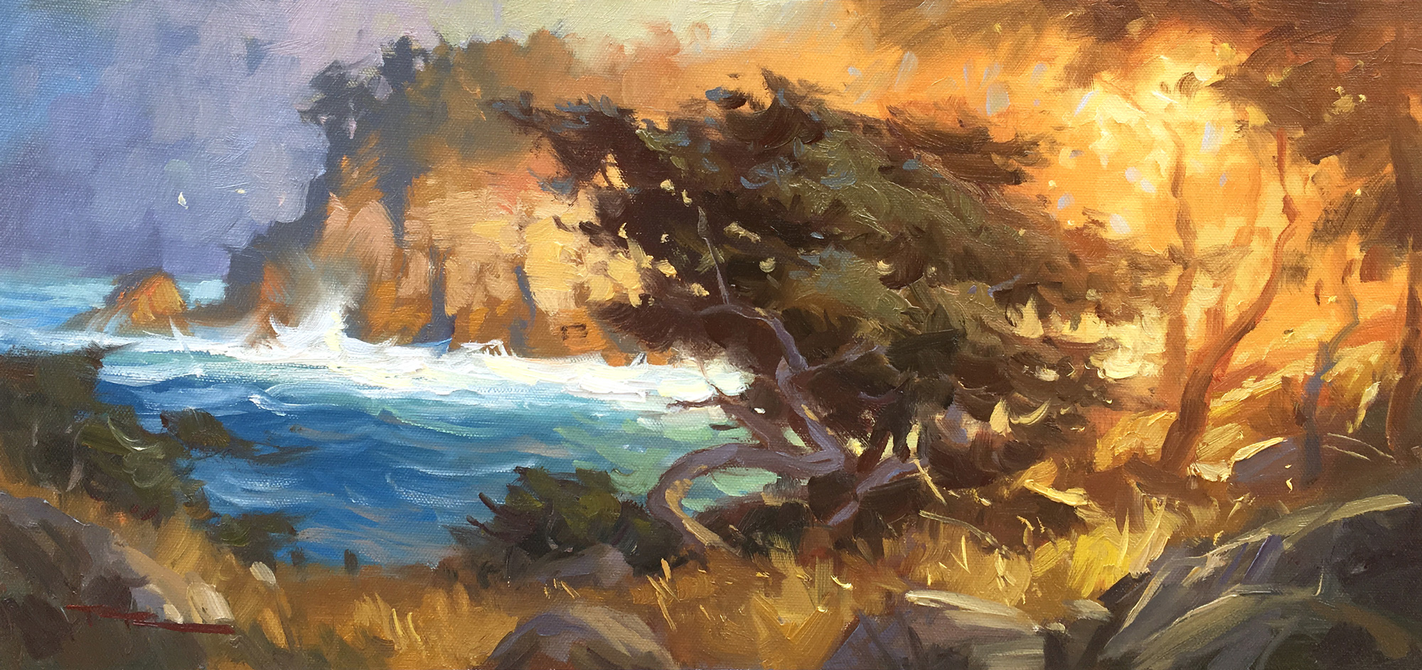
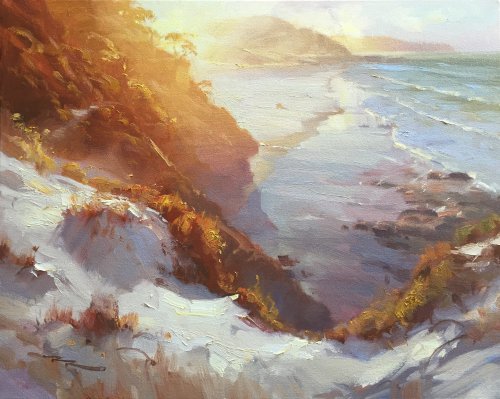
The French (and expensive galleries) call this effect ‘Contre-jour’ lighting, or "against the light," which creates a striking and dramatic effect in landscape painting by positioning the primary light source behind the subject.
This backlighting technique results in several distinct visual characteristics:
Silhouettes and Strong Contrast
The subject appears as a dark shape against a luminous background, often losing midtone details while retaining a crisp or softened edge, depending on atmospheric conditions.
Glowing Highlights
The brightest areas often occur along the edges of objects, where light wraps around or diffuses through translucent elements like foliage, mist, or water.
Atmospheric Depth
Backlighting enhances a sense of depth as distant elements become hazy and warm-toned due to the scattering of light, while foreground elements remain in shadow.
Color Shift and Muted Foreground
Shadows in the foreground can take on cool or unexpected hues as they reflect ambient light, while the backlit sky often appears warmer and more vibrant.
Lens Effects and Diffusion
Depending on moisture or dust in the air, contre-jour lighting can introduce a halo effect, sunbursts, or soft diffusion, lending a dreamy or ethereal quality to the scene.
For painters, contre-jour compositions demand careful value control to balance the high contrast, ensuring that the dark areas retain subtle variation and the brightest areas don’t become overly harsh. It’s a powerful tool for creating mood, mystery, and drama in a landscape.
This demo for beginner to advanced painters is in oils but it's fine for acrylics too.
I'll take you step by step through this whole process.
Just 2 hours and you'll have a beautiful coastal painting. Or go the whole hog and paint a much larger version. Enjoy!

Whenever you’re ready! The lesson is available online any time, and your access to the lesson never expires.
As long as you need! Your access never expires, so you can come back again and again.
Sorry, no you can’t download the video. This is to avoid piracy. You’ll always be able to view the video on this site though.
Richard is a talented full time artist, who loves painting and teaching.
Hi I’m Richard. I’ve been painting my whole life and back in 2001 I traded my graphic design career for the humble life of a full time artist. I love painting, and as it turns out, I love teaching too.
Nowadays I balance my life between parenting, painting, surfing, travelling and teaching. My work is regularly featured in international art magazines, in galleries in New Zealand and America, on TV and in my Mum’s house.
I give outdoor painting workshops in interesting spots around this beautiful planet of ours and love encouraging people to paint. Two of my favourite artists are John Singer Sargent and Joaquín Sorolla.
My painting website: www.nzpainter.com
I’d love to be your new teacher.

Richard is a master artist with an exceptional skill in identifying and communicating key factors to making successful paintings. I have found his video workshops an excellent resource for improving my own work.

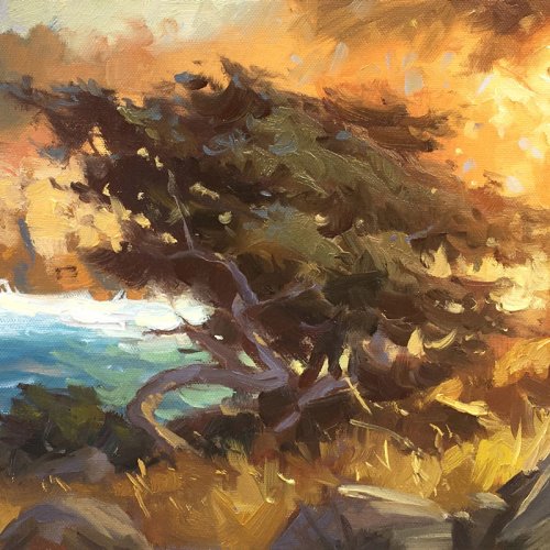
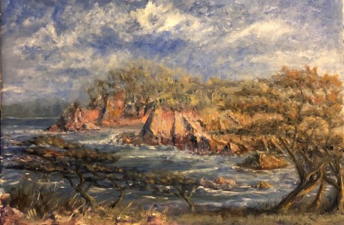
"Point Lobos" 20 x 47" Oil on Canvas by Richard Robinson
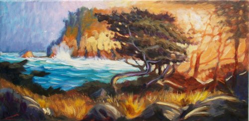
"Point Lobos II" 20 x 47" Oil on Canvas by Richard Robinson.
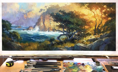
A larger painting in the studio.
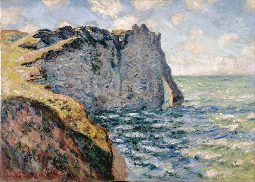
"The Cliff of Aval, Etrétat" by Claude Monet 1885
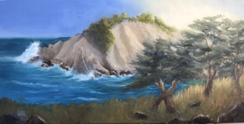
"Point Lobos" 9x12" WB Oil on board by Jim Haycock
Great Impressionistic feel to this painting Jim. Very much reminds me of Monet's series at Etretat. Very similar! The one thing Monet has done differently is to spend more time making clear shapes, which tends to make a painting easier to read. Creating more definite colour shapes also helps to keep colour areas separate and avoids muddiness which has occurred through much of your painting. Take a step back from your painting and your foreground trees on the right are blending in with the background hill. Having foreground objects blending in with background objects is something I always try to avoid because it tends to flatten the painting and make it difficult to read. I would recommend either lightening the background there or darkening the tree in order to separate those two planes of depth. Similarly the top of the trees on the second hill are blending in with the sky and muddying the colours there. I'd suggest repainting the sky there to solve that. Soft edges in the distance do help with creating depth but beware of overdoing it and muddying the sky. This softening effect has worked really well in the furthest hills, largely because the cooler colours there are more similar to the sky colour and so do not muddy the sky when blended with it. You've given more space to the sky in your painting than in my design and to your credit have filled it with effective clouds full of motion and spirit. Nicely done. Conversely, the thin strip of land clinging to the bottom of the painting feels more like an afterthought - like you tried to squeeze it in at the end. Horizontals imply stability and calm. Diagonals imply motion and excitement. I always try to remember that when designing a scene with the intention that my design should speak about the feeling of the place. Something to dwell on. Overall a very pleasing painting with a few things I'd encourage you to think about. Good job!
"Point Lobos" Oil, canvas, 30cm x 60cm by Elena Sokolova
A very light filled and colourful painting Elena. Nicely done. I have only compliments to give you for this work but for a small note to be careful of making repeating patterns with your brushwork as is evident in the sky and water. Easy to say, hard to do! Great work Elena.
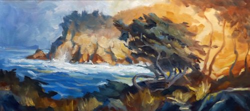
"Coastal Light" 8x16" Oil on Canvas by Laurena Beirns
Hi Laurena, good to see you working out that glowing light effect and paying good attention to the waves and cliff forms especially. If I can make a suggestion, looking over all your previous work it would simply be to pay more attention to the drawing of the scene and individual items. Thankfully drawing is an easy skill to learn well - it just takes practice and you can make it even easier on yourself in these painting projects by printing out my painting and using the grid transfer method to get the drawing accurately onto your canvas. It takes an extra chunk of time but it's well worth it in the end. See the Grid Transfer Method. In terms of the colour in your painting, particularly in the glowing light area I can recommend using more yellow and orange before you start adding white to your mixtures because white tends to cool down mixtures rather than warming them like yellow and red. Hope that helps a little. Good work!
"Point Lobos" 18x8" Oil on Canvas by Denis King
Great work here Denis. Your own painterly style is shining through giving this a lot of motion and energy. Looks to me as if you've done everything pretty well spot on, at least in terms of doing everything that I taught in this lesson, so if anything's wrong now it's my fault. Looks good to me. Good job.
$15.00USD
$15.00USD
$15.00USD
$15.00USD
Not loving your painting lessons? No worries!
If it’s not the right fit, we’ll give you a full refund within 30 days of purchase - no questions asked.
When you purchase a DVD you also get online access to the same lesson, including any lesson resources like photos, downloadable notes and access to upload your painting to the student gallery.
That's why you need to make a password when you purchase a DVD, so you can access the online content as well. Enjoy!