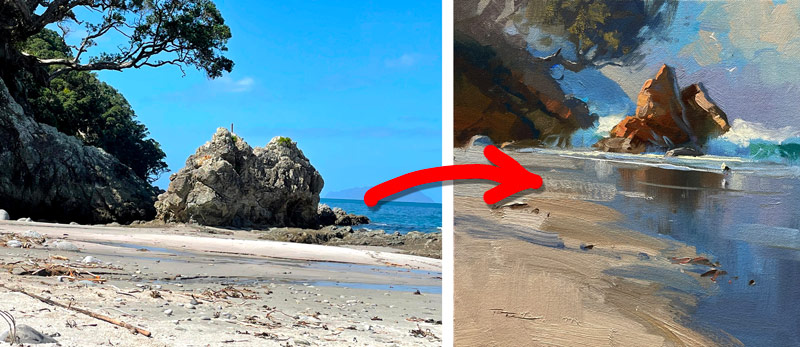
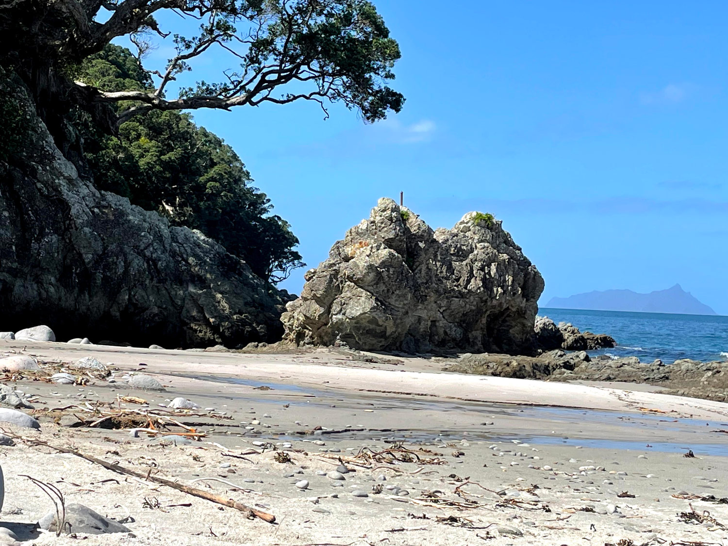
I know what it's like to flick through your photos looking for inspiration but never finding something that sparks you. It's a frustrating waste of time! You can spend hours online looking for the perfect shot too, but the reality is, with a little knowledge of light and form, you can actually turn a pretty average photo into a great painting. All it takes is a little extra thinking and planning. The main ingredient is the LIGHT.
I've begun to use an ipad to digitally design my paintings in a painting app called Procreate. Once you get the hang of it, it's a hugely efficient way to create the plan for a painting, getting most of the problems solved before you uncap your paints.
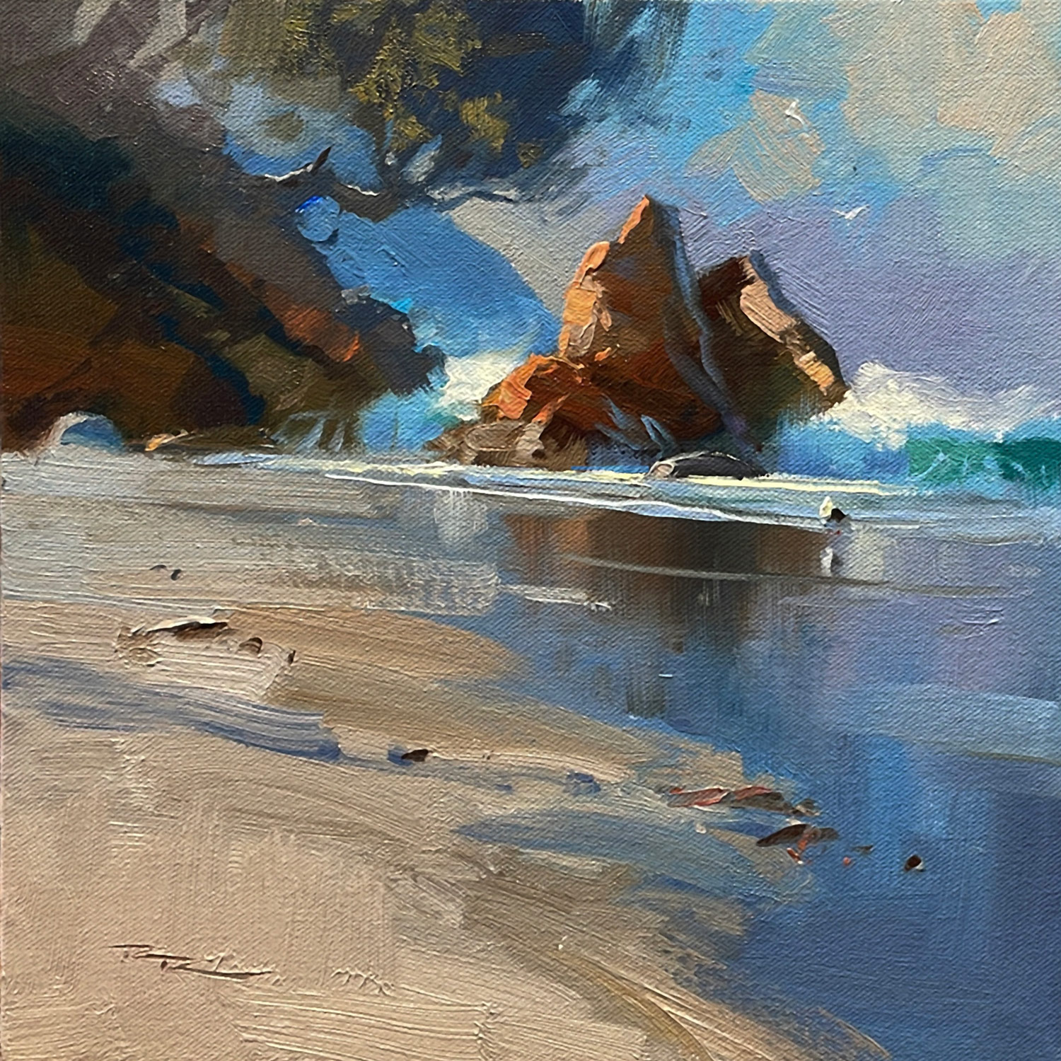
Good job Evelyn. Good colour and drawing. It's tricky getting those soft edges with acrylic. Knowing that going in, it pays to plan those blends ahead of time, particularly in the wet reflective sand. It means pre-mixing larger piles of paint so that you can paint it all really quickly, avoiding hard edges.
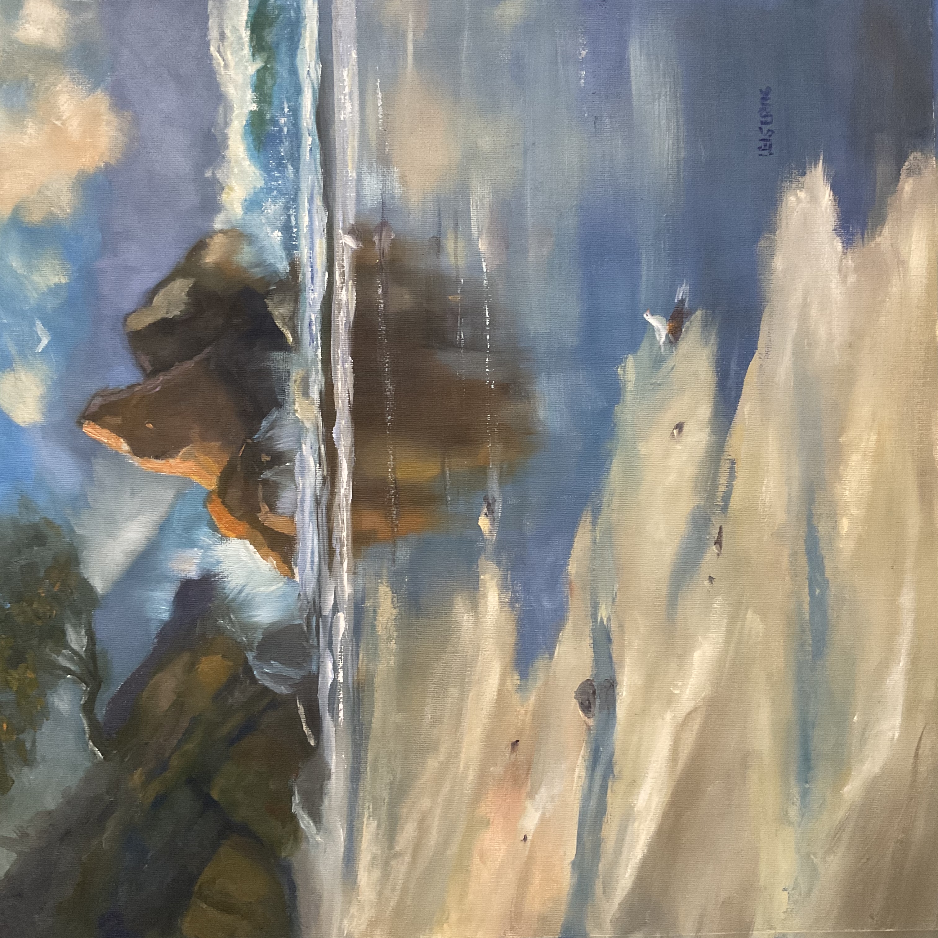
Smugglers Bay by Anne-Dore Leisering
Thanks Anne-Dore, nice work. Great colour and good variey of hard and soft edges. Just two suggestions for you. The first is possibly a problem of the camera angle that you took the photo of your painting on. The lines of white foam in front of the rock need to be sloped very slightly down to the right. Currently they are horizontal, giving the impression that the whole ocean is tilting a little to the left. Secondly the seagull, although nicely done, is about 3 times too small for its position in the foreground. Easy to get that wrong.
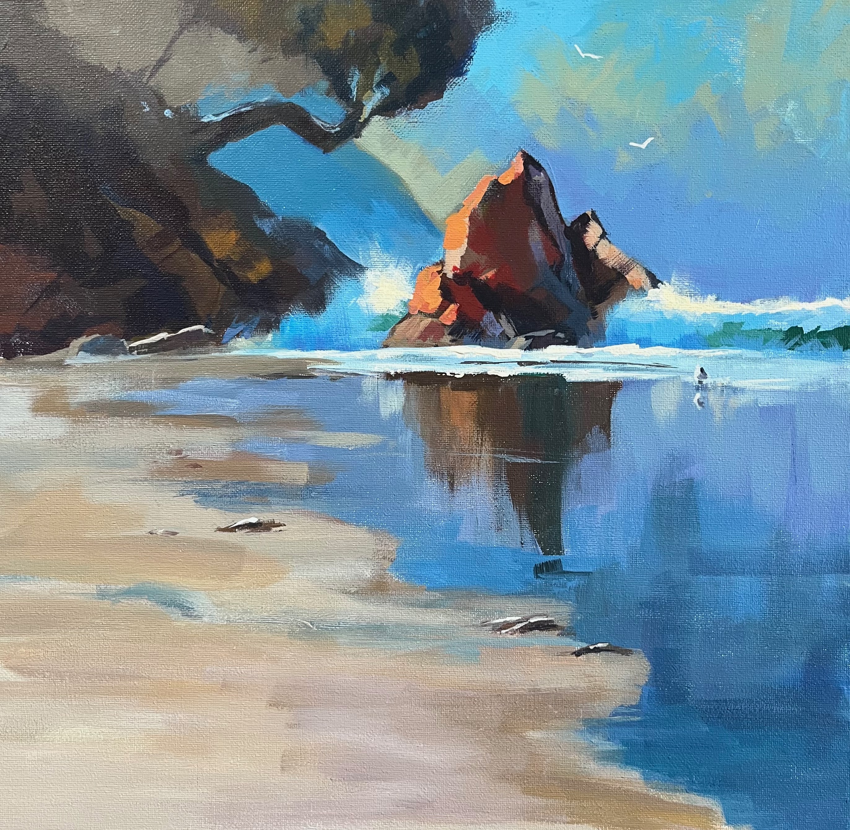
Smugglers Bay by Barbara Magor
Nice one Barabara. You really cut loose with that palette knife eh!? Great to see all that interesting texture. I do feel that it spoils the smooth reflective surface of the wet sand and that if you made that smooth there would be a beautiful contrast between the rough and the smooth.
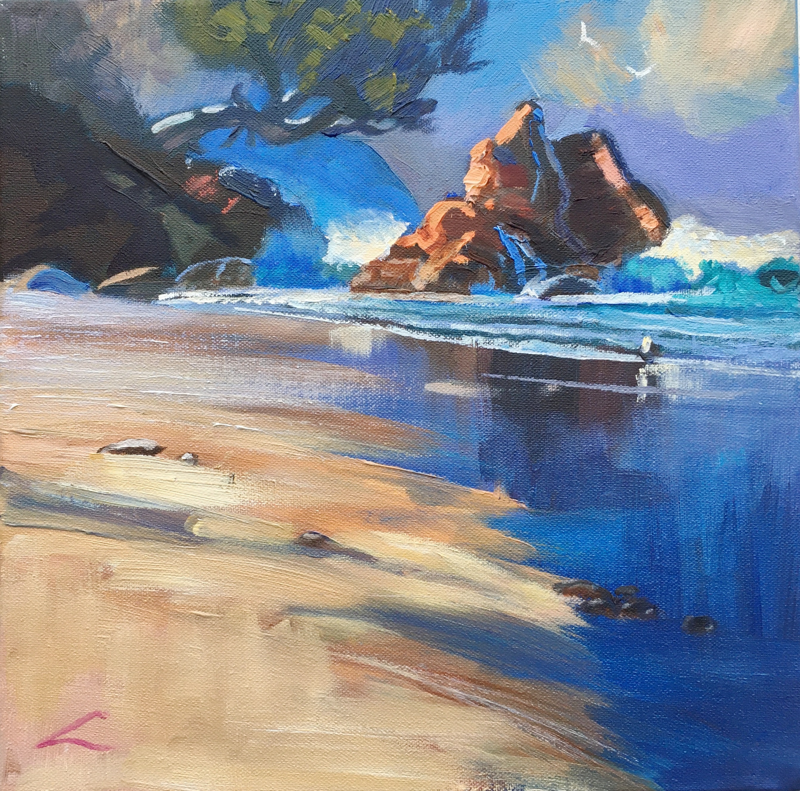
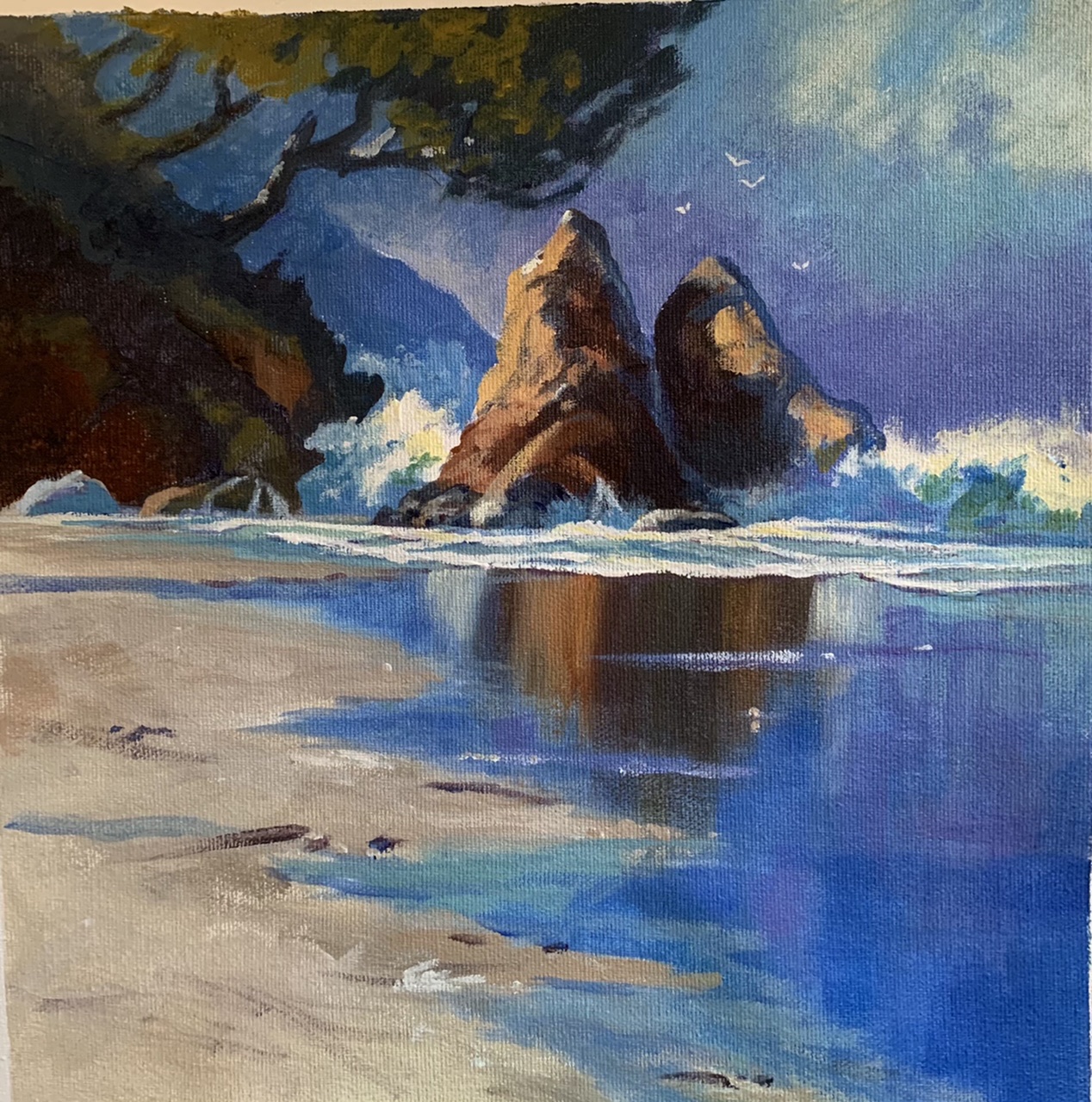
Smugglers Bay, acrylic by Claudia Morgan
Ooh that's some beautiful crisp brushwork there in the rocks! Niiice. Great colour variations there too - it's all too easy to keep it all the same colour in the darks or the lights, but you've conquered that particular pitfall well. A little softer blending in the rock's reflection would stop that from jumping out at us and a touch more continuation of the blue hill and and green sky background behind the tree trunk would help make more sense of that top left corner. Otherwise, all good.
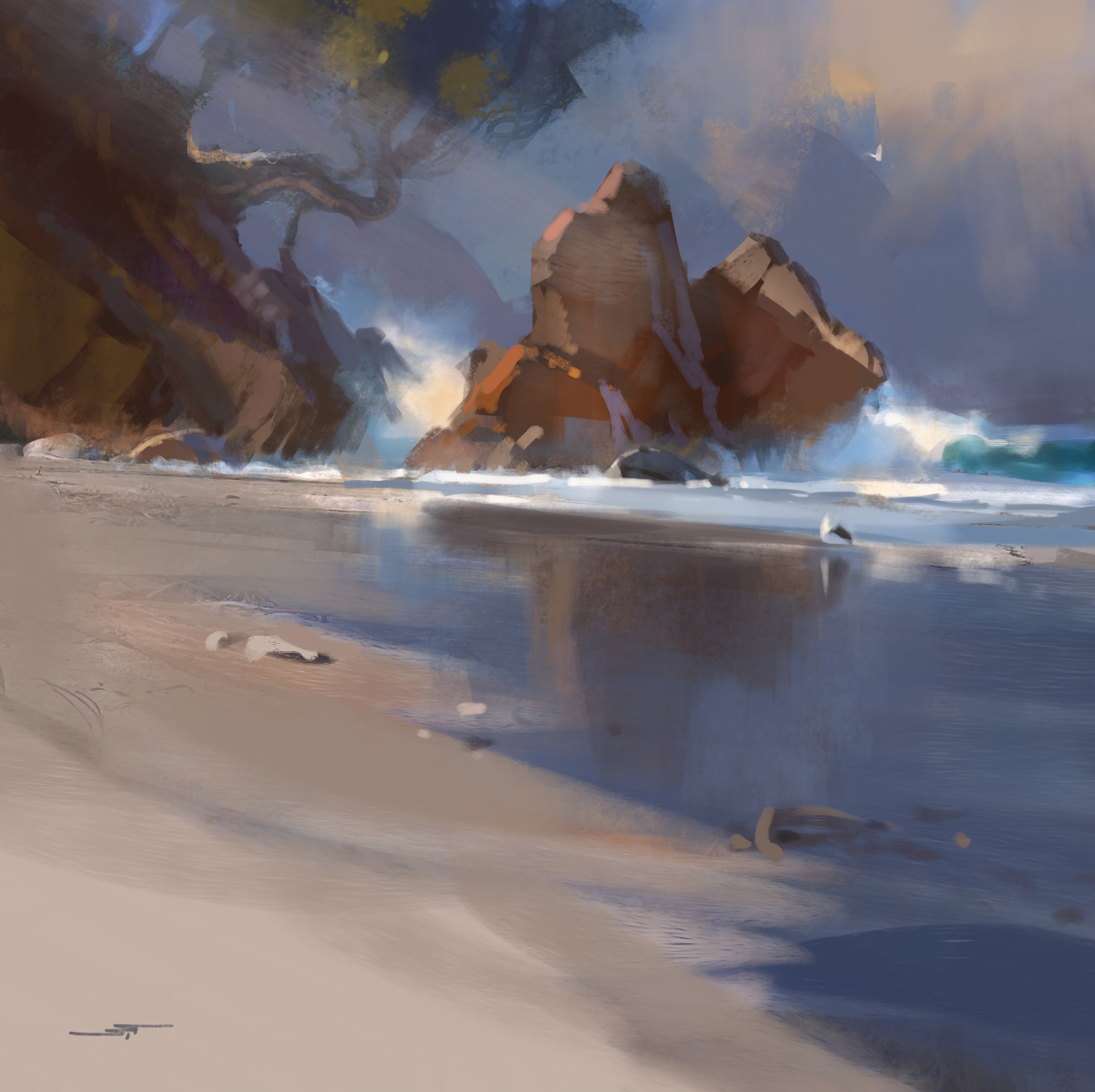
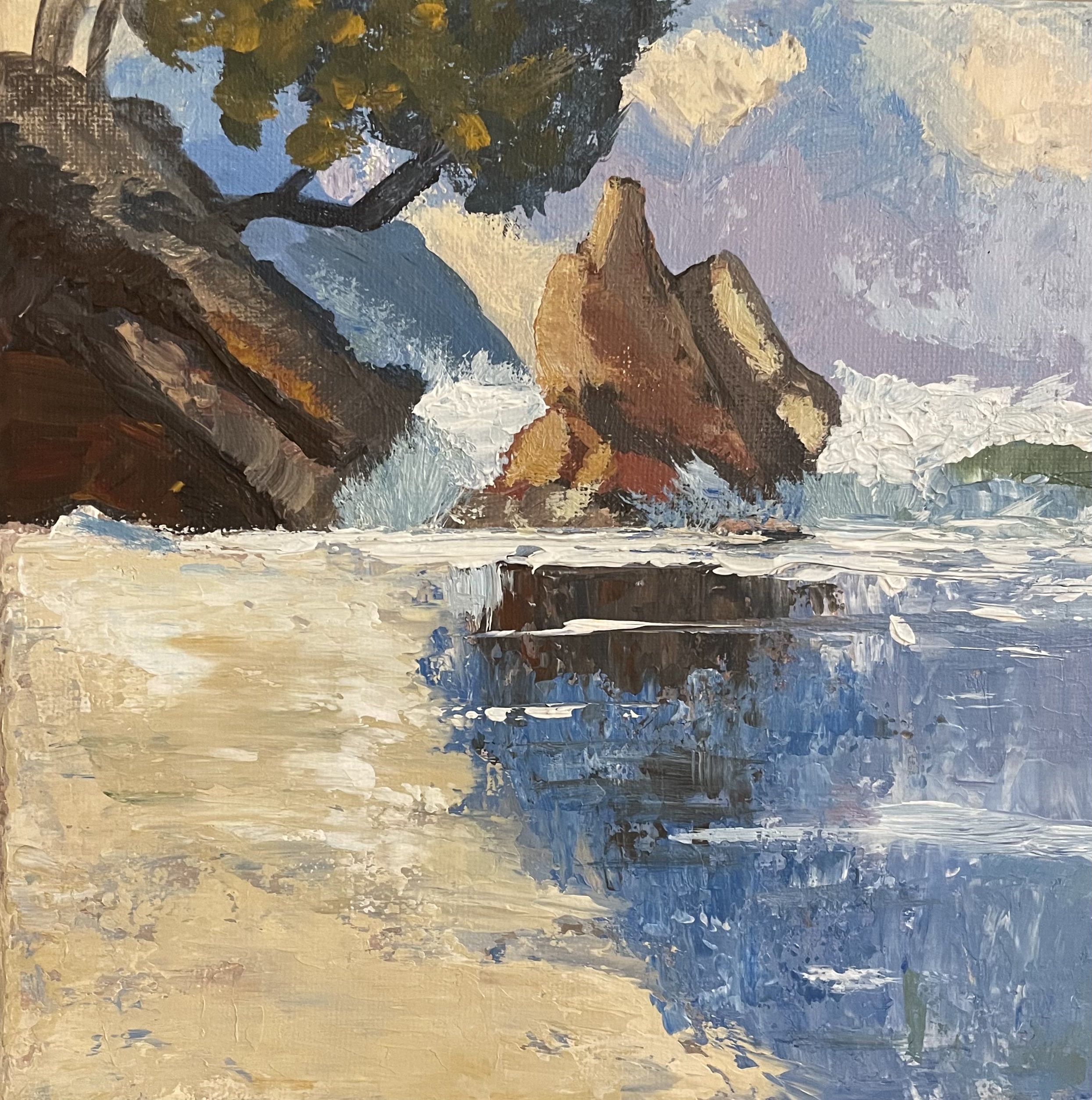
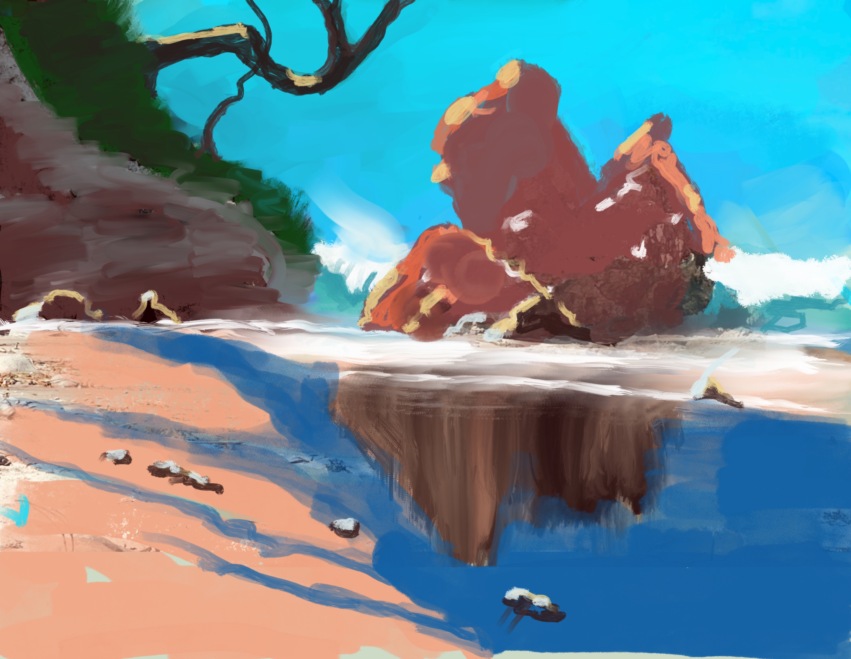
"Smugglers Bay" first time sketch on Procreate, Eric Hillmer, Toronto, ON, Canada
Good to see you giving it a go! The more you do the more you'll get comfortable with the tools and discover just how efficient and freeing working digitally can be.
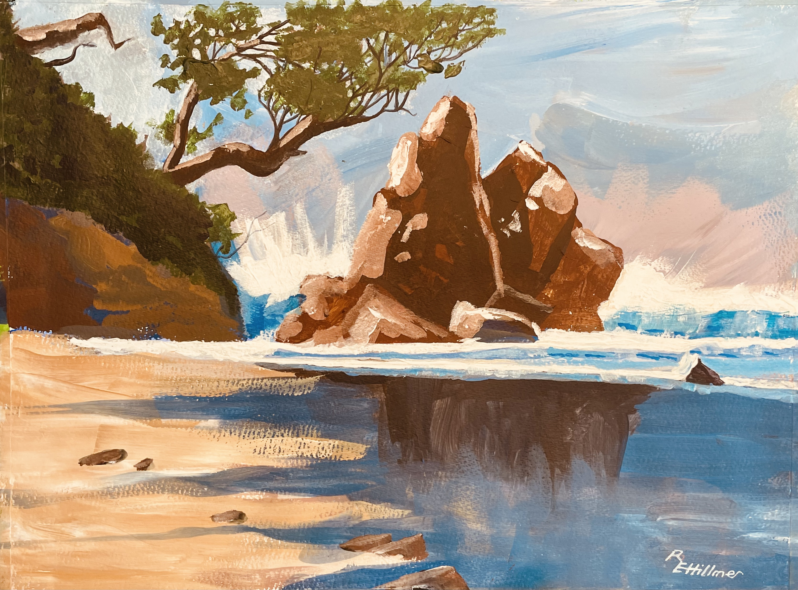
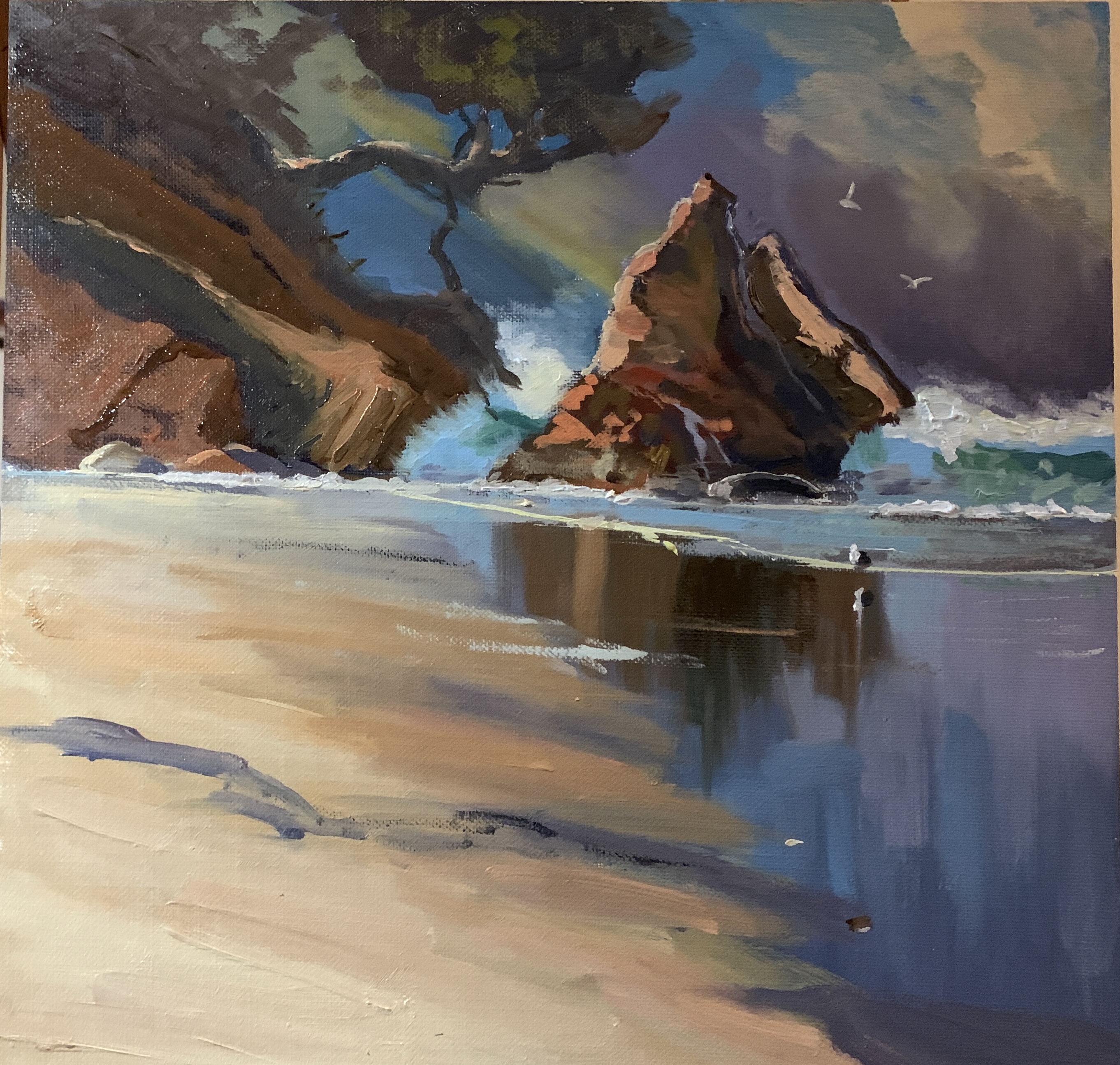
"Smugglers Bay"pained in acrylics, Eric Hillmer, Toronto, ON, Canada
Great to see the big improvement from the initial digital sketch to this painting Eric. Even though it was your first digital painting, there are several things you observed in this painting that were incorrect in the digital. I'm seeing strong rocky forms, bold brushwork and attention to detail here. I'd like to see some more variety in the colour families in the darks, not in value, but in hue. For instance in the darks in the rocks you could have introduced some cooler greys the same value (darkness) as the other darks. Then you could have added darker accents in the cracks and fissures. Also, the reflection of the sky in the wet sand should be lighter the closer it gets to the rock, and while you're doing that you could paint over the right side of the rock's reflection a little to line it up better with the rock.
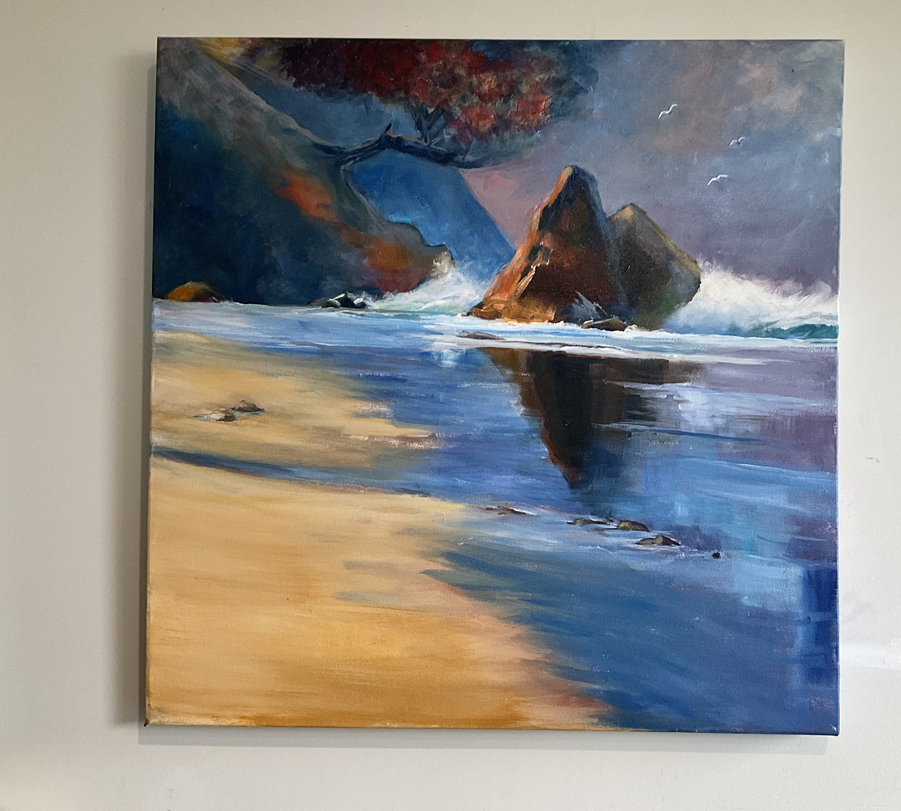
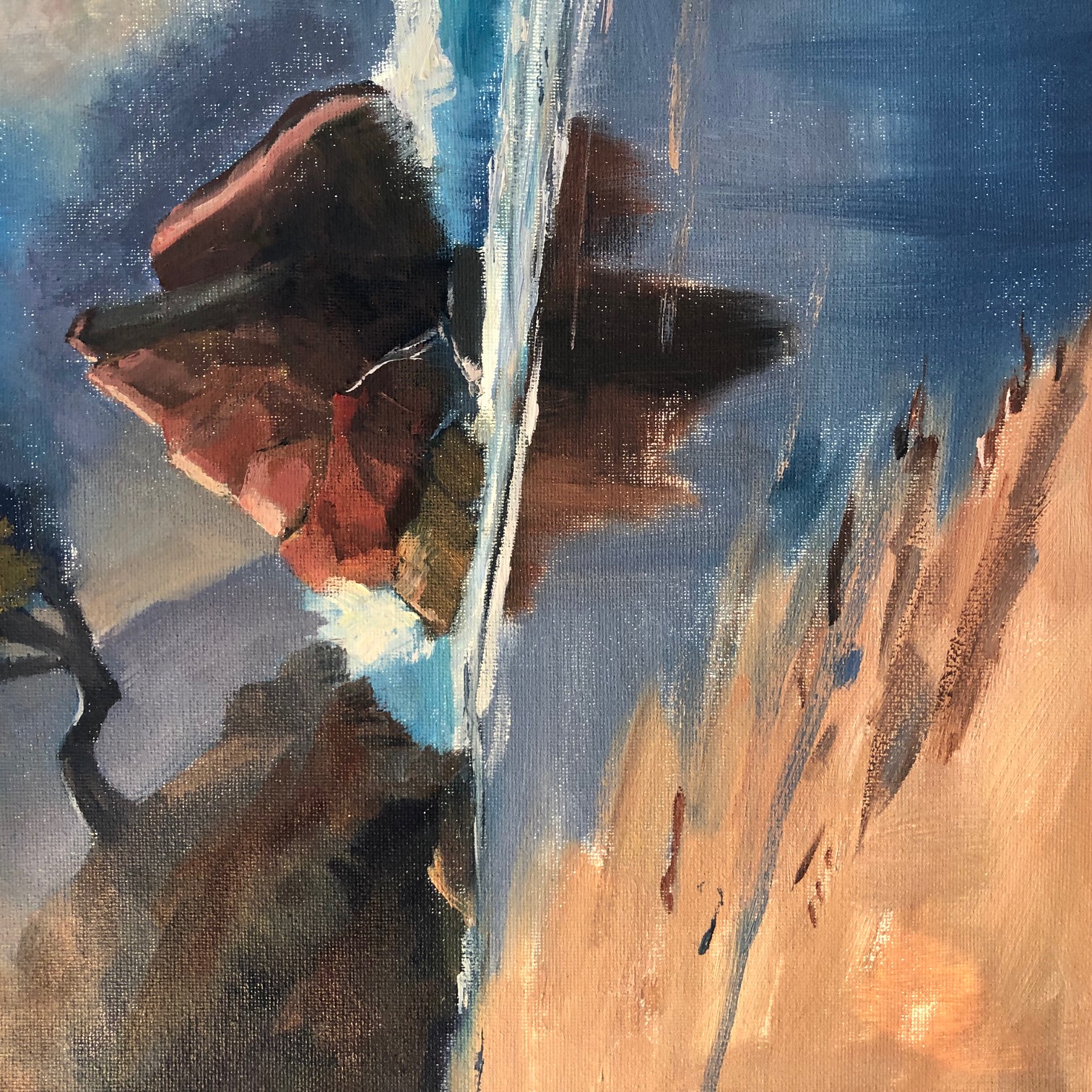
Smuggler’s Bay by Jim Neilson
Great colour and bold brushwork on a large canvas Jim. Nicely done! In your next painting I challenge you to avoid blending out your brushwork so much. It's mostly noticeable here in the rocks because they have an obvious blocky structure that needs to be painted as such. Looks great on the wall!
February workshop- Smugglers Bay 10”x 10” Acrylic on canvas by Karen Woodhouse (South Australia)
Really nicely done, Karen. Love the way you've rounded some of the rocks going from light to dark, contrasted with other edges that you've made sharp. The waves and the beach look great too. Just haven't quite achieved the hazy light effect from the top left, simply because you didn't add enough white and orange into those mixtures there so they turned out a little too dark to convey light. You could glaze that in now that it's dry if you wanted to. Check out my video on glazing with acrylics: https://mypaintingclub.com/blog/post/109-Glazing-with-Acrylics
Scott Dyer 12" x 12" Done in Oil.
Hi Scott, strong painting! For some reason this strongly reminds me of Goya's "The Third of May 1808". I guess it's a combination of your brushwork, the spotlight effect and the colours and the powerful angles. Very nice. I'd just like to see a few dark accents in the rocks on the left and a few bits of flotsam on the beach for more interest.
Smugglers Bay by Nancy Newton
Hi Nancy, nice work. Good colour, drawing and brushwork. Tree looks a little odd stuck onto a rock of lighter value - the rock there should be the same value as the trunk. Also be mindful of those little white spots of canvas showing through. Looks like it might be the result of a canvas that's a little too absorbent. A coat of gesso should fix that for the next painting, or simply be more aware of it and use more paint.
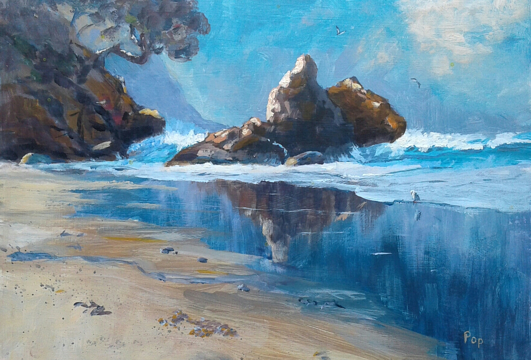
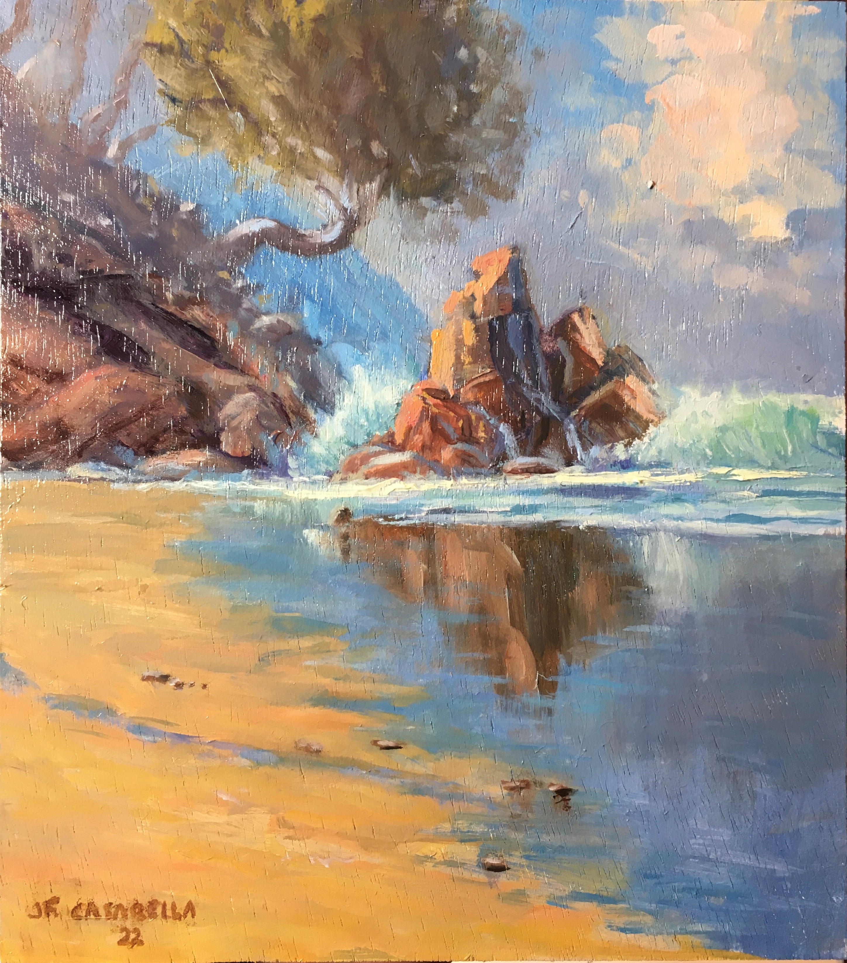
Smugglers Bay by JOSE FELIX
Some really nice work in here Jose. Particularly nice colours with a warm feel to the whole thing. The main rock and the waves look great. The section that the tree grows upon could be a little darker. Beautiful sky with billowing cloud. Great stuff!
Paint this expressive beach scene with ease.
In this lesson learn how to turn an average photo into a great little painting. All it takes is a little extra thinking and planning. The main ingredient is the LIGHT.
We'll go from designing on the ipad (painting right on top of the photo) over to the canvas where I’ll be teaching you about drawing, colour mixing, variety (how to create more interest in your paintings), texture, and we're really going to focus on how you can invent light to bring the best out of your subject.
Follow along step by step using the resource photos or use the techniques to create something more your own.
Claudia Morgan
01/04/2022
Your critiques are really helpful. Thank you for taking the time. It isn't the first time I have completely forgotten to finish a part of my painting--this time upper left. Gotta work on that!

Login to your account to post a comment.