
"The creative adult is the child who survived." -- Ursula Leguin
So I got a big commission to paint a couple months ago - the largest I've ever painted. It was a really interesting job for a few reasons:
Eager to do a great job for my old school teacher I visited the new house under construction and was given the tour. The large space for the painting was in a stair well between the second story which features a pool, and the third story which looks out over the harbour.
As soon as they mentioned the Poor Knights as a painting subject, (a world famous dive location just offshore where we'd all enjoyed diving) I saw a flash of inspiration, the image of a painting divided by land a sea. Since the second story housed the pool the idea seemed to fit perfectly and we agreed to go ahead.
For such a big piece it was really important to get the design nailed down before I started so I could avoid any repainting. It also helped to calm my anxiety of starting such a large painting to know that most of the design problems were solved beforehand.

This is the first digital sketch I gave the client. I intentionally avoided detail at this point so as not to waste time if the client didn't agree to the basic concept.
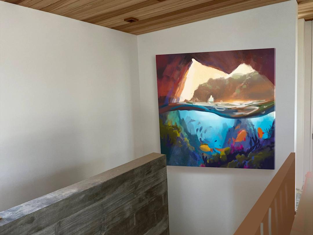
I also went the extra distance to show them how the painting would look in place.
They were very happy with the idea and wanted to be sure that I would include much of the local sealife in the painting, so I moved on to a more detailed digital sketch...
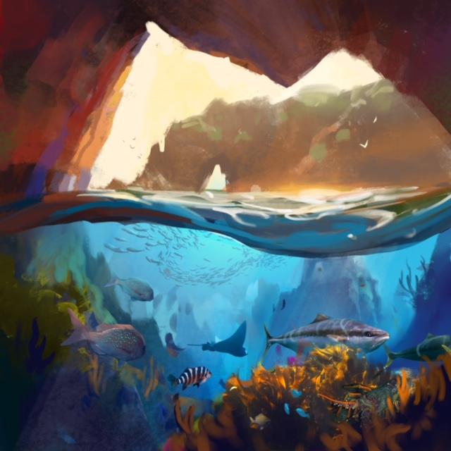
I researched which species of sealife and vegetation were in the area, using multiple photos from the internet and placing them all into a harmonious composition. I use the Procreate App on the Ipad Pro for this. It is painting, but digitally - a very efficient way to design a painting. The client enjoyed seeing the extra detail.
I'm always careful to caution clients that the final painting may vary up to 20% from the design, due to the creative nature of the painting process.
Also, because you can achieve much more vibrant colours digitally than with actual paint, I'm careful to mute the colours a little in the digital design so that they don't expect to see that degree of vibrancy in the finished work.
When I give them the mock-up of the painting in place I'm careful to match the lighting of the room, again to avoid setting expectations too high in terms of the impact that the painting will have in the room. It's very easy to make it really jump out by giving it more contrast and saturation than it would naturally have in the room, but the client may be dissappointed by the final result if you do that. Better to make it look natural.
Once I got the go ahead on this design I built the canvas (Sooo many staples!) and gave it a splashy acrylic undercoat, warm on the top, cool on the bottom.
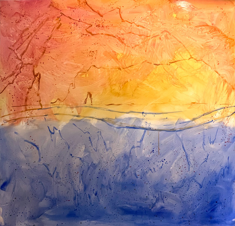
In the past I used to share photos of the painting progress with the client at each stage but eventually I found that it tended to cause more trouble than it was worth. Clients don't really appreciate seeing the messy beginnings, because they often have that sinking feeling of, "Oh!? Is that finished??"
They don't have the vision of the finished work that you do, nor the trust in the process, so I've found it's better to show them the final painting fully formed, but always provide them with a decent colour study first, because the last thing you want is to have to make changes to what you consider a fully finished work.
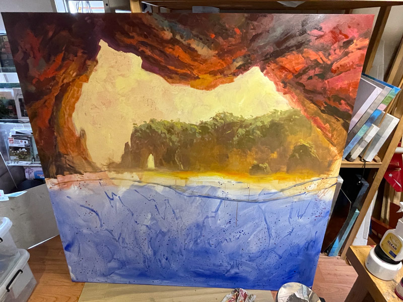
The top half was painted first, simply to avoid dribbles on the lower half. You'll notice that the rocks on the left change a little in the next progress shot.
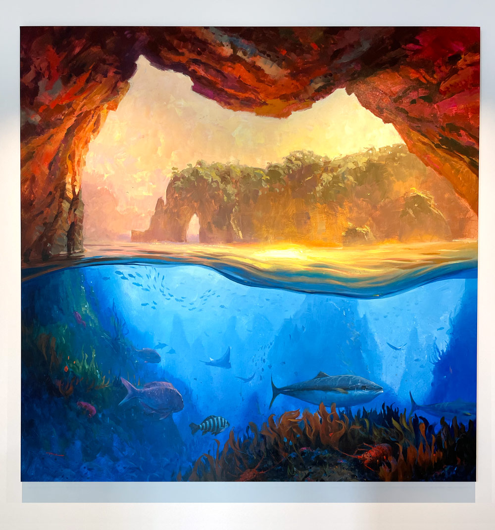
The finished painting. "Poor Knights" 6x6' Acrylic on Linen.
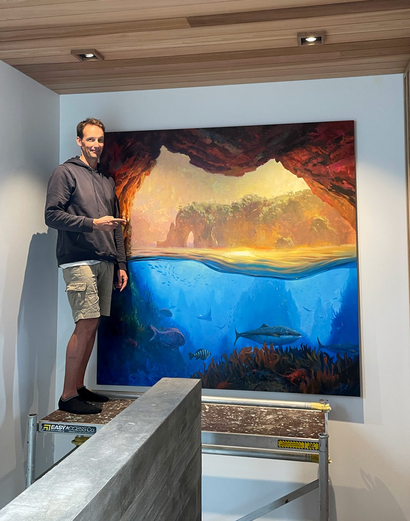
Finished! It took a whole day to transfer the painting and install it. I hired a furniture moving trailer to transport it and the builders set up the scaffolding for me a head of time. I drilled slots out of the underside of the top wooden stretcher bar so that the bolt heads screwed into the wall could fit into them securely. I made sure the bolts screwed into wood, not just plasterboard, and added velcro dots to the bottom corners to hold it flat to the wall. I didn't want to trust the weight of the painting to a wire or string, so bolts it was.
This was really a stretch for me in terms of size and subject and was the cause of some anxiety and a fair bit of procrastination. I'm very happy to have had the opportunity to stretch and grow though. What I figured out about painting an underwater scene is that it's basically just really strong atmospheric perspective. 100% humidity so to speak.
Objects underwater quickly become bluer and softer edged as they recede from you and the overall light levels are lower. Another feature I could have added was light rays fanning out from the surface down, but in the end I felt like it may have confused the shapes of the rock spires in the murky distance, so I left them out.
As I was painting I was thinking a lot about style as I researched how various artists have depicted underwater scenes. I was also building my 'Find Your Style in 7 Days' Course at the same time. The more research you do, the more preparation, the better the result. That's vitally important with big paintings because the bigger the painting, the bigger the mistake when something goes wrong.
Big paintings fill your vision and give you the wonderful feeling of being fully emersed in a world of paint and beauty.
Happy Painting!
Richard.
Login to your account to post a comment.