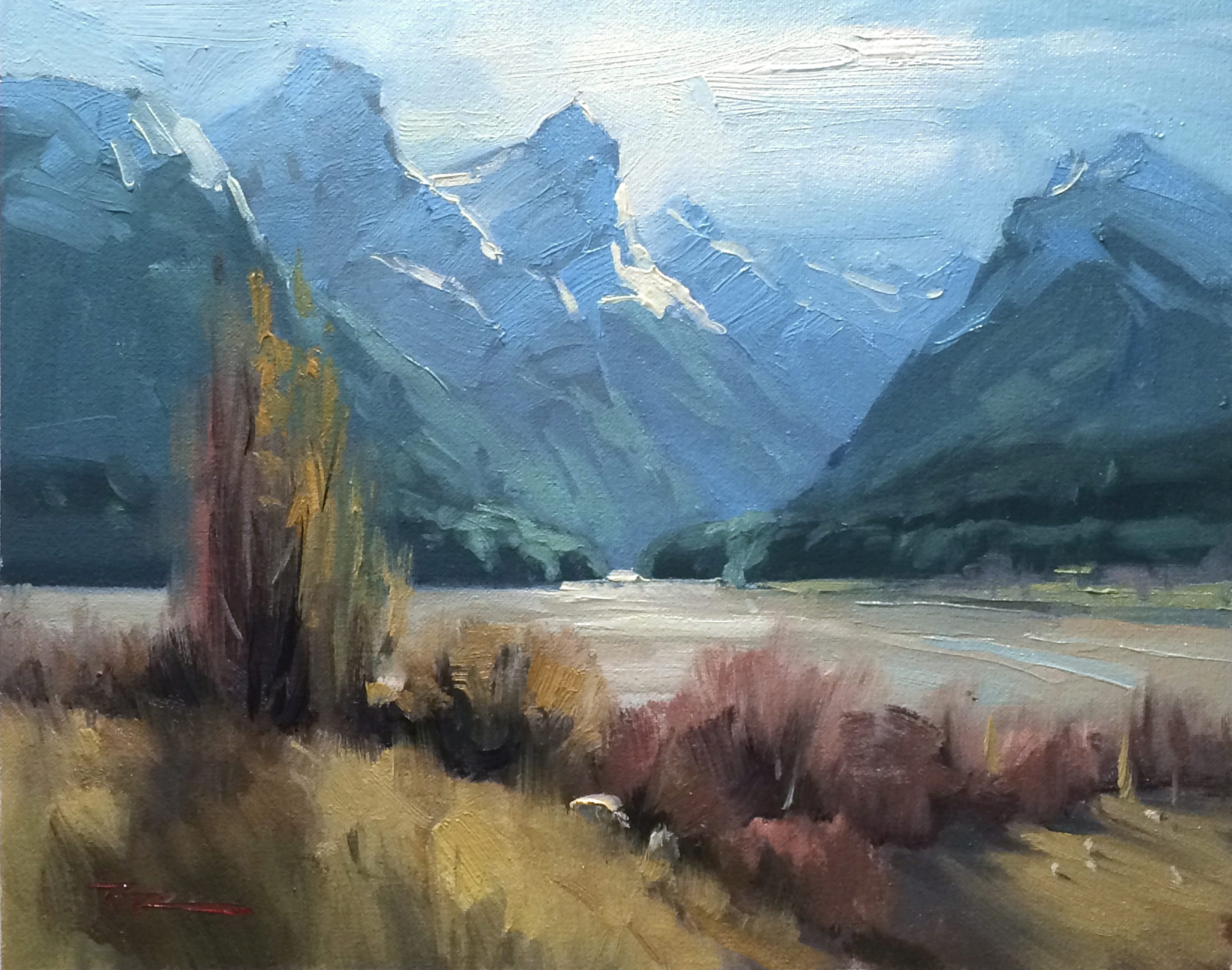
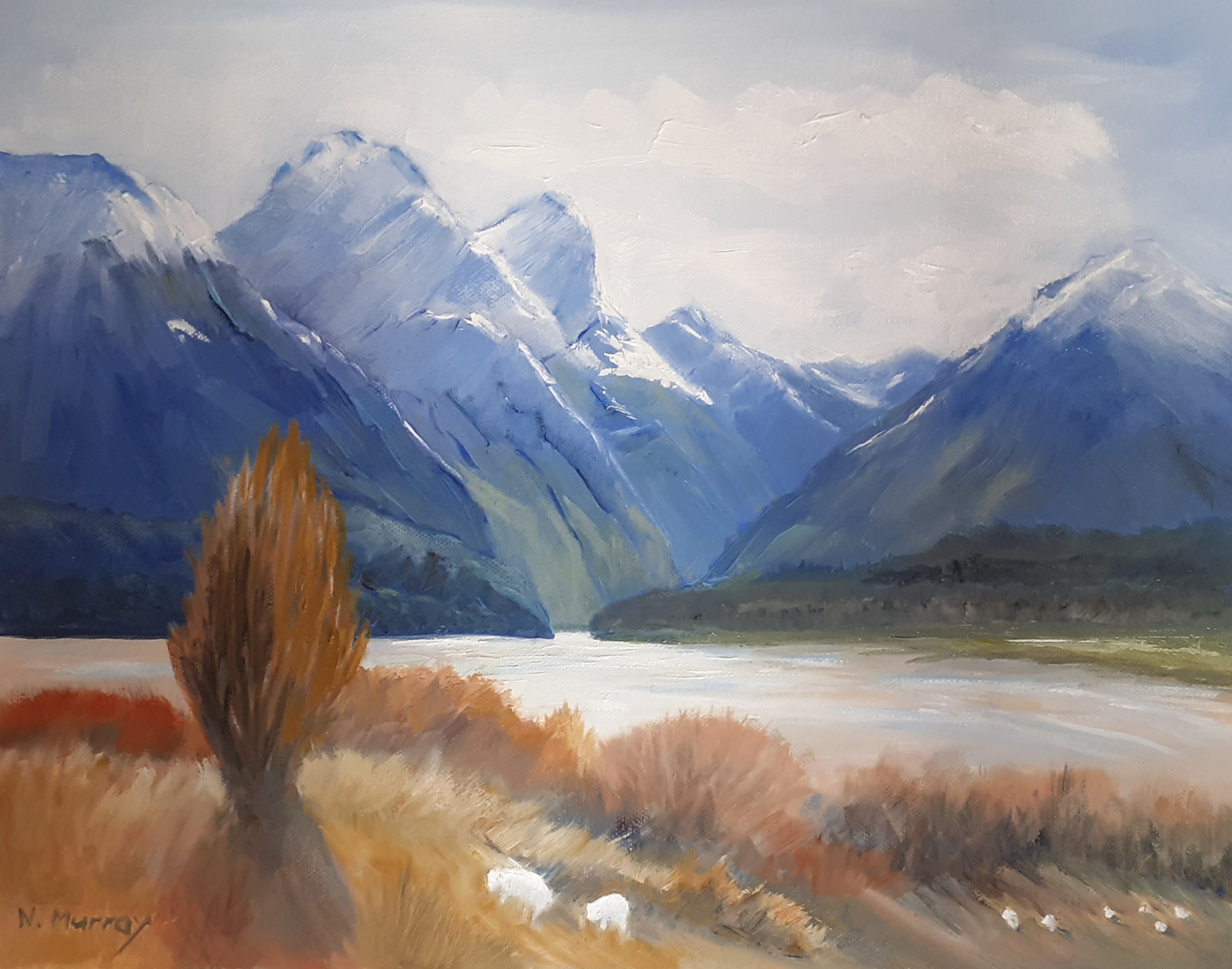
Paradise, in New Zealand is one of my favorite painting spots anywhere on the planet.
A beautiful day today. We headed up to Paradise and painted to our hearts content. John Speedy joined us too. Again John Crump helped with a key comment close to the finish - I had a big green tree on the left there I’d been battling with which looked like a party of sea sponges and John asked me why I’d painted it. ‘Because it’s there!’ I laughed, because my most successful enemy is the tyranny of the real - feeling obligated to paint what’s in front of me.
Five minutes later the green 'sponges' were gone and a wintery brown tree had grown in its place - MUCH better!
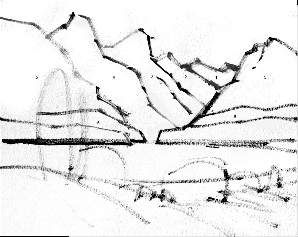
I was concentrating more here on the shapes which compose a painting. Shape variety above all. For instance no tree is exactly the same shape or size, no edge of mountain exactly parallel to those behind it, no cloud nor sheep cloned. At least, that’s the theory.

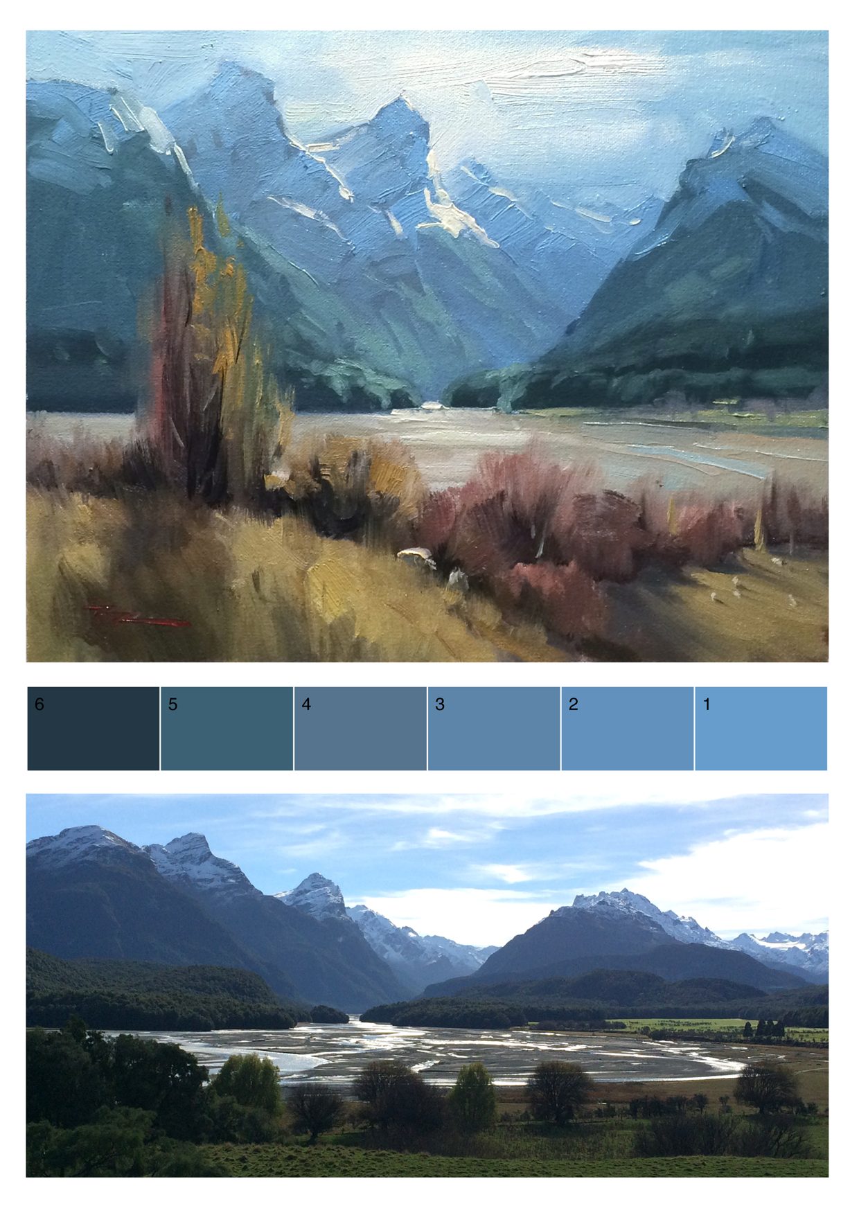
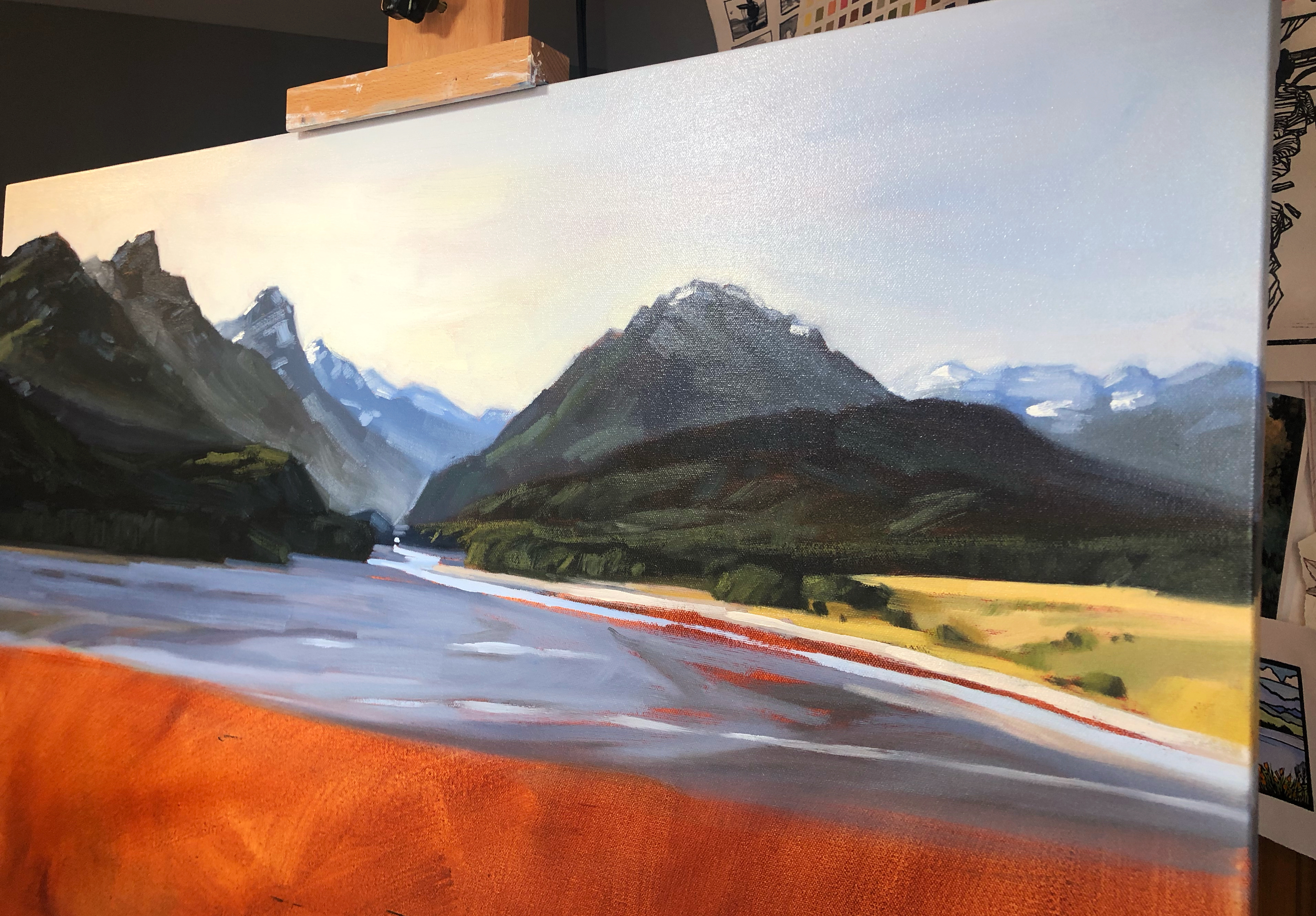
"Paradise" 13x10.5" Oil on Canvas by Richard Robinson.
M. Graham & Co. Oil Paints
Alizarine Crimson
Phthalo Blue
Ultramarine Blue
Burnt Sienna
Cadmium Red
Cadmium Orange
Yellow Ochre
Cadmium Yellow Light
Titanium White
Painting medium
M. Graham & Co. Walnut Alkyd Medium or Walnut Oil
Solvent
Gamsol
Canvas
Fredrix ultrasmooth canvas.
You could use a canvas panel or anything you prefer.
Brushes
Rosemary & Co. Richard Robinson Brush Set
Palette knife
Paper towels
Stay-wet palette
Water spray bottle
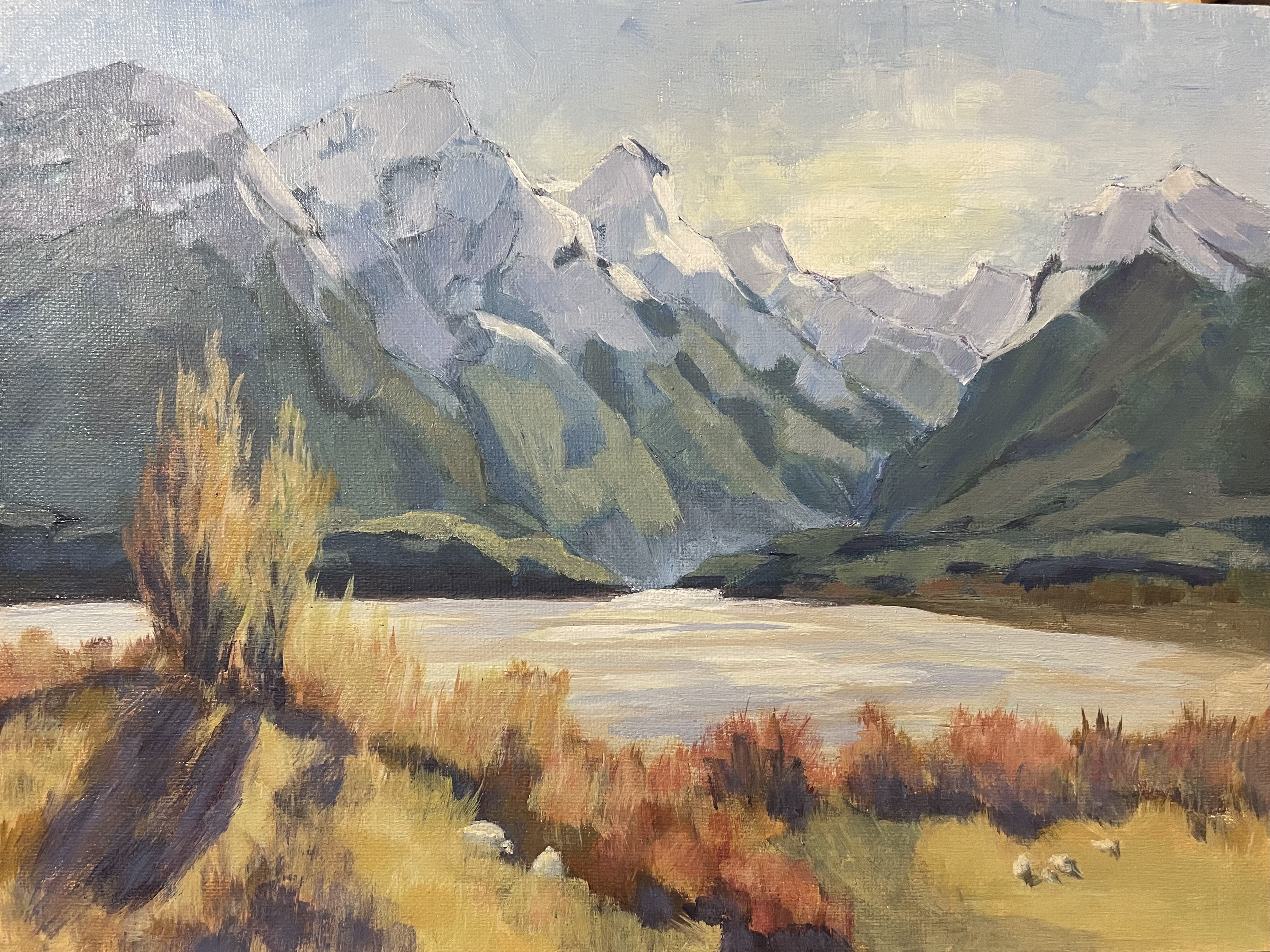
Painting paradise #33 by Mark Price
Hey Mark, great painting. Solid drawing, interesting brushwork and strong colour. I'd just suggest that you lighten and blue the colours more into the distant mountains, adding more depth. Also you could do with practicing the shapes of the snow in shadow and light. As can I.
Have a good look at how John Crump does that. Copy a few of them and then do the same with a few photos. It's trickier than it looks of course to translate all the intricacies of a snow clad mountain into a simplified version on canvas. By focusing on those for a while you'll get the hang of it and figure out your own visual shorthand for it.
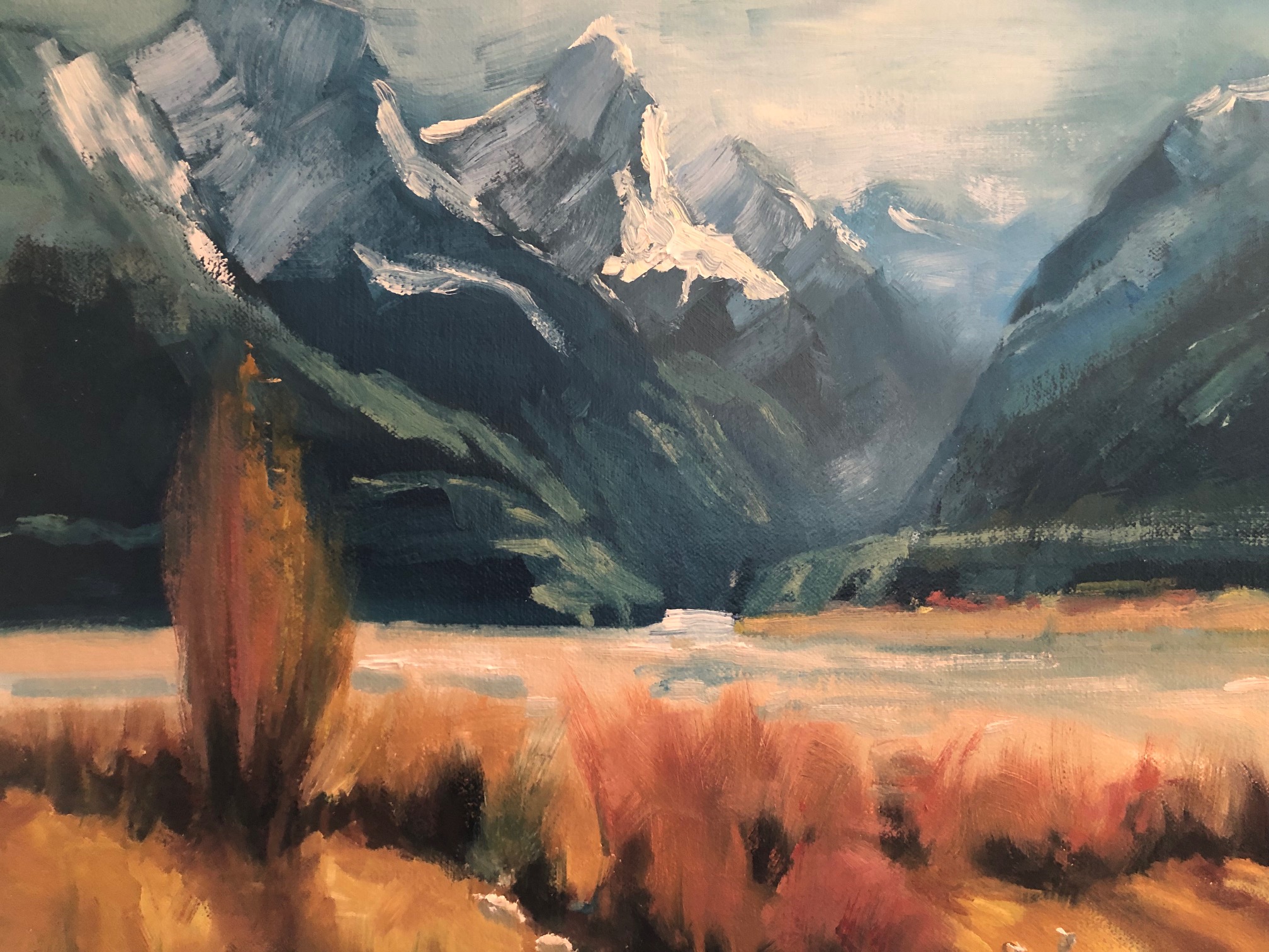
"Second go, if at first you don't succeed, try, try again. At least I hope I succeeded this time🤔" by Nancy Murray
Hi Nancy, good effort on this painting. Lots of work gone in I can see. Overall the colour works well, and there are sections of nice painterly brushwork and the drawing is not half bad.
Beware leaving those dark contrasty lines in the mountains that attract the eye. Ask yourself why would they be darker than any other shadow on that mountain. They wouldn't.
Also ask yourself why would shadows in the distant mountains be darker than shadows in the foreground hills. Again, they wouldn't. Those in the foreground need to be darkened. Similarly, the shadow sides of the sheep need to be darker for a better sense of light and form.
Look also at your tree which seems too symmetrical and pruned for a natural specimen. Making it less regular gives it more character and interest.
Happy painting!
Paradise, Isabel Gibson, acrylic
Artist: Isabel Gibson
Nice work Isabel. The drawing is good, the overall colour scheme is nice and warm due to your shadowed snow being more neutral grey than blue grey and your brushwork is bold and painterly. Good to see.
3 things I'd like to tweak:
Make less contrast and more blue in the colours in the mountains receding into the distance. If you squint at mine you can see those colours blend together into a blue grey because they're all very close to each other in hue and value. Squint at yours and you can still see those dark greens popping out. They're too dark and not blue-grey enough. Easy to fix.
Secondly, while you're there, be mindful to avoid leaving little lines along the edges of the mountains that give them a slight outlined look. Outlining objects is the quickest way to flatten a scene, and we don't want that in this painting that's all about creating depth.
Lastly, a small thing too, the edges of the shadows in the long grass cast by the tallest tree need to be more soft edged and grassy. And if you vary the long dark shape on the top edge of that hill more it'll look less like an outline as well.
Hope that helps.
Paradise: Oil on canvas 11x14 by Nancy Newton
Great bold painterly work, Nancy. There's a lot of contrast in value and warms/cools in there that's quite striking. I do like how your left most mountains are so big they're cropped at the top, but I'd like to see those pushed clean out the top rather than trying to squeeze them in there. The cropping gives a great sense of scale, like they are so big they can't even fit. Nice.

Paradise in Oils V:2 by Geoffrey Geeson
Geoffrey this is all good. I'd only change one thing and that's the brushwork of the sunlit snow on the mountains. It just seems disproportionately thicker and textured than the rest of the painting.
It's great to try these things, and if you like that I'd encourage you to continue, but for me the texture is too different from the rest of the painting which is all brushed on rather than dabbed on. There's my two cents. Otherwise, love it!
PARADISE by Kimberly Woodman
Lovely work, Kimberly. Great colour and brushwork and drawing. I'd just like to see a little more care with some of the edges to sharpen them up and provide a little more clarity. I'm specifically looking at the left hand edge of the mountain on the left that could be brought forward by sharpening and thereby giving the valley beyond it more depth.
"Nearly done with Paradise (burnt sienna ground)" by Tamsin Barlow
Ooh that's looking great, Tamsin! Love the strong crisp shapes and succinct brushwork. Beautiful!
Paradise is one of my favorite painting spots anywhere on the planet. Join me as I take you through this beautiful painting step by step. You’ll learn how to paint receding mountains, snow in shade and light, wispy autumnal willow trees and how to add those finishing details. Enjoy!
Who is this course designed for?
ALL skill levels from beginner to advanced.
Oils or Acrylics.
Learn About
Get the full course here: https://mypaintingclub.com/lessons/86-Paradise
Thanks to everyone who was part of the monthly workshop!
(Monthly workshops are available to all Premium Members - $20/month)
Login to your account to post a comment.