
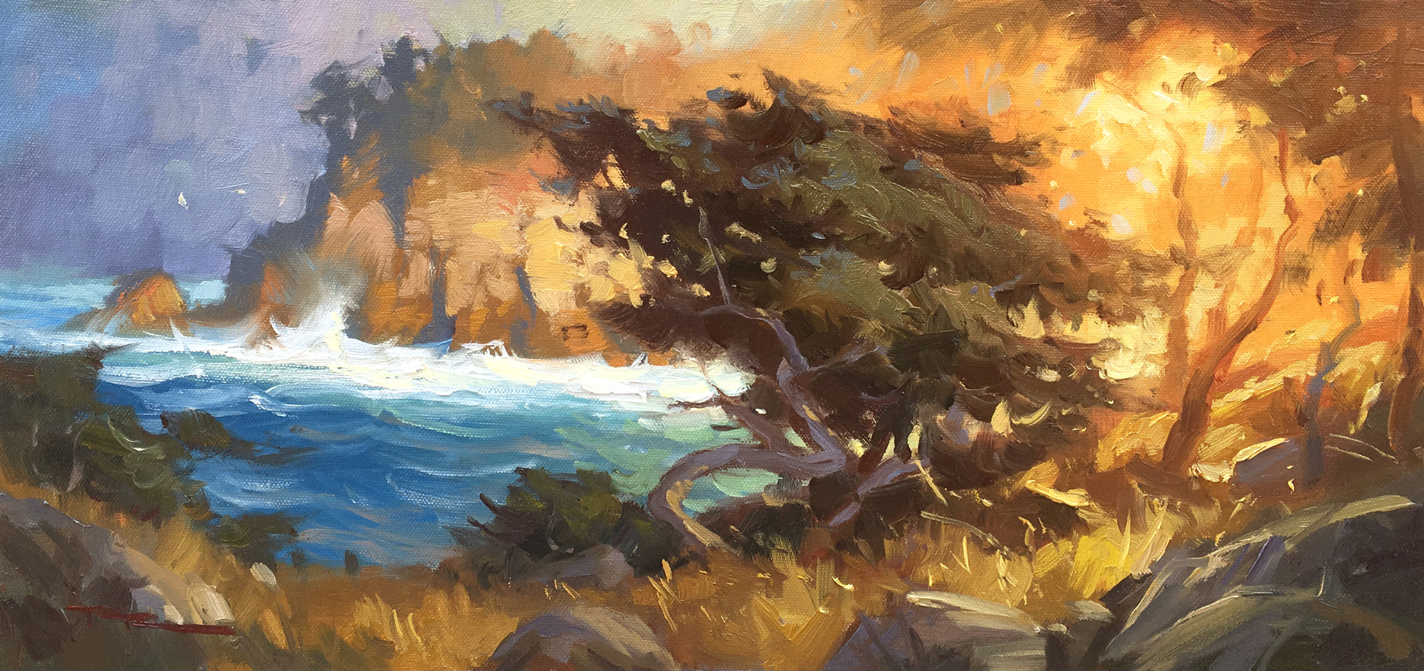
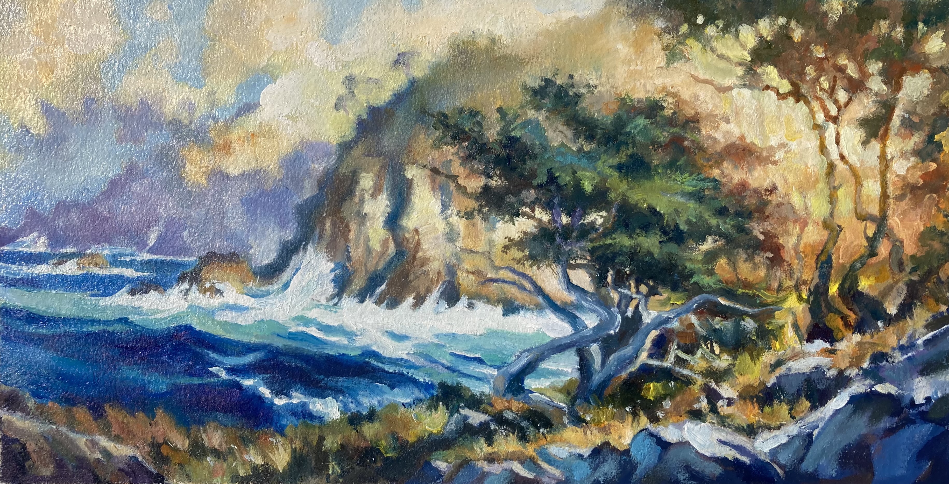
"Point Lobos" 15 x 18" Oil on Canvas by Richard Robinson.
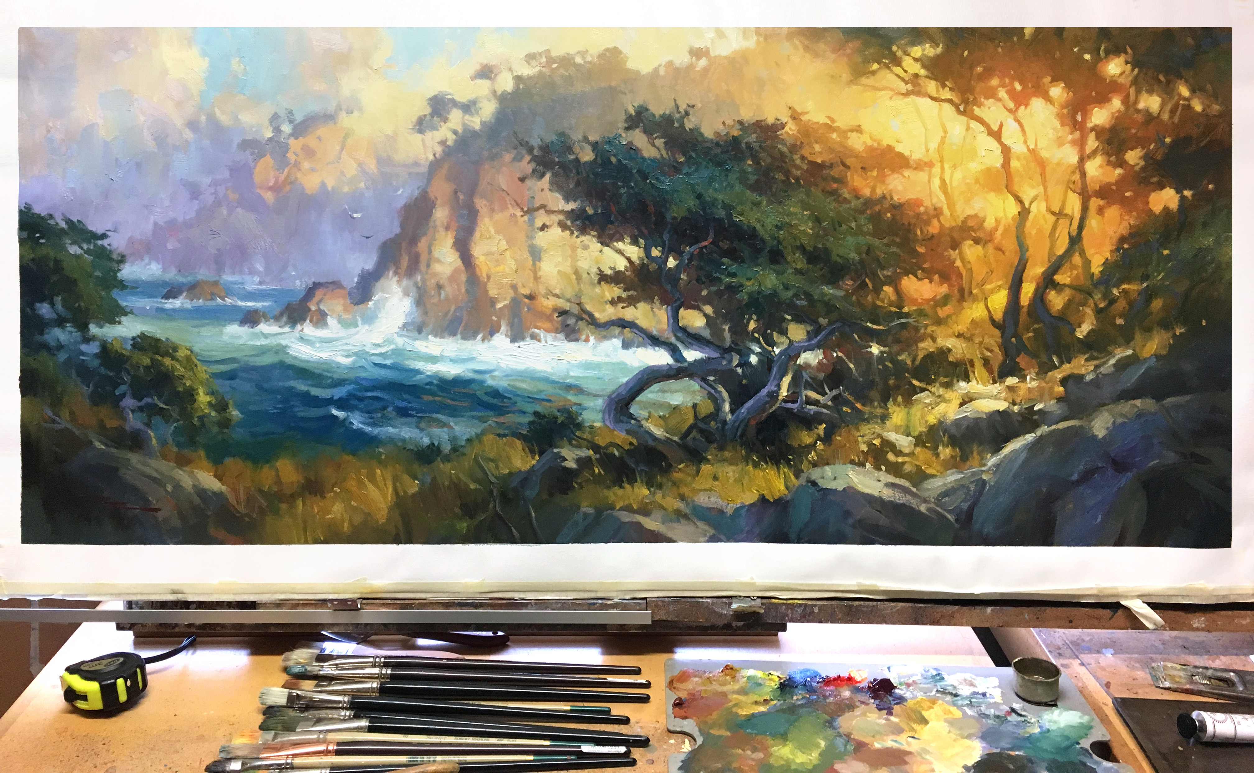
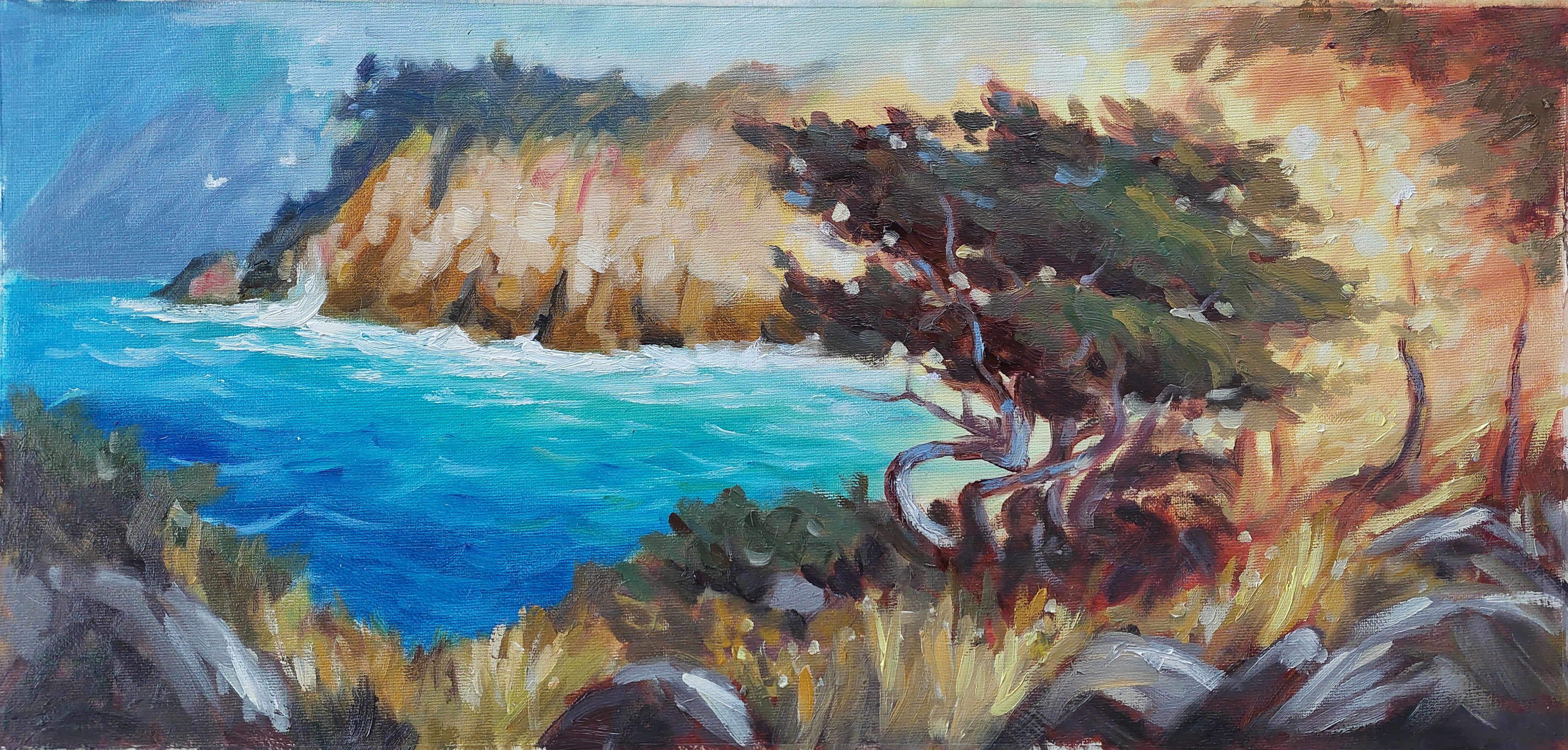
"Point Lobos II" 20 x 47" Oil on Canvas by Richard Robinson.
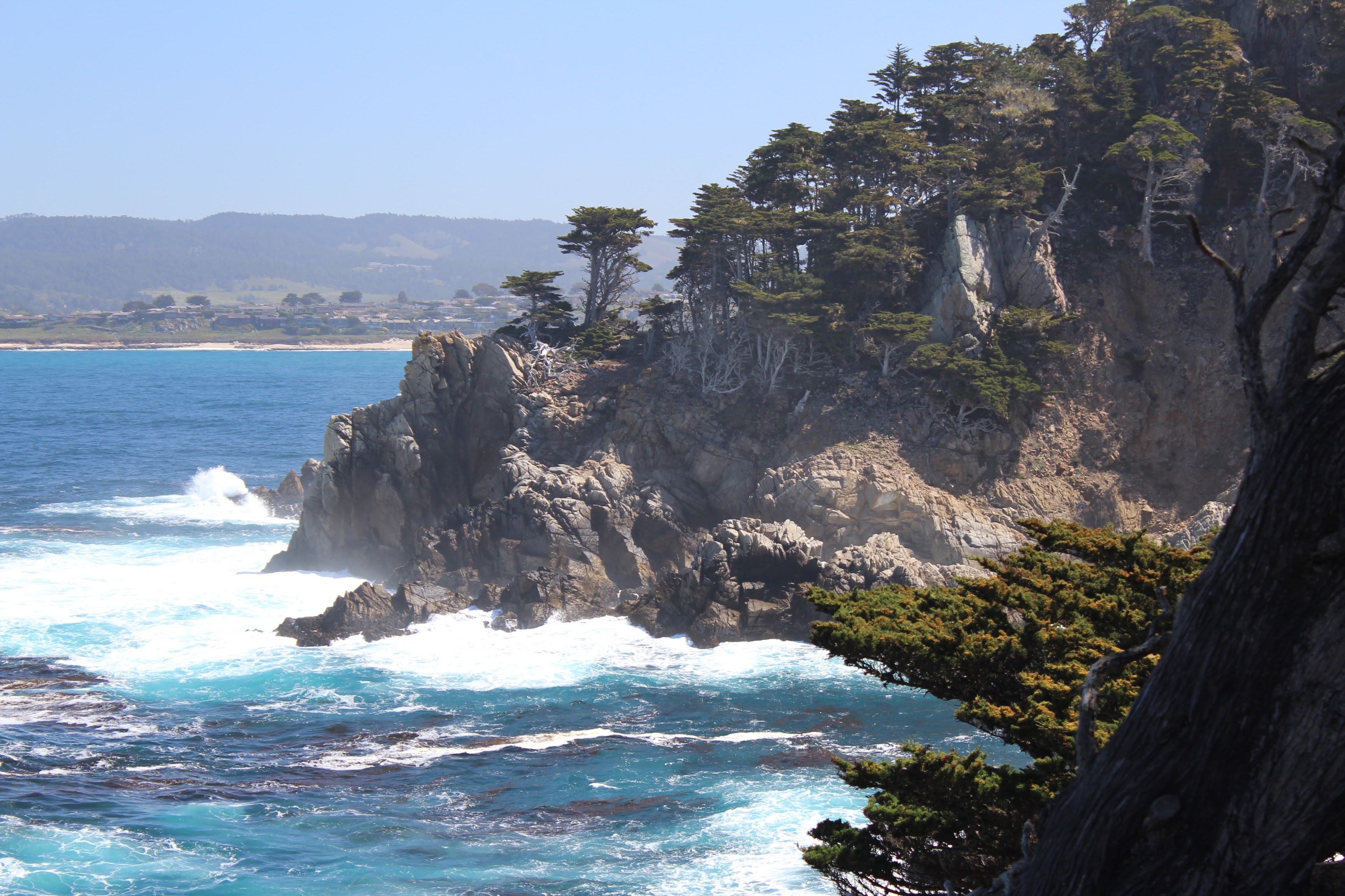
Point Lobos, California
Join me in a painting adventure to one of my favorite painting spots - Point Lobos, California. Paint this stunning impressionistic coastal scene with ease using big brushes. Follow along step by step using the resource photos or use the techniques to create something more your own.
When I first set foot here I couldn’t quite believe my eyes - Point Lobos is really a natural wonderland - I felt my heart wasn’t big enough to take it all in. Mother nature is so generous in her gifts. Let’s try to pay her a little homage in thanks.
The French (and expensive galleries) call this effect ‘Contre-jour’ lighting, or "against the light," which creates a striking and dramatic effect in landscape painting by positioning the primary light source behind the subject.
This backlighting technique results in several distinct visual characteristics:
Silhouettes and Strong Contrast
The subject appears as a dark shape against a luminous background, often losing midtone details while retaining a crisp or softened edge, depending on atmospheric conditions.
Glowing Highlights
The brightest areas often occur along the edges of objects, where light wraps around or diffuses through translucent elements like foliage, mist, or water.
Atmospheric Depth
Backlighting enhances a sense of depth as distant elements become hazy and warm-toned due to the scattering of light, while foreground elements remain in shadow.
Color Shift and Muted Foreground
Shadows in the foreground can take on cool or unexpected hues as they reflect ambient light, while the backlit sky often appears warmer and more vibrant.
Lens Effects and Diffusion
Depending on moisture or dust in the air, contre-jour lighting can introduce a halo effect, sunbursts, or soft diffusion, lending a dreamy or ethereal quality to the scene.
For painters, contre-jour compositions demand careful value control to balance the high contrast, ensuring that the dark areas retain subtle variation and the brightest areas don’t become overly harsh. It’s a powerful tool for creating mood, mystery, and drama in a landscape.
This demo for beginner to advanced painters is in oils but it's fine for acrylics too.
I'll take you step by step through this whole process.
Just 2 hours and you'll have a beautiful coastal painting. Or go the whole hog and paint a much larger version. Enjoy!
M. Graham & Co. Oil Paints
Alizarine Crimson
Phthalo Blue
Ultramarine Blue
Burnt Sienna
Cadmium Red
Cadmium Orange
Yellow Ochre
Cadmium Yellow Light
Titanium White
Painting medium
M. Graham & Co. Walnut Alkyd Medium or Walnut Oil
Solvent
Gamsol
Canvas
Fredrix ultrasmooth canvas (Giving it a light sanding first helps the paint stick better).
You could use a canvas panel or anything you prefer.
Brushes
Rosemary & Co. Richard Robinson Brush Set
Palette Knife
Paper Towels
Container for solvent
Container for painting medium
Get the full 1hr online video painting lesson here: https://mypaintingclub.com/lessons/140-Point-Lobos
Enjoy!
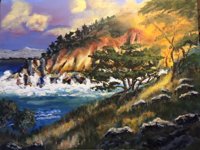
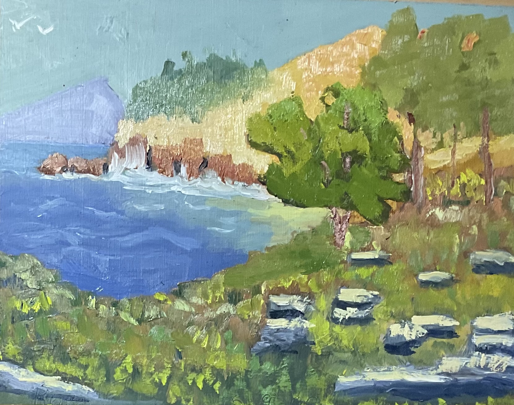
Point Lobos, acrylic, by Phillip Rysdon
Hi Phillip, good to see all the work that’s gone into this. The drawing is well done and those grasses and cliffs came out really well. There are two things I’d like you to look at.
Firstly, the transition of the light glow across the cliff area from right to left is too abrupt, even though you have softened the edges there, the whole area needs to change in colour more gradually in order to better give the impression of light.
Secondly, and this is part of that first problem, is that the darks in the cliff are too dark compared to those in the foreground. If you made those all lighter by a few degrees, including the distant ocean, that would do two great things for your painting - give it more depth, separating the foreground from the background, and would also give it a better sense of light.
These ‘contre jour’ backlit scenes rely on that value difference between foreground and background in order to work properly. Hope that helps.
"Point Lobos Oils on Oil Paper" by Geoffrey Geeson
Great work, Geoffrey! You’ve got some beautiful organic shapes in here and a solid glowing light effect, good tonal separation between the foreground and background and cohesive painterly style of brushwork. I can’t see anything to tweak. Nice!
Point Lobos oils 30x60 cm canvas sheet by Adana Virna
Hey, Adana, nice piece! Most notably, your brushwork has something lyrical about it that’s adding movement to the whole painting. Lovely to see that.
I just think your glowing area needs a little more detail in there to give it more depth, and the lights in the foreground rocks and grasses needed toning down a little into half-lights so they’re making more of a foreground frame for all the light in the background. That could be achieved by glazing it a little darker with burnt sienna for example.
The dark accents in the cliff need to be lightened a little too to create more depth between the foreground and background. I find it helpful to think of these backlit scenes in terms of value planes of depth, getting lighter as they recede.
"Point Lobos" by Stephen Dickens
Hi Stephen, looks like you're having fun. Big bold strokes and loads of paint. Great!
Looks like early days for you so I won't get into too much detail, but I want to encourage you to keep at it and direct you to some more learning resources that will help.
Firstly, drawing is the key to good painting, so in order to focus on drawing, you can simply take away the problem of colour and practice drawing or painting in black and white. There's a good drawing course on my website to help you with that: https://mypaintingclub.com/lessons/125-Real-Drawing-for-Kids-1
Colour mixing is the next step and there's a nice little lesson on two colour simplicity here: https://mypaintingclub.com/lessons/173-2-Color-Simplicity
Gives those a go and see what you think.
Congratulations and thanks to everyone who entered a painting into the monthly workshop. Great work!
- Richard.
Login to your account to post a comment.