
"Summer at the Cove" 15x15" Oil on Canvas by Richard Robinson - Tutor
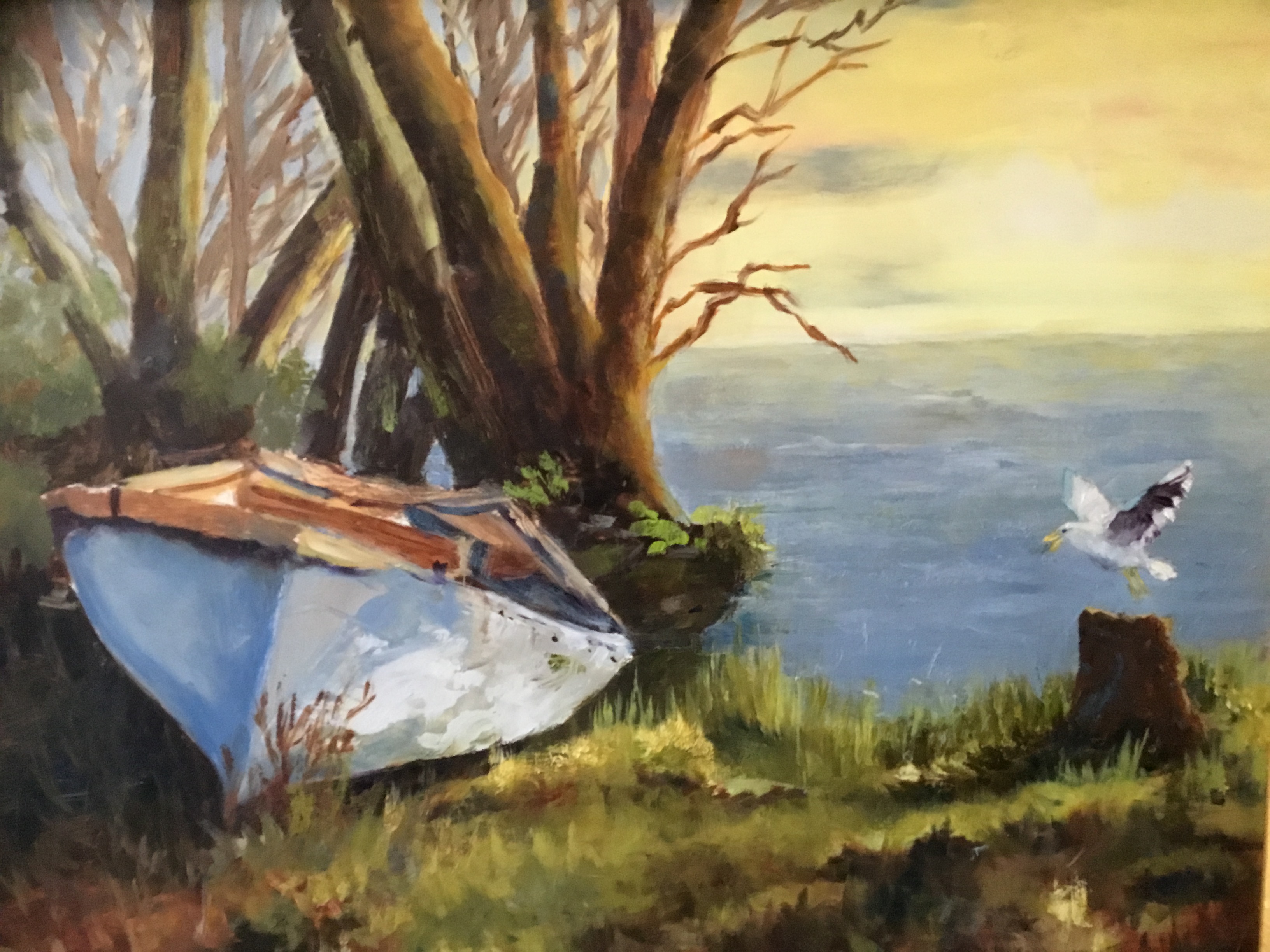
Along the Shore by Lana Huepenbecker
Lovely painting, Lana, with a strong sense of light and colour. I'm enjoying your painterly brushwork and glowing light effect in the sky. You've done well to push the trees back into space by lightening the value and altering the colour. I recommend being really careful when painting branches that you keep them anatomically correct for the specific tree and generally getting thinner as they grow otherwise the eye is drawn to the strange shape. It's good to practice them on paper first to get the rhythm.
You've got two trunks there matching each other too - a small lost chance for natural variety. Be sure to make your horizon level and flat - use a ruler or masking tape if need be. Soft edged is great, but wobbly... not so much. You've done a great job of the shadows across the grass with overlapping dark and light shapes. Love the seagull too, though I'd tend to bring it and the stump and the boat a little further away from the side of the canvas as these objects are really the stars of the show, so why have them on the side of the stage?
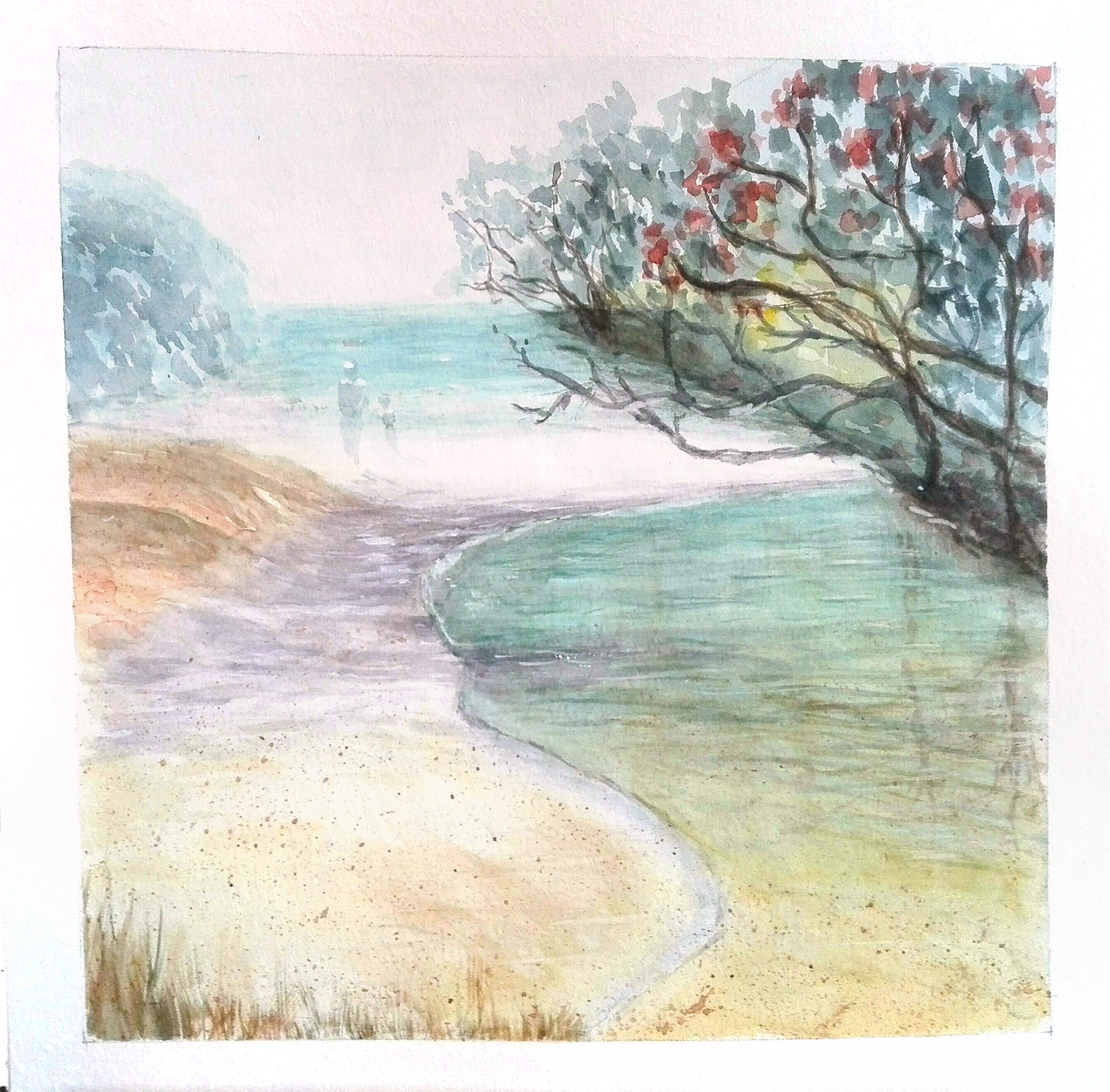
Waipu Cove by Genevieve Reinke
A nice serene painting, Genevieve. Very lightly and gently painted, carefully done. Since this particular lesson was about loosening up I'd like to encourage you to try this painting again using bigger brushes and really load them up with paint. Often that's hard to do with watercolour since they often come in little pans with little palettes and little brushes, so if you want to get more expressive it really helps to upsize everything. Have fun!
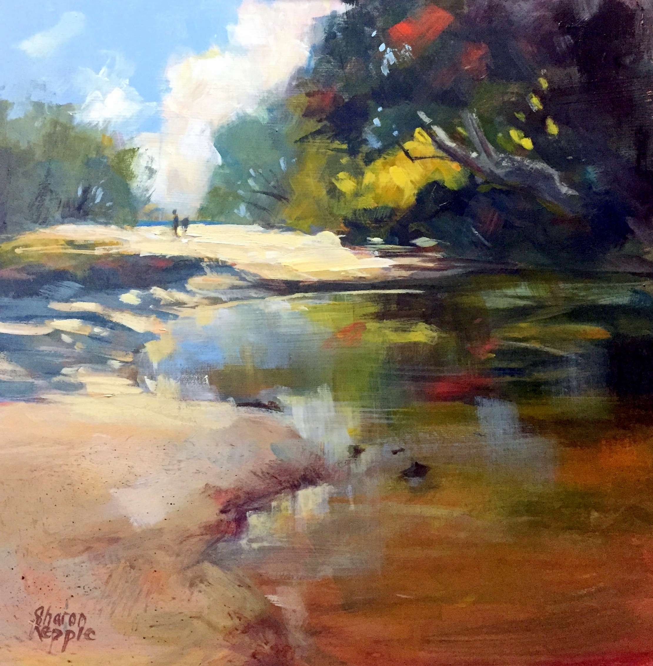
Waipu Cove by Sharon Repple
Wow, beautiful work Sharon! I love the strong colour work in this and succinct brushwork. Great variety of sharp and soft edges too and the full value range evoking strong sunlight. Nothing I would change here. Good job.
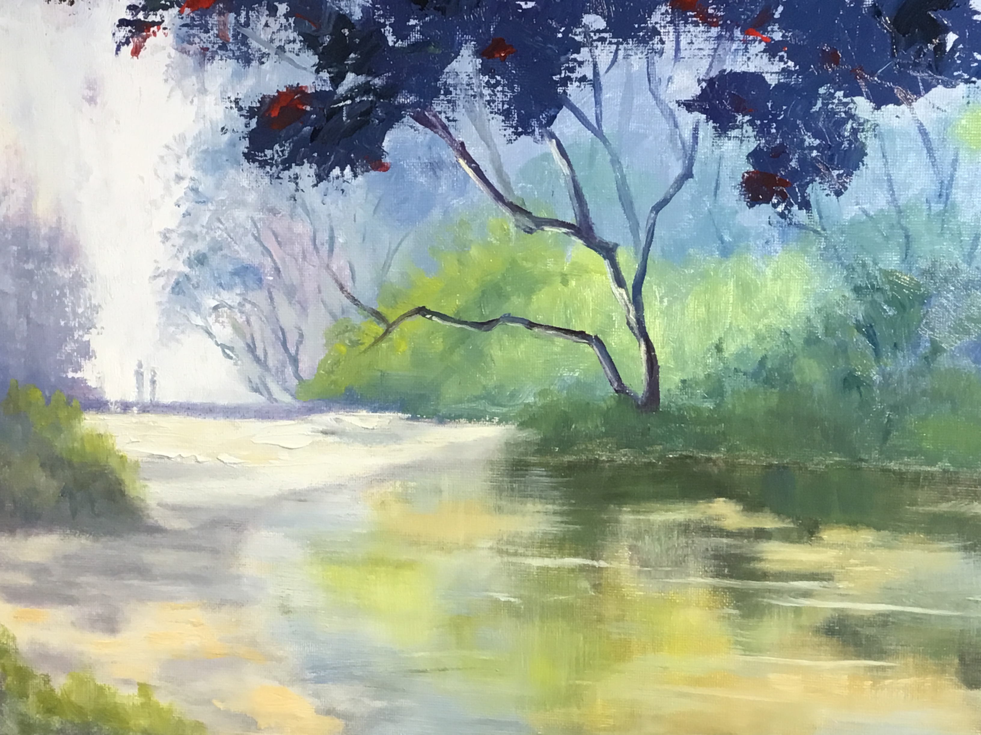
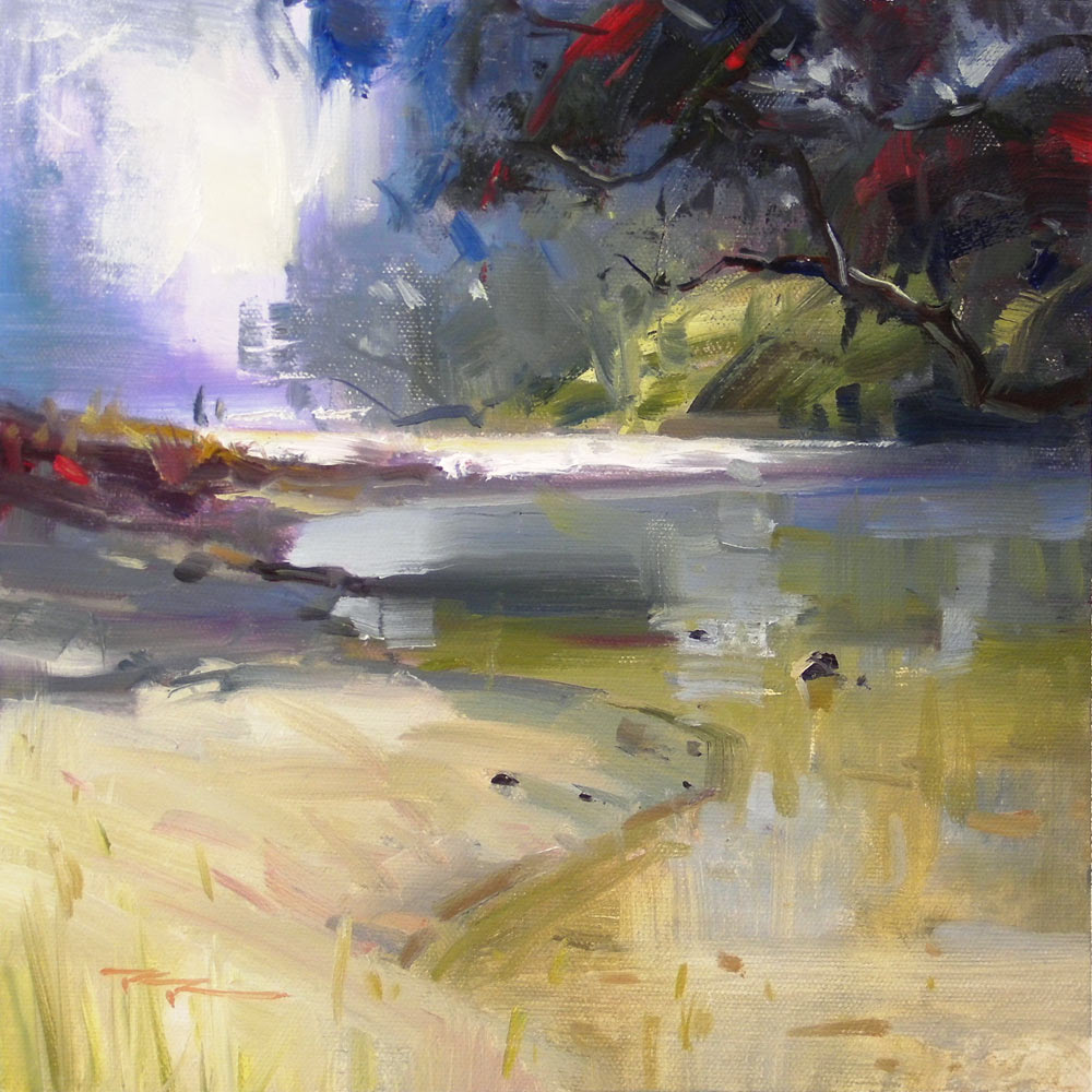
Waipu Cove by Lana Huepenbecker
That's a really light, bright treatment, Lana. Really interesting to see. You've achieved a good sense of spacial depth there by gradually lightening and cooling the distant colour planes, though the effect is spoilt a bit by the dark tree branches joining the bank where there should be shadows of an equally dark value. Either that or lighten the tree slightly to match the value of the shadowed grasses there.
The dark blue grey foliage at the top could do with a little more detail like a few twigs and the occasional individual leaf to stay in keeping with the feel of the rest of the painting.
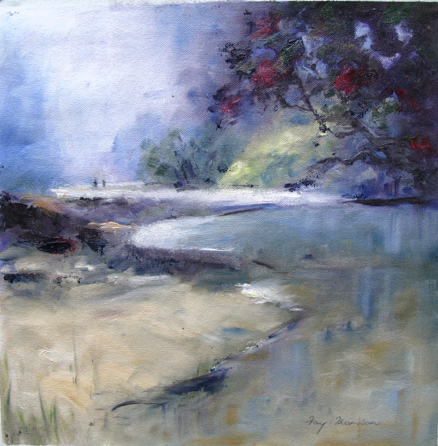
Waipu Cove by Fay Thomson
Nice work. Fay. It's got a nice feel to it. With all those soft edges it's almost a watercolour in oils. Great to see that contrasted with the few little sharp accents here and there. All that softening leads very easily to muddied colour, especially where darks meet lights and warms meet cools. The only way around that is to use lots of different brushes, some for darks and some for lights, or be pedantic about keeping a single clean brush in between strokes.
Student critiques are made as part of the monthly online workshops available to all Premium Members.
Get the Waipu Cove Painting Lesson
Login to your account to post a comment.