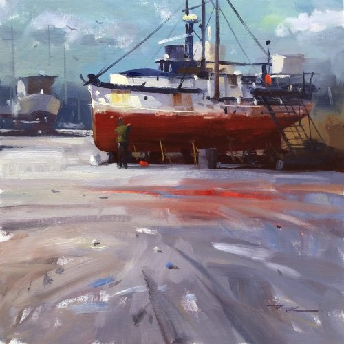
- Creating a leading foreground
- How to paint with big masses
- How to create large colour movements
- How to finish with calligraphic brushwork
- and LOTS more!

A friendly place to learn at your own pace.
with Richard Robinson
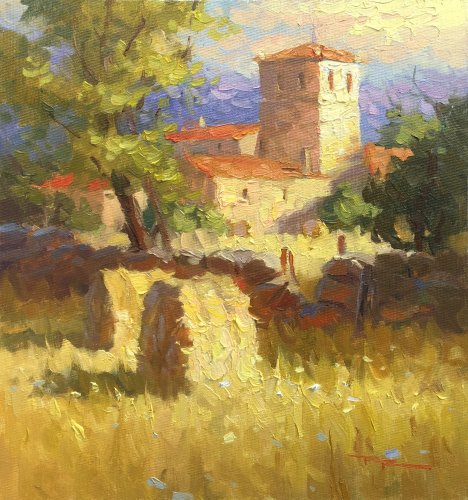
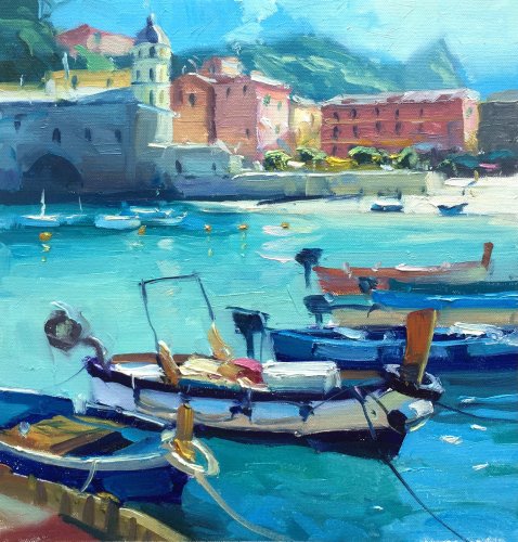
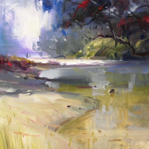
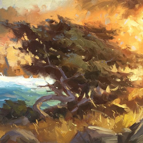
Discover the power of passionate brushwork in these 4 great painting lessons. Follow along step by step using the resource photos or use the techniques to create something more your own.
Whenever you’re ready! The lesson is available online any time, and your access to the lesson never expires.
As long as you need! Your access never expires, so you can come back again and again.
Sorry, no you can’t download the video. This is to avoid piracy. You’ll always be able to view the video on this site though.
Richard is a talented full time artist, who loves painting and teaching.

Hi I’m Richard. I’ve been painting my whole life and back in 2001 I traded my graphic design career for the humble life of a full time artist. I love painting, and as it turns out, I love teaching too.
Nowadays I balance my life between parenting, painting, surfing, travelling and teaching. My work is regularly featured in international art magazines, in galleries in New Zealand and America, on TV and in my Mum’s house.
I give outdoor painting workshops in interesting spots around this beautiful planet of ours and love encouraging people to paint. Two of my favourite artists are John Singer Sargent and Joaquín Sorolla.
My painting website: www.nzpainter.com
I’d love to be your new teacher.

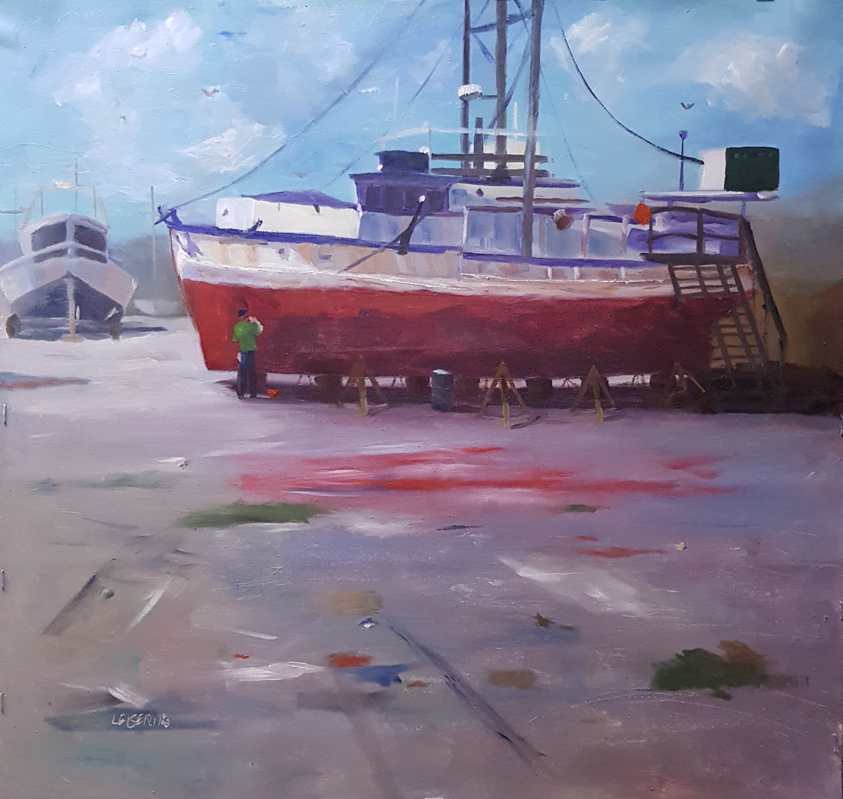
Boat repair Oil on canvas 50cm x 50 cm
Hi Anne-Dore, this is a dynamic piece with a graphic edge to it! You've captured the character of the boat beautifully, and I especially enjoy the contrast between the warm red hull and the cooler blue sky. The way you've handled the light and shadow on the boat feels natural and believable, giving the scene a grounded realism. One area to consider refining is the foreground. While it has a loose, painterly quality that works well, perhaps you could introduce a few larger areas of tonal variety to suggest texture or interest without overwhelming the composition. Overall, this is a wonderfully composed and executed painting—you’ve done a fantastic job conveying the mood and setting. Keep up the great work! Looking forward to seeing your next piece. Warm regards, Richard.
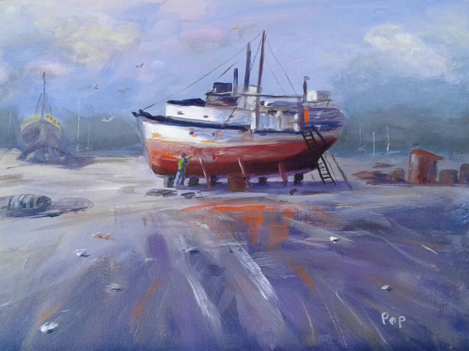
Boat repairs, acrylic
What a lovely soft sense of mood and atmosphere you’ve achieved here, Evelyn. The soft, diffused light and muted colours give a peaceful, almost nostalgic feel to the scene, while the movement in the brushstrokes adds energy and life to the foreground. The reflections and wet ground plane are beautifully painted, with those streaks of colour leading the eye naturally toward the boat. One area you could refine is the foreground, where the brushwork feels slightly hurried and could benefit from a touch more detail or texture for added interest. Additionally, consider darkening the shadows under the boat just a fraction to ground it more firmly and enhance the sense of depth. Overall, this is a charming piece with great storytelling, and I love how you’ve captured the character of the boat so well—keep up the fantastic work!
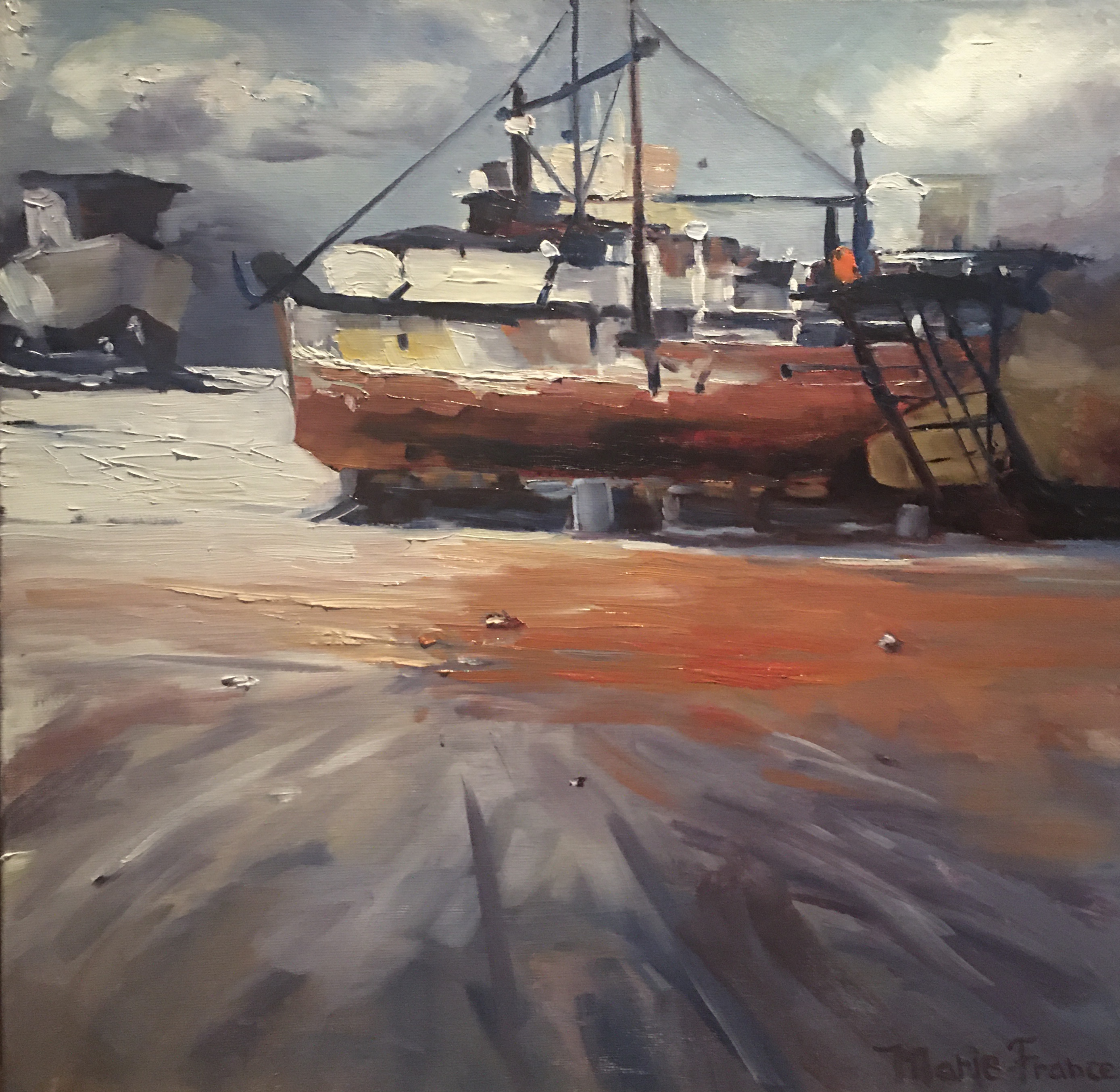
The OldTimer, 16 x 16, oils, by Marie-France L''Ecuyer, QC, Canada
You’ve captured such a wonderful sense of atmosphere here, Marie. The moody sky, the warm reflections in the wet ground, and the characterful old boat all work together beautifully to create a strong narrative. Your brushwork feels confident and expressive, especially in the sky and the foreground, and I love how you’ve created such a strong contrast between soft and sharp edges throughout the painting. You’ve really nailed the dramatic light and colour harmony here. Fantastic work—keep exploring this kind of drama!
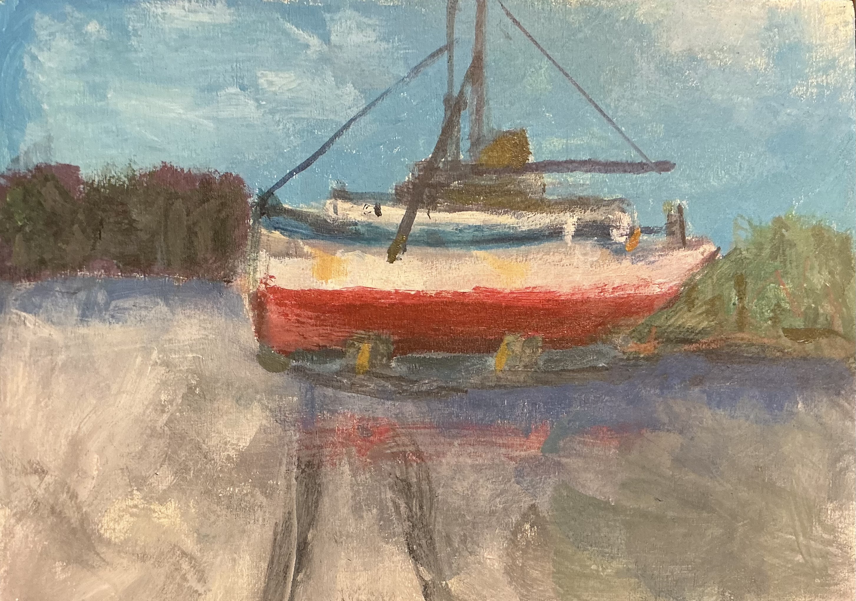
On the Blocks
You've done a great job capturing the character of the boat and its surroundings, Leslie. I love the bold choice of the red hull—it immediately catches the eye and adds a wonderful pop of color against the softer background tones. The way you've suggested the reflections in the wet ground below the boat also creates a nice sense of connection between the vessel and its environment. One area to develop might be the values, particularly in the shadow areas of the boat and the darker elements in the background. These could be pushed a little darker to create more depth and contrast, helping the boat feel more three-dimensional. You might also soften the transition between the sky and treeline to make that edge sink behind, letting the boat take the spotlight with it's crisp edges. Great effort here—keep experimenting with these techniques, and I look forward to seeing where your painting journey takes you!
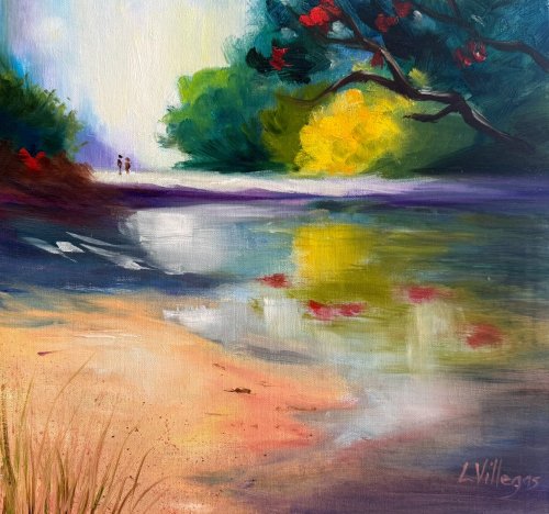
Waipu Cove by Louise Villegas. Oil 12 x 12. Another challenge to paint loosely!
Hi Louise, thanks for your painting. The vibrant colour, strong contrast and bold brushwork make this a treat to look at. I like the softness in the light-filled background and your spotlight on the foreground sand. To push the depth, try separating the value families a touch more: lighten the shadow mass in the furthest tree - leaving it so similar to the darks in the foreground serves only to flatten the image. Similarly you could lighten the darks on the left. Also consider shortening the central sand bar at the right, so that the eye is invited to wander up and around the stream into the distance instead of being stopped by a solid bar. Try cooling the distant greens slightly with a hint of blue-violet to help them recede. To avoid having your signature get so close to the edge of the painting in future you might try working backwards from the S. Lovely, loose work—keep chasing that light!
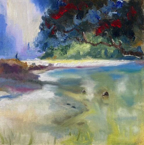
Waipu Cove Study
Hi Geoffrey, strong colour and good drawing and shapes in here. Looks like you went nuts with blending with the soft brush at the end there, but, it's great to try that out a couple times till you find out what it does - generally just takes the excitement out of interesting brushwork. To be fair, it can help a bit with reflections, clouds and atmosphere, but, yeah it's easy to undo good brushwork with it. You could bring this one back with a few crisp strokes defining the waterline and midground details in the bank. Mind you keep strokes in reflections more vertical and horizontal too - it really helps.

Waipu Cove - my take. Now I know why Van Gogh cut off his ear!
Hi Nancy, there's a lot of good stuff going on in here: exciting brushwork, interesting organic shape design and a fairly harmonious colour scheme. One thing that would help create more depth in this would be to darken the foreground tree so it's clearly separate in value from background hill. Value is the lightness or darkness of a colour. A great exercise for you to really get the idea of using value in a painting is to repaint this using just black and white. Working from photos often makes colour work difficult, especially in photos like this where there's a dark object against the light because the camera tends to over-darken and desaturate (remove colour from) the darks. That's why it's so good to paint from life as often as possible so that we get a better understanding of light and colour. Long story short, darken that tree and try working over the water again, but work from dark to light - you've lost some of the darks in there - try squinting at the water resource to see what the big colour shapes are doing. Happy painting!

Weekly Class Recommendations- Waipu Cove 10”x10” oil on canvas by Karen Woodhouse (South Australia)
Hi Karen, really nice design and shaping of form here - great work. I appreciate the soft glow of the background light too and the colour variety there - nice. Love your spotlight work in the green bank too - beautiful! It's the colour you've pushed rather that the paint application to lean this towards abstraction, and that's working well to add interest, but I'd like you to try being bolder with the paint - thicker, stronger, faster! Use different tools. That the point of this lesson. Make the shape, break the shape, make and break, make and break. Go nuts! (That said, great painting!)

Waipu Cove
Hi David, great energy, colour and brushwork in this little piece - bravo! Just two things would solve this one for me. Lose the 3 dark blobs in the foreground water (They're too similar, and incongruous) and cover and then repaint that foreground waterline stroke with a line that starts thin and gets fatter at the bottom, or something like that - it just needs more finesse, more calligraphy, perhaps 3 lines. (By the way I can't use photos in the magazine that are out of focus. If you put a better photo in I'll be able to use that - but don't delete this one otherwise you'll lose the critique. Cheers).

"Waipu Cove." 12x12, Oil on canvas.
Hey Toni, nice work. Really good shadows and reflections. I'd just note that the background and foreground tree need to be separated by value, meaning the background hill etc needs to be a little lighter than the tree. The foreground grasses need to grow at a variety of angles. You probably feel this already, that the palette knife on the white beach is incongruous with the rest of the painting, which means you needs to tidy it up a bit, or introduce other paintwork like it throughout the painting. Other than that, great!
 sale
sale
Not loving your painting lessons? No worries!
If it’s not the right fit, we’ll give you a full refund within 30 days of purchase - no questions asked.
When you purchase a DVD you also get online access to the same lesson, including any lesson resources like photos, downloadable notes and access to upload your painting to the student gallery.
That's why you need to make a password when you purchase a DVD, so you can access the online content as well. Enjoy!