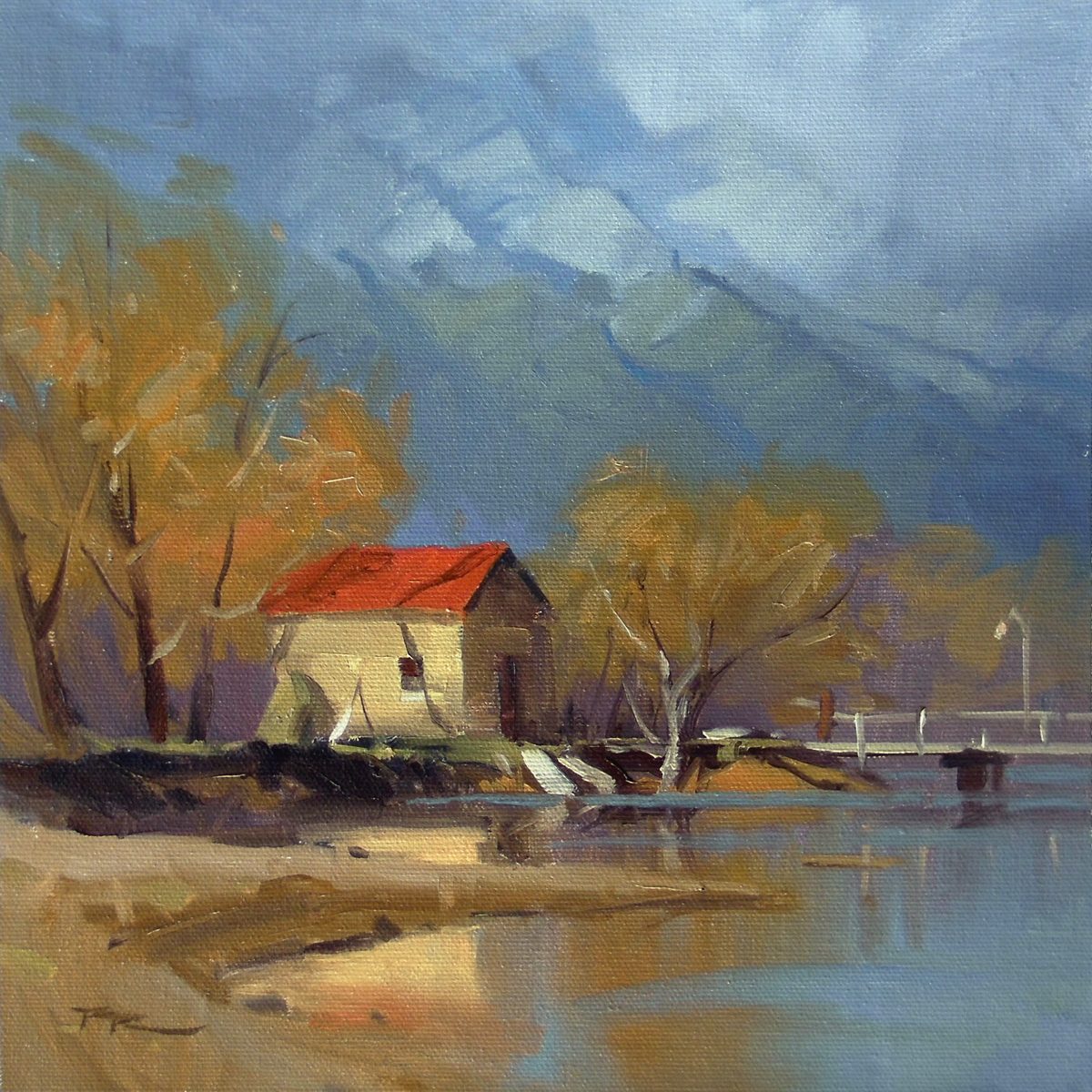
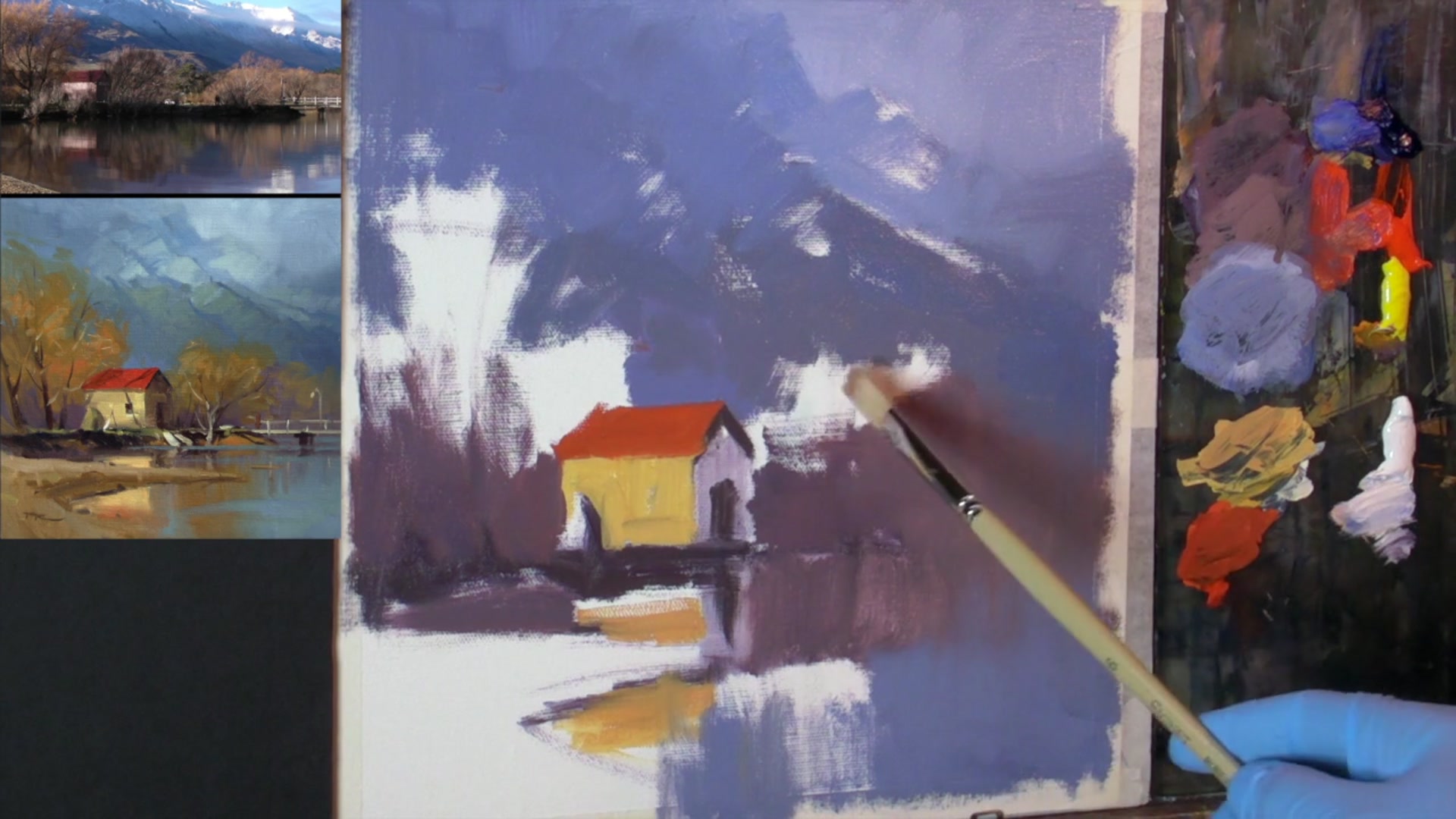
In this chapter, we're diving into the serene beauty of Glenorchy with a focus on simplicity and color mastery. I've chosen a very simple palette for this lesson, using just three primary colors—red, blue, and yellow—along with white. This limited palette is a fantastic way to deepen your understanding of color mixing and to see how most hues can be achieved with these basics. We'll be painting a charming lakeside scene, capturing the tranquil essence of the boat shed nestled in nature. I've selected a couple of bristle brushes and finer ones for detail work, and I'm using M. Graham's walnut oil as my medium, steering clear of any thinners this time. As we begin, you'll learn to create a thin wash using a mix of blue and red, which will serve as the foundation for your sketch. By placing the boat shed at the intersection of a vertical and horizontal third on your canvas, we'll adhere to the rule of thirds, enhancing the composition's balance and visual interest. This scene is not only a joy to paint but also a rewarding subject that will enrich your painting skills and appreciation for color harmony.
This guide accompanies the full video lesson. The lesson includes the complete narrated video, the printable PDF chapter, and personalised critique support.
"Glenorchy" 11 x 11" Oil on Canvas by Richard Robinson
Step 7Mixing Warm Light Values
Mix Warm Light Values
Use a clean brush to mix the oranges together in the foreground. Start with orange, but if it's too intense, modify it with blue and white to achieve a warm light value. This approach simplifies your color choices using a primary palette of blue, red, yellow, and white.
Balance Your Grays
When mixing grays, adjust the balance by adding complementary colors. If the gray is too red, add blue and yellow to neutralize it. If it's too yellow, add blue and red to correct the tone.
Pro tipUse a simple primary palette to simplify color choices and make it easier to mix consistent colors.
Embark on your painting journey by establishing a strong foundation with a light sketch using a thin wash of blue and red. Position key elements like the boat shed using the rule of thirds to create a balanced composition. As you progress, focus on blocking in dark and light values, ensuring that reflections in water are slightly adjusted to maintain realism.
Introduce vibrant colors with care, tempering them with complementary tones to avoid overpowering the scene. Pay close attention to perspective and detail, ensuring lines slope towards the horizon to maintain depth. Use mid values and reflections to unify the painting, and create an atmospheric background with soft transitions between elements.
In the final stages, focus on enhancing contrast and adding texture to bring your painting to life. Use loose, expressive strokes for natural elements, and soften edges to create a cohesive look. Add final touches like figures to inject life into the scene, and use contrast strategically to guide the viewer's eye to focal points.
Points to remember
Use a thin wash for initial sketches to keep lines adjustable.
Reflections in water show lights slightly darker and darks slightly lighter.
Temper vibrant colors with a touch of blue and white.
Ensure all lines slope slightly down towards the horizon for correct perspective.
Use a simple primary palette to simplify color choices.
Use loose, calligraphic strokes for branches to keep the painting lively.
Avoid painting parallel lines at equal distances for natural variation.
Use contrast to guide the viewer's eye to focal points in your painting.