In this chapter, we're diving into the fascinating world of color harmony, a concept often discussed but rarely mastered. Our journey begins with a practical tool: the gamut mask. By visiting my online page, you can access this tool to create unique color schemes for your paintings. The process is straightforward, with instructions readily available, and any uncertainties can be clarified by clicking on the helpful question marks. The beauty of the gamut mask lies in its simplicity; you define a shape, and your palette is limited to the colors within it, naturally fostering harmony. This technique, inspired by the renowned artist James Gurney, allows you to simplify and unify your color scheme, enhancing the coherence and mood of your artwork. We'll also focus on using a two-value statement to distinguish between light and shadow, simplifying complex scenes and establishing a clear visual structure. By the end of this chapter, you'll be equipped with a powerful method to achieve color harmony in all your future paintings, transforming your approach and elevating your art to new heights.
This guide accompanies the full video lesson. The lesson includes the complete narrated video, the printable PDF chapter, and personalised critique support.
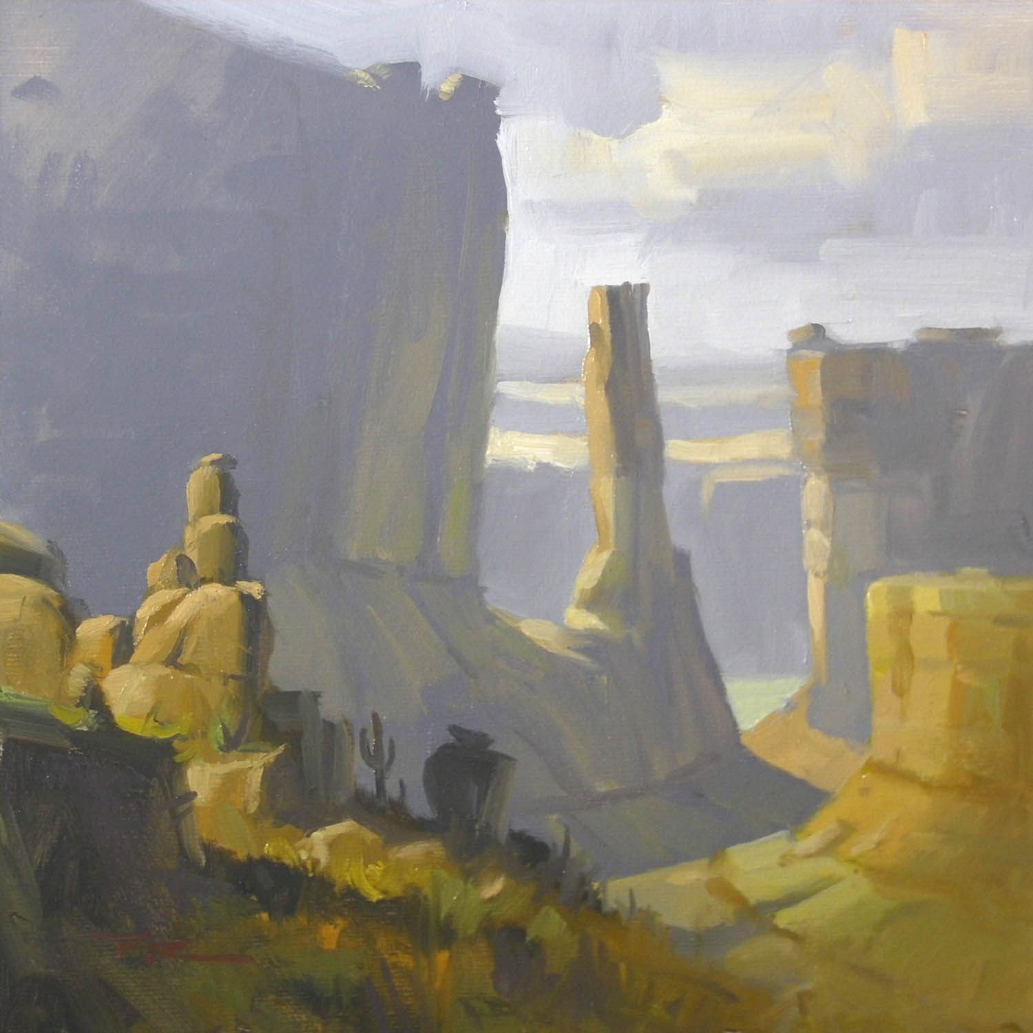
"Park Lane" 10x10" Oil on Canvas by Richard Robinson
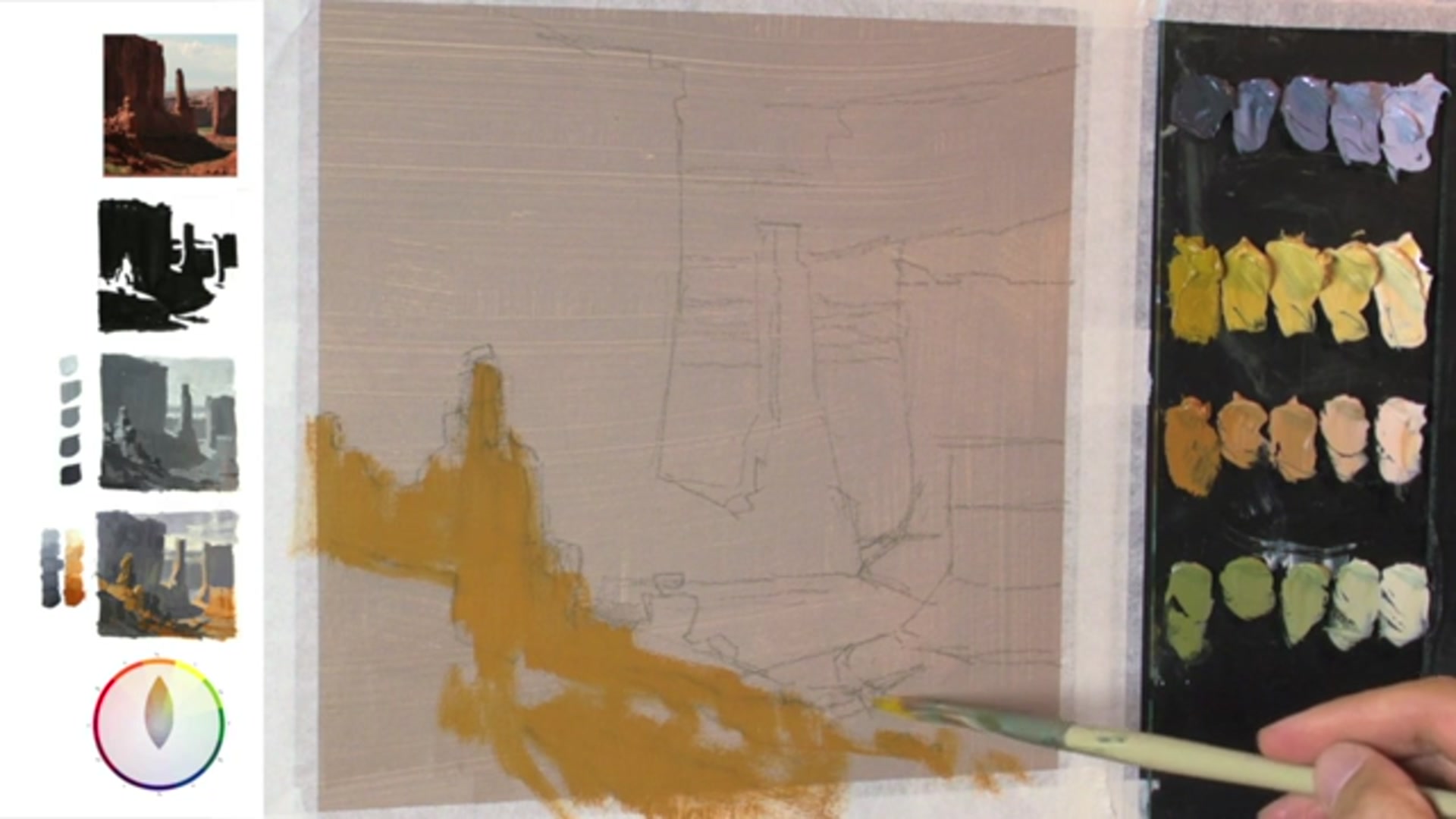
Step 11Applying Paint and Mixing Colors
Organize Your Colors
Take the time to organize your colors and complete any preliminary studies. This preparation may take longer initially, but it will lead to a more satisfying painting by resolving potential issues early on.
Avoid Over-Referencing the Photograph
Resist the temptation to constantly refer to the photograph. Instead, rely on the preparatory work you've already completed to guide your painting process.
Correct Mistakes with Value
If you apply the wrong value, don't hesitate to wipe it off and correct it. Use the value on your brush to adjust other areas if needed, then reapply the correct value to the initial area.
Apply Colors with Intention
Apply colors methodically, working from dark to light and thin to thick. Start with the thinnest dark layers and gradually use thicker paint as you move to lighter values, reducing the amount of painting medium and using larger amounts of paint.
Mix Ample Paint
Always mix more paint than you anticipate needing. It's easy to underestimate the amount required, especially with colors like greys, which may need remixing if you run out.
Pro tipMix more paint than you think you'll need to avoid running out mid-painting.
Embark on your painting journey by simplifying the landscape and achieving color harmony. Begin with a two-value statement to distinguish light and shadow families, and use a gamut mask to limit your color palette, ensuring a cohesive and harmonious color scheme. Choose a resource photo with large, simple shapes to focus on color relationships, and develop a visual concept that excites you, guiding your artistic decisions.
As you progress, create Notan sketches to define dark and light shapes, ensuring a dynamic and balanced composition. Conduct limited value studies to explore depth with three to five values, and experiment with gamut mask variations to discover unique color interactions. Prepare for your final painting by selecting your favorite color study and setting up your materials, including toning your canvas with a warm acrylic grey for enhanced color harmony.
During the painting process, apply colors methodically from dark to light, focusing on the center of interest and edge control to guide the viewer's eye. Add highlights and details with restraint to maintain balance, and use texture to enhance depth. Complete your painting with final touches, signing your work to mark it as your own. Remember, each step is an opportunity to explore and express your creativity.
Points to remember
Use a gamut mask to limit your color palette and achieve harmony.
Choose a photo with large, simple shapes to focus on color harmonies.
Link dark shapes to dark shapes and light shapes to light shapes for visual unity.
Keep your values separate on the palette to maintain simplicity in your study.
Mix more paint than you think you'll need to avoid running out mid-painting.
Darken the top of the chimney to make it stand out against a lighter background.
Ensure reflected light colors are lighter than the surrounding shadows to accurately depict light effects.
Remember that taste equals restraint when applying highlights.