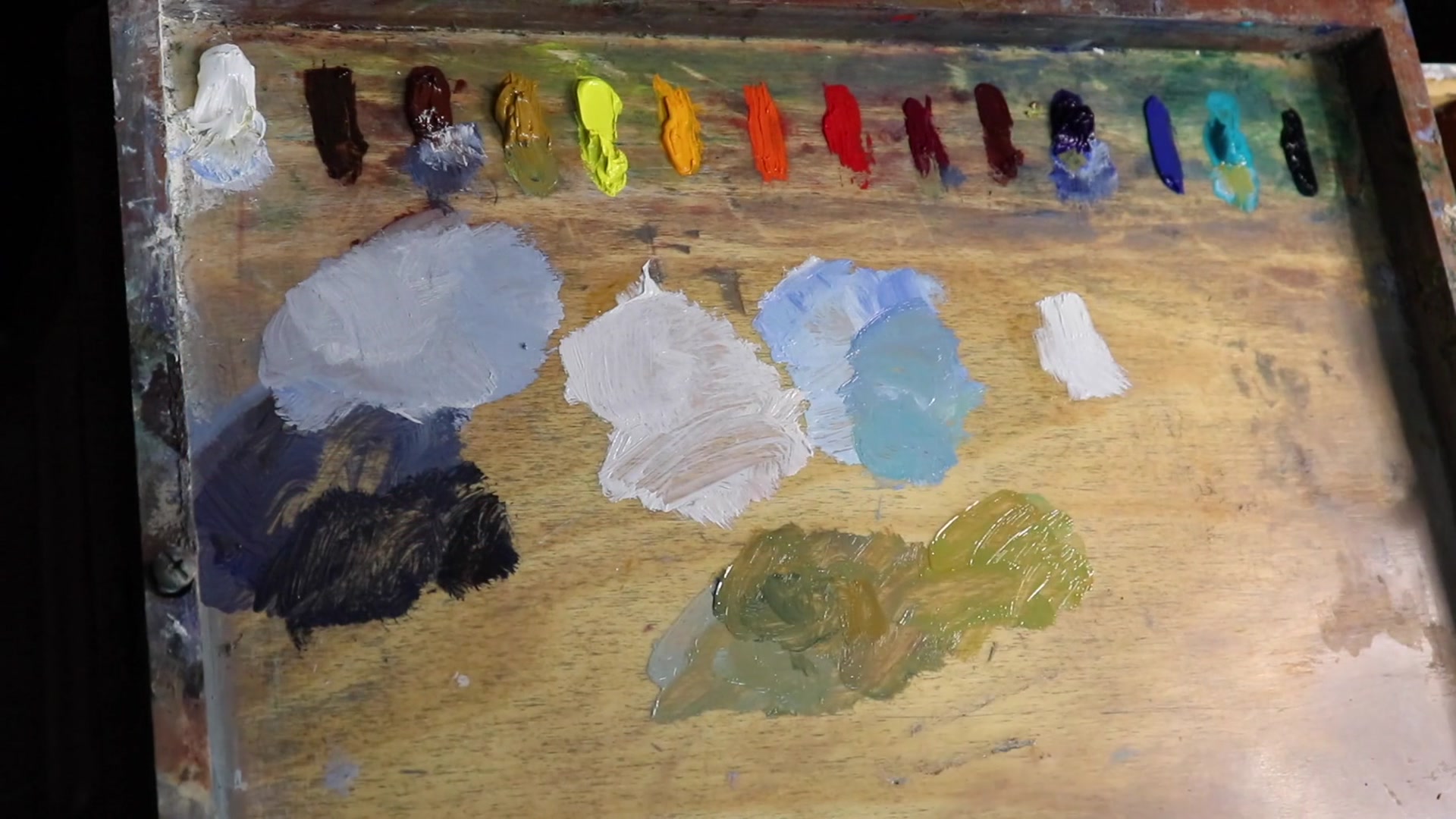
Welcome to this painting workshop where we dive into the vibrant beauty of Taupo Bay, a stunning coastal gem in northern New Zealand. In this chapter, I'll guide you through the process of capturing the dynamic interplay of ocean waves, the rugged majesty of cliffs, and the ethereal dance of light that brings this scene to life. We'll explore techniques for painting clouds, sky, rocks, and foliage, all while focusing on creating depth and realism. You'll learn how to design a composition that harmonizes colors and values, ensuring your painting resonates with energy and aliveness. As we progress, I'll demonstrate how to mix those captivating ocean hues directly on the palette, sharing insights into color theory that are invaluable for both beginners and seasoned painters. Whether you're working with oils or acrylics, this lesson is packed with practical tips to enhance your seascape painting skills. By the end, you'll have a piece that not only captures the essence of Taupo Bay but also reflects your personal artistic journey.
This guide accompanies the full video lesson. The lesson includes the complete narrated video, the printable PDF chapter, and personalised critique support.
Combine titanium white with yellow oxide and ultramarine blue, then add a touch of quinacridone magenta. This mix will create a balanced sand color without being too saturated.
Balance the Mixture
Ensure the mixture doesn't appear green or overly saturated by adjusting the amount of quinacridone magenta. The red in the magenta will help desaturate the greenish tint from the ultramarine blue and yellow oxide.
Lighten the Sand
Add plenty of titanium white to the mix, as the sand should be one of the lightest values in your painting. This will help achieve the correct tonal dynamic.
Simplify Color Combinations
Aim to keep your color combinations simple, ideally using two to three colors. This will help maintain harmony and clarity in your painting.
Tidy and Detail
Tidy up areas of the painting by restating darks and shadows. Add more detail even in the blocking-in stage to create a solid foundation for further refinement.
Pro tipUse quinacridone magenta to desaturate the greenish tint in your sand color mix.
Embark on your Taupo Bay painting journey by preparing your canvas with a warm burnt sienna wash, setting the stage for a vibrant landscape. Sketch your composition with confidence, using Liquin to thin your paint and speed up drying times. As you lay out your design, let the headland be your focal point, guiding the viewer's eye with thoughtful composition adjustments.
Dive into your color palette with a rich array of hues, establishing depth with dark values to create atmospheric perspective. Paint with intention, using broad strokes for clouds and headland shadows, while ensuring your colors harmonize across the canvas. As you progress, layer your sky and sea with dynamic blues and greens, leaving room for the play of light on wave crests.
In the final stages, refine your painting with detailed brushwork on cliffs, rocks, and foliage. Use your dagger brush for precision, and adjust your greens to reflect distance and depth. Balance your composition by restating darks and highlights, ensuring your painting captures the essence of Taupo Bay with clarity and vibrancy.
Points to remember
Use Liquin Original to thin paint and speed up drying time.
Adjust composition elements to enhance the overall design.
Start with the darkest values to establish depth and perspective.
Mix burnt sienna with ultramarine blue for neutral grays with a blue cast.
Ensure cloud highlights are not too bright to maintain depth.
Leave gaps in the sea for adding white water on wave crests.
Use loose, gestural brush marks for a painterly effect.
Mix in a color with red to reduce green saturation and help it recede.