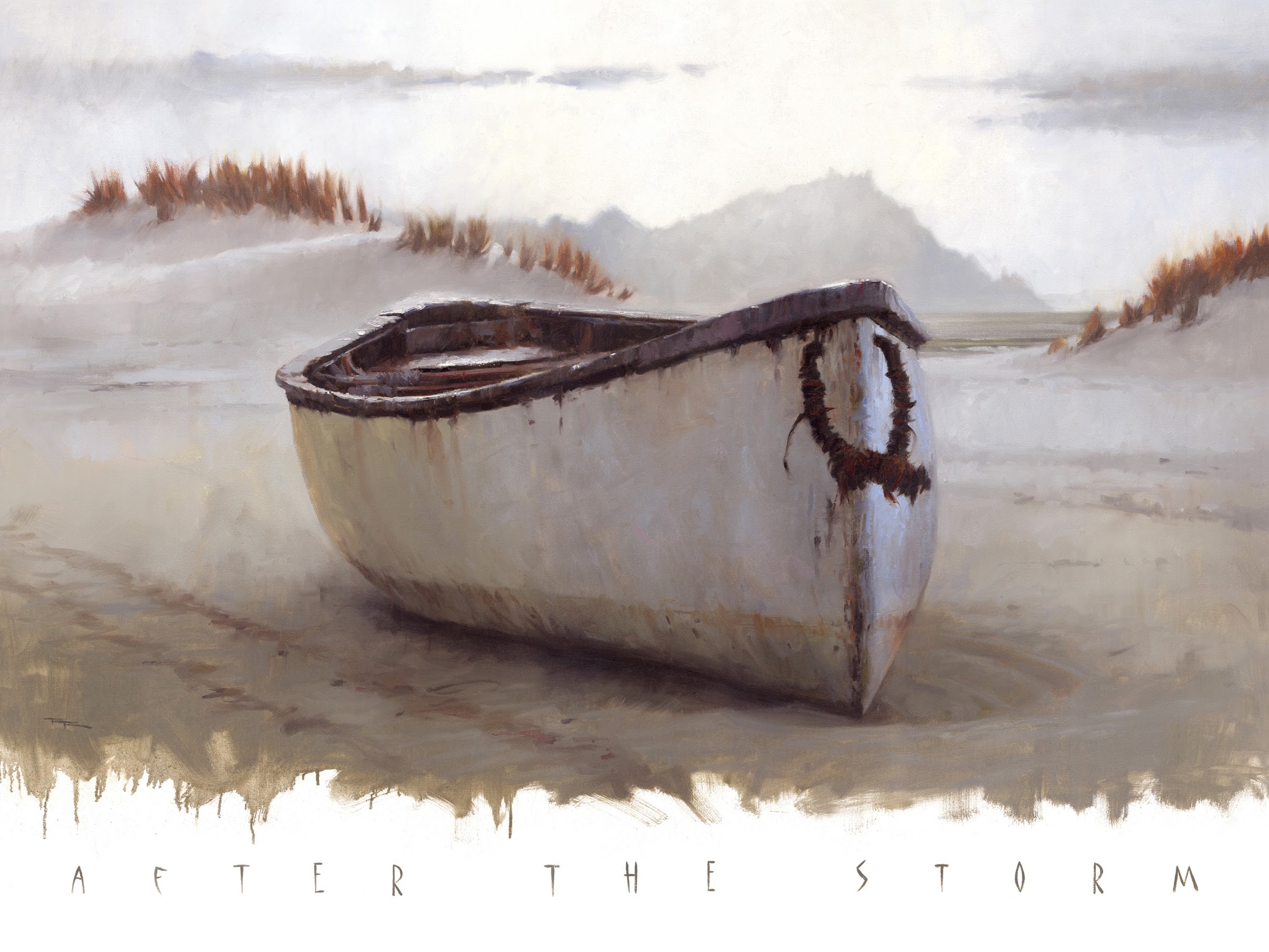
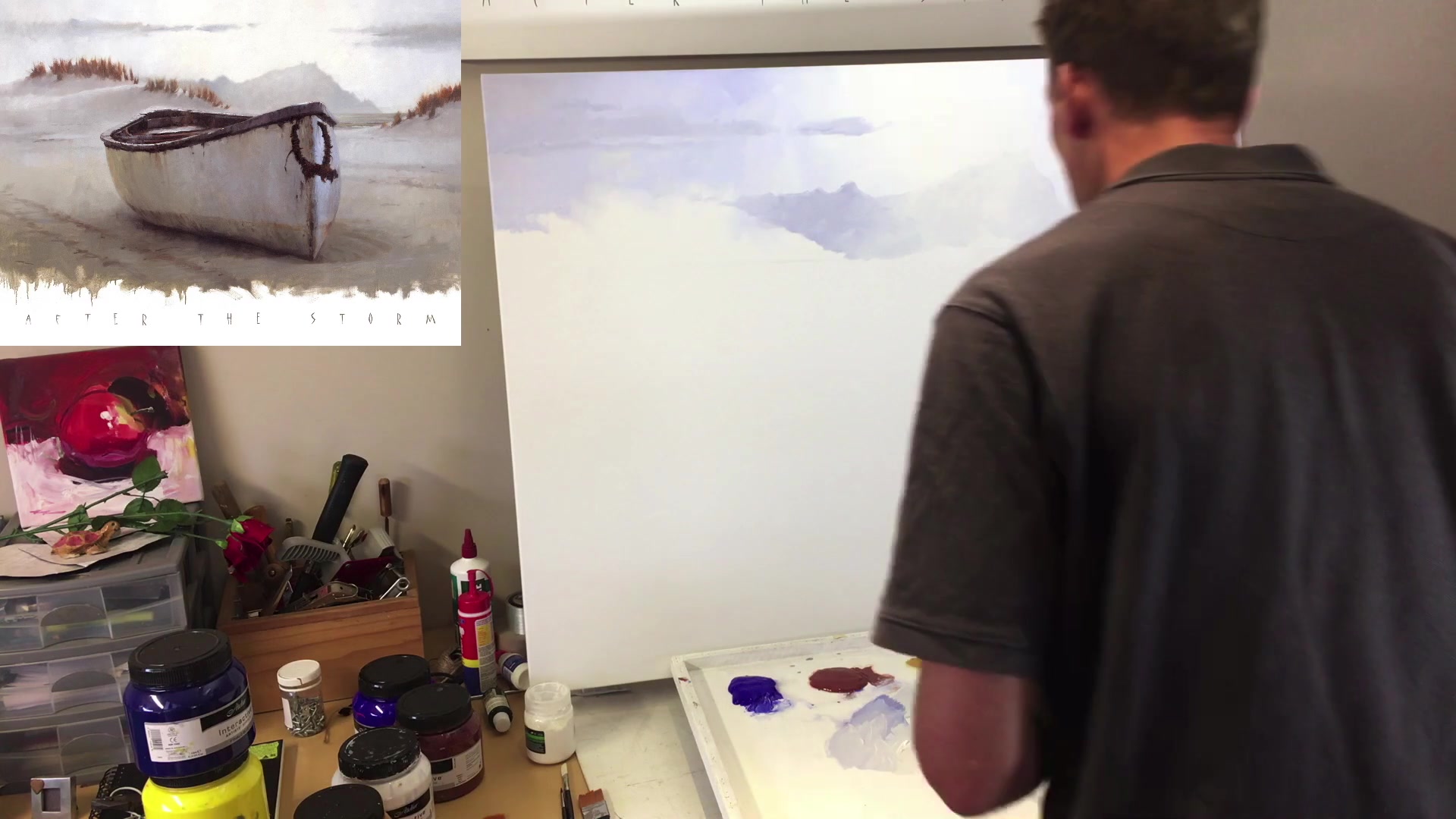
In this chapter, we'll embark on an exciting journey of painting 'After the Storm,' where you'll learn to capture the essence of light, atmosphere, and depth using just three colors. I've chosen a large canvas for this project, stretched on sturdy wooden frames and triple primed with gesso, ready to bring our scene to life. With a big bucket of water and a towel for wiping off, we're all set. I'll guide you through the process with a selection of brushes, each serving a unique purpose. The bristle brush will cover the canvas for the block-in, while the synthetic Rosemary & Co. brush will handle the finer details like the rim of the boat and dune grasses. This lesson is all about simplicity and effectiveness, focusing on monochromatic techniques to avoid muddy colors. By using a single brush for the majority of the work, you'll learn how to maintain clarity and vibrancy in your painting. Whether you choose acrylics for their durability or oils for their classic appeal, this scene offers a rewarding subject with its dynamic composition and the opportunity to explore soft-edged brushwork and sparkling impasto highlights. Let's dive in and enjoy the creative process together!
This guide accompanies the full video lesson. The lesson includes the complete narrated video, the printable PDF chapter, and personalised critique support.
Spray the area lightly with water. Use a dry brush to gently soften the edge by making very small, light zigzag motions. This technique prevents the area from looking like a hard cut-out.
Enhance Foreground Contrast
Keep the edges in the background soft to allow the foreground elements, like the front edge of the boat, to have sharp edges. This contrast will make the foreground pop.
Adjust Value Contrast
Observe the value contrast on your painting compared to the reference. If needed, add a little more value to certain areas by making them darker to match the desired effect.
Pro tipUse a dry brush with light zigzag motions to soften edges without creating a hard cut-out effect.
Embark on your painting journey by selecting a large canvas and choosing between acrylics or oils, with acrylics offering durability for expansive works. As you begin, focus on capturing the mood of the scene with a limited palette, using colors like ultramarine blue and burnt sienna to create a cohesive and atmospheric piece. Consider the evolution of your painting by comparing earlier versions and experimenting with different formats to enhance the composition.
As you paint, pay attention to the character and age of elements like boats, which add intrigue and contrast to your work. Use complementary color schemes to draw the viewer's eye and explore painterly techniques to develop your skills. Manage your painting process by starting with a light sketch and working from the background to the foreground, maintaining soft edges by working wet into wet.
Incorporate variety through texture, color, and value, and use techniques like softening edges with a dry brush to prevent a uniform look. Regularly clean your brushes to maintain their quality and ensure smooth blending, especially in areas like mountains where avoiding outlines is crucial. With each step, challenge yourself to explore new techniques and enhance your painting's depth and interest.
Points to remember
Choose a large canvas and consider acrylics for durability.
Capture the mood with a simple, monochromatic color scheme.
Introduce atmospheric perspective by adjusting values for depth.
Focus on a specific painting challenge to enhance your skills.
Use a spray bottle to keep acrylic paint wet for smooth blending.
Always wet your brush before using acrylics to prevent drying.
Apply paint while the surface is wet for consistent value.