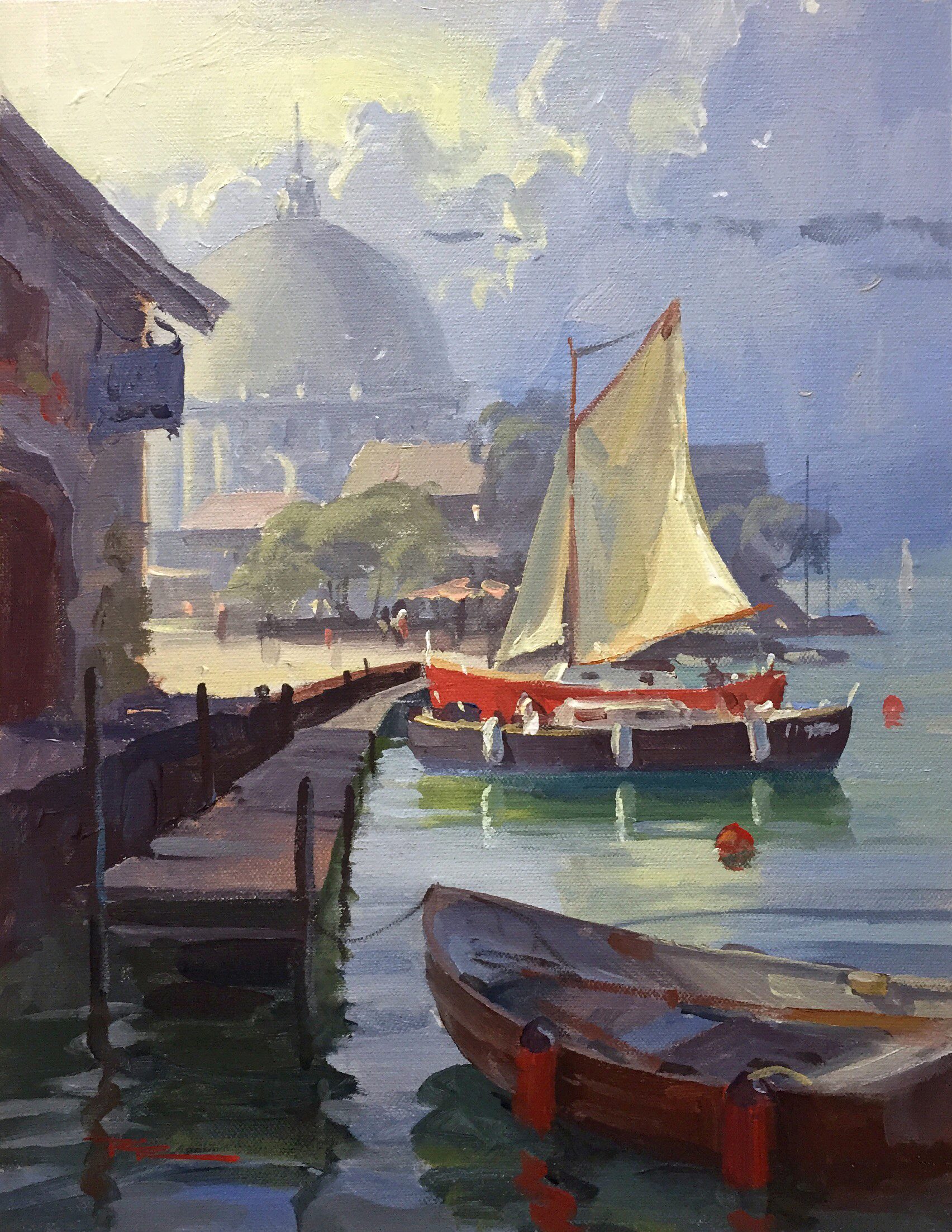
Welcome to the enchanting medieval village of Yvoire in France, a place that seems to pause in time as it closes for winter, yet during my visit, it was alive with warmth and beauty, a scene begging to be captured on canvas. In this chapter, we dive into painting this idyllic harbour scene, guiding you step by step through my acrylic techniques. You'll learn how to design with big shapes, invent warm light, create atmospheric depth, and paint reflections, all crucial skills for bringing this picturesque setting to life. We'll start with small thumbnail sketches to explore composition and balance, moving through black and white studies to grasp values and contrast, and then onto grayscale and color studies to refine tonal values and test color harmony. This process builds a solid foundation, allowing you to confidently develop your painting with accuracy and detail. I encourage you to pick up your brushes and immerse yourself in this rewarding subject, discovering new techniques and ideas to enrich your own artistic journey.
This guide accompanies the full video lesson. The lesson includes the complete narrated video, the printable PDF chapter, and personalised critique support.
"Safe Harbour" 11 x 13" Acrylic on Canvas by Richard Robinson.
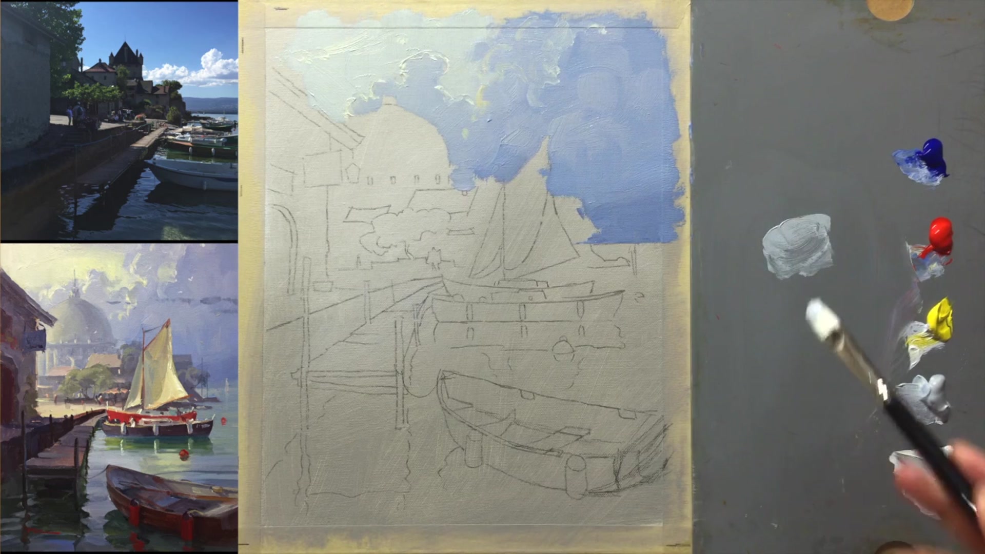
Step 10Painting the Background Buildings
Paint the Background Buildings
Begin with a light toning grey on the left side of the buildings. As you move to the right, gradually darken the tone by adding blue and a tiny bit of red. Use a light touch to create a smooth gradation.
Shape the Dome
Ensure the dome is symmetrical across its center line, regardless of its shape. Add slightly darker details, but avoid too much contrast to keep the area in the background.
Adjust Lighting and Color
On the side where the light hits, make the colors lighter and warmer. Remember the light source is from the top left, affecting how colors are perceived.
Minimize Contrast
Keep the background subtle by reducing value and color contrast. Use greyed tones for elements like roofs and trees, avoiding vibrant colors.
Utilize the Filbert Brush
Use the fine edge of a filbert brush to create details and smooth transitions. Roll the brush to shape rounded elements like tree foliage.
Pro tipUse toning grey to quickly mix subtle, greyed colors for the background, maintaining a simple palette.
Embark on your painting journey by laying a solid foundation with initial sketches and studies. Begin with thumbnail sketches to explore composition and balance, followed by black and white and grayscale studies to understand values and depth. Experiment with color studies to ensure harmony in your palette, and refine your sketches into a detailed blueprint for your painting.
As you progress, embrace the differences between your painting and reference photographs to add character and interest. Make design changes to enhance the focal point and adjust colors to create depth and vibrancy. Choose your medium wisely, and use techniques like creating a background gradient to set the scene.
In the final stages, focus on painting methodically from background to foreground, using the right brushes and techniques to bring your scene to life. Pay attention to details like reflections and highlights, ensuring each element contributes to the overall composition. With patience and practice, your painting will capture the essence of a safe harbor, inviting viewers into its tranquil beauty.
Points to remember
Use thumbnail sketches to refine composition ideas.
Allow your painting to have its own character, not just replicate a photo.
Modify elements that compete with your focal point.
Lighten the background to enhance depth and contrast.
Select the medium you are most comfortable with.
Use a clean brush to gently soften edges for variation.
Vary the brightness of highlights on the sail for depth.
Use larger brush strokes in the foreground for depth.