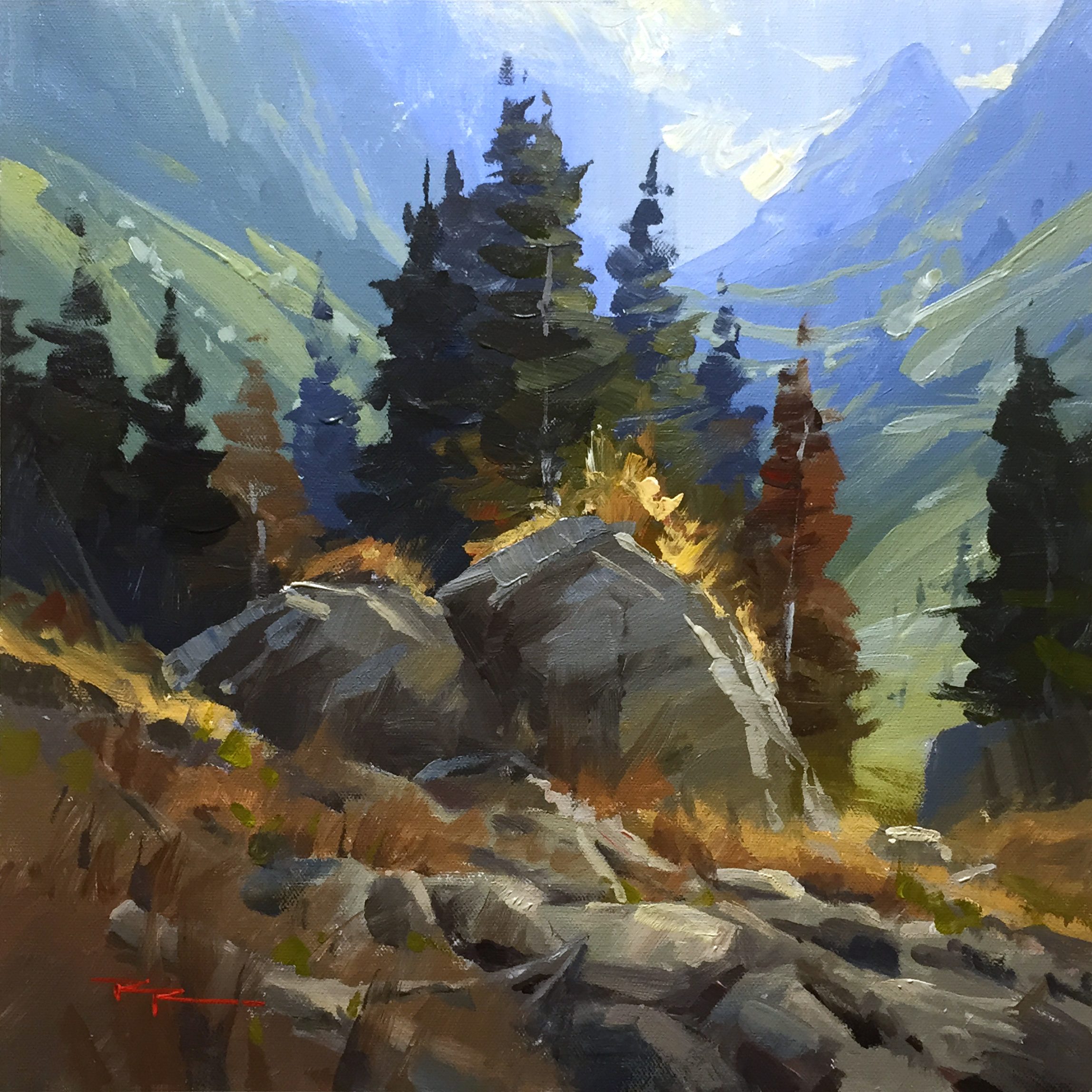
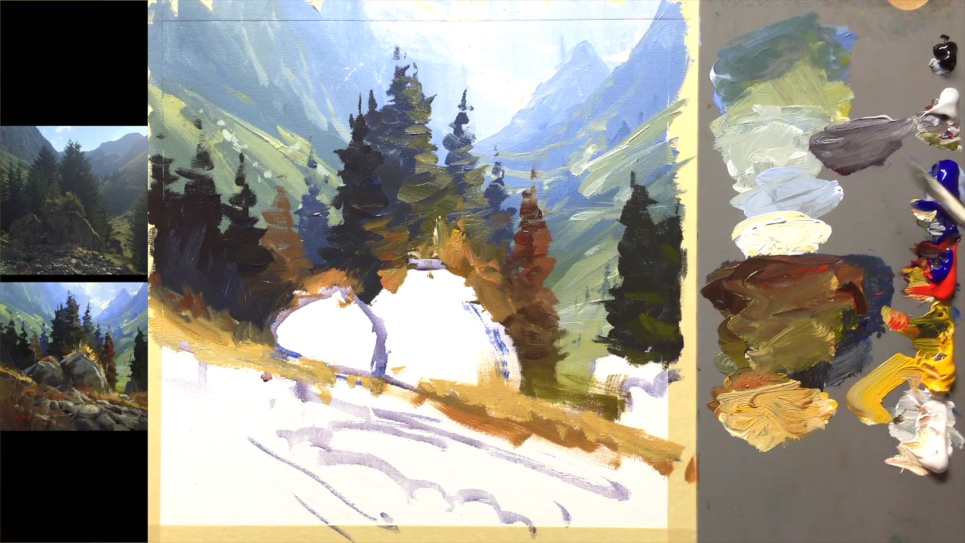
Ah, the French Alps in summer—truly magnifique! The hills resonate with the charming sound of cowbells, and one can almost imagine Heidi frolicking through the meadows. In this chapter, I invite you to join me in capturing the essence of this breathtaking alpine scene with acrylics. We'll embark on a step-by-step journey where you'll learn to paint the diffuse light effects that give the Alps their ethereal glow, and create a sense of vast atmospheric depth. Together, we'll explore dynamic brushwork techniques and the art of inventing convincing rocks, all while focusing on the beautiful rocks and dark trees as our main subject. By using the ascending valley and mountain tops as a backdrop, we’ll create a painting with remarkable depth. With just a few brushes, a glass jar of water, and straight acrylics on an acrylic-primed canvas, you'll discover how to paint quickly and efficiently. Starting with the background and layering towards the foreground, you'll manage drying times seamlessly. This scene is not only a rewarding subject due to its natural beauty but also an excellent opportunity to refine your painting skills. Enjoy the process and the joy of bringing the French Alps to life on your canvas!
This guide accompanies the full video lesson. The lesson includes the complete narrated video, the printable PDF chapter, and personalised critique support.
"The French Alps" 13 x 13" Acrylic on Canvas by Richard Robinson
Step 13Mixing and Applying Rock Colors
Mix Rock Shadow Color
Create a gray color for the shadow side of the rock. Make it fairly neutral with a slight warmth by adding a little yellow. For rocks in greenish areas, include a touch of green to harmonize with the surrounding grass and trees.
Paint Foreground Rocks
Mix a slightly darker than mid-gray with a touch of red and yellow to warm it up. Apply this color thickly and gesturally to the foreground rocks. Avoid over-mixing to achieve a natural streaking effect that adds texture.
Deepen Rock Shadows
Mix a slightly darker brown for the deeper shadows in the rocks. Apply with confident strokes and avoid excessive dabbing to maintain the natural texture and form of the rocks.
Add Warm Reflections
Introduce a slightly warmer, lighter orange to the right side of the rock. This reflects the warm grasses nearby, enhancing the shadow side with their light.
Enhance Shadow and Light
Strengthen shadows on the left with a warm, darker gray. Mix a bluish mid-gray for the top lights on the rock's left side, reflecting the sky. As these lights move deeper into shadow, they should become darker and bluer.
Pro tipAvoid over-mixing paint on the palette to create natural streaking effects that add texture to rocks.
Embark on your painting journey by selecting a captivating scene from the French Alps, focusing on the interplay of rocks, trees, and the majestic mountains. Begin by laying down the background with a swift application of acrylics, moving from the sky to the distant mountains, and then gradually building up the mid-ground and foreground. This layered approach not only helps manage drying times but also establishes a sense of depth and perspective in your composition.
As you progress, think of the elements in your painting as a family, with trees and rocks forming cohesive groupings that guide the viewer's eye. Use a variety of brush techniques to suggest details and textures without overworking the scene. Pay attention to the play of light and shadow, adjusting colors to reflect the atmospheric perspective and the natural lighting of the landscape.
In the final stages, focus on adding highlights and refining details to bring your painting to life. Use thick paint and varied brushwork to create dynamic textures in grasses and rocks. Carefully apply highlights to accentuate the natural contours and lighting effects, ensuring a harmonious and vibrant composition. Remember, each stroke contributes to the overall mood and story of your alpine landscape.
Points to remember
Work from background to foreground to manage drying times.
Visualize elements as family groupings for a cohesive composition.
Use down strokes for a consistent sky texture.
Vary mountain lines to avoid a cloned appearance.
Use a big brush to suggest details without overworking.
Adjust light colors to become lighter and bluer as they recede.
Mix large piles of paint to extend drying time.
Use a crisp square brush for sharp, dynamic tree marks.
Mix blue into orange for natural color variation.
Use thick paint and varied techniques for dynamic grasses.
Avoid over-mixing to create natural rock textures.
Apply highlights thickly to enhance contours and reflections.