Teacher
Richard is a talented full time artist, who loves painting and teaching.

with Richard Robinson
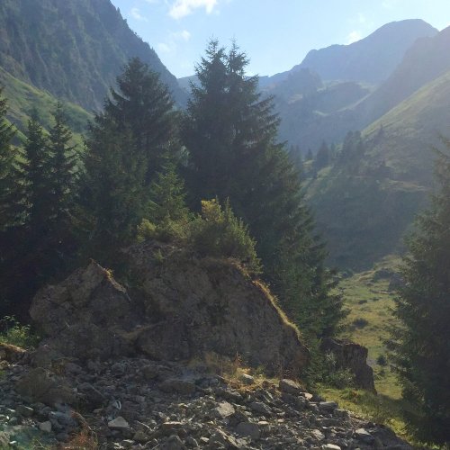
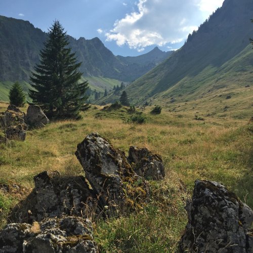
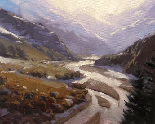
Ah, the French Alps in Summer! Magnifique! The hills are alive with the sound of cowbells and all we’re missing is Heidi frolicking in the meadows.
Follow me step by step as I show you the techniques I use to paint this beautiful alpine scene quickly and easily in acrylics.
Painting a diffuse light effect, vast atmospheric depth, dynamic brushwork and inventing convincing rocks are all demonstrated in the video. Enjoy!
Whenever you’re ready! The lesson is available online any time, and your access to the lesson never expires.
As long as you need! Your access never expires, so you can come back again and again.
Sorry, no you can’t download the video. This is to avoid piracy. You’ll always be able to view the video on this site though.
Richard is a talented full time artist, who loves painting and teaching.
Hi I’m Richard. I’ve been painting my whole life and back in 2001 I traded my graphic design career for the humble life of a full time artist. I love painting, and as it turns out, I love teaching too.
Nowadays I balance my life between parenting, painting, surfing, travelling and teaching. My work is regularly featured in international art magazines, in galleries in New Zealand and America, on TV and in my Mum’s house.
I give outdoor painting workshops in interesting spots around this beautiful planet of ours and love encouraging people to paint. Two of my favourite artists are John Singer Sargent and Joaquín Sorolla.
My painting website: www.nzpainter.com
I’d love to be your new teacher.

Richard is a master artist with an exceptional skill in identifying and communicating key factors to making successful paintings. I have found his video workshops an excellent resource for improving my own work.
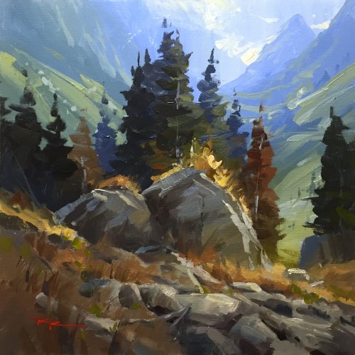
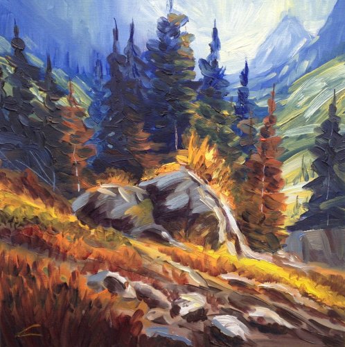
"The French Alps" 13 x 13" Acrylic on Canvas by Richard Robinson
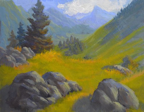
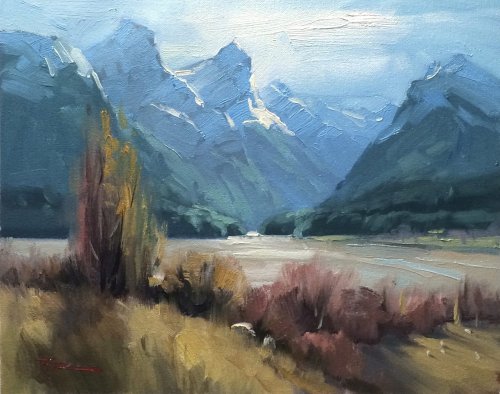
"The French Alps II" 8x10" Acrylic by Susan Burke
Your painting has good colour and tones Susan - good lights and darks that give a nice sense of sunlight. I like the blues that you have used to get a sense of distance into the mountains but you need to be careful when you apply the highlights to those distant peaks - they are too green for that distance. I like the colours used in your trees too but you may notice that the tops of the trees are In a straight line sloping down steeply to the left, as do the hills that we are standing on so that the painting has developed a strong feeling of sliding towards the bottom left corner. When I look at your rocks, I get the feeling that you are painting what you know, not what you see. The shapes of your rocks and their whole character suggest that you are making them up. Probably the easiest way to solve that problem is to go outside, find some really nice boulders, and sketch and paint them. If you can get the choice of coastal and inland boulders, all the better!
"Explore III" 29x32" Oil on Canvas by Silke Sauritz
Well….This is certainly different Silke. A painting loaded with nice colour and ambience. Two things that I need to mention. The natural landscape is normally random in its design - we may see things that look like each other but they are more the exception rather then the rule. If, when we design a painting, we repeat shapes or have equidistant elements or perhaps have intersecting edges all at one point, then we eliminate that sense of random. Our painting begins to look like an arrangement. You will notice when you look at your painting that the rocks and the trees behind those rocks are arranged neatly in the corners of the painting, that the hills coming down from both the left and the right sides of your painting are almost exactly the same angle and form a very nice 'u' in the centre of the picture, and that the band of trees in the centre of the valley look very neatly arranged - a man-made plantation. Small points but they can so easily take away the feeling of reality in your painting. Painting or sketching from nature outdoors can often help.
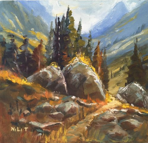
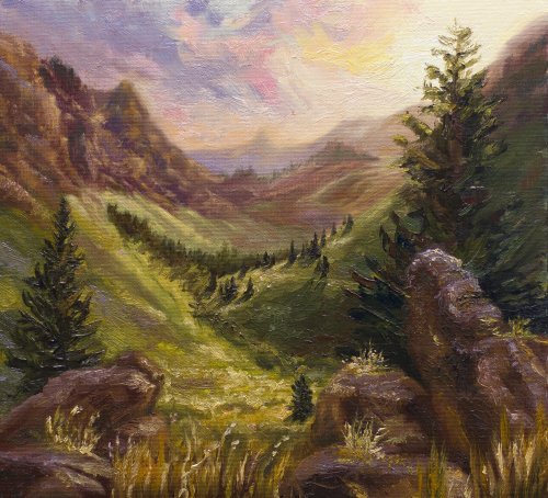
"The Way to the Valley" 10.5x11" Acrylic by Nili Tunis
This is a bold approach! Lots of colour and strong lights and shadows. A nice arrangement of the elements in the painting with the path helping us to get to the background. Two things to be aware of though - yellow is the first colour to fade with distance. The yellow slopes back behind the trees and the path as it turns the corner are shouting for attention - their colour is too strong. The other slight problem is that the tallest tree and the mountain top on the right are too close to the edge/ frame- they are creating 'tension points.' Best avoided.
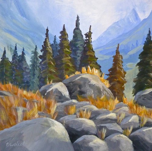
"Workshop 46" 12x12" Acrylic by Tammy Wolcott
This too is a very good effort–lots of imagination in the way the rocks have been presented. They lead us back into the painting very nicely. The trees however are quite a visual barrier - they virtually forbid us from going any further! (This is true for several of the paintings). In this situation, I would lower the trees and simplify them into a more general shape rather than a series of conspicuous points. Overall, the sense of colour, particularly in the background, is very good.
"French Alps" 20x24" Acrylic on Canvas by Mimi Tschida
A very good effort Mimi - the elements in the painting are nicely laid out but because you have used very similar tones throughout, I find it difficult to settle on your point of interest. I would have liked to have seen some good strong darks and lights on the rocks in the foreground to get an increased sense of distance and the green behind the trees is too strong – remember, green disappears quickly with distance. If you gaze at your picture, you'll notice that the red tree on the left catches the eye more than any other part of the scene - not your intention I suspect! One other point - try to avoid what I call pattern making in your shapes. Notice the tops of your trees. They are a replica of each other and are all forming a straight line–like soldiers standing at attention. Even if things like that do happen in nature, (unlikely ) we're best to rearrange them to avoid creating those patterns.
"Alps" 40x40cm Oil on Canvas by Elena Sokolova
Another painting with heaps of colour - very bold! Nice free brushwork and well set out although the boulders could have been be moved off - centre a little. However, (and this is possibly a personal thing), there is a point where a painting can become too 'chromatic,' too much of the complementaries - where the colours are all yelling for attention at once! At that point, the painting will have lost it's theme - the overall colour feeling that 'glues' it together. More neutral colour with small areas of brilliance in the right places is often a better way. Even brilliant flowers look better with neutrals around them. Don't go overboard and make your work look depressed though! - Many thanks to John Crump for his thoughtful critiques. You can see John's own paintings and teaching dvds at www.johncrump.co.nz
$15.00USD
$15.00USD
$15.00USD
$15.00USD
$15.00USD
Not loving your painting lessons? No worries!
If it’s not the right fit, we’ll give you a full refund within 30 days of purchase - no questions asked.
When you purchase a DVD you also get online access to the same lesson, including any lesson resources like photos, downloadable notes and access to upload your painting to the student gallery.
That's why you need to make a password when you purchase a DVD, so you can access the online content as well. Enjoy!