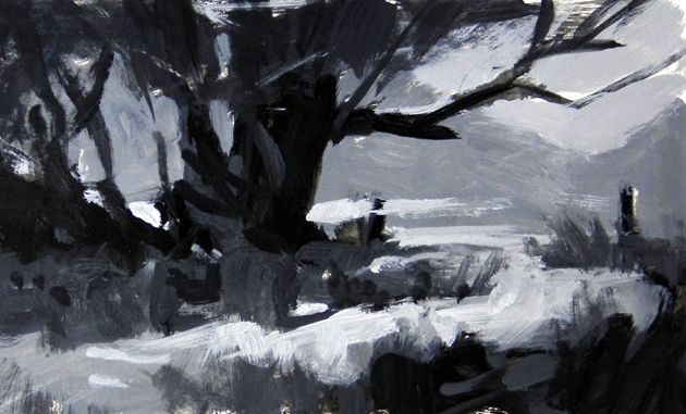
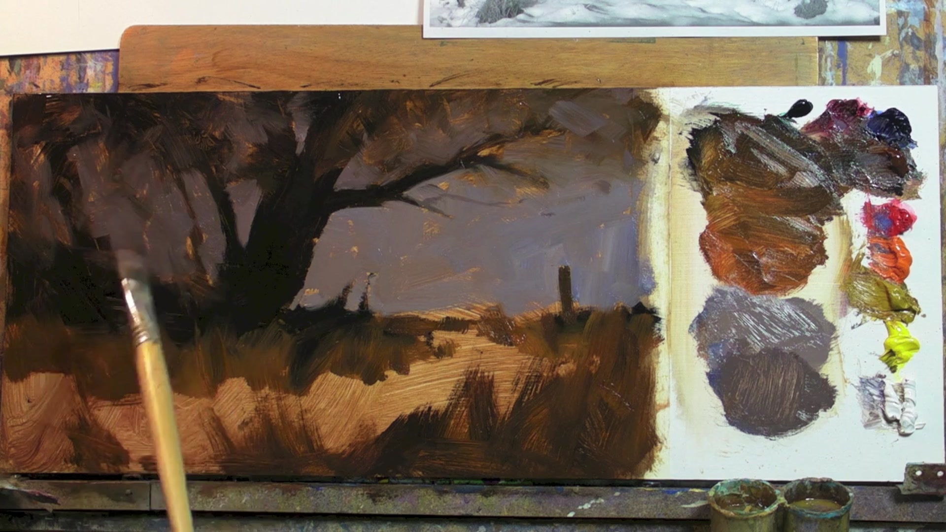
As we embark on this painting journey together, I am thrilled to introduce you to our first workshop, aptly named 'First Snow.' This lesson is inspired by a photograph I captured during one of my painting adventures in the stunning Crown Range above Queenstown, in New Zealand's South Island. This scene, with its dramatic interplay of light and shadow, offers a perfect opportunity to explore the beauty of snow-covered landscapes. In this chapter, we'll dive into the art of balancing warm and cool color variations, and the expressive brushwork that brings a painting to life. You'll learn how to simplify complex scenes by joining dark shapes, creating a strong, cohesive design that avoids clutter and maintains balance. As you paint, feel free to exercise your artistic license—move elements, alter colors, and make the scene your own. This is your chance to create a captivating piece of art that invites viewers into its serene, wintry embrace. Let's get started and enjoy the process of bringing this beautiful snow scene to life on canvas.
This guide accompanies the full video lesson. The lesson includes the complete narrated video, the printable PDF chapter, and personalised critique support.
Recognize that gradients create a sense of light and depth in your painting. A gradient from left to right in value can enhance the appearance of light through a subject. Avoid painting large areas in a single value to prevent a flat and uninteresting look.
Evaluate Use of Gradients
Look at your painting and identify areas where gradients are lacking. Notice how a lack of variation, especially in large areas of color, can make the painting appear flat, similar to paper cutouts.
Pro tipUse gradients to add depth and interest to your painting, avoiding flat, uniform areas.
Embark on your painting journey by focusing on a strong No Tan design. Simplify your composition by joining dark shapes and ensuring that major elements are well-placed within the frame. As you progress, maintain the integrity of your design by keeping dark shapes consistent, even as you introduce light and color.
Develop your painting with a thoughtful approach to color and texture. Use the thin to thick painting technique to add depth, and explore warm and cool color relationships to create vibrancy. Don't hesitate to start over if foundational issues arise, as a strong base is crucial for a successful painting.
As you add details, focus on creating texture and depth through gradients and varied edges. Use a palette knife to introduce randomness and avoid uniformity, ensuring your painting remains dynamic and engaging. Finally, enhance the background and add final touches to bring your scene to life, culminating in a personal signature that marks your work as complete.
Points to remember
Join dark shapes to simplify and strengthen your design.
Maintain consistency in dark shapes to preserve balance.
Use warm and cool color variations for vibrancy.
Don't be afraid to start over if the foundation is flawed.
Use a grid to accurately transfer and enlarge your drawing.
Use gradients to add depth and avoid flat areas.
Use a palette knife to add random texture and avoid uniformity.
Use minimal strokes when adding lighter values to prevent mud.