Teacher
Richard is a talented full time artist, who loves painting and teaching.

with Richard Robinson
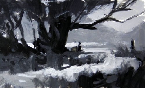
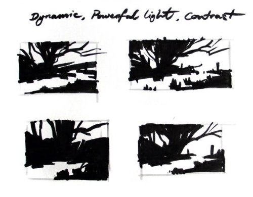
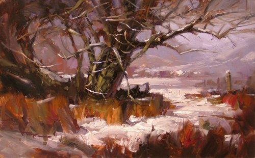
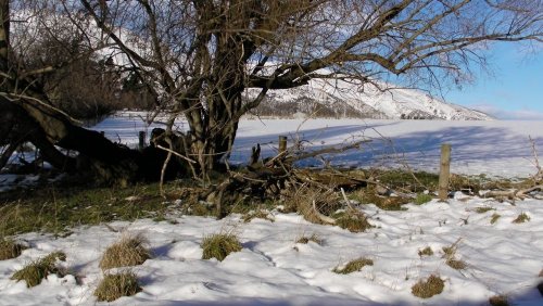
Get started in landscape painting with this dramatic snow scene. We’ll be focusing on using warm/cool colour variations and expressive brushwork. Follow along step by step or use the resource photo to create something more your own. Enjoy!
Whenever you’re ready! The lesson is available online any time, and your access to the lesson never expires.
As long as you need! Your access never expires, so you can come back again and again.
Sorry, no you can’t download the video. This is to avoid piracy. You’ll always be able to view the video on this site though.
Richard is a talented full time artist, who loves painting and teaching.
Hi I’m Richard. I’ve been painting my whole life and back in 2001 I traded my graphic design career for the humble life of a full time artist. I love painting, and as it turns out, I love teaching too.
Nowadays I balance my life between parenting, painting, surfing, travelling and teaching. My work is regularly featured in international art magazines, in galleries in New Zealand and America, on TV and in my Mum’s house.
I give outdoor painting workshops in interesting spots around this beautiful planet of ours and love encouraging people to paint. Two of my favourite artists are John Singer Sargent and Joaquín Sorolla.
My painting website: www.nzpainter.com
I’d love to be your new teacher.

Richard is a master artist with an exceptional skill in identifying and communicating key factors to making successful paintings. I have found his video workshops an excellent resource for improving my own work.
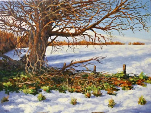
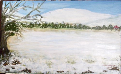
Winter Tree by Mike Oliver 16×12″ Oil on Canvasboard
Hi Mike thanks for your painting. Here’s a wee critique for you: Design It’s a good solid design, not much different from the photograph itself which is already a fairly nice design. In my opinion the photo is a bit better balanced with the dark mass on the left being a counterpoint to the long branches stretching out to the right. Three things that might improve your design a little is to mix up the spacing and size of your foreground grasses to add more variety, increase the size of your fenceposts a bit and stop that big wedge of a hill from pointing out of the picture. Illusion of Realism All those fine branches are a very tricky thing to paint and you’ve done a valiant job with a small brush trying to get them all in one by one. Nice to see that sort of dedication to doing a good job. I can tell you would be a carpenter who sands the underneath of the drawers too. All that hard work has paid off in a way because it’s created a tapestry of texture which from a distance gives the illusion of fine branches. On closer inspection though the fine branches appear a bit too ordered – which demonstrates the gap between your understanding of the tree structure and the actual tree structure. It’s not a big gap, but to me it’s plain you had trouble seeing the tree clearly and relied a lot on your ‘symbol’ of a tree rather than spending more time really looking and coming to grips with it. All artists are guilty of that to some degree and it’s just where you are at the moment. With all that patience at your disposal I thought it was interesting you didn’t put the same detail into the depiction of the trees shadows on the snow, but it is good to contrast detail with obscurity. Throughout the painting you’ve kept a keen eye on the direction of the light source which is good to see and adds to the illusion of depth. Colors Nice to see you playing with warm and cool colors like this and pushing the warms as many of us like to do. It looks like an intense warm light on the trees but that hasn’t followed through into the green grasses. Put an orange light on green and it turns quite ruddy. See in the photo how the color of the grass and tree are really quite close? When you change the light in the scene you need to keep that same close relationship. You’ve done that with the snow a little by adding yellow into the lights which is good to see. You might have grayed down the distant oranges and lightened them too to allow for atmospheric perspective. Keeping them high chroma like that brings them forward – see how they are the same color as the oranges in your foreground? Not so good. Values You are seeing values quite well except for those distant trees and have attempted some 3 value structure (dark, middle, light) in the foreground snow which is nice to see although again you haven’t quite seen the shapes as clearly as you could have. Brushwork There are some nice areas of interesting brushwork, but you have painted with a small brush the whole time which, without seriously thick paint or serious skill, tends to a labored look in paintings in my opinion. I’d personally like to see you get some big brushes out and use your patience skills to figure out how you can say more with one bold stroke than what you have tried here to say with 20. It’s nice to see you using some quite thick paint in your lights however.
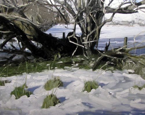
Snow in the Fields by Dirk Rampling 24×36″ Oil on Canvas
Hi Dirk, thank you for your painting. I think you’ve done a great job. You’ve demonstrated really good drawing skills in being able to state the complex tree clearly. Your values are excellent – I especially admire the subtle 3 value structure you implied in the foreground snow to portray the bumps and hollows there. Regarding values, you might have thrown a little more light into the big black tree shadow to stop it becoming a hole in the painting. (Perhaps your photo has lost some color detail there though). Your brushwork is confident and appealing – from broad and brisk to fine and careful. Your treatment of the light against dark areas in the tree are particularly well done showing clear thinking in the most difficult area. I like your composition – you’ve cropped to include only the strongest part of the tree and with it have created a nice window through to the background. I have 3 recommendations for altering the design however, the first would be that the 4 clumps of foreground grass need rearranging into a less balanced pattern – they look conspicuously well ordered, and too even in size. My other suggestions are not nearly as obvious as that, and only suggestions, that you might have provided a snowy way through the grass strip which is currently acting as a sort of barrier to the rest of the painting and is not inviting the viewer through, in other words. Perhaps some snow on the fallen branches there? The third thought was that you might have pushed the far-ground trees on the left even further back into space by lightening them a little or cooling them in order to more clearly delineate the main tree from the background, helping with the sense of space and enhancing the star of the show which is the tree. My final thought was that I would have liked to see more warm/cool variation in your colors – a touch of yellow in the light on the snow and some warmer notes of orange and brown in the grasses and tree. Warm/cool variations bring colors to life. I keep reminding myself that the more variation I can inject into my painting the better it will be because our eyes revel in it – variations in color, value, texture, shape, line and edges – a whole symphony of variation. Overall it’s a nice piece which shows a lot of skill and I’d be happy to hang it on my wall. I hope I can do as well in my demo!
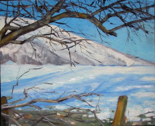
“First Snow†by Carla Whelan – Acrylics on canvas panel 12×10″
Hi Carla, thanks for your painting. You’ve made a bold decision in cropping the image down to this segment – something I would also be inclined to do as well at first because of its elegant graphic simplicity. You’ve painted the tree well with good structure and roundness of form in the main branches, including the shadows it casts upon itself – not an easy thing to do, especially on the small scale 12×10″ canvas. A few more cast shadows would have really solidified the roundness of the branch. The rest of the painting seems to play only a supporting role to the overhanging branches, but unfortunately there’s not enough interest there to hold my attention for long. Perhaps if the barn had been brought forward that would have given the eye somewhere else to visit. As it is, the long sharp wedge of the hill points like an arrow off the side of the painting, telling the eye where to go and the post on the left makes a similar mistake by bringing attention to the side of the canvas like an actor poking their head out from the side of the stage – better to leave that one out or move it in further – one or the other. You’ve divided your canvas cleanly in half with the horizon which is normally condemned as one of the original sins of poor composition so it’s definitely something to watch out for, but in this top heavy composition I don’t think it really matters much, although it would certainly have been nice to break that long straight line up a little with some lost edges, or mid-ground trees, or moving that barn forward – anything to add variation. Our tendency is to simplify everything we see, but our eyes love variation, relationships and complexity so our job as painters as I see it is to provide those things in a painting. You’ve certainly provided that in spades with your tree, but it’s a seems a shame there’s not more of that in the bottom foreground which could do with some more detail (and warmth – try adding a little violet) in the shadows on the snow and some more clumps of grass. Maybe a rope swing off the tree would help connect the top and bottom of the painting too? Another point is the form of the mountain – in the original photo you can see subtle but definite value plains – the light plains on the left hand faces tilted towards the sun. You haven’t quite got that in your mountain and it seems a little flat because of it, despite the drawing of the angles and shapes being pretty good. Suggesting a very distant mountain behind this one would also have helped with the sense of depth and added more interest and more story to the piece as well. Overall I think it’s a pleasing image at first but is lacking enough interest and variation to withstand the test of time.
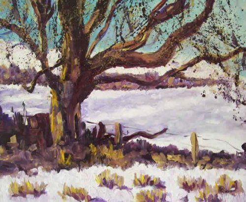
“Autumn’s Last Stand†by Lynda Cookson – Oil on Board 24×20″
Hi Lynda, thanks for your painting – it’s wonderful to see your freedom of expression in this piece and it’s clear that you enjoyed painting it. I like the idea of splattering paint to simulate the complex texture in the tree but perhaps it could have done with a few more thin branches to help with the illusion of detail. I like the idea of exaggerating the green in the sky as a counterpoint to the extra warm notes you’ve introduced but it would have been good to introduce more of that into the snow shadows to help create more unity in the painting. The key there is to get exactly the same value as the base shadow color you’re painting into. It’s good to see you’ve introduced some reflected light into the shadow side of the tree, although you might have used a cooler color there again to contrast the warm light. It seems to me that the drawing has been sacrificed a little in the rush of creative excitement. There are a few things to look at… 1. the tree branches are conspicuously variable in thickness. Trees are very finely balanced constructions. Taking care and time in describing those fine relationships in thickness pays off in the end. 2. The foreground clumps of grass need to cast shadows which obey the same light source as the tree shadows do. 3. There is no definition in the shape of the snow in the foreground (shadow, halftone, light), which is equally a problem in being able to see and paint subtle value shifts. When we’re enjoying getting the paint on and playing around it’s a very tricky thing to suppress that joyful intuitive side and switch on our critical analytical side in order to keep the drawing in check. If you conquer that it’s then equally as difficult to switch off that mode and get back into intuitive mode. A good way to do this is to keep stepping back from the work which shrinks it, or viewing it in a mirror which shrinks and flips it, in order to see it from a new viewpoint which encourages us to knuckle down and analyze it with a critical eye. When things really aren’t going right I find a checklist helps – “how clear is my drawing?, how much variation do I have in my edges, shapes, values, colors, lines, ? etcâ€. I do like your warm/cool color combinations here. If you had changed the warm color for the tree (grayed it down a little) so that it was different from the grasses this would have helped make the light more believable and added more variety to the color scheme. I love to push the color like this too but in this case the tree color looks a little too bright and warm compared to the grasses, so I would either gray the tree a little or add some purer oranges into the grasses. The shapes, sizes and spacing of your grasses could benefit from some more variation too – they look a little planted in rows. Also, have a closer look at how the edge of the foreground snow line breaks up in the photo – there are clumps leading into it which break it up more that what you have indicated here. Nature is full of variation and every time we simplify that variation in a painting I feel we take away from her, instead of praising her. The distant trees might do well to be quietened down a bit – lightened in value to add more depth. At the moment it’s jumping forward a little and competing with the tree. The composition is solid although as I mentioned in another critique the dark band of grass does act as something of a barrier to the viewer – it’s nice to have ways through to the rest of the painting (an open gate, a break in the mist, a window in a wall, etc.) I love your brushwork, thick paint and color usage and look forward to seeing more of your work.
“Snowy Retreat†by Patricia Anne Atkins – 12×18″ Acrylic on Board
Hi Patricia thanks for your painting. I like that you’ve thought to balance your composition with the little house there, but it looks like you’ve pushed both the tree and the house off the side of the stage too far, leaving the stage (all that empty snow) as the star of the show when there’s not much going on there to hold our interest. One of the classic composition ‘rules’ is to not cut things in half with the edge of your painting and you’ve done that with your tree here. (I know it’s tempting) The idea of making the snow centre stage like this will work much better if you added those long tree shadows to it to give it more interest, or a path/track leading through it – whatever will break up that big empty space. My advice to you in general would be to spend more time looking at how and why a thing looks like it looks, and paint that knowledge instead of your idea of what a thing should look like. That’s the biggest key to painting well – letting nature be your teacher.
$15.00USD
$15.00USD
$15.00USD
$15.00USD
Not loving your painting lessons? No worries!
If it’s not the right fit, we’ll give you a full refund within 30 days of purchase - no questions asked.
When you purchase a DVD you also get online access to the same lesson, including any lesson resources like photos, downloadable notes and access to upload your painting to the student gallery.
That's why you need to make a password when you purchase a DVD, so you can access the online content as well. Enjoy!