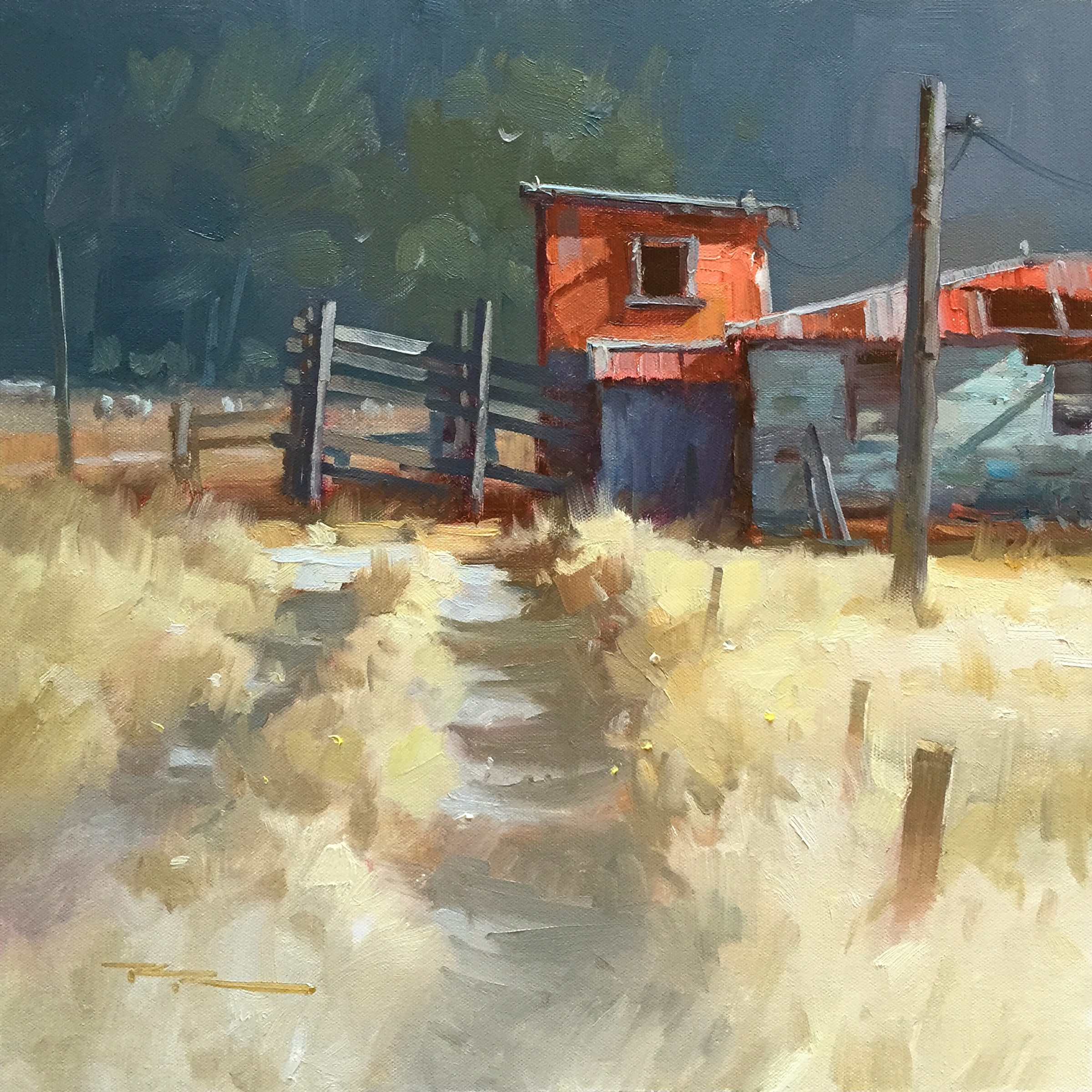
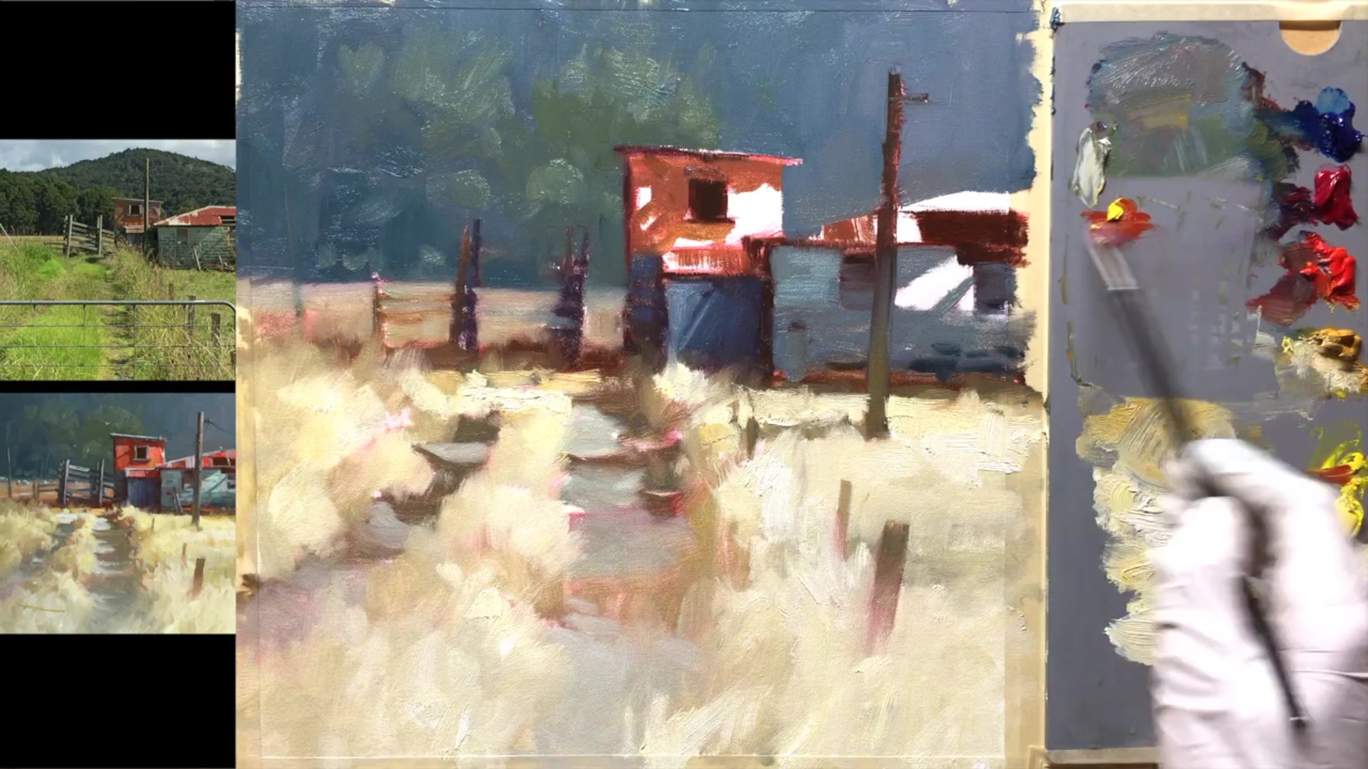
In this chapter, I invite you to join me as we explore a charming rustic farm scene just down the road from my home in Rua Kaka, New Zealand. This spot, nestled right alongside the main highway, is often overlooked by passersby, but to me, it holds a unique beauty that captures the essence of our farming community. Although the roadside noise made it impractical to paint on location, I captured photos and video to bring back to the studio, where we'll recreate this scene together. You'll learn how to simplify complex subjects, create glowing light, and use edge variety to bring your painting to life. I've made a few personal adjustments to the scene, such as transforming the vibrant green grass into a warm golden brown—a nod to my preference despite living in lush New Zealand. Additionally, I've opted for strong light in the foreground to draw the viewer's eye into the heart of the painting, highlighting the intriguing structures. Through this lesson, you'll gain insights into capturing the character and charm of rural landscapes, making this a rewarding subject to paint.
This guide accompanies the full video lesson. The lesson includes the complete narrated video, the printable PDF chapter, and personalised critique support.
"Country Road" 15x15" Oil on Canvas by Richard Robinson.
Step 13Building Lights and Details
Switch Focus to the Building
If you're feeling stuck with the grasses, shift your attention to the building. This change can help refresh your perspective and prevent overworking any area.
Mix and Apply Neutral Grey
Create a neutral grey slightly darker than mid-grey. Use the edge of a palette knife to carefully apply this to the front facing edge of the roof for a rustic effect.
Lighten the Roof
Add white to your grey mix to create a lighter shade for the top of the roof. This will help highlight the roof's surface and add dimension.
Detail the Window Frames
Use the neutral greys to paint the window frames. Tidy up the details with a small signing brush for precision.
Soften Edges with Light Brown
Soften the edges of the building with a light brown on your brush. This will help push the building back into the distance.
Add Lights to the Shed
Mix a light grey for the top of the shed. These lights should appear almost white but are actually a light grey, adding subtle highlights.
Mix Light for Building Side
Combine mainly white with a little blue, yellow ochre, and a tiny touch of red for the side of the building. Add more blue further down for variation.
Pro tipUse the edge of a palette knife for precise application of neutral greys on the building's roof.
Embark on your painting journey by setting up your materials and sketching the initial outlines with a thin walnut oil solution. This foundational step helps establish your composition and guides the placement of darks and lights. As you progress, focus on building depth and contrast by layering darks thinly and adjusting colors with warm and cool tones. This approach ensures a natural transition and enhances the realism of your scene.
As you move through the painting, pay attention to the interaction of light and shadow, especially in areas like grass and buildings. Use color mixing techniques to create vibrant shadows and highlights, adding dimension and interest to your work. Remember to test your colors on small areas first to ensure they harmonize with the rest of the painting.
In the final stages, focus on adding details and refining your composition. Use smaller brush strokes for intricate elements like fence posts and road stones, and apply finishing touches like flowers or weeds to enhance texture. Maintain soft edges in the foreground to emphasize the light effect, and ensure your signature complements the overall palette. With these steps, your country road scene will come to life with depth and vibrancy.
Points to remember
Use a very thin mixture of walnut oil for sketching initial outlines.
Apply darks thinly to avoid muddy colors and ensure easier layering.
Use yellow ochre to warm and lighten dark areas for natural transitions.
Twist the brush to create small triangular shapes for added detail.
Test your mixed color on a small area before applying it broadly.
Grey down the background to enhance depth and make foreground colors pop.
Shift elements to ensure overlapping forms are easily readable.
Use smaller brush strokes for details like fence posts to maintain a light effect.