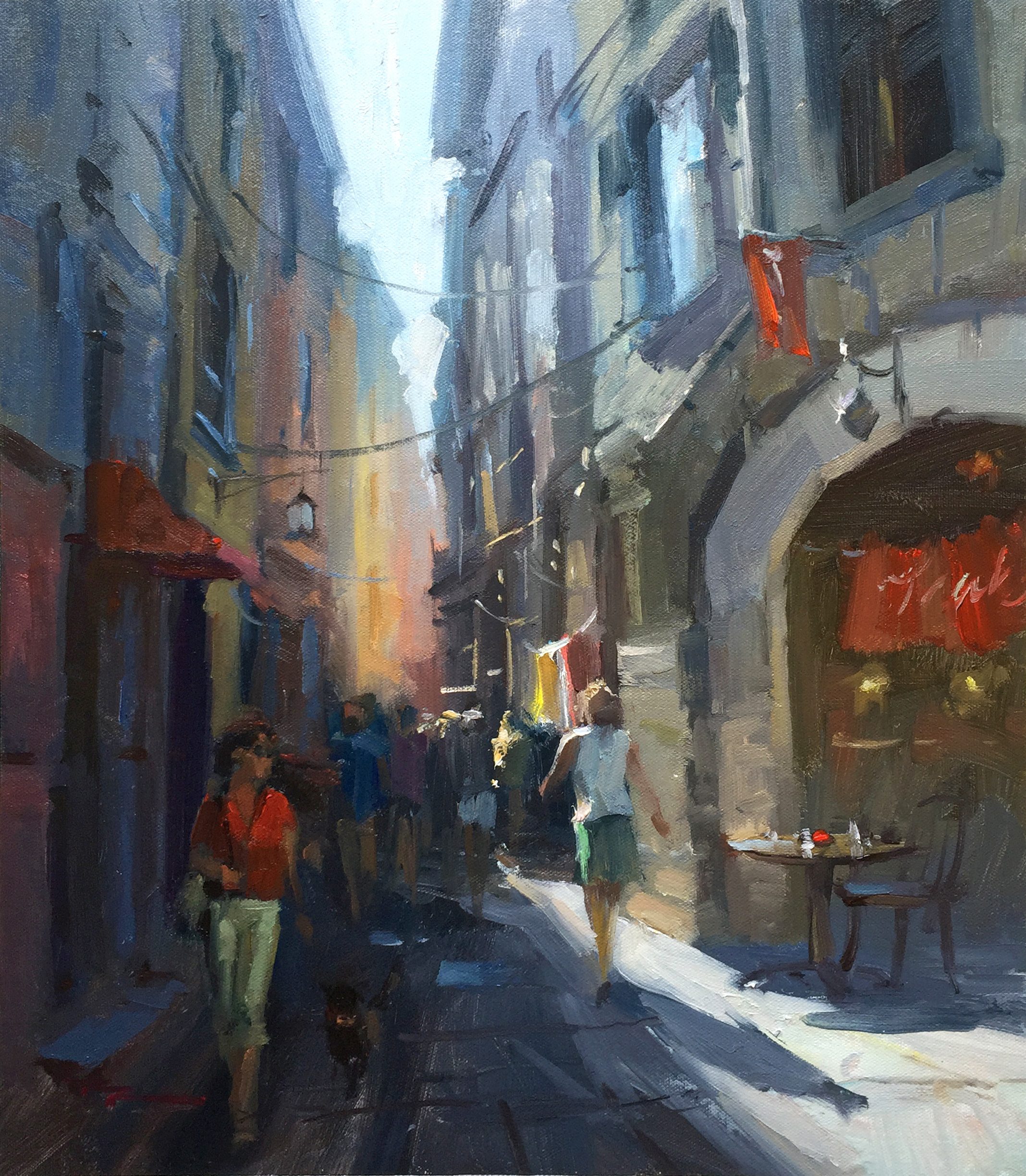
Returning to Italy in this chapter, I invite you to explore the enchanting streets of Vernazza, one of the five charming villages of the Cinque Terre. This area, with its car-free, winding streets and vibrant, colorful buildings, is truly a painter's dream. As we delve into this bustling Italian street scene, you'll learn to capture the glowing light, reflected light, and sky shine that make these streets so captivating. We'll tackle perspective drawing and figure painting, essential skills for bringing this lively scene to life. The unique character of Vernazza, with its rich hues and quaint architecture, offers a rewarding subject for any painter. As you follow along with my step-by-step guidance, consider incorporating elements like umbrellas or overhang canvases to add interest and shape to your composition. Notice how the large light shape in the scene directs the viewer's eye down the street, creating a dramatic design. Together, we'll transform this picturesque setting into a vibrant painting that captures the essence of Italian charm.
This guide accompanies the full video lesson. The lesson includes the complete narrated video, the printable PDF chapter, and personalised critique support.
"Streets of Vernazza" 14x17" Oil on Canvas by Richard Robinson.
Step 7Adding Sky Shine and Atmospheric Lighting
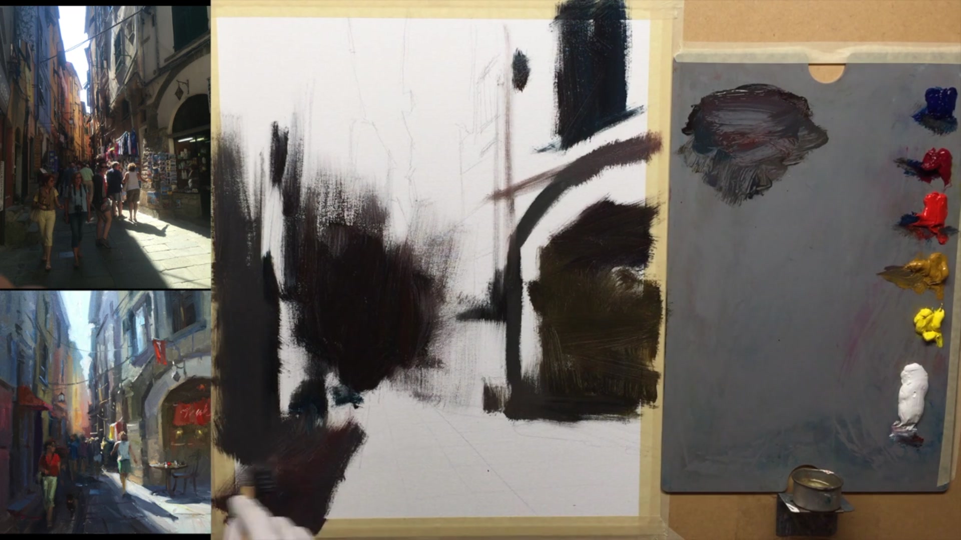
Lighten Dark Areas
Add a little bit of white to your darkest darks to create a slightly lighter dark. Use this mixture to brush in all the large areas where a lighter dark is needed. Thin the paint with walnut oil to ensure it covers the canvas without being too thick.
Add Sky Shine
Mix a bluish color to create sky reflections in the shadows. Brush this lighter, bluer color into the dark areas you've already painted. Ensure the initial layers are thin to allow for easy blending of this new color.
Enhance Shadow Contrast
Make the shadow areas a bit bluer than in the reference photo to enhance color contrast between the cool shadows and warm lights. As you paint higher up, gradually lighten the blue by adding white to mimic the effect of sky light.
Create Atmospheric Lighting
Paint the top area with an overall blue to represent light pouring down from the sky. Adjust the blue as you move lower, darkening it to maintain the atmospheric lighting effect. This ensures the lighting condition appears natural and cohesive.
Pro tipKeep initial layers thin to allow for easy blending of subsequent colors.
Embark on your painting journey by thoughtfully composing your scene, incorporating elements that guide the viewer's eye and create interest. Adjust your reference photo's exposure to reveal hidden details, ensuring a balanced image that serves as a strong foundation for your painting. Begin with a secure canvas and a well-planned sketch, using a grid transfer method to accurately capture complex scenes.
As you progress, focus on maintaining perspective and depth by carefully observing and replicating the angles and lines in your reference. Use a mix of dark tones to establish the shadows and contrast, and gradually build up layers of atmospheric lighting to enhance the scene's realism. Balance warm and cool colors to create a dynamic interplay of light and shadow, ensuring that each element contributes to the overall composition.
In the final stages, refine your painting with fine details and thoughtful color interpretation. Use high-quality brushes for precision, and add elements like furniture and figures to inject life and movement into your scene. Make final adjustments to enhance depth, warmth, and cohesion, ensuring your painting captures the vibrant essence of the Streets of Vernazza.
Points to remember
Incorporate elements that guide the viewer's eye through the composition.
Use the 'shadows' filter to bring out more detail in dark areas without affecting the highlights.
Use a grid transfer method to simplify and accurately sketch complex scenes onto your canvas.
Ensure vertical lines converge at the top to maintain perspective.
Keep initial layers thin to allow for easy blending of subsequent colors.
Wipe off any unwanted blue before adding warm colors to prevent creating grey tones.
Reflect sky colors in windows to break up shadowed areas and add interest.
Use a high-quality brush to achieve fine lines and avoid clumps in your details.