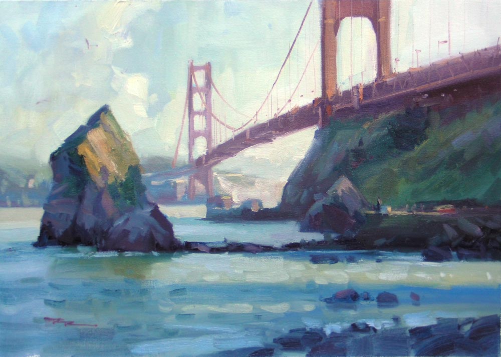
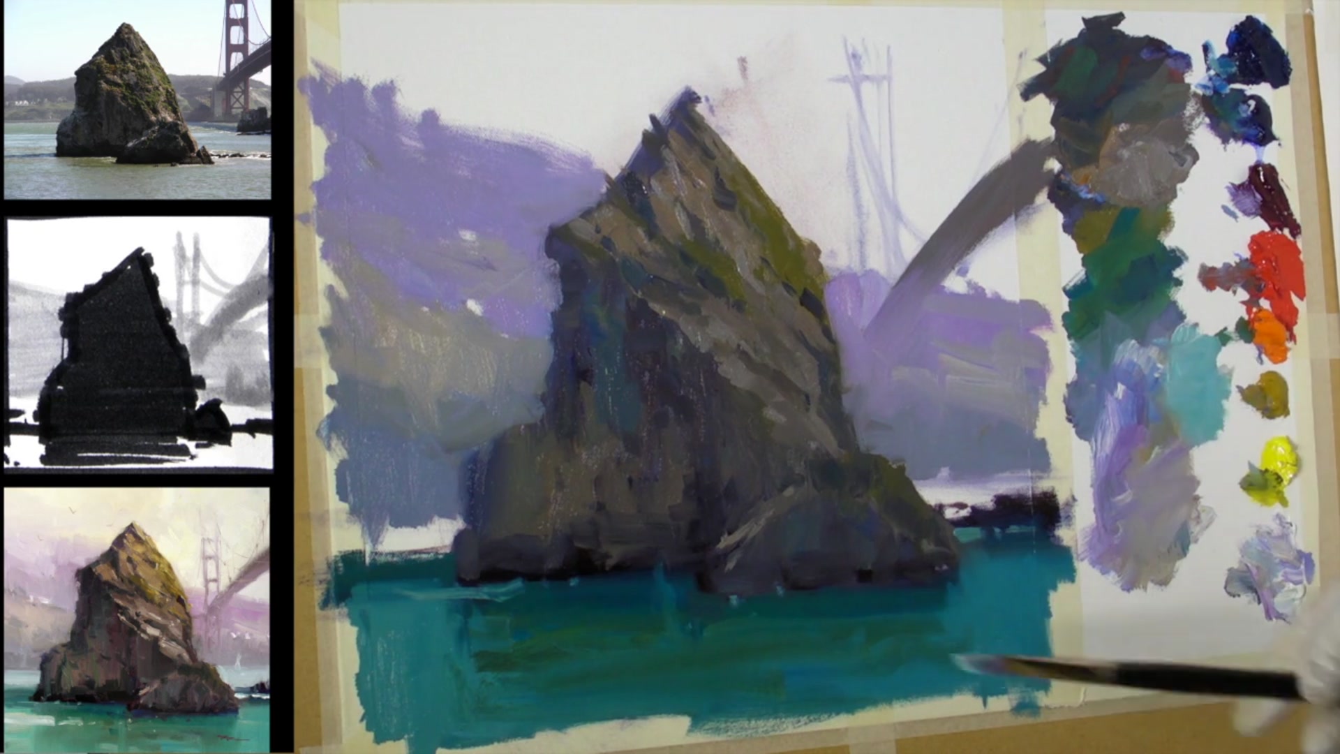
During a recent trip to San Francisco, I had the surreal experience of painting the iconic Golden Gate Bridge. It's a sight many of us have seen countless times on TV, but standing there in person, brush in hand, was truly something special. While the bridge itself is a magnificent subject, I found myself captivated by a particular rock in the scene. Its subtle colors and intriguing shapes offer a wealth of lessons for us as painters. In this chapter, we'll focus on capturing the essence of that rock, allowing it to take center stage while the bridge plays a supporting role. You'll learn how to paint convincingly solid rocks by examining their form, color, and texture. We'll start by selecting a square canvas to complement the rock's shape and integrate the bridge effectively. Through sketching and value studies, you'll gain insights into composition and balance. Approach this as a study, embracing the freedom to experiment and express yourself without the pressure of perfection. Let's explore the beauty and timelessness of rocks together.
This guide accompanies the full video lesson. The lesson includes the complete narrated video, the printable PDF chapter, and personalised critique support.
"Golden Gates" 12x16" Oil on Canvas by Richard Robinson
Step 10Mixing and painting the sky
Mix Turquoise
Use phthalo blue or phthalo green as a base. Add a lot of white and a tiny touch of bright yellow to achieve the desired turquoise hue.
Prepare the Sky Color
Mix yellow ochre with a lot of white and a tiny bit of purplish grey. This combination will create a soft, atmospheric sky color.
Paint the Sky
Apply the mixed sky color, starting from the top of the bridge. As you move towards the light source on the right, lighten and warm the color slightly with a tiny bit of bright yellow.
Pro tipUse phthalo blue or green with white and a touch of yellow to mix vibrant turquoise hues.
Embark on your painting journey by thoughtfully designing your composition. Choose a square format to harmonize the rock and bridge elements, and sketch a notan design to balance light and dark areas. Approach your painting as a study, allowing yourself the freedom to experiment and express creativity without the pressure of perfection.
Begin by establishing the darkest darks with a mix of ultramarine blue and cadmium red light, and layer warm grays over this base. Introduce variations in shadow grays by adjusting hues while maintaining consistent darkness. Pay attention to light reflections, especially those bouncing off surfaces like water, and gradually build up the light side with subtle transitions and vibrant greens.
As you refine your painting, maintain a consistent light pattern and avoid overly bright highlights to preserve the scene's believability. Use the edge of your brush for precise dark accents and blend colors harmoniously in the water and sky. Finally, employ a palette knife for organic textures, ensuring your colors remain pure and vibrant.
Points to remember
Use a notan design to establish the balance of light and dark areas.
Keep the dark passages thin to prevent them from standing out too much.
Maintain consistent darkness in shadow greys while varying their hue.
Pay attention to subtle changes in value caused by light reflecting off surfaces like water.
Leave small spaces for rocks when applying foliage colors to maintain a natural look.
Avoid overly bright highlights on rocks to maintain a believable light pattern.
Use the crisp edge of your brush to create fine lines without needing a smaller brush.
Clean the palette knife between strokes to keep the color pure.