Teacher
Richard is a talented full time artist, who loves painting and teaching.

with Richard Robinson
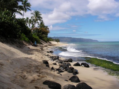
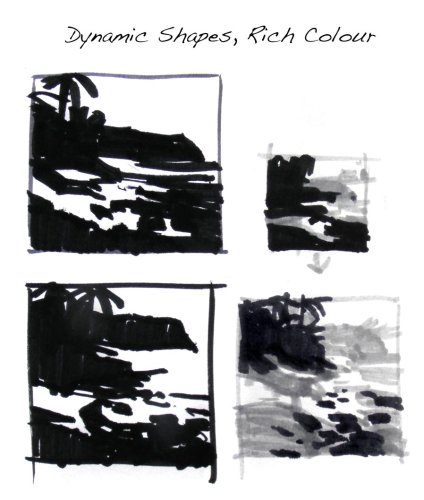
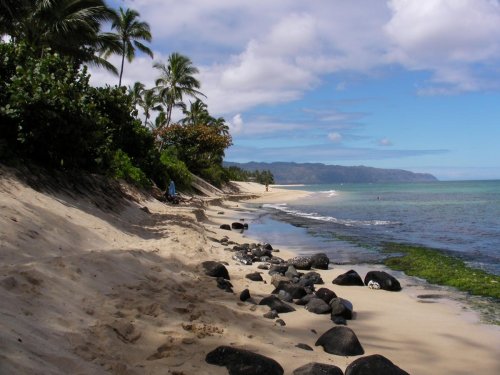
Laniakea is a stunning beach rich with colour and contrast. In this lesson I’ll show you how I personally deal with each of its elements to create a unified whole with special emphasis on creating richly coloured shadows. I also reveal my latest technique to create more dynamic brushwork in your painting.
Whenever you’re ready! The lesson is available online any time, and your access to the lesson never expires.
As long as you need! Your access never expires, so you can come back again and again.
Sorry, no you can’t download the video. This is to avoid piracy. You’ll always be able to view the video on this site though.
Richard is a talented full time artist, who loves painting and teaching.
Hi I’m Richard. I’ve been painting my whole life and back in 2001 I traded my graphic design career for the humble life of a full time artist. I love painting, and as it turns out, I love teaching too.
Nowadays I balance my life between parenting, painting, surfing, travelling and teaching. My work is regularly featured in international art magazines, in galleries in New Zealand and America, on TV and in my Mum’s house.
I give outdoor painting workshops in interesting spots around this beautiful planet of ours and love encouraging people to paint. Two of my favourite artists are John Singer Sargent and Joaquín Sorolla.
My painting website: www.nzpainter.com
I’d love to be your new teacher.

Richard is a master artist with an exceptional skill in identifying and communicating key factors to making successful paintings. I have found his video workshops an excellent resource for improving my own work.
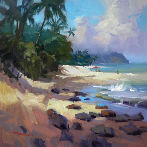
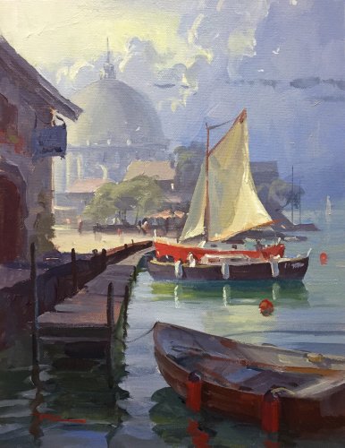
"Laniakea" 11x11" Oil on Canvas by Richard Robinson
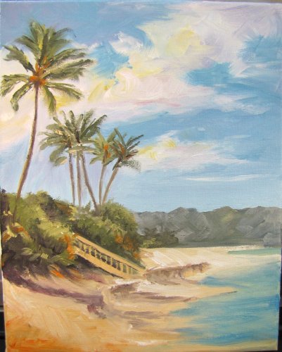
"The Entrance" Oil on Canvas by Caroline Lee King.
Design I like the vertical design Caroline - nice to see the whole palm tree and that sense of freedom given to a scene by adding more sky and I love the shapes of your clouds too. I like the way you've made the stairway a focal point but the final drawing of that does let it down a bit as it is not clear what's happening at the end of it. I was hugely impressed to see that you made 5 separate paintings of this scene - way to go! Colour The colour in this is really pretty good. You could add a little more depth of colour to the water, try to avoid mixing your lights with your darks in the sand (it goes muddy) and darken the shadows in your clouds slightly to give them more form. Your hills could have some more blue in them too - they're quite a flat gray at the moment. Nice to see you playing with throwing some orange around to spice things up. Brushwork I'm liking your vigorous brushwork Caroline. Beware of crossing the line between bravura and sloppy though. Some of the shapes in your palm fronds could have been handled with more care and the stairs are quite clunky. My goal is always to try to make things read well from a distant but to look beautiful up close too. You're getting there. Realism There are a few things need touching up to raise the realism on this. The shadows across the sand could be more definite and continuous, the drawing of the stairs could be more refined and there are the other few things I've already mentioned. The overall drawing is good though and that's usually what makes for convincing realism. Hope that helps.
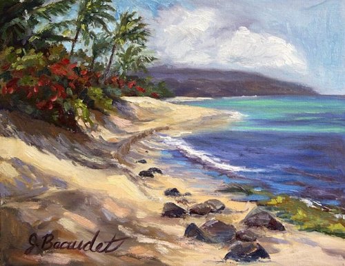
"Turtle Beach" Oil on Canvas by Jim Baldourmas.
Design Jim you've got a real cheery painting here - what it lacks in realism it makes up for with charm. You may not have captured the scene itself but the spirit of it is certainly there. The rocks seem to be the main feature because they are so dark against the sand so it's a shame the drawing of them wasn't a bit more informed. Their bases need to be flatter and more so as they move down the beach and they all need to be casting shadows onto the sand. Making them lighter gray will help them settle down too. Looks like at the top end of the far sand dune you're not quite sure what's going on in regards to how it meets with the flora there. If you're not sure the viewer won't be sure. Colour Nice to see you varying the hues in your beach shadows and your clouds which look great. In the foliage the base dark that you laid down was a mid value which is too light and is making the plants float on top of it spoiling the illusion of depth. Making that darker will solve the problem there. Brushwork You've got a great variation in brushwork there from soft clouds to chunky rocks and turbulent whitewash so it looks like you've had some fun with the palette knife but you've also discovered its limitations in that it's not very good at curved lines as in the palm fronds which look pretty clunky because of that. Realism This one's got a fair way to go on realism and much of that is down to drawing and values so I would recommend the best way for you to improve those things quickly is to do a few dozen paintings in grayscale and get some drawing training under your belt so you can really understand what it is you are seeing. If that's going to stop you having fun, don't worry and just paint!
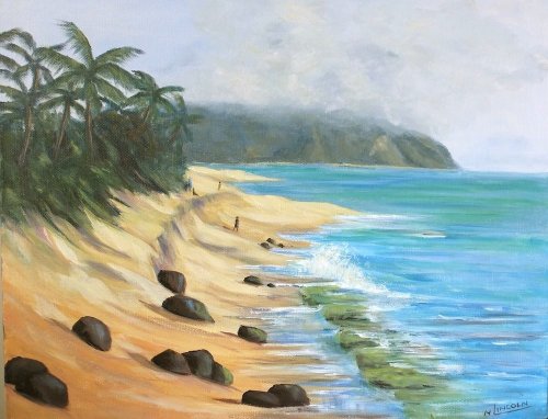
"Turtle Beach" 12 x 18" Acrylic on Canvas by Ngaire Lincoln.
Design Hi Ngaire you've simplified the design somewhat and lost the drama of the dark shadows across the sand, which is actually in keeping with the overcast looking sky but does lose some of that warm tropical feeling. There is a problem with the comparison of scale between the rocks and the trees and the people. I think it's that the people and trees are too small. Having those dark rocks tucked away in the bottom left corner is not the best design idea - better to remove them altogether. Colour Having decreased the contrast between the shadows and the lights on the beach has taken some of the sparkle out of the colours there but all the same it's good to see you playing with adding some variety into the colours that are there with some oranges, mauves and greens. The same could be said for the ocean although it does look a little patchy with stripes placed here and there without a thorough understanding of what's going on. Brushwork Nice to see you enjoying your brush and those are some great looking palm trees there! Love that lost edge you've given the mountain under the cloud and the splash of foam on the shore. I can recommend pushing your lights further by using much thicker paint there - lots of fun. Realism Might want to measure that horizon and level it up. Which direction is the light coming from? Have you applied shadows consistently throughout the painting? Should the water darken as it gets closer to you and you see more through the surface? Answering questions like these all add up to a convincing painting. The highlight of this painting for me is the convincing structure of the mountain and the way you've worked the cloud over it - nice! Keep up the good work Ngaire.
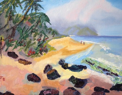
"Turtle Beach" 8x10" Oil on Canvas by Jennifer Beaudet.
Design Hi Jennifer, the design looks all good to me. You did great reducing the size of the palms which was a problem with my painting. The curve of the beach is really well done as is the treatment of the foreground shadow. You mentioned you weren't quite happy with the sky and perhaps that could use a little fiddling - extending one of the clouds out the top of the picture might help as running an object that close to the edge always gives the appearance that you were trying to squeeze it in (like your foremost rock). Also since the light is coming from top left the light area on the far right end of your cloud is defying the light source - it might read better as a shadow plane there. Colour It was a nice decision to gray down the background a little as they has helped the colour in the foreground pop a little more. The addition of the red flowers was also a nice idea that you executed well although you could have grayed down the distant flowers a little because they're poking out a bit there. Some of the shadows on the beach seem to have turned a bit muddy which in my experience comes from fudging your cools and warms together on the canvas instead of laying down your cools over the top stroke by stroke, keeping the brush clean. Brushwork You brushwork is good and varied, following the forms of objects well. Nice to see some impasto stuff going on there - quite impressionistic. Your palm trees are working from a distance but up close the brushwork looks a bit uncertain and that's led to a little muddiness in the sky there. Great shapes though. Good variety of soft and sharp edges too. Realism The overall realism is great and that owes much to your careful drawing. You mentioned that it has sold already - barely even dry! That's fantastic and a good testament to a painting well done. Congratulations.
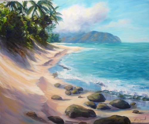
"My Dream" 50x60cm Acrylic on Canvas by Helena Ignowski.
Design Hi Helena this is looking great. You've changed the angle of the beach a little and included more water in the composition which is all good. Personally I would like to see a little wave there to add a bit more interest to all that blue. Good to see you running rocks out of the frame to help lead the viewer in and their placement and recession is done well too - nice and random. Colour Your colour is great - very tropical. It's good to see you building a solid cloud by working through the spectrum from cool shadows to warm lights. You managed to push the distant trees back by cooling and lighting them too - good job. Overall it's good to see you varying the colour in every area - beautiful! Brushwork I'm really enjoying your fluid brush strokes here and the textural contrast you've made with the impasto foam breaking on the shore - exciting stuff! You might like to look at softening off the brush strokes in your distant water as it seems too similar to the foreground water and that can take away from the illusion of recession. Changing the hue of the ocean in the distance will help it recede as well. Realism A few of your rocks could do with some more attention - particularly the way they sit in the sand, which is largely a product of their base line. The rocks further away should have a flatter base line. Other than that the realism of this piece is good and I especially like the light pushing through the palm fronds - nicely done. Great job Helena!
$15.00USD
$15.00USD
$15.00USD
$15.00USD
Not loving your painting lessons? No worries!
If it’s not the right fit, we’ll give you a full refund within 30 days of purchase - no questions asked.
When you purchase a DVD you also get online access to the same lesson, including any lesson resources like photos, downloadable notes and access to upload your painting to the student gallery.
That's why you need to make a password when you purchase a DVD, so you can access the online content as well. Enjoy!