Teacher
Richard is a talented full time artist, who loves painting and teaching.

with Richard Robinson
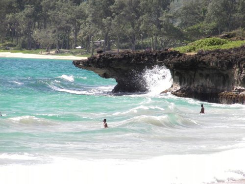
One of the last things people notice about a painting is its brushwork simply because most work is seen from a distance at first and then viewed in more detail as the viewer moves closer.
To me, beautiful brushwork has variety, unity, purpose and vigour. Up close it should be an interesting abstract collection of marks which resolves into a coherent scene as we retreat from the canvas. Learn how in this workshop.
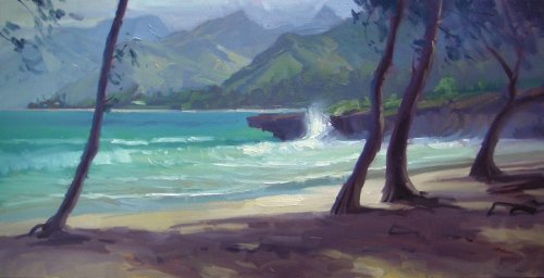
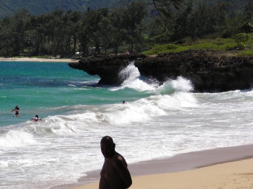
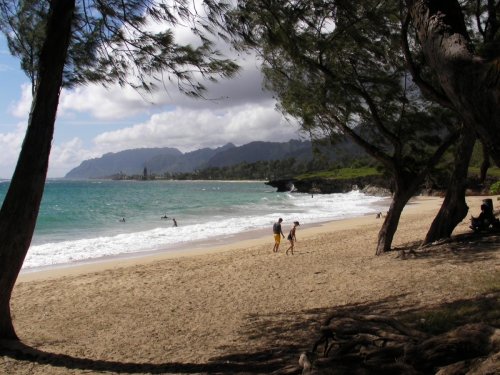
Follow along step by step or use the resource photo to create something more your own. Enjoy!
Whenever you’re ready! The lesson is available online any time, and your access to the lesson never expires.
As long as you need! Your access never expires, so you can come back again and again.
Sorry, no you can’t download the video. This is to avoid piracy. You’ll always be able to view the video on this site though.
Richard is a talented full time artist, who loves painting and teaching.
Hi I’m Richard. I’ve been painting my whole life and back in 2001 I traded my graphic design career for the humble life of a full time artist. I love painting, and as it turns out, I love teaching too.
Nowadays I balance my life between parenting, painting, surfing, travelling and teaching. My work is regularly featured in international art magazines, in galleries in New Zealand and America, on TV and in my Mum’s house.
I give outdoor painting workshops in interesting spots around this beautiful planet of ours and love encouraging people to paint. Two of my favourite artists are John Singer Sargent and Joaquín Sorolla.
My painting website: www.nzpainter.com
I’d love to be your new teacher.

Richard is a master artist with an exceptional skill in identifying and communicating key factors to making successful paintings. I have found his video workshops an excellent resource for improving my own work.
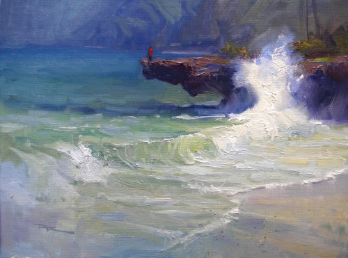
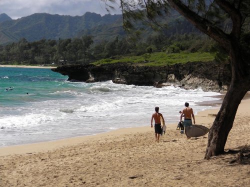
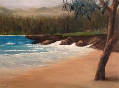
"Pounders II" 11x14" Oil on Canvas by Richard Robinson
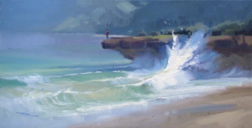
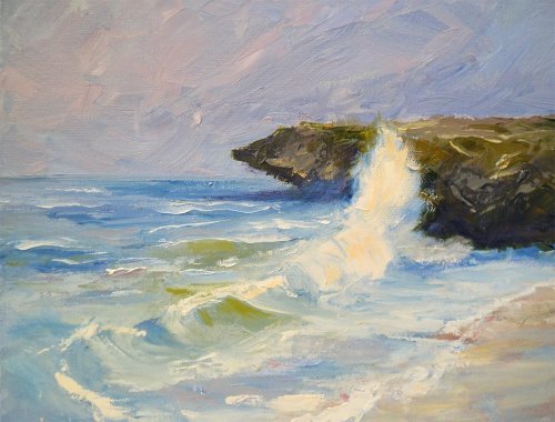
"Pounders" 10x20" Oil on Canvas by Richard Robinson (First plein air piece at this location)
"Pounders" 10x20" Oil on Canvas by Richard Robinson (First plein air piece at this location)
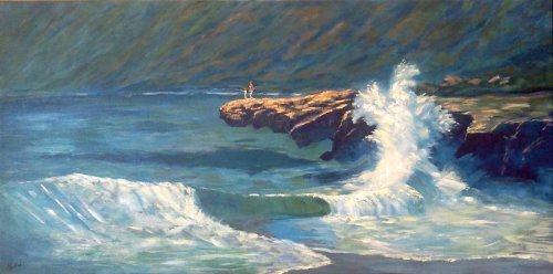
'Another Day in Paradise' 15x30" Acrylic on Canvas by Jess Paskel
Design Wow this is very dramatic Jess - nice job. The design is very simplified which just puts more emphasis on the beautiful splash which is great. If you cut off 4 or 5 inches on the left I don't know that you would be missing much, so perhaps that's something to consider. Other than that I think the design is pretty solid - even in the background which could have been a weak spot of plain grayness you've introduced plenty of textural interest there and varied your colours - nice. Colour You've really played a lot with your warms and cool which is a big part of the appeal of this painting, exemplified by the warm orange on the rocks surrounded by the cool greens of the ocean and mountains. There's also a lot of subtle colour work in the big splash and the shadowed foam in that area which to me is the highlight of this piece - very keenly observed although unfortunately the same can't be said for the straight stripes of foam on the far left which looks clumsy by comparison. The overall colour effect is very effective. Brushwork At first I thought the brushwork was a bit finicky but then I saw the actual size of the painting and realised that like Monet's paintings this one would be much more impressive in the flesh. You're showing a good variety of large and small marks and a range of texture but I challenge you to try and include some even larger juicier brushstrokes in your next painting. Realism For the most part the realism in this one is really good but I keep wandering what's going on with the overall shape of the wave, that is, why does it slope away from the horizon instead of towards it as linear perspective would suggest? Other than that, all good.
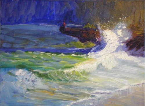
'Pounders 2' 30x40cm Oil on Canvas by Elena Sokolova
Design The fun you've had with this one! It looks great Helena. You've kept the design very similar to mine so I can't suggest anything different there except for leveling out the horizon a bit, but then the whole painting seems tilted slightly to the right so that may just be the photography? Colour It's very striking colour with that strong green and intense blues and for the most part those relationships are working okay but in the background the should could have been grayed more (add a touch of orange) to help push that back rather than jumping forward as it is. Brushwork I love how much you've pushed your brushwork in this one and there are some parts of it that are just singing now because of that. I particularly love the bottom half of the painting where all the action is happening, the effect of the splattering and the subtle little shadows under the foamlets along the wet sand. Plenty of action and it's all about the waves so that's great work. Realism Step back from this one and it looks great but there are a few subtleties you missed which detract from the realism up close. The large sharp brushstrokes in the distant water are spoiling the sense of depth there and so is the similar treatment of the background. Overall though, very enjoyable to look at - sign it and frame it!
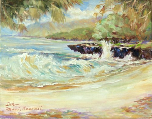
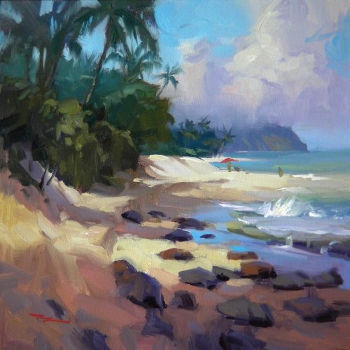
'Pounder, North Shore, Oahu' 11x14" Oil on Canvas by Ish
Design Ish, right of the bat I'm enjoying looking at this - it's clear you've been painting for some time and you have a good handle on it. I love the foliage you've added to the top and interesting shadows in the sand and I don't know if you intended this or not but the slanted horizon is adding to the powerful feeling of movement this piece conveys, along with the nicely curved beach, which if a little unrealistic is still very lyrical. Colour A beautifully light and airy colour scheme (Monet would approve) but you've also managed to throw in a few intense darks which makes it that little bit punchier. You are interweaving colour throughout the painting which is lovely to see - a visual feast and I can even see some greens in the beach which to most is counter intuitive but works very well here (I've been noticing subtle greens in the white sands here lately too). Nicely done. Those darker dashes of ochre in the waves seem a touch too dark, but that's being pretty picky. Brushwork Again a nice collection of brushwork with especially nice use of drybrush in the foam. Some beautifully crisp edges on the rocks there and lovely fluid work in the overhanging foliage. The tree atop the rock could perhaps do with a little more textural variation as it's looking a bit cotton-ballish to me. Realism Your drawing, colour, values are all good. Beautiful work - good job.
'Beach Scene' 9x12" Oil on Canvas by Bobbi
Design Bobbi this is a commendable painting with a lot going for it. I like how you've divided the space in your design, all except for the beach which is a large plain space that needs breaking up. You've tentatively placed a soft shadow across the foreground but this could be a lot more interesting. Adding the serpentine strip of wet reflective sand between sea and sand could also help with adding interest to this space. I found the way the distant beach lined up with the rocks, although accurate, was troublesome as it stopped the space reading easily so I opted to raise it slightly higher than the rocks in every painting I did there. Beware of objects lining up with things behind them - in nature we have the option to move our viewpoint to see what's going on, but in a painting it remains confusing forever more. You could also have varied the shape of the large mass of your distant trees to add more interest there. Colour Your colours in the water are all very good, especially the foamy sandy water on the beach which is always a tricky spot and also been pretty subtle with your greens atop the rock which is nice to see - although you could have blued and lightened the distant trees somewhat to help separate the midground and background space. The brown in the mist is an interesting choice which I think would look better in a sunset scene but doesn't quite fit in this one and begins to look more like smog to me. Brushwork It looks like you've had a little bit of fun with the brushwork, but I bet you could have more fun with it. It's always a reach to paint outside our safe zone but I always find it exciting and even if I don't like my finished painting there's always something to take away from it that filters through into future work. I encourage you to push yourself further in this area. Realism You've certainly got a good eye for drawing which is the backbone of realism and as I've already mentioned adding more variation in the foreground, variation is also a key to convincing realism but nature has an unlimited budget for variation and we tend to want to simplify things so when you feel that happening it's time to look again and ask yourself what other elements in the scene could be used to add richness to a particular section of the painting. Overall it's a good painting Bobbi and I can see you doing even better on your next one. Good luck!
'Bear Rock' 12x12" Oil on Canvas by Dorothy Debney
Dorothy I'm drawn to this painting for its interesting brushwork. You've altered the design from my original by making the background equal in value to the ocean which leaves the painting a little unbalanced right to left. You have also lowered the horizon which I think works well to give the rock a larger scale although it throws the size of the foreground into question. I've certainly not solved that with my painting either and I suppose it has much to do with the angle of the swells and the size of the figure on the rock. I would suggest that if you keep the horizon lowered as you have it and the base of the furthest rock lifted so, then the furthest rock might require more evidence of atmospheric perspective (lightening and graying in this case) to help with the illusion of depth. I'm always surprised at how little a change in perspective drawing it takes to spoil the illusion of reality in a painting. Colour I like your overall colour scheme and I think the colour works well together but there are a few eye-pokers there which could do with some work. The main one is the darker green in the face of the waves. It's just a bit too dark for the surrounding colours. From it's placement I assume you were trying for the light green where the wave is quite thin and translucent so for this colour to work it really needs to be a little lighter than its neighbours. I do like the idea of using a warmer gray in the background as you have done to tie in with the colours in the beach sand but it does look as though it needs to be darker in order to read better - either that or adding more of your warm gray into the distant ocean as they are usually a closely related pair. Brushwork Looks like you had a lot of fun with the palette knife on this one and it's nice to see you've balanced much of this large gestural work with some finer lines and details - something that's hard to stop and do when you're going at it with the knife. Exploring brushwork was the main goal of this workshop and you've done that in spades, so, well done. Realism I didn't expect everyone to nail the realism and brushwork and the same time in this workshop - that takes a lot of practice, but in a few areas like the big foam and the rocks you've done a good job of dealing with both at the same time. Some more attention to the overall structure of colour in the ocean and waves will give you more insight there, especially if you squint while you look. At the moment the ocean's not working well as a cohesive whole because you have patches of darker value breaking the structure. I would also like to see the shape of the big splash broken a little and a few softer edges added. I hope that helps some.
$15.00USD
$15.00USD
$15.00USD
$45.00USD
Not loving your painting lessons? No worries!
If it’s not the right fit, we’ll give you a full refund within 30 days of purchase - no questions asked.
When you purchase a DVD you also get online access to the same lesson, including any lesson resources like photos, downloadable notes and access to upload your painting to the student gallery.
That's why you need to make a password when you purchase a DVD, so you can access the online content as well. Enjoy!