Teacher
Richard is a talented full time artist, who loves painting and teaching.

with Richard Robinson
One of the biggest problems we encounter with landscape painting is the sheer amount of detail and complexity we are faced with. How do we deal with all of that!?
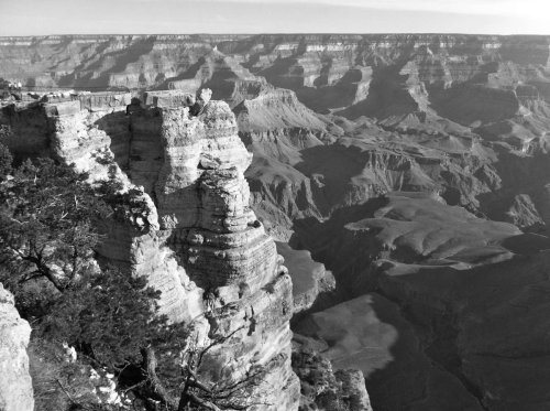
This workshop teaches you about simplifying a scene with the light and shadow families and then using a two value statement to simplify even further. What better place to do this than the Grand Canyon – one of the most complex scenes on Earth!
Whenever you’re ready! The lesson is available online any time, and your access to the lesson never expires.
As long as you need! Your access never expires, so you can come back again and again.
Sorry, no you can’t download the video. This is to avoid piracy. You’ll always be able to view the video on this site though.
Richard is a talented full time artist, who loves painting and teaching.
Hi I’m Richard. I’ve been painting my whole life and back in 2001 I traded my graphic design career for the humble life of a full time artist. I love painting, and as it turns out, I love teaching too.
Nowadays I balance my life between parenting, painting, surfing, travelling and teaching. My work is regularly featured in international art magazines, in galleries in New Zealand and America, on TV and in my Mum’s house.
I give outdoor painting workshops in interesting spots around this beautiful planet of ours and love encouraging people to paint. Two of my favourite artists are John Singer Sargent and Joaquín Sorolla.
My painting website: www.nzpainter.com
I’d love to be your new teacher.

Richard is a master artist with an exceptional skill in identifying and communicating key factors to making successful paintings. I have found his video workshops an excellent resource for improving my own work.
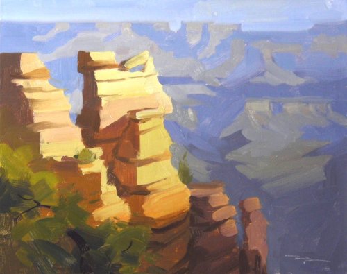
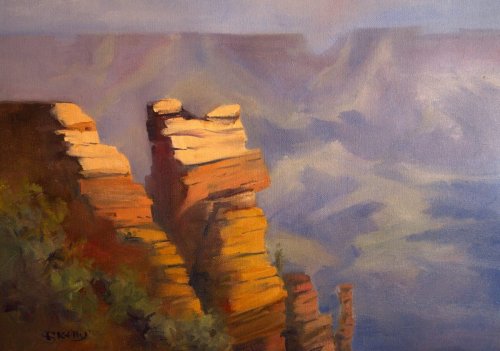
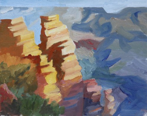
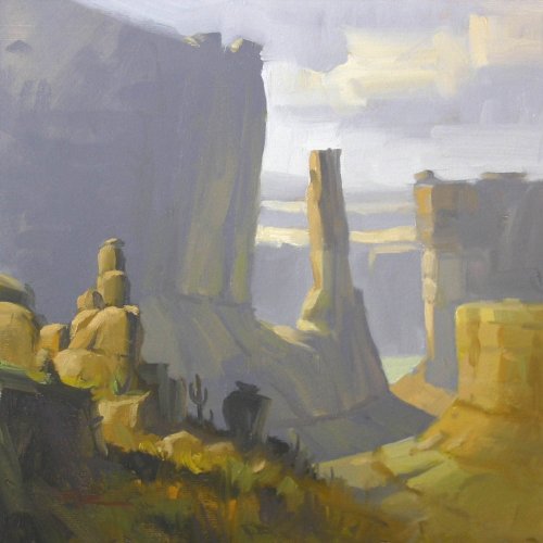
"Sunrise, Grand Canyon" 10x8" Oil on Canvas by Richard Robinson
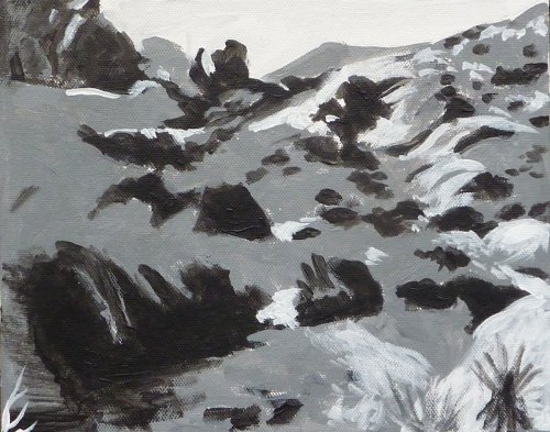
"From Up High" 29x42cm" Oil by Sandra Kelly
Great work Sandra. Finding simplicity was the goal of this exercise and you've managed to keep things simplified despite the larger canvas and the complex subject. You've even managed to simplify the colour banding of the rock strata into four distinct layers. Making all the background have soft edges was a really nice idea and that's lent a real photographic crispness to the foreground rocks. All the the colours have a lovely warmth to them which is great to see and in that respect you've jumped ahead of my small study and created colour unity throughout the whole painting which is something I only managed to achieve in my larger studio painting after 2 weeks! Beautiful subtle work there with warm grays in the background and you managed to keep all the values in good relationship with each other there which is not an easy task at all. I do feel that I would like to add a little area of slightly lighter interest in the background area somewhere to the the eye more reason to travel back there. The one thing that is spoiling the effect of light on your foreground rocks is the colour of the cracks there. If you make those cracks that are within large areas of light just a slightly darker version of the rock colour rather than adding blue to them it will really help with the illusion of strong light. Keep up the good work!
"Grand Canyon, Study 2, Bock-in" by Jim Delk
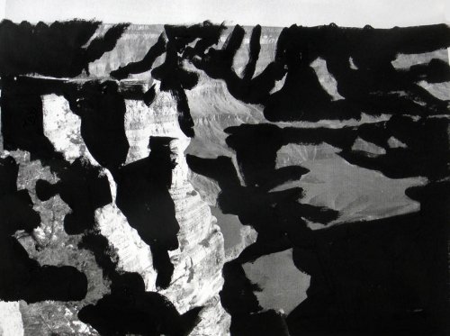
That's getting there Jim. You've certainly been looking at simplifying the scene and figuring out the major light and shadow families. It looks to me like you copied my own study as much as you looked at the photograph, which is fine but I think you'll get even more learning done next time by trying to figure out how you want to simplify the scene. As is often the case your painting was actually working better at the end of the block in stage (shown on the left) before you started fiddling with it. By viewing both paintings in grayscale we can see clearly why the block in reads better. You've lost the background's dark/light value structure you had achieved in the block-in. It looks like what you did was lighten all the blue-gray shadow family in the background but left all the lights which made the lights too dark comparatively. You've also exaggerated some warm colours there (that big patch of brown in the middle background) which is out of place - it needs to be much cooler due to atmospheric perspective. Squinting at your scene really helps with this. Our common problem is that as soon as we focus in on one small area of the scene we lose it's relationship with the rest and in fact our brains go ahead and exaggerate the differences in colour and contrast there so that we can see it better, but that is really confusing for us painters. That reflected light you have added into the shadows in the foreground rocks has really livened them up and you managed to hold back from adding too much detail there which is great. In fact the foreground is looking pretty good and I would just like to see you tackle the background again. Nearly there! Great to see you have already done two separate studies too - great work!
"Red Rock Canyon" 10x8" Oil by Ivana Jackson
Very nicely done Ivana. Firstly your drawing is very accurate. Compared to the photo you seem to have transferred the image to the canvas remarkably well - so much so that I assume it was traced on. No sin there in my book if you did trace it. The only trouble I ever find with tracing is that it's very easy to then become a slave to the drawing. Either way the drawing is good here and the scene itself is already cropped and organized fairly well in the photo so you can't really go wrong there, and you have made a few conscious changes to the layout that have helped it along a little like removing the little noble of rock in the top left corner which would otherwise attract the eye to the edge of the canvas. You've also given the tree a little more breathing space which is a good idea and introduced a subtle pathway of light in the foreground. Nice work! In terms of your colour decisions it looks like you have some knowledge of plein air painting because you've corrected the under-exposed shadows by lightening them which is great to see but personally I feel that you've missed a couple of opportunities to introduce some slightly punchier colour in the foreground and midground which would have helped to spice up the scene. You have thought clearly about the light and shadow families which is great to see but perhaps added a little more detail than I would have expected when the goal of this exercise was really about simplifying our subject. Hard to stop sometimes! Anyway, I hope you're proud of this painting because you've certainly done a lot of things well in it and I hope you'll enjoy the next workshop challenge too which leads smoothly on from this one.
"Grand Canyon, Study 2, Final" by Jim Delk
That's getting there Jim. You've certainly been looking at simplifying the scene and figuring out the major light and shadow families. It looks to me like you copied my own study as much as you looked at the photograph, which is fine but I think you'll get even more learning done next time by trying to figure out how you want to simplify the scene. As is often the case your painting was actually working better at the end of the block in stage (shown on the left) before you started fiddling with it. By viewing both paintings in grayscale we can see clearly why the block in reads better. You've lost the background's dark/light value structure you had achieved in the block-in. It looks like what you did was lighten all the blue-gray shadow family in the background but left all the lights which made the lights too dark comparatively. You've also exaggerated some warm colours there (that big patch of brown in the middle background) which is out of place - it needs to be much cooler due to atmospheric perspective. Squinting at your scene really helps with this. Our common problem is that as soon as we focus in on one small area of the scene we lose it's relationship with the rest and in fact our brains go ahead and exaggerate the differences in colour and contrast there so that we can see it better, but that is really confusing for us painters. That reflected light you have added into the shadows in the foreground rocks has really livened them up and you managed to hold back from adding too much detail there which is great. In fact the foreground is looking pretty good and I would just like to see you tackle the background again. Nearly there! Great to see you have already done two separate studies too - great work!
"Valley of Fire" 10x12" Oil by Marina Laliberte
Great work Marina. It's paintings like this where I start to think, 'well, should I critique it or not?' because it's so nicely done it's hard to offer any improvements. Looking at your previous work, this one seems to be such a big leap ahead, especially for your landscape work, that I'm going to have to take all the credit as a fantastic teacher and take a bow. There, now that that's done I can start pointing out some of the good points and some of the not so good. You have simplified! That's the biggest achievement of this piece I believe. There is a lot of complexity there in the photo but you have managed to keep squinting and keep painting what you're seeing when you squint. You've kept a close eye on the shadow and light families and managed to keep each area roughly within one value - changing hue, but not value. That's great! You have designed! You have cropped the scene nicely and you've moved that bush on the right to make an s-curve of light through the painting, leading us into the background. You weren't a slave to the photo. Awesome! Because you've simplified and kept your head on straight your brushwork has a bold directness to it which I find very appealing and you've been aware of your hard and soft edges too, although some of those crisp edges in the background just behind the main foreground rock on the left could do with softening a bit to help with creating more space. Watch out for those little white gaps here and there showing white canvas - I often go back over these with a finger or dry brush at the end of the painting. Your colour recession has worked really well here and I think the star of the painting is really that big wall of interesting muted colour on the right - nicely simplified and with just enough variation in colour and texture to make it very convincing from a few steps away. If there is one thing I would personally change in this painting it would be the bottom left corner. With those few diagonal strokes of gray you've gone halfway between making a dash of light or making an edge of rock with the sky light reflected off it. The value is too dark for light and too light for reflected light, so I'd just decide what it was, scrape it off and do it again, or even put that bush in there softly - if it was mine. Other than that, it's all good. Nice work!
"Red Rocks" 12x15" Oil by Pauline Le Merle
Design Congratulations Pauline on a really interesting and appealing design. It has the classic S-curve pulling our eye through the canvas and plenty of variety. The shapes are beautifully organic with your own distinctive rhythm to them. The only thing I would have changed is the rock kissing the top of the canvas - moved slightly up or down it wouldn't draw so much attention to the edge. Colour You have simplified your colour and kept and eye on your light and shadow families which is what we were focusing on in the workshop and you've done well to keep that green subdued in most places except it seems to jump out a little in the midground. I particularly like your little rocks in the foreground which add so much interest and lead your eye into the painting. The colours in your shadows are nicely varied and for the most part painted with thin paint which is good to see. You could have lightened the darks in the background to add more depth to the painting as they are tending to flatten the image out at the moment by bringing the background forward. It's good to see you did lighten and blue the big cast shadow on the ground as it receded though. Brushwork Your brushwork is really interesting in its variety but there are a few places I personally would have removed some detail like the midground bushes and that little speckled bush right in the foreground. Your tree is in need of a bit of reshaping with a stronger sense of light and shade and that dark crevice in the rock behind it isn't helping much. The rocks just to the right of the tree could do with some stronger shadows to give them some more obvious form. Overall you've done a great job and I hope those few tips help in some way.
$15.00USD
$15.00USD
$15.00USD
$15.00USD
Not loving your painting lessons? No worries!
If it’s not the right fit, we’ll give you a full refund within 30 days of purchase - no questions asked.
When you purchase a DVD you also get online access to the same lesson, including any lesson resources like photos, downloadable notes and access to upload your painting to the student gallery.
That's why you need to make a password when you purchase a DVD, so you can access the online content as well. Enjoy!