Teacher
Richard is a talented full time artist, who loves painting and teaching.

with Richard Robinson
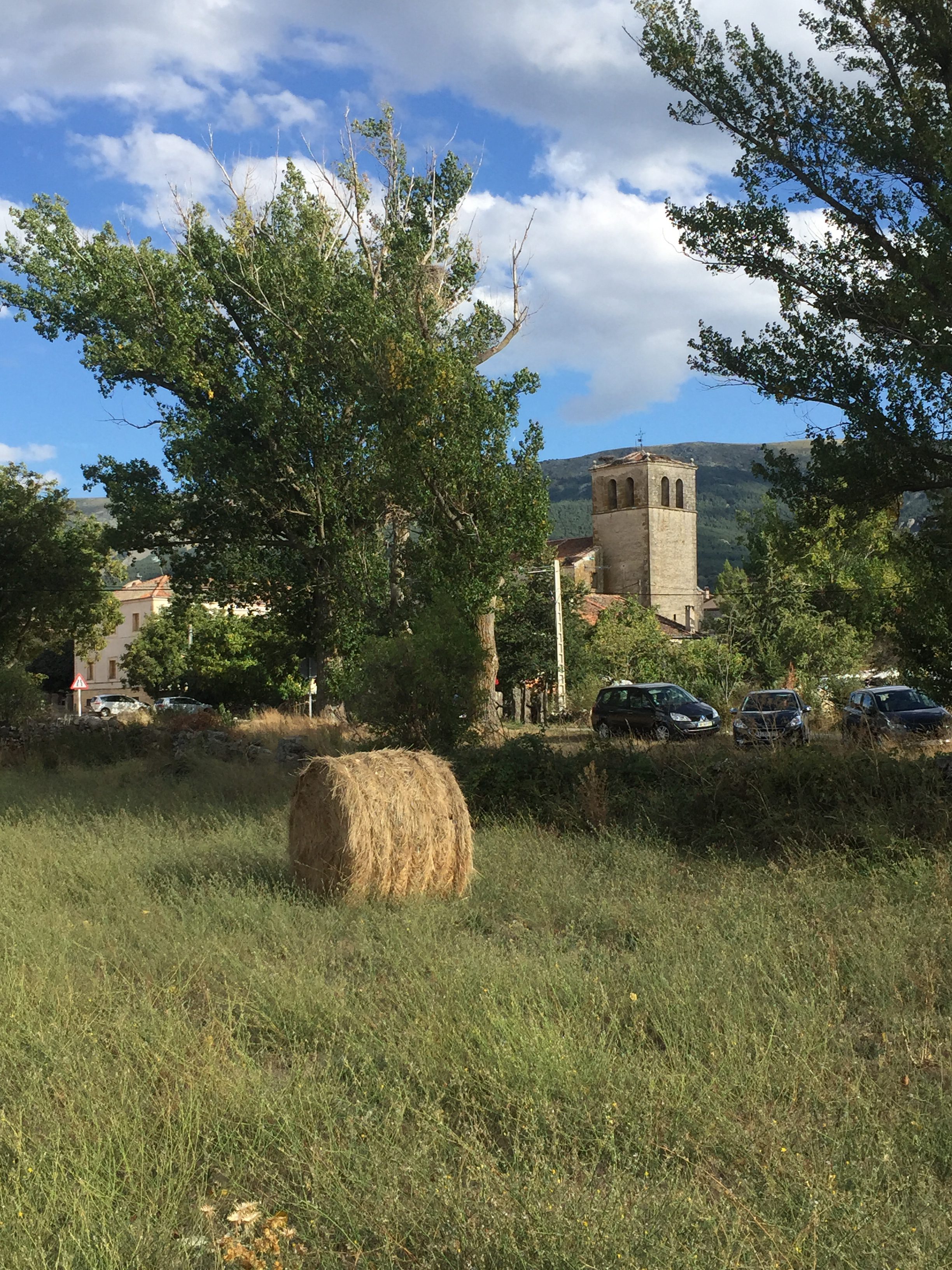
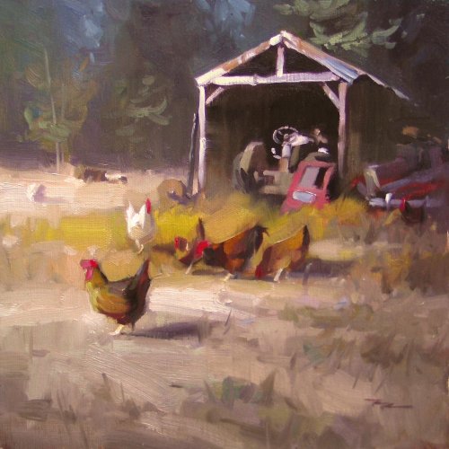
What a lot of paintings lack is movement. Find out how to use bold impressionistic brushwork combined with shimmering broken colour to produce movement in your paintings. In this project we only use two brushes and six colours – nice and simple. Enjoy!
Whenever you’re ready! The lesson is available online any time, and your access to the lesson never expires.
As long as you need! Your access never expires, so you can come back again and again.
Sorry, no you can’t download the video. This is to avoid piracy. You’ll always be able to view the video on this site though.
Richard is a talented full time artist, who loves painting and teaching.
Hi I’m Richard. I’ve been painting my whole life and back in 2001 I traded my graphic design career for the humble life of a full time artist. I love painting, and as it turns out, I love teaching too.
Nowadays I balance my life between parenting, painting, surfing, travelling and teaching. My work is regularly featured in international art magazines, in galleries in New Zealand and America, on TV and in my Mum’s house.
I give outdoor painting workshops in interesting spots around this beautiful planet of ours and love encouraging people to paint. Two of my favourite artists are John Singer Sargent and Joaquín Sorolla.
My painting website: www.nzpainter.com
I’d love to be your new teacher.

Richard is a master artist with an exceptional skill in identifying and communicating key factors to making successful paintings. I have found his video workshops an excellent resource for improving my own work.
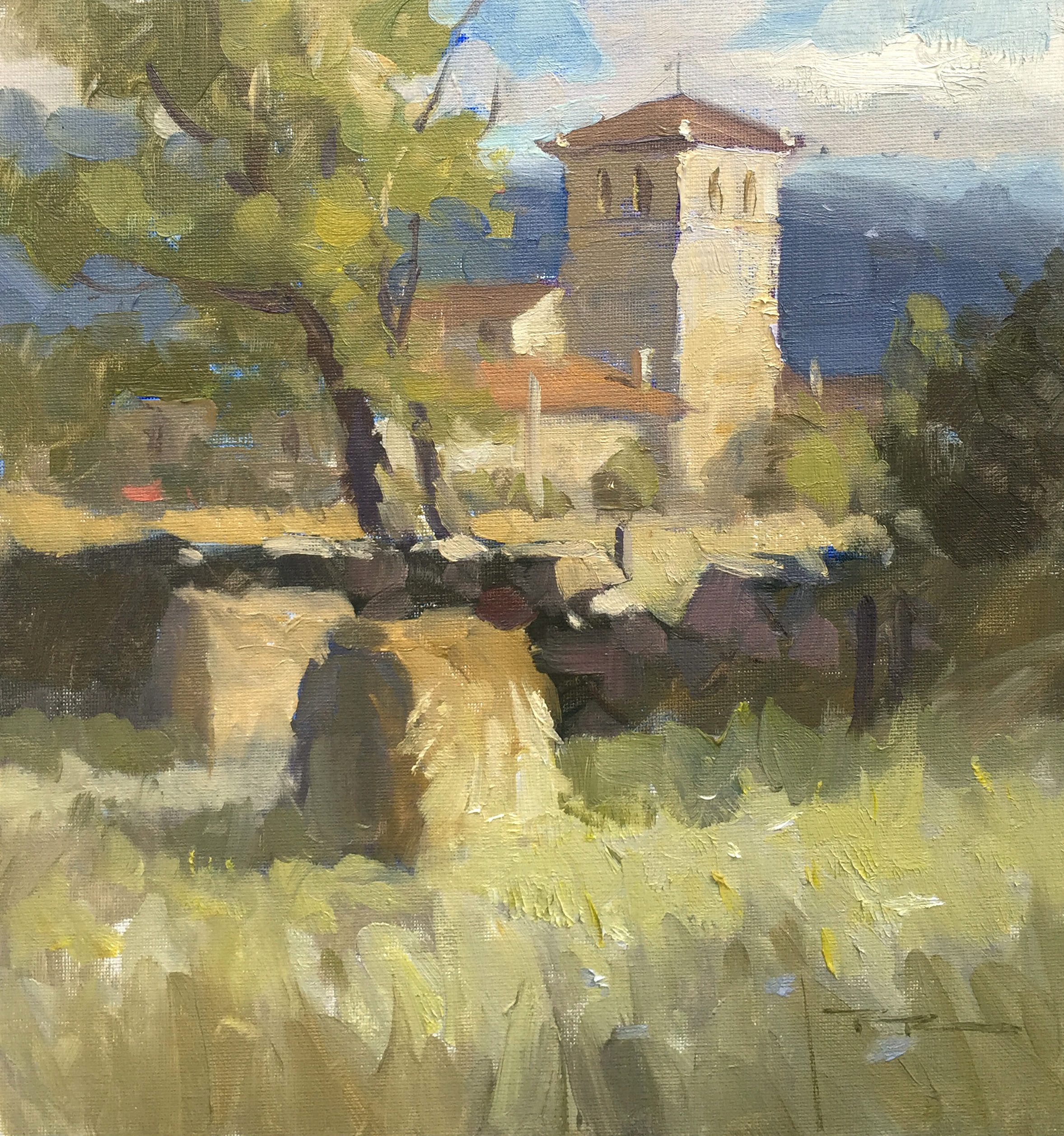
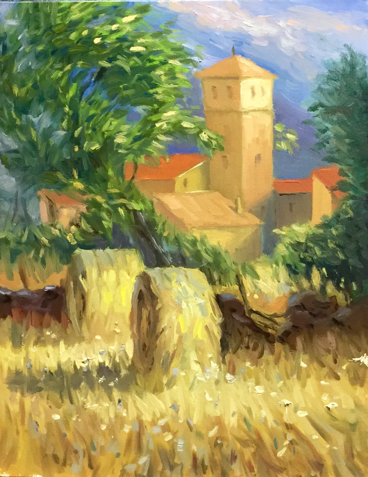
"Matabuena 1" Oil on Canvas 11x14" by Richard Robinson
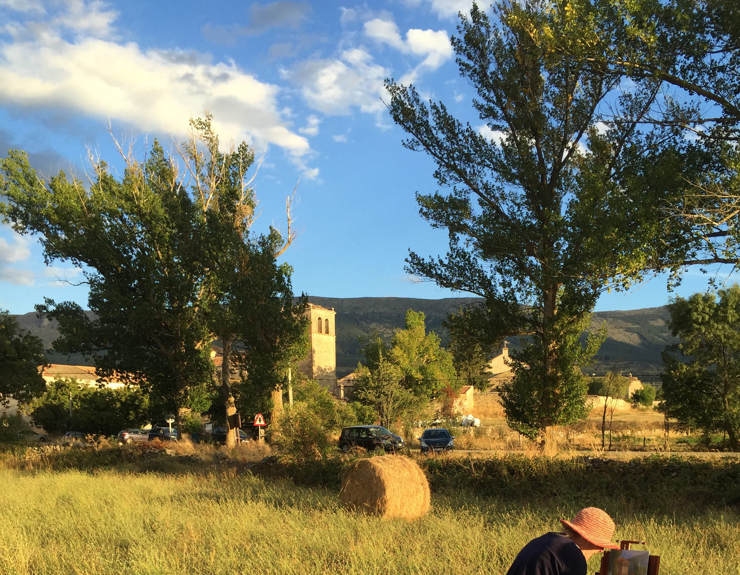
In this Plein Air painting (painted on site) I was focused on composition and values.
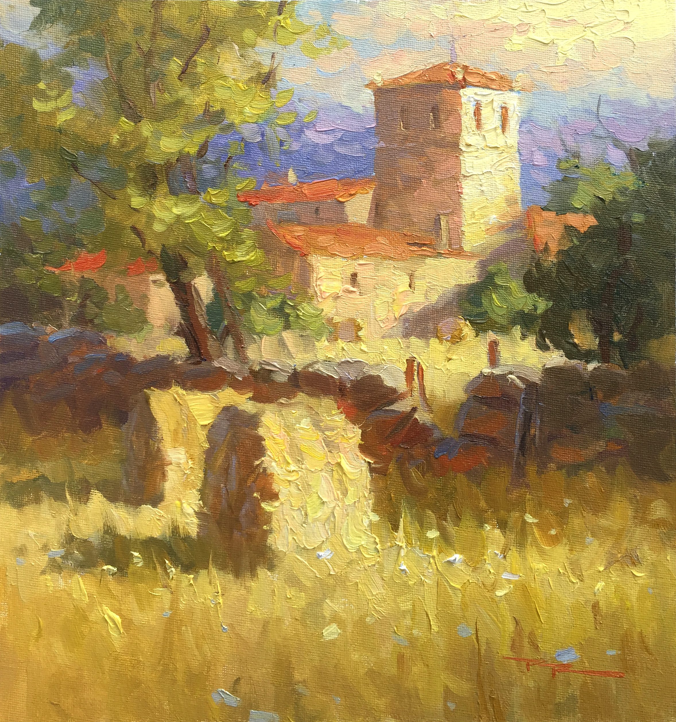
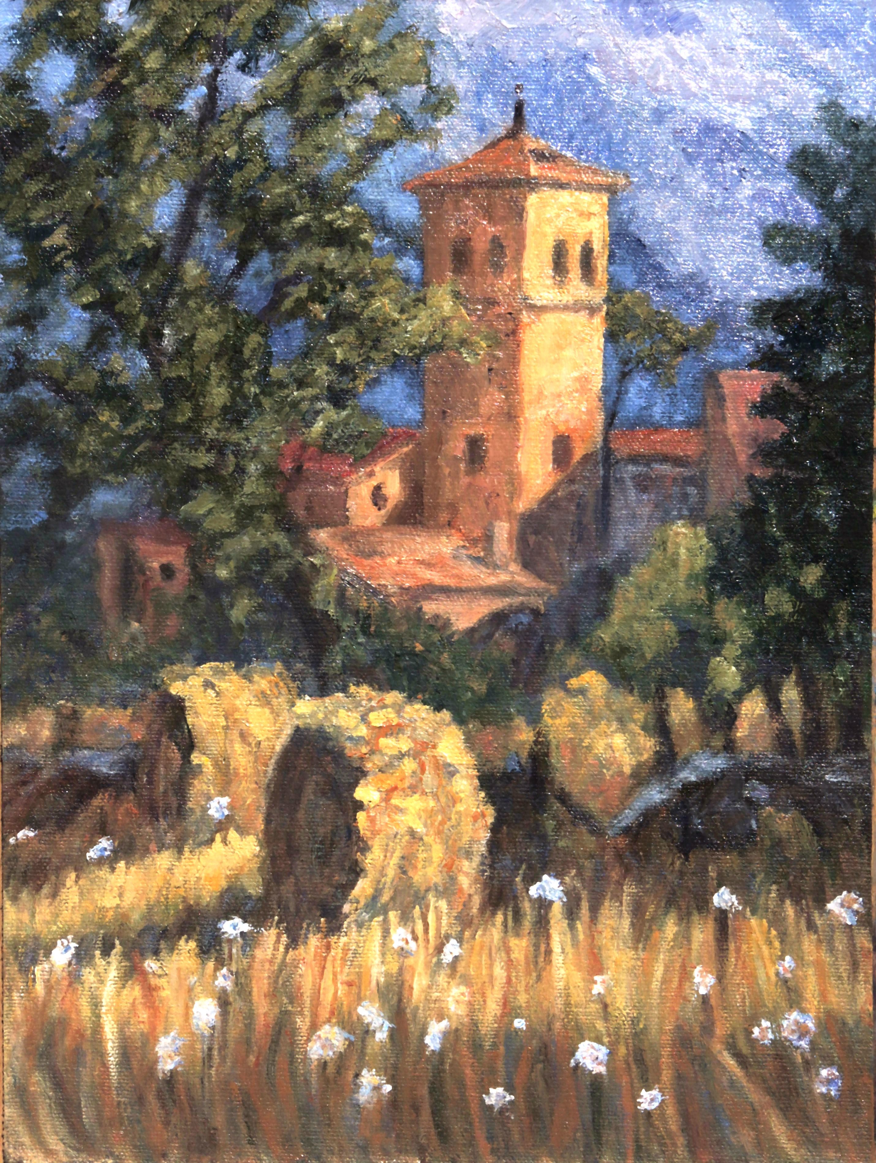
"Matabuena 2" Oil on Canvas 11x14" by Richard Robinson
Later in the studio I produced this painting focusing more on the colour and light.
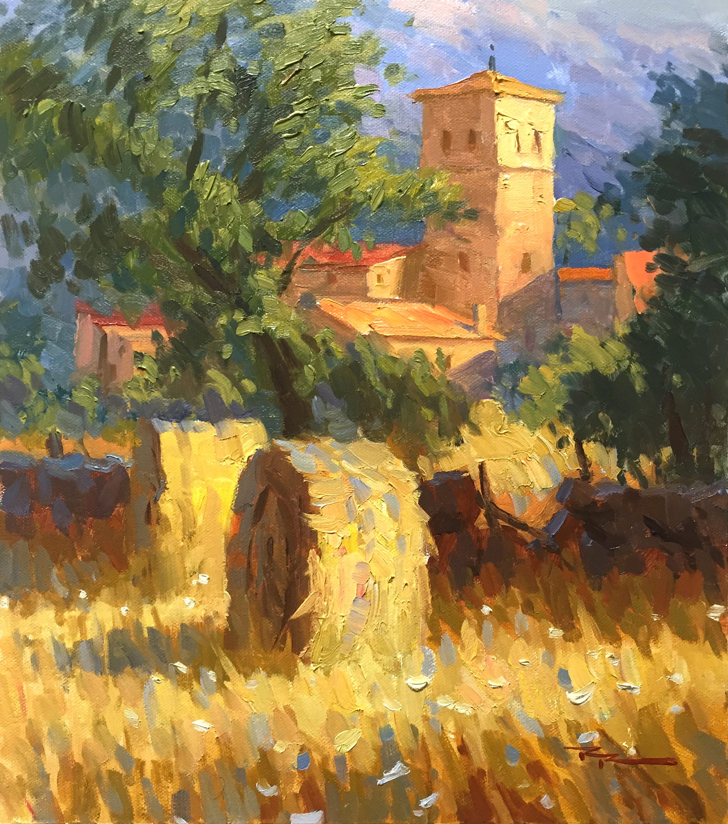
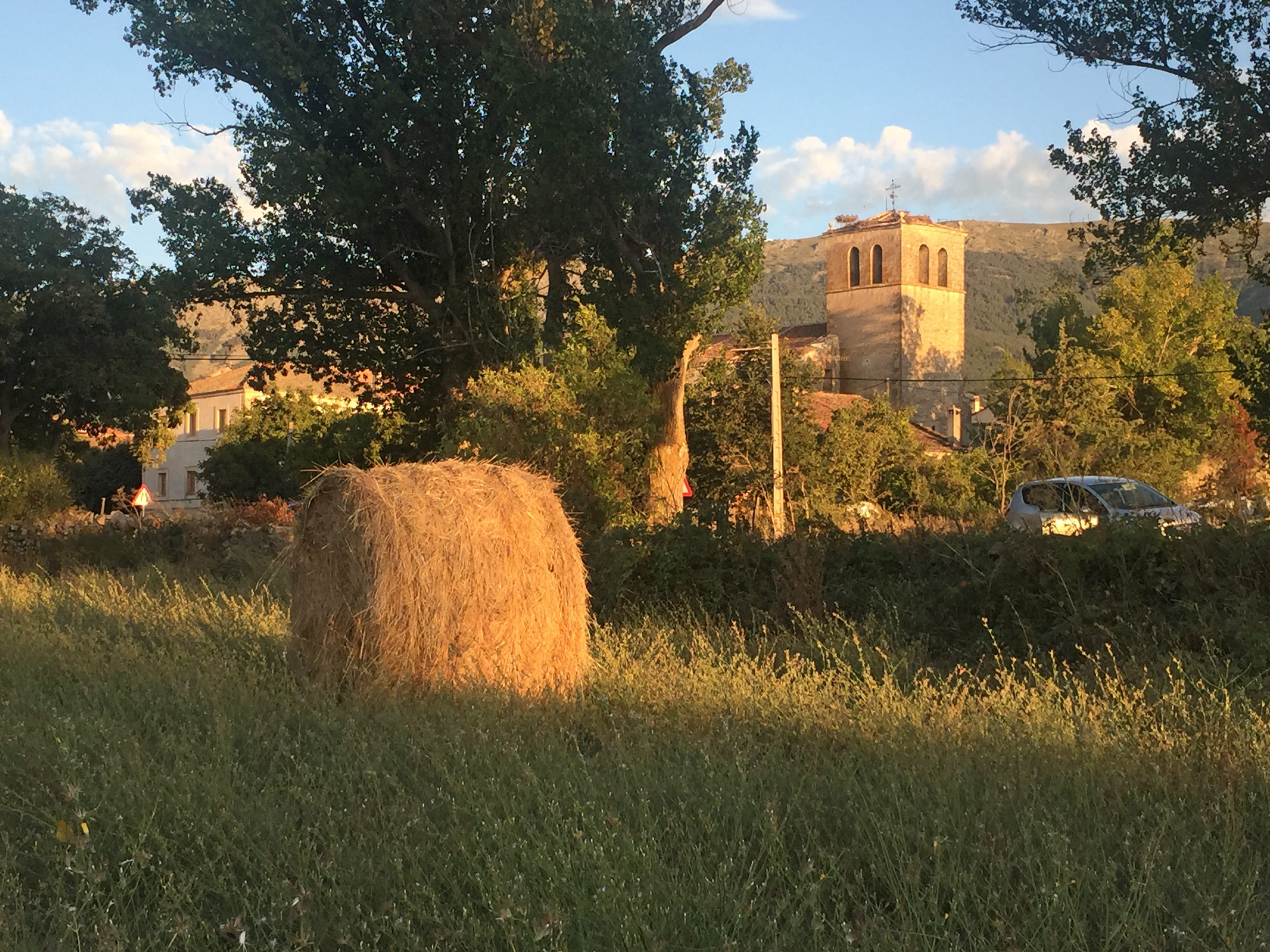
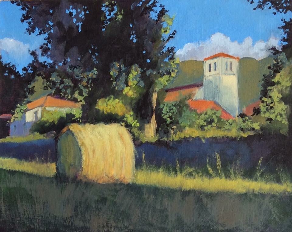
"Hay Bales" 11.5 x 13" Oil on Canvas by Richard Robinson.
In this painting I focused on creating movement using directional brushwork and broken colour.
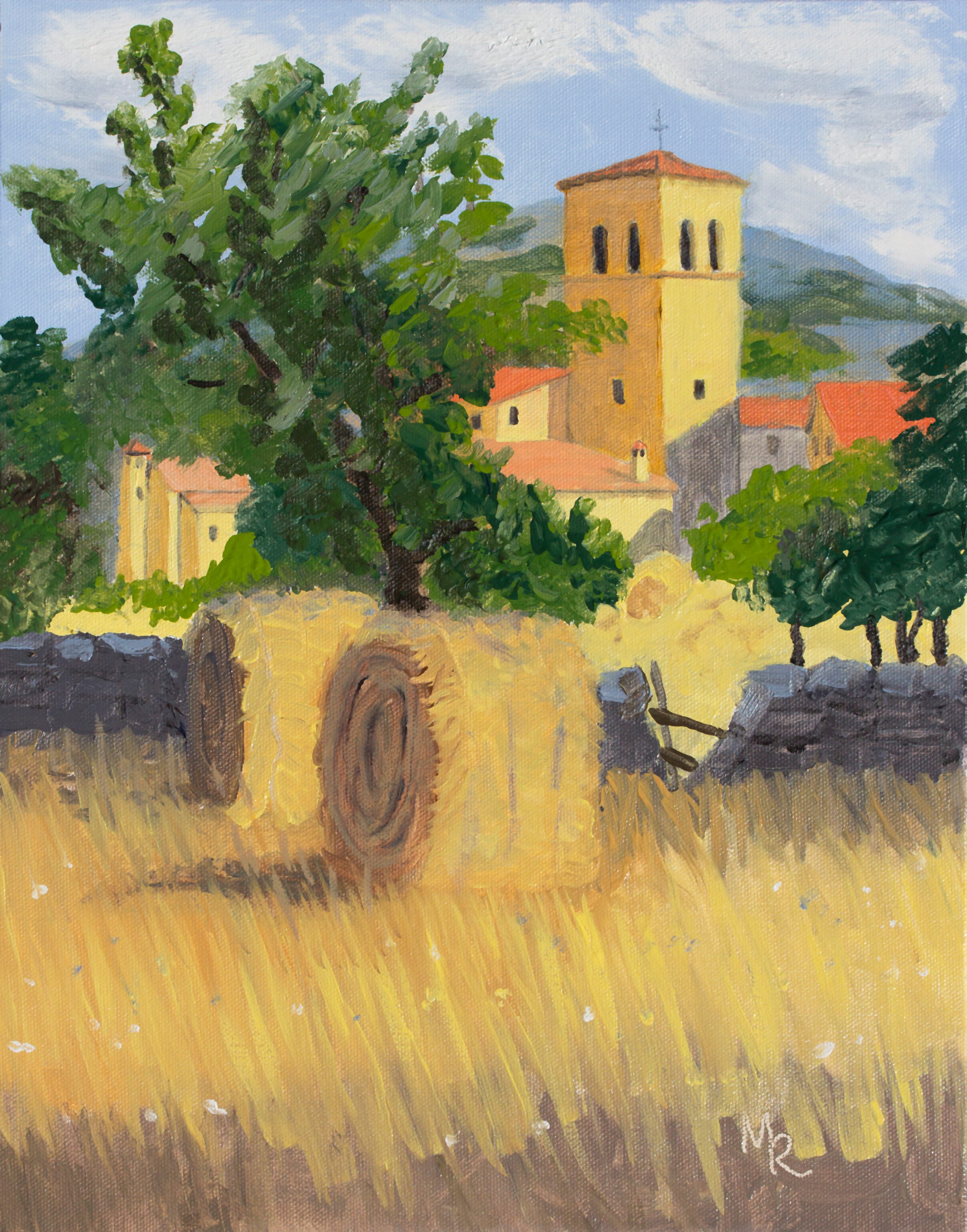
"Matabuena Hay Bales" 11x14" Alkyd on Canvas by Mike Robles
Mike I can see you trying to break out of your shell with this one! Normally your painitngs are very tight and detailed but you're pushing yourself into new territory here! Great to see. I used to work with alkyds too and found it tricky to achieve the fluid all prima look I was wanting because they dry so fast they tend to make you do thinner glaze type work. Personally I find oils less taxing to work with. Anyway you've made a good job of it. Couple of things I'd like to see changed would be slightly darker more vibrant shadows in the haybales and grass and lighter warmer windows in the distant buildings to stop them popping forward like that. You mentioned getting sunspots on the painting when you photographed it in the sunlight and that you use Photoshop to remove the spots. Firstly I always photograph my paintings in the shade, and then if there are still any sunspots I use the Noise > Dust & Scratches filter to remove spots. Normally the spots show up worst in the darks so I sometimes select those areas with a soft edged lasso and then apply the filter selectively. Also, I usually photograph paintings at a slight angle to avoid reflections and then reshape the image to normal in Photoshop. To do that I select all, cut and paste the image, then use the transform tool to stretch the corners into place. That's probably the biggest clue I could give you about using Photoshop to perfect your painting photos.
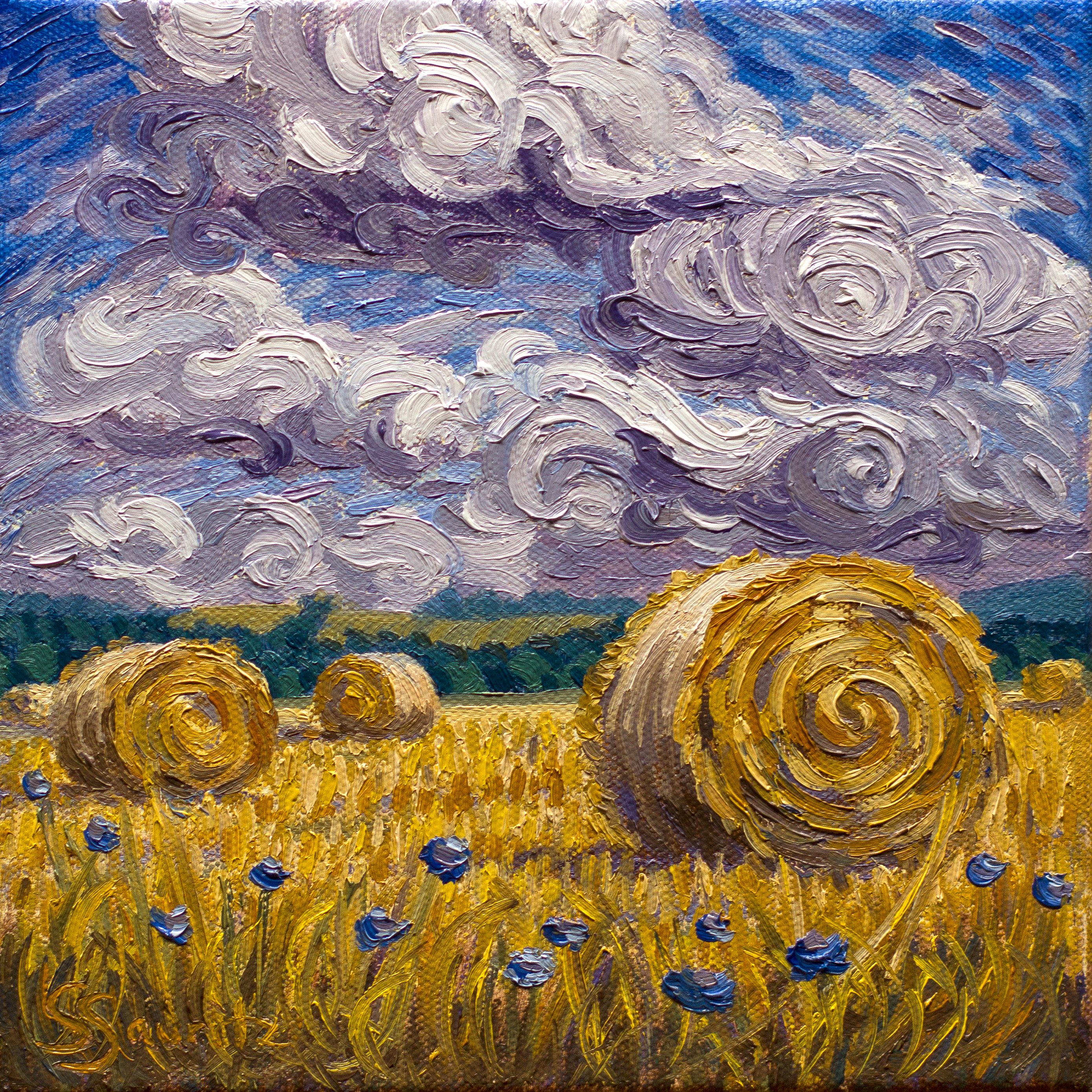
"Strawbales 2" 20x20cm Oil on Canvas by Silke Sauritz
Wonderful movement in this piece Silke - a real Van Gogh! It's clear that you had a close look at how Van Gogh builds his subjects with thivk brushstrokes, one at a time like bendable bricks. I love how the spiralling forms in the bales are echoed in the clouds. When this happens it's like the whole world is in harmony. Speaking on harmonies (smooth segue) the complementary harmony of yellow/purple and orange/purple is working well. Nice job! Nothing I would change.
"Haybales in Matabuena" Oil on Canvas by Lori Ippolito
Great movement in this painting Lori! You really knocked this out of the park with brushwork. Great to see you putting the cool grays in there with the warms as well. The only thing I can see that would improve this is to straighten up the drawing of the tower a little which is making me think of Pisa. Oh and you mentioned your ochre colours lacking punch in the final painting, but you can easily glaze over some of that with an orange or yellow when it's dry to raise the vibrancy. I suppose that would help it match the vibrancy of the greens in the tree, though if you knocked those down a bit you'd achieve the same thing. Great work!
"Spanish Countryside" 12x9" Oil on Canvas by Candi Hogan
Nice work Candi - there's a lot of life in this painting. The drawing is good and you have a strong sense for light and shadow shapes. The brushwork is true to your usual style with a little more movement thrown in. I've noticed a tendancy to gray darks in all your paintings. I wonder if that's a particular dark colour on your palette doing that or a result of your dabby brushwork, which tends to make gray if you don't constantly reload your brush and clean it between making strokes where darks and lights have mixed. Maybe you just prefer grayish shadows. The white flowers could be made a little more subtle by shrinking the ones further away and making the ones in the foreground shadow a blue-gray, and by changing the shape of them more since they wouldn't all be facing you. Overall you've done a very good job.
"Warm Evening" 30x25cm Oil on Paper by Christophe Borrel Ducroz
Nice work Christophe. You've done a decent copy of the photograph while simplifying the background and including detail where it was needed in the main elements. The lacey brushwork in the trees works well and it's good to see you experimenting with large gestural brushwork in the foreground. Couple of things to watch out for - you've outlined some elements including the haybale, roofs and the edge of the forground shadow. Doing that tends to flatten the painting, spoiling the illusion of depth created by overlapping objects. Darks too dark: photos of high contrast scenes like this usually make the darks too darks, losing colour information there, and you've fallen into the trap of copying that without the knowledge to introduce more colour into the darks. Doing this saps colour from the painting making it look less lively, and using the same dark darks in the background trees as in the forground also reduces the depth that could be gained by slightly lightening and bluing the darks back there.
$15.00USD
$15.00USD
$45.00USD
$15.00USD
Not loving your painting lessons? No worries!
If it’s not the right fit, we’ll give you a full refund within 30 days of purchase - no questions asked.
When you purchase a DVD you also get online access to the same lesson, including any lesson resources like photos, downloadable notes and access to upload your painting to the student gallery.
That's why you need to make a password when you purchase a DVD, so you can access the online content as well. Enjoy!