Teacher
Richard is a talented full time artist, who loves painting and teaching.

with Richard Robinson
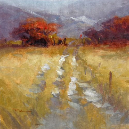
Of all the elements a painter must consider including subject, design, value and colour, perhaps the most often overlooked by beginners is the subtle art of edges.
The best painters do this so subtly we are not even aware our eyes are being lead through the canvas going from one sharp edge to the next. In this workshop you are going to discover the possibilities of edges and how they can enhance your own work.
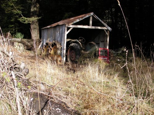
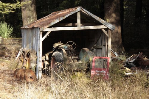
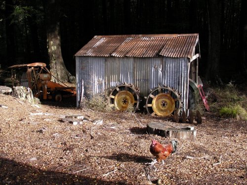
Follow along step by step or use the resource photo to create something more your own. Enjoy!
Whenever you’re ready! The lesson is available online any time, and your access to the lesson never expires.
As long as you need! Your access never expires, so you can come back again and again.
Sorry, no you can’t download the video. This is to avoid piracy. You’ll always be able to view the video on this site though.
Richard is a talented full time artist, who loves painting and teaching.
Hi I’m Richard. I’ve been painting my whole life and back in 2001 I traded my graphic design career for the humble life of a full time artist. I love painting, and as it turns out, I love teaching too.
Nowadays I balance my life between parenting, painting, surfing, travelling and teaching. My work is regularly featured in international art magazines, in galleries in New Zealand and America, on TV and in my Mum’s house.
I give outdoor painting workshops in interesting spots around this beautiful planet of ours and love encouraging people to paint. Two of my favourite artists are John Singer Sargent and Joaquín Sorolla.
My painting website: www.nzpainter.com
I’d love to be your new teacher.

Richard is a master artist with an exceptional skill in identifying and communicating key factors to making successful paintings. I have found his video workshops an excellent resource for improving my own work.
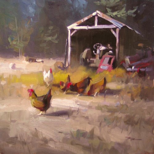
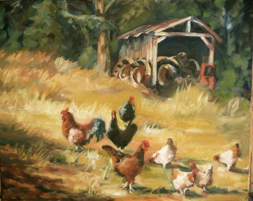
"Chickens in Paradise" 11 x 11" Oil on Canvas by Richard Robinson
"Scratching Out a Living", Oil on Canvas by Elfrida Schragen
Design Elfrida the overall design looks good to me - you've balanced it well with plenty of interesting chickens and the tree and the foreground shadow. Personally I would have moved the chickens up away from the bottom of the painting just a little more. Getting close to the edge of the canvas with key objects always makes me feel edgy if you'll excuse the pun. It's all a little heavy on the right too, especially considering the tilt of the land too so I think you could actually crop an inch or two off the left hand side and not loose anything important while balancing the composition a little. Colour The colour is attractive and punchy with some subtler grays threaded throughout. I would like to see the green in the background muted just a little and some larger dark spaces added there because to my eye it's jumping forward a little. Brushwork I find your brushwork really appealing in its fresh boldness and there are a few areas like some chickens and those leaning tractor tyres where you've really nailed it - fresh direct painting combined with accurate drawing, so, nicely done there. The details on the tractor could have done with a smaller brush and I noticed that your handling of the grass is the same in the foreground and background, that is, the brushstrokes are the same size which hinders the illusion of depth a bit. Squinting at your subject will help with that - paint what you see while you're squinting. Realism I'm pretty impressed with the realism of much of this painting. My favorite piece is the small white hen closest to us - beautiful! The least realistic portion is the ground plane which understandably is the trickiest part of the scene with its complex surface mottled by shadows. If you give the viewer some more clues as to the specific elements present there it will help a lot. For instance make the dirt slightly cooler than the grass, and make the grasses get smaller with less detail as they recede and have them cast small shadows onto the dirt. Be clear about the slope of each area of ground and how the grass sits on it. Overall it's a nice painting though and my comments are just picking out small things I would personally change. Great work!
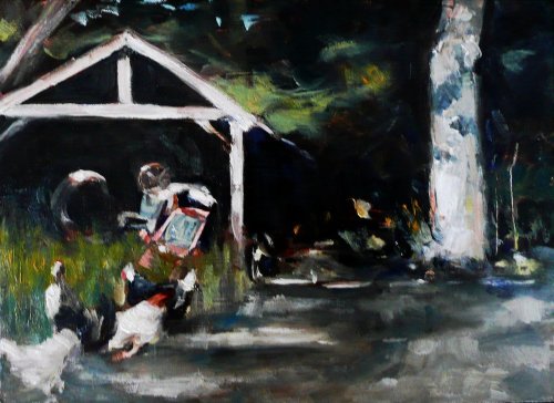
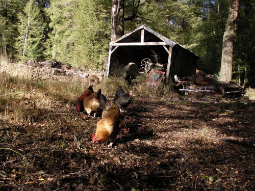
"Light on Shed (with Chickens)", Oil on Canvas by Casey Toussaint
Design Casey there's something about this design that catches my eye. I don't know if it's because it's breaking a number of my own compositional 'rules' or because it actually works well. To me it looks very modern in that it ignores traditional conventions. Cutting off the side of the barn and placing the white chicken in the bottom corner drags the eye over to the edge but it's then pulled back by the starkly lit pillar of a tree on the right, so in that way it is really nicely balanced. It rubs me the wrong way and then smooths out my fur, reminding me of how the impressionists would sometimes abruptly crop their scenes to give the feeling of a quickly observed slice of life, or a snap shot, not contrived. Colour Such a stark contrast! You said your goal was to paint the light and you've certainly done that rather than getting stuck trying to carefully render bunch of chickens and I applaud you for that because it's an illusive goal that I'm aiming for myself. Brushwork There's a lot of variation and experimentation in there which I love to see. Only the tractor stands out to me as being a bit fumbled and the drawing has been a little lost there, but overall you've achieved painterly effects which seem to have been joyfully dashed on rather than laboured over, so well done. Realism From a distance this piece really comes together and considering the bravura brushwork that's quite some accomplishment. Great work!
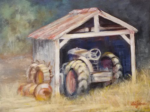
"Retired", Acrylic on Canvas Panel, 9x12" by Bonnie-Leigh Jones
Design I think you're right Bonnie, this angle is so interesting it doesn't need chickens or anything else for a complete painting. I think what it does need though is a little more space around the subject as shown in the photoshopped image. Colour I've made a few adjustments in the colour too because you lost a lot of saturation in overpainting with too much white in your mixtures. Brushwork Because of the scumbling technique you've used there's not a lot of visible brushwork to speak off although it's good to see you subduing the detail in the background and the technique you used for the grass seems to have worked really well to indicate grass without overdoing the detail. Although the brushwork is mostly hidden there's a unity in that which I find quite pleasing to my eye. Realism Realism is usually won or lost in the drawing and in this case your drawing is a bit wonky and you've lost form by scumbling too much light over your mid values. Could be worse, could be better, as always. I can see you've put in a lot of effort and have just ended up overworking the painting which is so easy to do. It's the effort which is the key those because that's the path to making your next painting even better, so, well done.
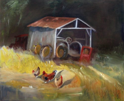
"Scratching Out a Living", Oil on Canvas, 20x24" by Jim Delk
Design Hi Jim, you picked the most interesting angle of the shed to paint - one that I'm sure I'll paint later on too. I I just love those tractor wheels leaning on the side of the shed and the raking light across the old tin. There's nothing wrong with your design as far as I can see except for the path leading out the bottom right corner which I would raise up to run off the side or obscure with grasses. You could do with one or two other chickens as well to fill out the foreground. Colour The colour is a little bit haphazard but there are sections like the side and roof of the shed and the tractor wheels where you have done a really good job getting the colour relationships right. The biggest problem seems to me to be the similarity of all the values. I can't be sure whether or not this is due to the photography of your painting though because it does seem to be a fairly uniform loss of contrast overall which makes me think you've photographed surface shine. I took the liberty of adjusting the contrast and making a few other changes in photoshop to illustrate a few points. Brushwork I can see you're still learning (as am I) to put a brushstroke down and leave it alone. A lot of that comes from good drawing skills, which is built purely with practice. Most of your brushstrokes have been overworked. When I find myself doing this I try to make myself stop painting, look very hard at the shape of colour I want to paint with my brush, taking in its characteristics including where its edges are sharp or soft, consider how I can achieve it with one brushstroke, looking back and forth to measure the placement, hold my breath and place the stroke on the canvas. Realism With the exception of the side of the shed and the tractor tyres the few colour problems and unsure drawing detracts from the realism here, especially the confusion evident in the ground and grasses. I can see the problem you faced of mowing the grass and putting in the chickens was a big one so it was always going to be a stretch, but I think you could resolve it better given more time. The shadows from the chickens for instance are not making sense at the moment - they are too vertical which puts the ground plane in doubt. Personally I feel the shed is so interesting from this angle it barely needs anything in the foreground to flesh out the painting - perhaps just the hint of a path through the grass would do. I hope you enjoyed painting this one as much as I did Jim and I look forward to seeing how you deal with the next one.
$15.00USD
$15.00USD
$15.00USD
$15.00USD
Not loving your painting lessons? No worries!
If it’s not the right fit, we’ll give you a full refund within 30 days of purchase - no questions asked.
When you purchase a DVD you also get online access to the same lesson, including any lesson resources like photos, downloadable notes and access to upload your painting to the student gallery.
That's why you need to make a password when you purchase a DVD, so you can access the online content as well. Enjoy!