Teacher
Richard is a talented full time artist, who loves painting and teaching.


A friendly place to learn at your own pace.
with Richard Robinson
Join Richard for 4 Complete Landscape Painting Lessons from Italy as he guides you through each painting project step by step. Compare your work with other students and learn from the insightful student critiques that Richard has made.
This is a uniquely powerful learning experience based on comparison and solving common painters problems with simple and effective solutions. Enjoy!
Whenever you’re ready! The lesson is available online any time, and your access to the lesson never expires.
As long as you need! Your access never expires, so you can come back again and again.
Sorry, no you can’t download the video. This is to avoid piracy. You’ll always be able to view the video on this site though.
Richard is a talented full time artist, who loves painting and teaching.
Hi I’m Richard. I’ve been painting my whole life and back in 2001 I traded my graphic design career for the humble life of a full time artist. I love painting, and as it turns out, I love teaching too.
Nowadays I balance my life between parenting, painting, surfing, travelling and teaching. My work is regularly featured in international art magazines, in galleries in New Zealand and America, on TV and in my Mum’s house.
I give outdoor painting workshops in interesting spots around this beautiful planet of ours and love encouraging people to paint. Two of my favourite artists are John Singer Sargent and Joaquín Sorolla.
My painting website: www.nzpainter.com
I’d love to be your new teacher.

Richard is a master artist with an exceptional skill in identifying and communicating key factors to making successful paintings. I have found his video workshops an excellent resource for improving my own work.

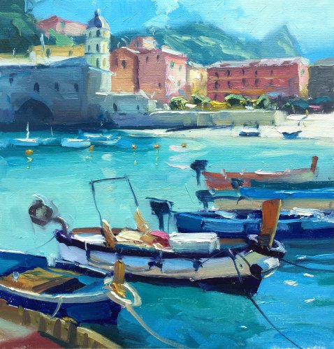
“Mediterranean Harbour†11×13″ Oil on Canvas by Richard Robinson.

Vernazza, Italy. Photo courtesy Kelly Wegener


“The tolling of the distant bell†60x80cm Acrylic on Board by Jon Main

“Beautiful Vernazza†32.5x31cm. Oil on Paper by Silvana M Albano

“Mediterranean Colours†12×14″ Oil on Canvasboard by Glenys Jones

“Courbron – Amalfi Italy†11×14″ Oil on Canvas by Toska M. Courbron - altered in Photoshop

“Courbron – Amalfi Italy†11×14″ Oil on Canvas by Toska M. Courbron

“Mediterranean Harbour†Oil on Canvas by Janet Buckton
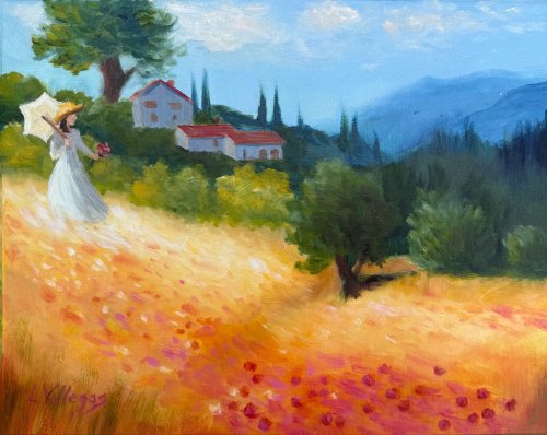
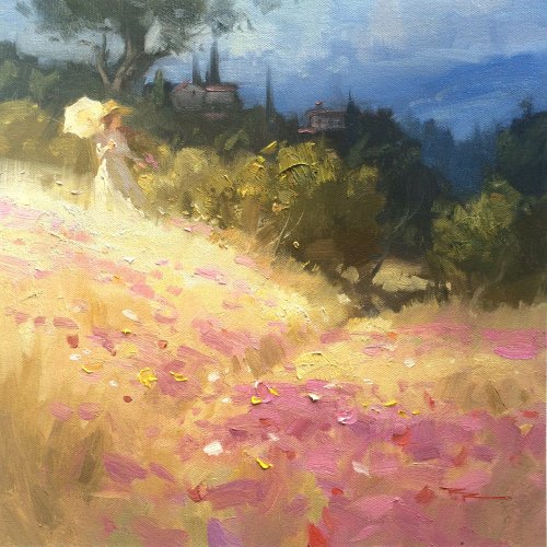
Tuscan Fields - 11 x 14 oil on linen pad. I used the scene of the Tuscan winery my son and his new bride visited on their honeymoon.
Lovely sense of sunlight here, Louise, and I love that you personalised it with the buildings. The warm gold field with those pink-red flower notes sparkles against the cooler blue mountains. The figure is charming and reads clearly. Your soft, hazy distance helps the scene feel spacious. Some things to consider: If the buildings are in light, the land around them needs to be in the same light. The tree trunk behind here needs to come into the midground behind her, otherwise it seems too large compared to the buildings. Your flowers are all the same shape and spacing. They're better painted in large clumps with a few outliers - then you can create interesting shapes that lead the eye. If you add more blue/grey to the greens in the housed hills and also grey the red roofs a little this will create more depth - avoiding the background jumping forward and battling the foreground. Optional practice On a postcard-sized sketch, group the flower dots into a few larger, varied shapes rather than a uniform scatter, leaving small calm patches. This will strengthen the path of the eye up the hill. You’ve captured joyful colour and light - keep that. Just a few things here for you to think about.
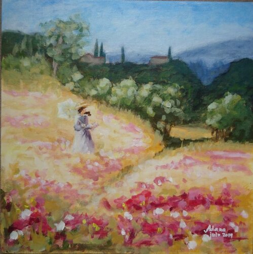
Tuscan fields, acrylics, 2019
Hi Adana, there’s a lovely sunlit glow running through your field, and the warm pinks against the cool blue distance feel joyful. You've got pleasingly interesting organic shapes in your brushwork that diminish in size as they recede, adding depth, which is great. If you add a little more blue/grey to the hills with the houses that will create more depth, separating those hills more clearly from the midground trees. The figure is well painted but her dark hair in front of her face is a confusing shape that could be removed. Note that in my demo painting I was sure to place a dark background behind here parasol so the interesting shape draws more attention. You could glaze a soft brown shadow across the grass behind her to achieve the same effect. If your flowers flowed off the bottom of the canvas that would feel more natural. You’ve got a beautiful sense of light and color here, Adana. Keep that sparkle. Lovely work — keep going!
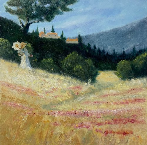
“Tuscan poppy field”, after Richard Robinson 12x12” oil on panel , Mark Price
I love the airy light across the field, Mark. You've subdued the colour scheme a little and sharpened the drawing and detail, bringing a little more realism to this piece. Nice! Those broken, warm strokes in the grasses feel sunlit and alive, and the pink poppy notes are placed with a nice rhythm. Lots of interesting texture in the foreground and a nice path to walk further into the distance (although this could do with being a less symmetrical shape.) You've got a good variety of tree shapes. You distant mountain shape could do with some more interest - currently it's making a symmetrical sky bowl shape with the dark hill on the left. The building, although nicely painted, have strong sunlight on them as opposed to the dark land around them, which is odd, so I'd either shadow the buildings or throw some light on the hill. You’ve got a beautiful sense of light and a poetic mood here. Great job!
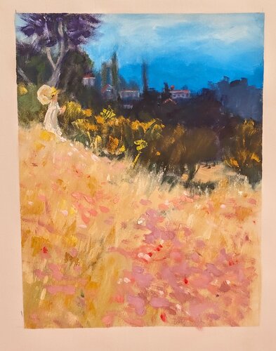
Inspired by Monet
Hi Alisair, there’s a lovely playful feel to this whole painting, exciting brushwork and strong colour contrast. I also like the soft, lost-and-found edges at the base of the midground trees suggesting long grass - beautiful! What’s working well - The big value pattern reads: bright field in front, darker band of trees, light sky on top. Value means how light or dark a colour is, and you’ve grouped them clearly. The vertical format works well. - Your figure is a charming accent and helps tell us where to look. The hat and dress silhouette sit nicely against the darker hedge line although I would like to see a little more care in the drawing of the figure here. I made a mistake in my demo painting by placing the large tree directly behind the figure, which is a confusing union of forms. I tried to fix that by obscuring the base of the tree so they don't actually connect. You could do that with yours too. My apologies! I look forward to seeing what you paint next - you've got a joyful style.
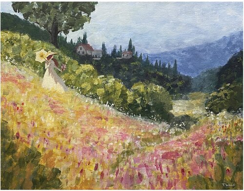
A Day in Tuscany
Hi Tena, this has an airy impressionistic feel, rich with rhythmic brushwork and shimmering colour while also displaying sharp drawing skills. That's rare to see both in an artist and I commend you! There's nothing I can see that I would change. Great job!
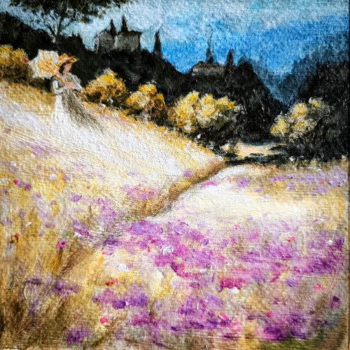
Tuscan Fields Toszkán mezők
Artist: József
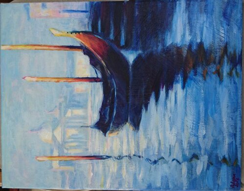
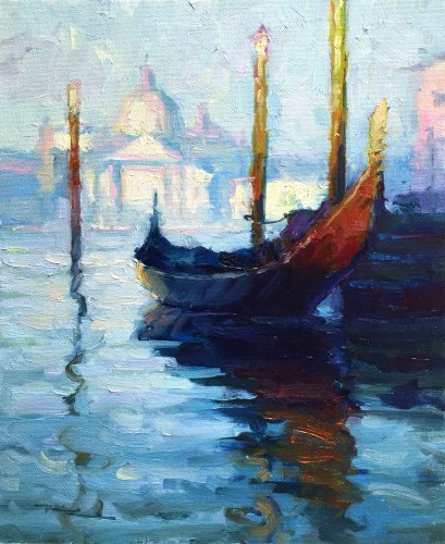
Gondola, Venice, acrylics, 2018
Artist: Adana VIRNA
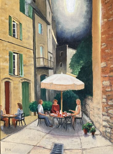
Tourettes sur Loups nocturne
Artist: Ian States
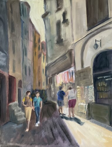
Vernazza
Artist: Alan Swaby
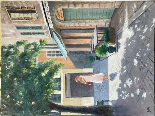
Street in Vence, France. Oils on 30x40cm canvas board
Artist: Ian States
Not loving your painting lessons? No worries!
If it’s not the right fit, we’ll give you a full refund within 30 days of purchase - no questions asked.
When you purchase a DVD you also get online access to the same lesson, including any lesson resources like photos, downloadable notes and access to upload your painting to the student gallery.
That's why you need to make a password when you purchase a DVD, so you can access the online content as well. Enjoy!