Teacher
Richard is a talented full time artist, who loves painting and teaching.

with Richard Robinson
Whenever you’re ready! The lesson is available online any time, and your access to the lesson never expires.
As long as you need! Your access never expires, so you can come back again and again.
Sorry, no you can’t download the video. This is to avoid piracy. You’ll always be able to view the video on this site though.
Richard is a talented full time artist, who loves painting and teaching.
Hi I’m Richard. I’ve been painting my whole life and back in 2001 I traded my graphic design career for the humble life of a full time artist. I love painting, and as it turns out, I love teaching too.
Nowadays I balance my life between parenting, painting, surfing, travelling and teaching. My work is regularly featured in international art magazines, in galleries in New Zealand and America, on TV and in my Mum’s house.
I give outdoor painting workshops in interesting spots around this beautiful planet of ours and love encouraging people to paint. Two of my favourite artists are John Singer Sargent and Joaquín Sorolla.
My painting website: www.nzpainter.com
I’d love to be your new teacher.

Richard is a master artist with an exceptional skill in identifying and communicating key factors to making successful paintings. I have found his video workshops an excellent resource for improving my own work.
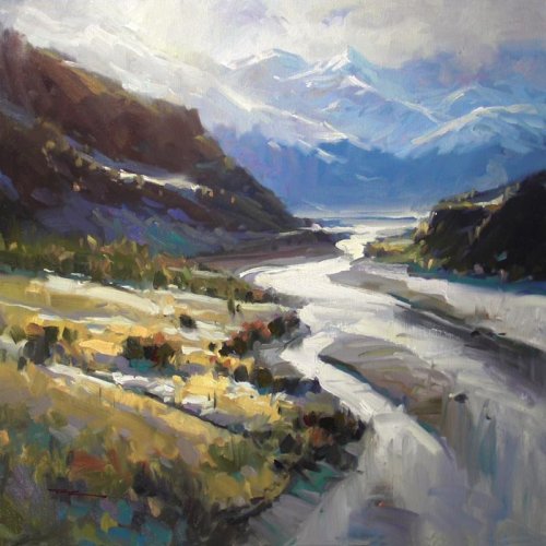
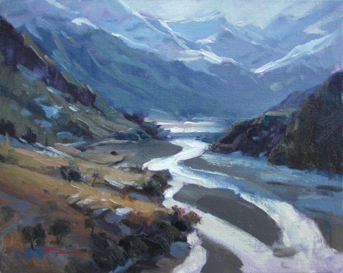
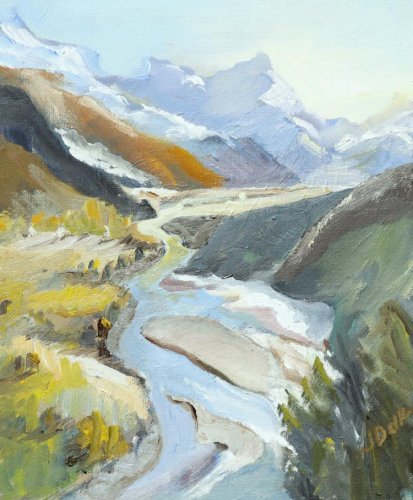
"Rees Valley" 11x14" Oil on Canvas by Richard Robinson
Studio Painting 20x20" Oil on Canvas by Richard Robinson
10x8" Plein Air Study - Oil on Canvasboard by Richard Robinson
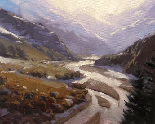
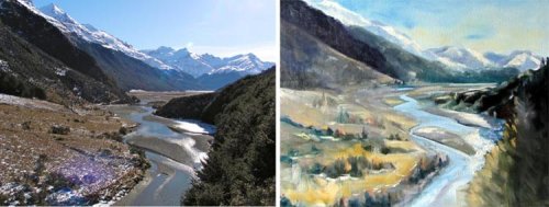
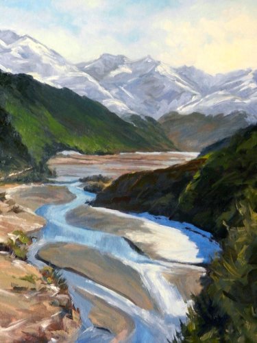
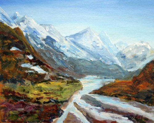
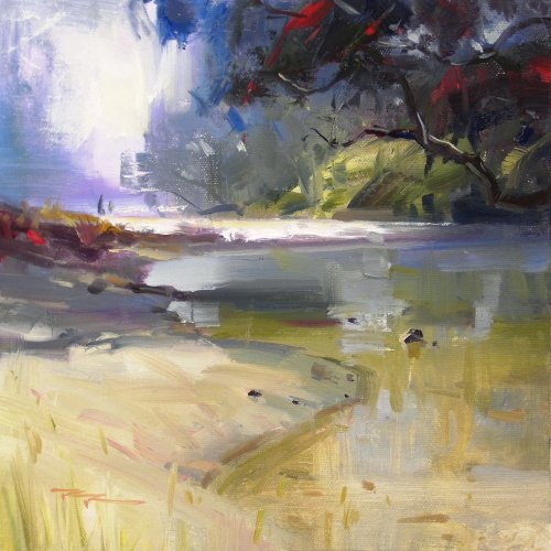
Rees Valley, New Zealand

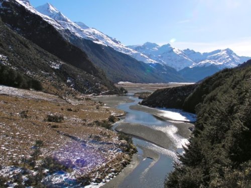
Rees Valley, New Zealand
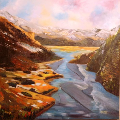
"Ribbons of Nature Mark 2" Oil on Canvas by Diane Boucher
Design I always find it instructive to compare the painting side by side with the resource photo when I'm critiquing it, but I also often view the painting by itself because that's how a painting is seen by everyone else and it must stand on its own. In this case the design is very similar to the photo which was quite strong to begin with so I don't see any problems there - it's a very interesting dynamic design. You have made the bottom left quarter more diverse in its shapes and colorings which is a nice idea but its rendering isn't quite as convincing as the rest of the painting so I feel it becomes a bit of a blindspot - somewhere I don't really want to look for very long because it doesn't stand up to scrutiny, despite it being the main colour interest in the painting. Yes you have used interesting colour, brushwork and shape design there, but it looks to me like you weren't exactly sure what features you were painting some of the time (is it a tree, a shadow, a bush, a different species of grass, etc?) The result of indecision in painting is muddied colour and a lack of clear object definition. To be fair this corner is a very tricky area to contend with because there is so much detail it's hard to decide what to leave in and what to leave out. Color I'm immediately attracted to your subtle grayed colour scheme. We see hardly any pure spectrum colour in nature so for me I like to see this emulated well in a painting (at times). I like the way you've put your highest chroma yellow in the foreground and then grayed it leading into the midground. I also like the warmth you've introduced into the sky (although you could have reflected some of that in the river too). Two things I would have changed would be to introduce some more light into the shaft of darkness coming from the top left because it seems too dark to be that far away due to atmospheric perspective. I would have also pushed the distant mountains on the right further away by lightening and graying that green there. Another small thing is the yellow colour in the tree at bottom right doesn't make sense for that type of tree although compositionally I like that colour there but the rendering of that area could have been more convincing too. So much to think about! Brushwork I think your brushwork is really interesting in this piece - you've used a large brush, and small brush for just a few important details like the shadowed edge of the riverbed, and a palette knife in a few places to add more texture and even that nice shimmering light effect in the water - nice job! I encourage you to keep at it with this combo of mark makers - they make for a very interesting paint surface. Realism Overall it's a pretty convincing scene, especially from a distance. There are the few areas I've already mentioned detracting from that realism a little, plus a couple other things worth mentioning: You've drawn the base of the midground dark hill on the left incorrectly where it meets the river plain - it should be lower and separated from the base of the distant mountains. The very straight diagonal line within that same hillside could also be broken a little to make it look less man made. It's a very pleasing painting to spend time looking at with plenty to interest the eye and spirit, so I commend you for a good painting and hope this critique has helped a little.
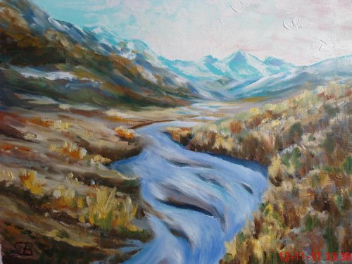
"Rees Valley" 12x16" Oil on Canvas Panel by Dania Bree
Design I really like this design. You've decided to crop out the plain on the left and make the river a bigger player. The remaining dark shapes balance each other in a bold simple fashion making this painting read really well from a distance. Bravo! Color It's all going quite well until we hit the green in the left hand mountains - and aaaargh! The chroma is too high (not enough gray) which brings this colour right into the foreground, spoiling the illusion of distance. The problem is that your brain knows all those trees are green so it tries to make you paint them vibrant green. If you blur your vision at the resource photo you will see the green there is actually very close to the blue/gray base colour of those mountains. Your other colours in that area (the other mountains and the river plain) are suffering from the same problem - not enough blue/gray in them. Easily fixed though. Same goes for the slashes of green in the hill on the right - just knock it back a little. Love the colour work in your sky and the same warm/cool idea being applied to the snow - very nice. I'm also enjoying the slight glowing light effect you've managed to work into the top edge of the mountain on the right - it makes sense of the light reflecting of the river too - good work! Brushwork In some areas like the foreground tree, the riverbanks and some of the river itself your brushwork is looking great with the appearance of being effortlessly brushed on which is a joy to look at. Some other areas have been labored over a little - areas where you haven't got the colour right first hit by the looks of it. Often with oils it's better to scrape an area and redo it from scratch rather than adding good paint to bad - one less ball to juggle. Realism Nearly there! Just those high chroma colours in the distance are spoiling the realism here, and the drawing of the mountains could be a little more precise - they look a bit muddled (tricky things aren't they!?) There's a curious problem with the structure of the base of the far left green mountain too - it seems to be arching over into the middle-ground somehow. Have a closer look at the resource photo to see what's going wrong there. Overall I think it's a very nice painting displaying some considerable skill with just that colour issue knocking some points off. Good work!
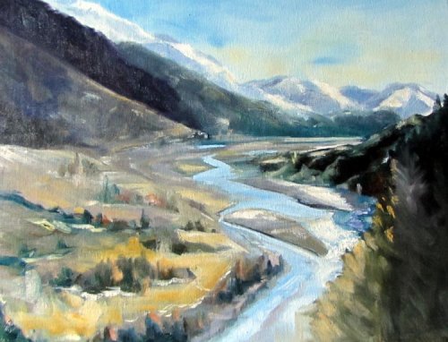
"Rees Valley" 20x14" Acrylic on Canvas by Debbie Piro
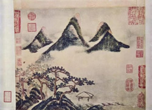
" ...I couldn't print off the photo as i had no ink, so i got my canvas, drew an outline of the hills, river etc and then while it was in my mind i went to another room and painted it." - Debbie Piro This is what some of the great old masters of Chinese painting did - except without cameras they would journey through the wilderness, absorbing what they could, then return to their studio and painted their impressions. Google: "Shan shui" (http://www.newworldencyclopedia.org/entry/Shan_shui) Their work, like yours in this case Debbie, was very symbolic - not a realistic representation of the landscape. It's interesting that your exaggerated steep mountains are reminiscent of those works and your design is simplified as is your colour scheme - all based on your current understanding (symbols) and the amount of information that your mind can currently hold from one room to the next as you go between your resource photo on screen and your canvas. So that's what happens when you paint more from your self than from your resource - you end up with more of yourself on the canvas than of your subject. It depends on your goal of course, but now that you have experienced painting in this manner you are more empowered with that knowledge to decide how you want to paint your next painting. For me I find if I spend more time looking at my subject than at my painting I come out with a better painting (in my eyes).
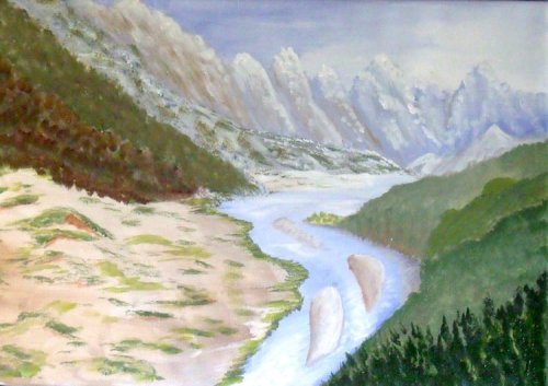
"Rees River" Acrylic on Canvasboard by Harald Skog
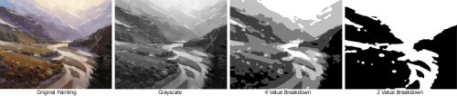
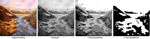
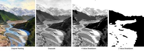
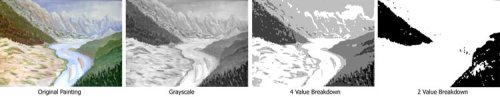
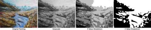
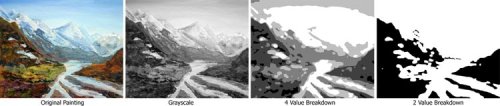
Design I always look at the design in terms of dark and light first and then in terms of colour. Is it interesting? Is it varied? Is it natural or too contrived? Those are the sorts of questions I ask myself. Looking at the 2 value breakdown of your design which is really the bones of the painting I think you've achieved an interesting balance of organic shapes. I would have personally preferred to make the left hand bank of the river more sinuous - you've straightened it out a lot which takes away some of the interest it might have had, and I don't see that it adds anything to the design making it straighter. Colour In terms of colour design it's nice to see you playing warms off against cools like that which certainly adds interest to the painting. Having green on one side of the river and orange on the other sets up a tension in the painting and has my eyes flicking back and forth trying to figure out why there's this battle of colour across the river. It's nice to see the warms and cools both on the large scale and in the individual brush strokes helping one another. I think it's a shame you missed the opportunity to gray these colours progressively as they move back into the scene - at the moment it's very much strong foreground colours and then straight to gray background colours, skipping the transition between the two. I would prefer to see some more colour interest in the sky too, which you can do by adding clouds or mist etc, but perhaps with all that painterly work in the rest of the painting it's good to have a quiet area like this for the eye to rest, but hey, it's all personal taste. Brushwork It looks to me like you have a freedom with paint that will allow you to create some really beautiful juicy work if you can knuckle down a bit and learn some more about drawing. Many painters are afraid to lay thick paint on so it's nice to see you're not afraid - the paint should be afraid though. (Uh oh, here comes Harald!). Jokes. Beware of building up too much texture where you want the paint to sit back though, like in dark areas and in the far-ground. I usually prefer to see a thin vs thick relationship happening throughout the painting rather than all thick or all thin. Variation is key. Realism I'd rate this about a 5/10 for realism. From a distance the scene is quite easily readable but pretty soon I start to question what's going on in the foreground which says to me that you weren't sure yourself and that basically comes down to drawing. By drawing I mean the learned skill of seeing something, understanding it's form and capturing that in paint. Like I said, that takes some knuckling down - the discipline to look at the subject for a good half an hour and figuring out what's going on before you pick up the brush. Although a good painting may look as though the painter has just slapped the paint on, most of those beautiful daubs of paint have been well considered before each stroke. John Singer Sargent (one of my favorites) was known to step back 10 feet after every single brush stroke, measuring its worth and scraping it off if it wasn't perfectly eloquent. That's a bit daunting isn't it? But inspiring too I think.
"Behind the Valley" 27 x27" Oil on Canvas by Huda jodah A.Omar
Design There's good variety in the major masses to make this an interesting design. The distant mountains seem to be flattened out a little which makes me wonder why you chose to do that since jagged mountain peaks seem to be more visually exciting than rounded hills. The big curving line of those mountains up to the left strikes me as a little unnatural and over simplified too. The curves in the riverbank on the left also have the look of being symbolic rather than keenly observed. Be careful of duplicating shapes (big and small) because that is our tendency but it is not the tendency of a landscape. The false horizon at the base of the mountains should be flat and horizontal. Colour I like the fact that you have pushed your warm and cool relationships but I do feel that you've gone a bit over the top with some of the oranges on the left in the middle and far-ground. These colours need to be dulled more by atmospheric perspective in order to give a better sense of depth. as should all the colours in your distant mountains. I'm intrigued by your colour variations in the sky - this is the second thing I notice when I glance at the painting. Although the subtle modulations of hue you've introduced are really very beautiful to look at, they do detract from the realism of that area. May I suggest you undertake some cloud studies to hone your abilities in this area? If you also take several different cloud photos and increase their saturation level (colour vibrancy) in any photo editing software you will see more easily where your colour changes should normally occur in a cloud for a given lighting situation. Brushwork It's great to see you creating a rich variety of marks from the soft swirls in the clouds to the chunky palette knife work in the show and the big brushwork vs fine lines in other areas. It's also nice to see you experimenting with lost and found edges in the top of your distant mountains and in a few other spots and I encourage you to continue following that idea. A couple of areas where your brushwork is lacking are in the trees on the left and in the water. You have brushed the trees to look like clumps of grasses and used all horizontal strokes in the water which spoils the opportunity to create any vertical reflections so the water doesn't look as reflective as it could because of that. Realism There are a number of things spoiling the illusion of realism in this painting - those I've already mentioned plus a few others but they all come down to lack of observation really. You have changed quite a few things in this painting to make it different from the photo, but I don't know that all those changes have been improvements. May I suggest that before you do an large painting again where you change this around that you try a few small ones of the scene first trying just to duplicate exactly what you see. That may be boring for a while but in this way you build a better understanding of the subject and are then more able to take liberties with it without losing the illusion of reality.
"New Zealand High" 10x8" Oil on Canvas by James C. Delk
Design I really like your design James. The vertical layout accentuates the serpentine course of the river which leads us into the mountains. I'm also enjoying the rhythmic fluidity of your lines - as if the whole landscape is dancing. The only things spoiling the composition for me are the strong dark stripe of a hill and the orange one both coming down from the top left. They are both too dark in value compared to the rest of the painting. Colour The high key (mid to light values) approach you've taken fills the image with light and atmosphere and the subtle combinations of different grays you've used has added to this airy effect. Unfortunately that's been spoiled by the dark orange in the distant mountainside - it's totally out of place with the landscape (needs to be lightened and grayed). Other than that I think your colour is quite appealing and the warmth you've added to the sky is a nice touch as well. Brushwork Your brushwork is bold and direct if a little clumsy in places but it gives me the impression you've been painting for some time because most beginner painters tend to be more fiddly with their brushwork. Realism Realism is where you've drawn the short straw here, but I don't know if that was one of your goals for this painting anyway. As an abstract arrangement of colored shapes this is a great painting, and that's something I strive for in all my work, but you've created that at the expense of realism. Those fluid lines I admire have lost the intricacies of the real shapes. By stretching out the river vertically you've altered the perspective but haven't followed that same perspective in the background which works to flatten the image and is quite disconcerting. By keeping the values in the background similar to those in the foreground that has conspired to flatten the image as well. The green trees at the base of the mountain on the left are too large which reduces the scale of the mountains around it. Ok so you bombed a bit on the realism, but most everything else about this painting is great, so, well done.
$15.00USD
$15.00USD
$15.00USD
$15.00USD
Not loving your painting lessons? No worries!
If it’s not the right fit, we’ll give you a full refund within 30 days of purchase - no questions asked.
When you purchase a DVD you also get online access to the same lesson, including any lesson resources like photos, downloadable notes and access to upload your painting to the student gallery.
That's why you need to make a password when you purchase a DVD, so you can access the online content as well. Enjoy!