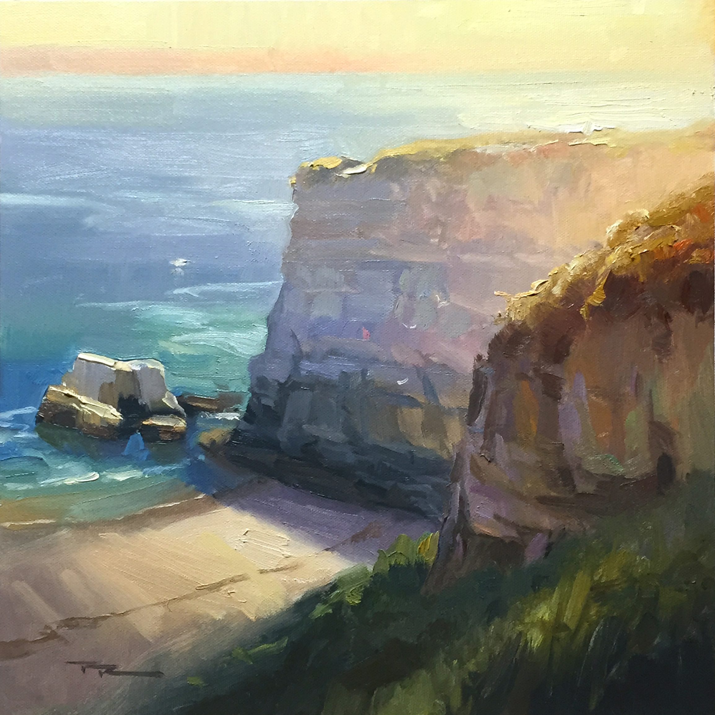
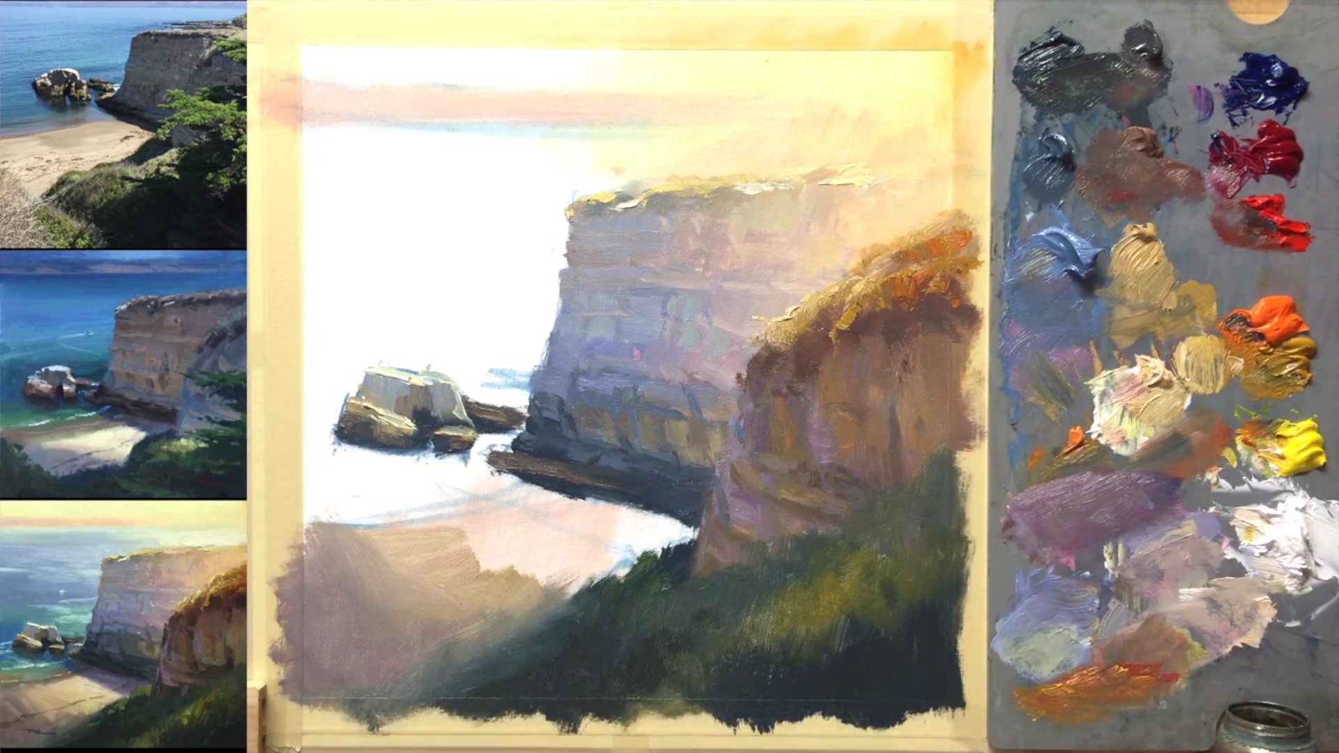
In this chapter, we dive into the enchanting world of California's coastal cliffs, capturing their majestic beauty at sunset. The challenge here is to transform a midday reference into a breathtaking sunset scene, a task that requires both creativity and technique. I initially painted these cliffs on location, racing against time to capture the essence of the landscape. Back in the studio, I sought to enhance the drama of the lighting, using a Photoshop sketch to reimagine the scene. This lesson will guide you through the process of creating a glowing light effect, capturing the translucency of water, and simplifying the complex structures of the cliffs. We'll work methodically, starting with a solid foundation and building up layers to achieve a luminous, atmospheric painting. This subject offers a rewarding opportunity to experiment with light and color, pushing the boundaries of your artistic expression. Join me as we explore these techniques step by step, and discover the joy of painting this inspiring sunset beach scene.
This guide accompanies the full video lesson. The lesson includes the complete narrated video, the printable PDF chapter, and personalised critique support.
"California Cliffs" 13 x 13" Oil on Canvas by Richard Robinson.
Step 16Painting the water and reflections
Add Cool Shadows
Work a purplish grey into the neutral shadow on the beach. This will create cooler shadows that contrast with the warm lights.
Paint the Cliff Shadow
Ensure there is a shadow at the bottom of the cliff. If needed, wipe out any mistakes and paint the shadow in to achieve the correct placement of light and darks.
Adjust Shadow Color Over Water
As the shadow moves over the water, make it darker and bluer. This transition is important for a realistic effect.
Create Blue-Green Transition
Add a slightly blue-green hue further down from the dark base of the water. This helps blend the shadow into the water.
Reflect Sky and Shore
Use a lighter blue where the sky is reflected rather than the rock. As the water gets closer to the shore, it should appear greener and slightly lighter.
Pro tipEnsure shadows change color as they move over water, becoming darker and bluer.
Embark on your painting journey by preparing your canvas and materials meticulously. Secure your canvas to ensure a stable painting surface and arrange your palette with Cobra water mixable oils. Begin by sketching your composition with a focus on dynamic shapes and a clear horizon line. Remember to mix your paints thoughtfully, adjusting the consistency with walnut oil for smoother application.
As you progress, pay attention to the interplay of colors and light. Mix both cool and warm greys to add depth and contrast, and create a vibrant sun glow using custom color mixes. Apply walnut oil strategically to enhance blending and achieve a glowing effect. Work from dark to light tones, especially on the cliff face, to build dimension and interest.
In the final stages, focus on details and finishing touches. Use color modifiers to simplify large glowing effects and exaggerate color differences to enhance the rock's form. Mix colors directly on the canvas for natural effects, and ensure shadows transition realistically over water. Keep your brush clean to maintain clarity in your light effects, and apply highlights with minimal strokes to capture the essence of sunlit rocks.
Points to remember
Mix walnut oil with white paint for a mayonnaise-like consistency.
Ensure variation in shapes and distances for a dynamic composition.
Use blue, red, yellow ochre, and white to mix cool and warm greys.
Mix magenta and yellow for a cleaner, more vibrant orange.
Use separate brushes for darks and lights to avoid color contamination.
Exaggerate color differences between warm and cool areas.
Mix color modifiers on your palette for glowing effects.
Mix colors directly on the canvas for painterly effects.