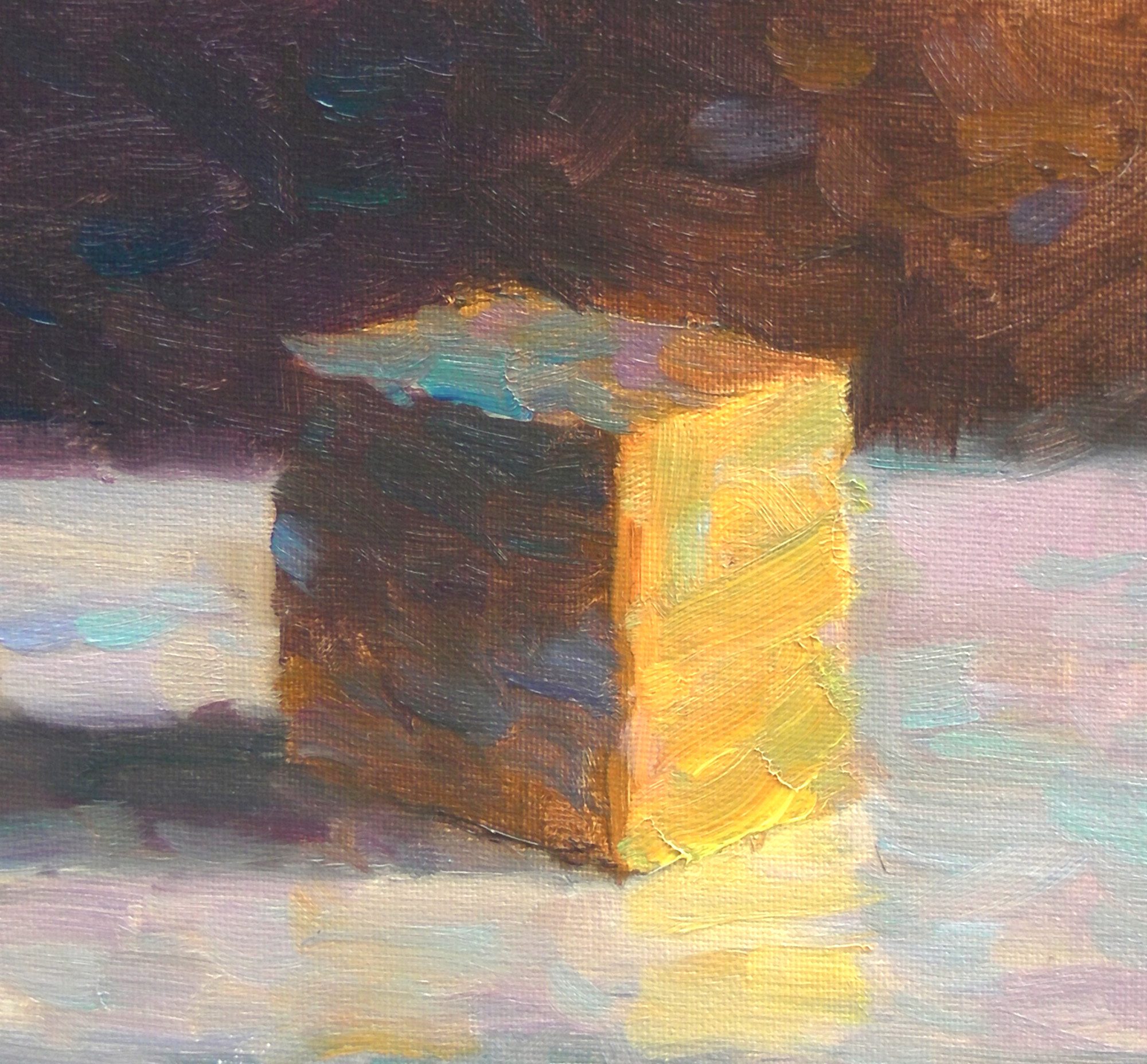
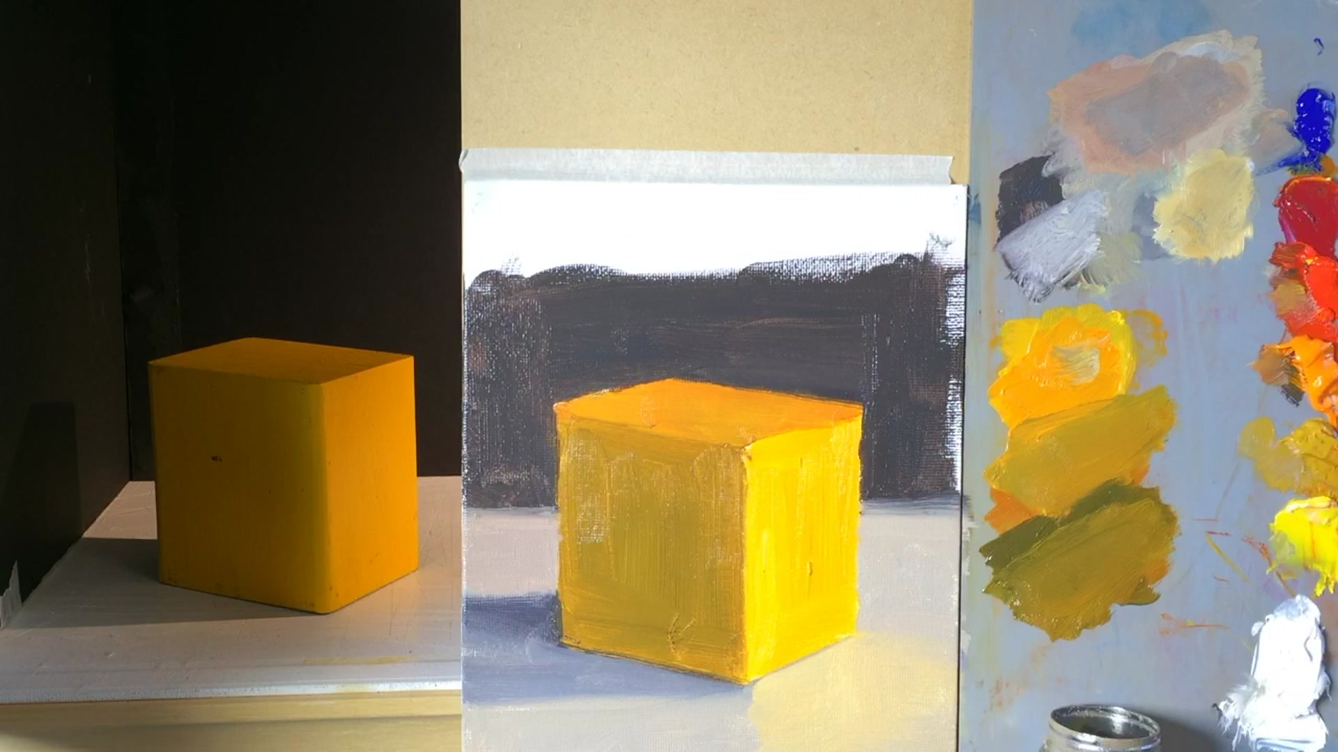
In this chapter, I delve into the fascinating world of broken color, a technique that breathes life and vibrancy into your paintings. We'll explore what broken color truly means and how to effectively incorporate it into your artwork. To illustrate this, we'll start with a seemingly simple block study from life. While it might appear straightforward at first glance, this exercise presents a rewarding challenge that will enhance your understanding and skills. Initially, I'll guide you through painting the block using a toneless method, capturing it just as it appears. Then, we'll introduce broken color to transform the painting, adding depth and interest. This foundational lesson is crucial, as it contains the keys to mastering more complex applications of broken color in future projects. Embrace the challenge, and enjoy the process of discovering how this technique can elevate your art to new levels of expression and dynamism.
This guide accompanies the full video lesson. The lesson includes the complete narrated video, the printable PDF chapter, and personalised critique support.
"Block study 2 - broken colour" 8x8" Oil on Canvas by Richard Robinson
Step 8Applying broken color to the cube
Mix a Redder Hue
Start with the original orange-yellow color on your palette. Add some red to this mixture to create a redder hue. Note that adding red will darken the color.
Adjust with White
To lighten the darkened mixture, add white. Be aware that adding white will also cool the color, giving it a pastel orange appearance.
Apply Broken Color Technique
Use a brush to drag the new color across the surface of the cube, avoiding mixing with the layer underneath. Refill your brush frequently and apply small dabs of color, with occasional larger strokes, to allow the original orange to show through gaps.
Pro tipAdd white to lighten a color, but remember it will also cool the hue, shifting it towards blue.
Embark on your painting journey by carefully drawing the cube, ensuring it fits harmoniously within your composition. Pay attention to perspective adjustments to capture the cube accurately from your viewpoint. As you move to painting, start with the most vibrant side, using warm light to enhance the yellow and orange tones. Adjust your mixes to reflect the light source, and remember that color relationships are more important than matching a single hue.
As you progress, focus on mixing shadow colors and adjusting color relationships. Use complementary colors to achieve the desired saturation and balance. Clean your brush regularly to maintain clarity and vibrancy in your work. Simplify the scene by squinting to see shapes and colors as flat, interlocking pieces, which will help you understand their relationships better.
Finally, apply the broken color technique to add texture and depth to your painting. Experiment with different hues and values to enhance the vibrancy and interest of your work. Practice with simple shapes before moving on to more complex forms, and always aim to maintain harmony in your color choices. With these techniques, you can create dynamic and engaging paintings that capture the essence of broken color.
Points to remember
Use perspective drawing techniques for accurate cube shapes.
Enhance vibrancy with a warm light source.
Start with a more saturated color mix; it's easier to lower saturation.
Clean your brush thoroughly to prevent muddy colors.
Squint to simplify the scene into basic shapes and colors.
Compare darks to darks, mids to mids, and lights to lights.
Add white to lighten a color, but remember it cools the hue.
Test your color by placing a small dot and squinting to check value.