Teacher
Richard is a talented full time artist, who loves painting and teaching.

with Richard Robinson
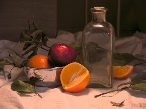
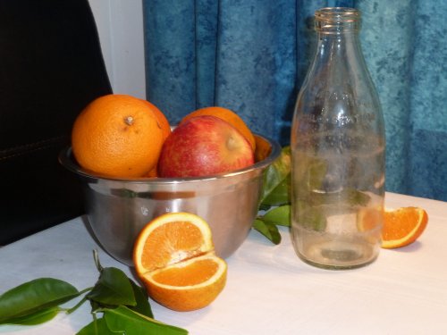
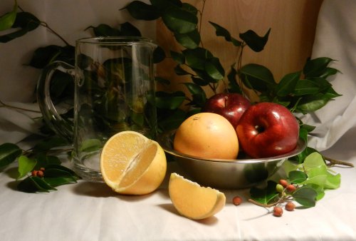
Master some advanced still like painting principals in this painting lesson. Follow along step by step using the resource photo or create something more your own following my suggestions. Enjoy!
Get the previous lesson here.
Whenever you’re ready! The lesson is available online any time, and your access to the lesson never expires.
As long as you need! Your access never expires, so you can come back again and again.
Sorry, no you can’t download the video. This is to avoid piracy. You’ll always be able to view the video on this site though.
Richard is a talented full time artist, who loves painting and teaching.
Hi I’m Richard. I’ve been painting my whole life and back in 2001 I traded my graphic design career for the humble life of a full time artist. I love painting, and as it turns out, I love teaching too.
Nowadays I balance my life between parenting, painting, surfing, travelling and teaching. My work is regularly featured in international art magazines, in galleries in New Zealand and America, on TV and in my Mum’s house.
I give outdoor painting workshops in interesting spots around this beautiful planet of ours and love encouraging people to paint. Two of my favourite artists are John Singer Sargent and Joaquín Sorolla.
My painting website: www.nzpainter.com
I’d love to be your new teacher.

Richard is a master artist with an exceptional skill in identifying and communicating key factors to making successful paintings. I have found his video workshops an excellent resource for improving my own work.
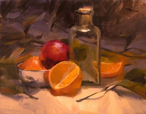
"Glass & Steel" 10x8" Oil on Canvas by Richard Robinson
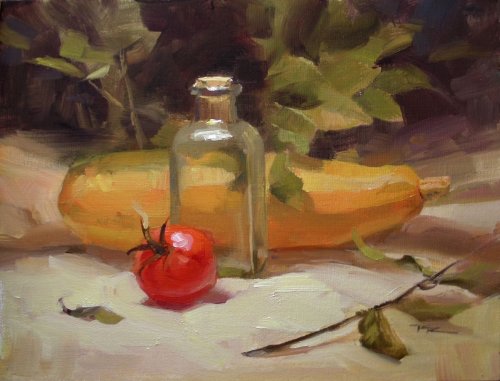
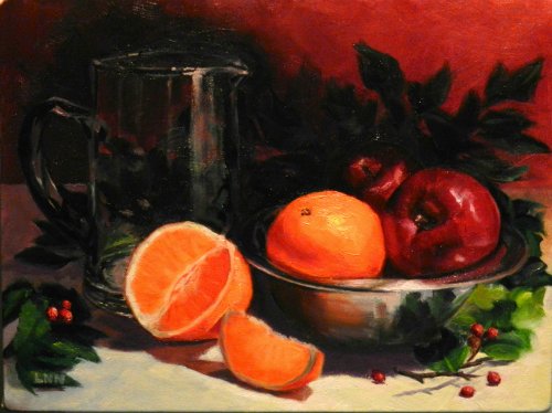
"From Our Garden" 10 x 8" Oil on Canvas
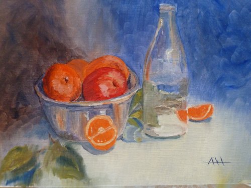
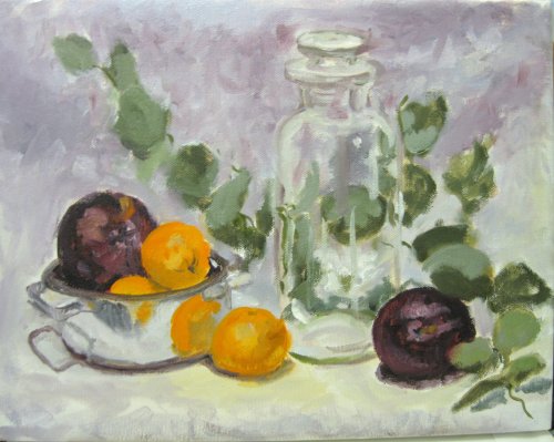
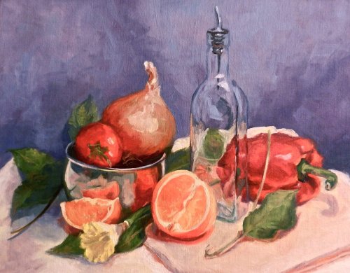
"Steel and Glass" 40 x 30cm Waterbased Oils by Annie Hemsley
Design No, not the best design in the world, but not the worst either. :-) The more time you spend on setting up, the better it's going to get. The flat white base doesn't help - not much interest or character there. The lighting is the main problem though. You have two or more light sources which effectively removes shadows and detracts from the dark and light shapes of the objects, flattening them. Basically it removes variation, which is the prime key to interesting paintings. It also makes it more difficult to paint as there is less obvious dark/light information to work with. My advice is to knuckle down and sort this all out before you start painting because the most important thing about painting is that you are excited to be painting the subject. One dominant light source - start with that. Colour The blue/orange complementary design is one of my favorites. Do remember that when you're using a colour design like that, that both colours needn't be of equal vibrancy. You could gray that blue right down and it will still work well, and in fact that would make the fruit appear even more vibrant contrasted with a more subdued background. At the moment the vibrant blue draws a lot of attention, so what did you want to be the star player here - the fruit or the background? Okay, so you can subdue colours at your discretion to meet the aims of your painting. When you're trying to paint vibrant coloured fruit, laying on more and more strong colour will not help because you can only go as vibrant as what comes out of the tube, so the idea is to darken and dull the shadow sides in order to make the light sides look bright by comparison. Again, working with a single light source makes this easier. Brushwork Waterbased oils do seem to have a tendency to not cover the canvas as well as traditional oils, which means either laying down an acrylic coat of broad colour notes first or laying on lots of thick waterbased oil paint. That's my experience with them anyway. They also tend to muddy in mixture faster than normal oils, making it harder to keep vibrant colour. All that means is that you're battling with an inferior medium and that tends to destroy any fresh brushwork because you'll spend a lot of time just trying to cover the canvas properly. (I may get stoned by some die-hard waterbased oil painters out there for saying this, but it's just my experience after working with them for over a year about 10 years ago and then a few brief forays since then). Besides that, when you start thinking more in terms of light and shade families and start building objects systematically with value plains you will find that your brushwork will improve along with your understanding and confidence. All a matter of brush miles. Realism Well I've dragged you over the coals a bit here Annie, but hopefully some of it helps. Actually your milk bottle, which is arguably the trickiest part of this painting challenge is looking decidedly glassy and solid, so well done on that - especially the exaggerated refraction of the orange which shouts out "hey I'm all glassy over here!" What impressed me more than anything was that you did one painting in watercolour and also this one in oils, which reveals to me the curious spirit of and true artist, and that is beautiful beyond all measure. You go girl!
"DR-Clementines" 11 x 14" Oil on Canvas by Dorothy Ruckdeschel
Design Wow - not your first painting then!? Love the freedom of this Dorothy - great to see. It's well designed with the dancing leaves balancing the formality of the other objects. Lightening the background as you have has added to the sense of fun and freedom in the painting but at the same time you've lost some of that overall dark to light structure which was holding the whole thing together so now I get a feeling that the top half is a little lost in translation, particularly because in changing the lighting behind the jar you've had to invent a lot of that glass which has detracted from its realism. Colour The play of colour against gray is nicely done. If you really want to push through into the impressionist colour I'd like to see some more hue variations being woven into the background and major masses as well, tying the whole thing together, although that would be easier on a larger canvas. Some areas got a little muddied like the plum on the left and some if the interior of the glass and I would have liked to see a little stronger colour and value in the orange on the left to give it more form, but overall it's very good. Brushwork You've achieved a real symphony of varied brushwork there on a small canvas - a real treat and something many of us aspire to. It seems a shame you lost the drawing in the top of the glass because up until then you had balanced keen drawing with loose brushwork, which is difficult to achieve. Personally I'd redo that bit because you're onto a winner. I'm really impressed with how far you're pushing your lost and found edges and most if the time you're right on with what needs to be sharp and what can be obscured - just keep thinking about those as you do them. Realism With a little more focus applied here and there in building form and careful drawing you will have fully bridged that gap between well observed realism and joyously applied paintwork. Great work!
"Workshop8" 40 x 30cm Oil on Canvas by Li Ningning
Design A very effective and pleasing design Li - it shows that you spent a good long time setting this up and arranging the lighting. Nicely done. Plenty of variation and subtlety. I especially like the S curve of the fruit leading back into the picture and onto the pitcher. Even the little berries are expertly placed! That's very Ninja. Colour It looks on my screen like the colour in your photograph of your painting has been pushed a little too vibrant, but even so, I can see all the relationships are good and the dark background does make the fruit look extra punchy and adds a degree of mystery to it all. Brushwork Your work is very slick and you do hide your brushwork a lot with overpainting and glazing but you have laid it on thick where it counts and that's beautiful to see. You could go even further in that regard pushing the relationship between thin and thick paint, but that's up to you, as always. I love those lost edges on the background leaves and the super-sharp edges in the foreground. Great stuff. Realism It doesn't get a lot more realistic than this in the alla prima style at this size. Your apple especially is very biteable and you've shown a commendable restraint with all the highlights which are so easy to overdo. The brevity of this critique basically means I can't think of anything much to improve on this painting, so all I can do is join in the applause for this one Li! Great work.
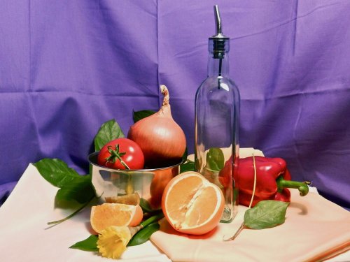
"Glass and Steel" 11x14" Oil on Linen by Dania Bree
Design I love this design Dania - there is so much well orchestrated variety here it's a joy to take in. The purple background was a bold choice but you've quite wisely subdued that so it doesn't overpower the subject. Your objects are well placed with solid overlaps so none are 'kissing' edges and the colour placements keeps the eye moving around the painting from reds to reds, oranges to oranges, greens to greens. It's a rich concerto full of life and movement. Colour There's a subtle grey quality to your colour which makes me wonder if you are using black in your grays. To me it's neither good nor bad to use black in your grays - it's all a means to an end and if the final colours are good and harmonious then who is to question the means. I particularly like the colour you have in the capsicum and the metal bowl - both have been subtly seen. It's good to see you noting the subtler differences in the shadows of the tablecloth too which introduces the background colour into the foreground. Brushwork Your brushwork is one of the main elements that drew me to look at this painting. From a distance it looks quite carefree and lyrical but on closer inspection I can see that it is in fact quite tightly drawn and the brushwork is well considered. It seems, like me, that you are trying to loosen up your brush strokes and it is working well. If you want to go further the next step is to use bigger, juicy globs of paint, and don't mix the paint completely on the palette - allow some of that to happen on the canvas. Then of course there's always the palette knife. Depends where you want to go next of course. Where you are is great, but where to next? Some of your edges could do with softening off like the far left edge of the table cloth - it's sharp and high contrast - not a good combo for the edge of the canvas, but you have certainly done well elsewhere. It's up to the artist to decide what to accent and what to obscure. Yes this helps with giving depth to an object and a scene, but we might also consider 'what is this painting about?' Am I more interested in the jungle or the tiger? Realism Realism most often relies on drawing and value and on both scales you have done very well. Your drawing did lapse a little in the bottle and the bowl, although that's probably just more readily evident because these are precise man-made objects which we know to be more straight and regular than organic material. I find it a real battle to balance expressive brushwork with careful drawing, but hey if it wasn't a challenge who would do it right? Congratulations on a beautiful painting Dania.
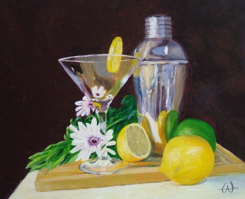
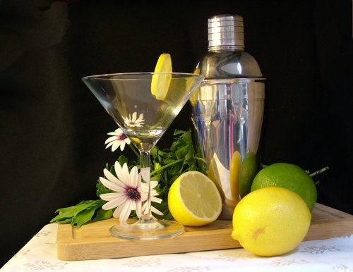
"Margarita?" 250 x 300mm Acrylic on Polyester Canvas by Anne Wheeler
Design Nice design Anne - as much as I try to avoid using the 'nice' word, there it is. It's well balanced, yet not symmetrical, it has a good variety of shapes, sizes and placements which don't seem over-organised, which is our natural tendency. I usually avoid a flat black background but in this case I think it works well with the modern items you have used. Even the slightly off balance chopping board and sharp diagonals running off the edges seem to me to add to the contemporary feel of this painting. I especially like the subtle curving procession from whole lemon to half lemon to slice which leads us to the top of the cocktail shaker - very cool. Colour I find it interesting that most of these still life paintings end up looking cooler (more blue) than their counterpart photos. I guess that's one of the differences between our eyes and a camera - our brains adjust to the warm colour cast of the light and render the colour as close to daylight 'normal' as possible. In a recent blog artist Qiang Huang came up with a good idea to counteract this - simply place a white led light (he used a white iphone screen) in the scene to give you a pure white to check your colours against. Similarly, one of the Impressionist's (sorry I forget the name) used to take a black top hat and white gloves or handkerchief outdoors painting to place in the scene so as to be better able to judge relative values. I recommend also having a value scale on your palette or beside your painting as you work. Aside from all that though, your colours are well done and keenly observed. I would like to see a little more value modelling within the flower to give it more solidity. Brushwork As with so many acrylic paintings this has been overworked until most of the brushmarks are gone which to me is a shame because it hides your handwriting and removes one more element of variety in a painting. That's my view however and it's all completely subjective (which makes it so hard to critique!) and it depends entirely on your goals as a painter. If you want to loosen up I recommend as always, bigger brushes and more paint (especially with acrylics) and if you want to get even tighter use smaller brushes and more layers. Personally I'm beginning to consider how can I use the infinite variety of brushwork, texture and paint thickness to say more about my subject, rather than just painting flat colour shapes. Realism It is beautifully crisp and detailed and the drawing is mostly excellent as is your judgement of values. It's especially interesting seeing the detail in the stem of the glass and the metal and the subtlety in the colours of the upper glass. I would add a thin occlusion shadow under the leaves where they sit on the board. Good job. Keep up the great work!
$15.00USD
$15.00USD
$15.00USD
$15.00USD
Not loving your painting lessons? No worries!
If it’s not the right fit, we’ll give you a full refund within 30 days of purchase - no questions asked.
When you purchase a DVD you also get online access to the same lesson, including any lesson resources like photos, downloadable notes and access to upload your painting to the student gallery.
That's why you need to make a password when you purchase a DVD, so you can access the online content as well. Enjoy!