Teacher
Richard is a talented full time artist, who loves painting and teaching.

with Richard Robinson
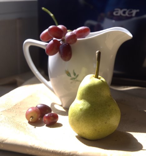
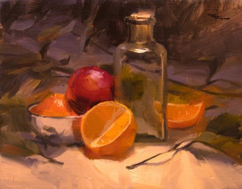
Get started in still life painting with this simple setup. Follow along step by step using the resource photo or create something more your own following my suggestions. Get the previous lesson here.
Whenever you’re ready! The lesson is available online any time, and your access to the lesson never expires.
As long as you need! Your access never expires, so you can come back again and again.
Sorry, no you can’t download the video. This is to avoid piracy. You’ll always be able to view the video on this site though.
Richard is a talented full time artist, who loves painting and teaching.
Hi I’m Richard. I’ve been painting my whole life and back in 2001 I traded my graphic design career for the humble life of a full time artist. I love painting, and as it turns out, I love teaching too.
Nowadays I balance my life between parenting, painting, surfing, travelling and teaching. My work is regularly featured in international art magazines, in galleries in New Zealand and America, on TV and in my Mum’s house.
I give outdoor painting workshops in interesting spots around this beautiful planet of ours and love encouraging people to paint. Two of my favourite artists are John Singer Sargent and Joaquín Sorolla.
My painting website: www.nzpainter.com
I’d love to be your new teacher.

Richard is a master artist with an exceptional skill in identifying and communicating key factors to making successful paintings. I have found his video workshops an excellent resource for improving my own work.
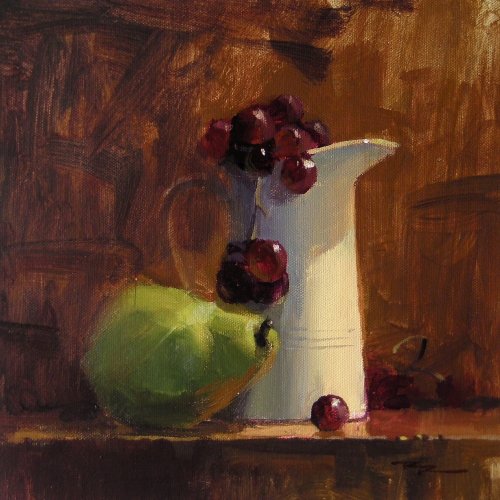
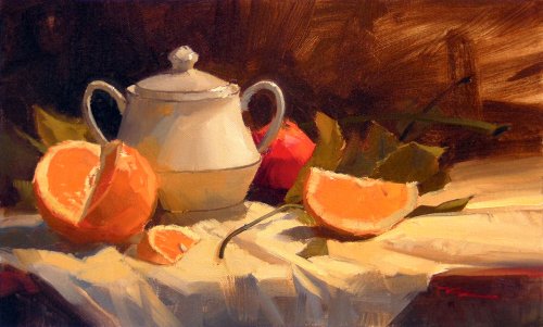
"The White Jug" - Acrylic on Canvas by Richard Robinson
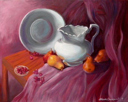
"The Corner Table" 16 x 20" Oil on Canvas by Sharon Casavant
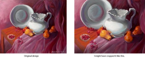
Design Nice painting Sharon. The design is very eye catching, as much for it's dark/light contrast as for it's colour and shape placements. I can see you've spent some considerable time playing with ideas and it has paid off. It feels to me that there's a tad to much space around your subjects (this is totally subjective of course), and I might have gone so far as to crop it as in the image below right. To me, the cropped image looks stronger and more dynamic - there is more light space on show and your main subject fills more of the canvas. It also makes the crimson less overpowering. However, maybe I like it more like that because I'm a guy. Your design has more femininity about it - with the plush crimson setting and flowing fabric it reminds me of a jewel on a large velvet cushion. Something to think about anyway. Colour It is a nice arrangement of colour shapes as I said and you have some good strong colour in your fruit but what it's lacking is a coherent colour for the light on the scene. The light on the jug and bowl and fabric looks very cool whilst the light on the fruit and table looks very warm. You need to start looking at the overall colour of the light on your subject. I know how difficult it is to paint whitish objects - to get those grays on the right side of warm or cool is extremely challenging. It just looks to me like you chose the wrong side this time. Inventing the crimson setting colour is a hugely tricky thing to do and get right simply because it changes nearly every colour in your painting, or should do, so my advice would be that if you want to paint a crimson fabric backdrop, go get a crimson fabric backdrop. You and I are not yet at the point where we can go making these things up willy-nilly without paying a heavy price in terms of realism. Yes you've used your artistic licence which is great, but how much you risk inventing should depend on the goals you have for your painting. Brushwork I do like the movement in your brushwork - again it seems to be very feminine, full of long languid swishiness - beautiful. You nearly have that resonating through the whole piece. It's in the bowl, the jug and fabric, but sadly you tightened up a bit on the fruit, which is understandable because they are smaller forms, but I would really like to see that lyrical brushwork throughout the whole painting. Maybe on the next one? Realism Again, nice to see you using your artistic licence in changing the colour of the setting and the inclusion of a table and glass bowl, however you lose a lot of realism when you try to paint imagined things like that. Also, you've broken the unity of some of your shadows by making the reflected lights to light in value compared to the shadow. Keep in mind throughout the whole painting, 'what am I painting? Is it light, or is it shadow?' Be clear about that and your subjects will be much more solidly real.
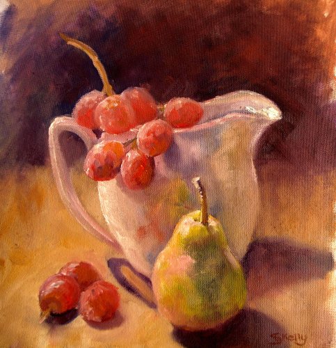
"Grape Time" 12 x 12" Oil in Canvas by Sandra Kelly
Design The placement of the objects and colour shapes seems to me to be very pleasing and harmonious. The pear leads back to the grapes which leads back to the jug and the whiteness of the jug is mostly in shadow and slightly out of focus so it doesn't seem to want to jump in front of the pear. You haven't quite captured the same depth with your painting - the viewing angle is a bit higher so the three grapes have shuffled forwards to compete with the pear and the pear seems to be edging a bit to close to the bottom of the canvas to me too. Those are pretty minor points to me though. I like how you've softened the background to help push all those warm colours back into space. Colour The colour in your painting is what really caught my attention. It's warm and light-filled and with all the scumbled additions of reflected light has produced an interestingly varied colour space in the style of the impressionists. You are very close to a really stunning colour treatment there - I think that if you had worked over the painting with thicker paint, adding hue variations everywhere without changing value it would have jumped up another level. You always do that at the risk of what you have there already though, so it's a gamble. What I mean about 'hue variations with a change in value' is this: take the brown colour of the base everything's sitting on, as a flat colour it's ok, but a bit boring, so we add variations of value into it - getting light towards the light source and darker away, or where it's cast into shadow. We can also look for reflected light in it, like a green tinge from the pear, or red from the grapes, or something from the background. So now it's more interesting. Now we can throw some more colour in there like a cooler gray, or a mauve (provided they're kept the same value as the base colour - the same degree of light or dark), and if that's made it too cool we can add some strokes or scumbles of hotter orange to balance it out. That's leading to really impressionistic colour usage, and I only mention it because your painting seems to be headed in that direction. It may be better for you at the moment to keep trying to paint what you're seeing, because that's challenge enough, but impressionistic colour is something you can explore anytime. Brushwork Your loose brushwork and scumbles are all adding to that impressionistic feel which is lovely. I like how you've played with lost edges - keep working on that. It looks to me on close inspection that you may have a slight issue with your canvas being too absorbent. Or perhaps you're using turps in place of a painting medium? Hard to tell from a photo. I don't using scumbling or dry brushing much at all in my work because I prefer the juicier look of wet in wet, but each to his own. If you do want a juicier look to the painting you'll need to use more paint, don't use turps or thinners for anything but the sketch, and make sure your canvas is well sealed with gesso or primer beforehand. Realism The painting doesn't score very high on realism because the drawing is a bit loose in some areas and the values wobble in and out of place in the darks but that doesn't stop it being a charming and colourful piece. Well done.
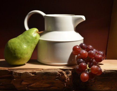
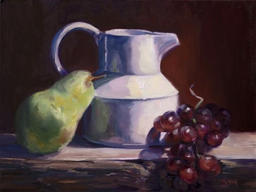
"Red Grapes, Green Pear" Oil on Canvas by Denise Maxwell
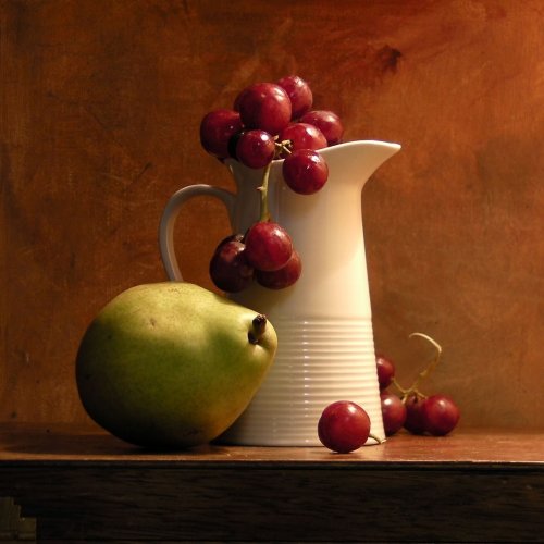
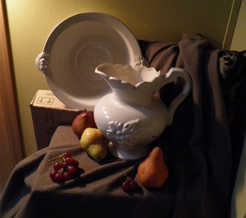
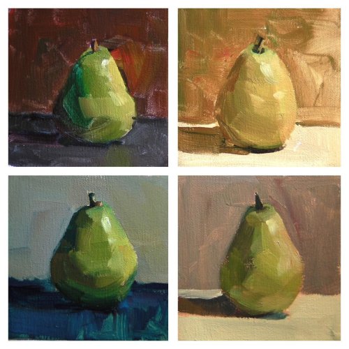
Design Great painting Denise. The design is appealing with enough variety of sizes, shapes and spacing to keep the eye interested and the ploy of the grapes breaking forward of the setting is interesting too. The old slab of wood is a nice textural addition and suits the other elements. Your background in the photo has a little more light in it which I thought was a bit of a shame to have lost that in the final painting, and I have the same regret for my own demo painting. Colour The colour in the pear and grapes and wood are great. You've managed to capture the translucency of the grapes and even the gray coating on their surface. The form of the pear is modeled nicely but the colour does seem to get a little chalky in the half tones which is often a sign of blending your light into your shadow rather than mixing a separate halftone where the colour is often more vibrant than anywhere else. The shadow colours in the jug seem to me to be a little too cool although I don't expect they were as warm as what we're seeing in the photo. You also some some sharp edges between value planes there which are not helping with the roundness of the form. In the photo there is a green stalk in the grapes which I thought nicely related the grapes to the pear and you might have included that although you did well to improvise the detail of the stalk at the back of the grapes. Brushwork Your brushwork in the grapes and the front of the wood is fresh and bold and joyful, but in the pear and more so in the jug as often happens with overworking problem areas you've lost some of that magic. Realism I can see you struggled with the ellipses in the jug which you certainly improved on in your second attempt. They're still not quite there, and they're always tricky things to draw accurately with a brush. (You'll notice I got the grooves in my jug drawn at an odd angle too!) When I'm trying to get these right I imagine a central horizontal line running through the apexes and even hold a ruler up to it which helps to construct your curves symmetrically on the left and right. These ellipses are not symmetrical top to bottom though. Any text on perspective drawing will teach you more on that. Getting the hand to do what the brain knows is another story though. The tops of cylinders often pose a problem because our brain knows the shape is actually circular and wants to draw that shape rather than what the eye is seeing. Also, notice in the photo how the middle angled section of the jug is so much brighter than the vertical sides because it is turned up towards the light? You've missed that in your painting and it is flattening the form. Other than that the realism is quite convincing, especially the grapes and the textured wood and you've even managed some little dents in the pear. Getting there, getting there!
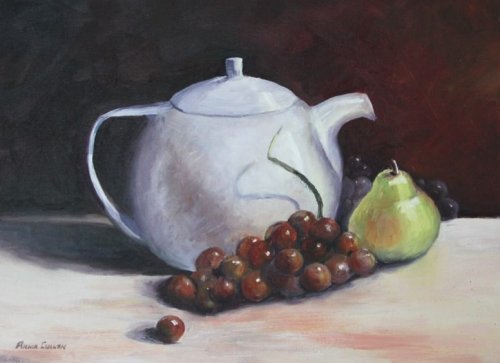
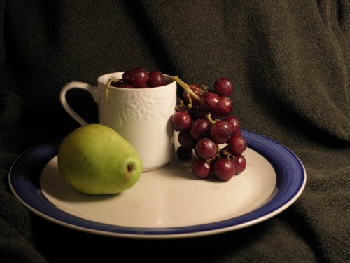
"Grapes, Pear and a White Teapot" Oil on Canvas, 12x16" by Annie Cullen
Design It's an interesting choice putting the white teapot on a white base and the way the deep red from the grapes is echoed in the background makes me think of the Yin & Yang symbol - dark on light, light on dark. I would have been tempted to place the background grapes behind the left side of the teapot to help balance it out in that direction. It seems a little like a ship with all it's cargo balance on the bow at the moment. Just a thought. Colour It's so tricky to mix those grays in the white jug isn't it!? I really struggled with that too. You haven't quite captured the subtlety of the colour/value gradation around the jug so it's ended up a little flat, but you really made this hard on yourself with the white base being reflected into the shadow side of the jug which makes the difference between dark and light very subtle indeed and you've painted the core shadow a little to dark here - you're close though! The grapes are great, so no worries there, but the pear needs a little deeper shadow side and no so much white in the lights which have gone a bit pasty and lost the powerful green that was available to you there. If you try painting a pear without using any white (except for using white in the mixture for the highlight), you can avoid getting pasty colour there. The same goes for a lot of things actually - we often reach for the white far too soon in our mixtures at the expense of truely rich colour. Your base looks to be suffering from the same problem, besides it being slightly too light - especially on the left side where it's furthest from the light. Brushwork A little to much fiddling and glazing with thin layers here for my liking, but hey that's just where you are at the moment. As I suggested to Stephen and anyone wanting to paint 'looser' more expressive paintings, try bigger brushes, more paint, stepping back from the canvas every few strokes and squinting or defocusing your eyes every time you look at your subject - remember it's the big shapes of colour we are after. If you get those right with the right soft or hard edges the jigsaw comes together from a few feet away. To me it's the difference between writing a poem or a song about a subject, or a long- winded clinical essay about its visual properties. Easier said than done though. Realism I've picked your painting apart but it's actually a pretty darn good rendition of the subject and I know you haven't done many still life paintings so I think you've done very well. One thing I noticed you working on here was the lost and found edges which is fantastic - keep going with that! I'd caution you to look again at the cast shadow edges under the front edge of the grapes however - the softness in your painting goes against the properties of the other shadows you so carefully built. Remember soft edges on cast shadows speak of a diffused light source or a longer distance from the object casting the shadow. Again, picking. Overall, pretty good I thought.
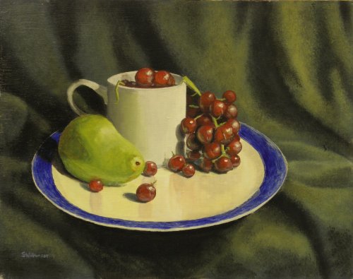
"Grape n Pear Still Life" 11 x 14" Acrylic on Canvas Panel by Stephen Williamson
Too good for me to critique Stephen! You've done a great job with everything here, especially the colour - we can see the light source has unified the colours. If you are wanting to achieve a looser style as you say I suggest you experiment with lost edges (really lost edges) and using a larger brush. One way to start breaking out of a tight style is to finish the painting in your usual fashion and then get out the larger brushes with more paint and work over some areas (often all the lights) trying to lay down bold expressive strokes in place of the many that you have there. Working over a finished piece has the dual freeing effect of knowing what colours go where, and losing the preciousness we usually hold for tight finished work. In acrylics this technique will obviously be more difficult than oils which would remain wet for you, but I'd be interested to see you give it a try. You already know you can achieve a good degree of finish so you can only gain in experience by working over a finished piece. It's said that John Singer Sargent would make one carefully measured stroke on his canvas at a time, standing back several paces after every stroke, and scraping it off if it did not express simply and exquisitely what he intended. Bravura work doesn't mean sloppy work - it's often more carefully thought out than finely wrought realism which is what you have achieved here. Good work.
$15.00USD
$15.00USD
$15.00USD
$15.00USD
Not loving your painting lessons? No worries!
If it’s not the right fit, we’ll give you a full refund within 30 days of purchase - no questions asked.
When you purchase a DVD you also get online access to the same lesson, including any lesson resources like photos, downloadable notes and access to upload your painting to the student gallery.
That's why you need to make a password when you purchase a DVD, so you can access the online content as well. Enjoy!